


WestwoodWestwood
— Brand Identity
WestwoodWestwood was more than a rebrand, it was a full 360 business transformation— from creating a fluid brand identity system that adapts across categories and environments to merging an experiential agency with a content studio and designing a website to house a robust editorial platform.
I can't thank the team enough that helped bring this vision to life.
Creative Direction — Cam Diamond
Brand Voice & Foundation — James Moore
Business Development & Strategy — Devry Reitz
Business Development & Strategy — Devry Reitz
Digital Design Director — Dan Ferro
3D — Méric Chaperon (Plus Mûrs)
3D — Méric Chaperon (Plus Mûrs)
1.0 The New WestwoodWestwood
We are agents of change born from the culture we now shape. A collection of strategic thinkers and creative makers who seek to discover authenticity wherever it lives, and share it with the world. An agency defined by its willingness to adapt, transforming brands and businesses alongside our partners and collaborators.
We are WestwoodWestwood, and we invite you to join us on our mission.

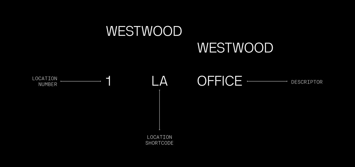
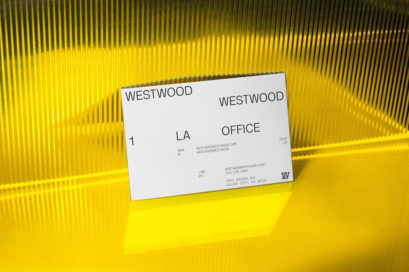
1.1 The Brand System
We created an entirely new fluid identity system to showcase this story using a blend of responsive grids, mixed typefaces and a forever evolving Brandmark.
This juxtaposition allows the WW brand to take many different forms, flexing across mediums and industries while maintaining a consistent and stable feel through the underlying structure.
Primary Typeface
NB International (Neubau)
NB International (Neubau)
Secondary Typefaces
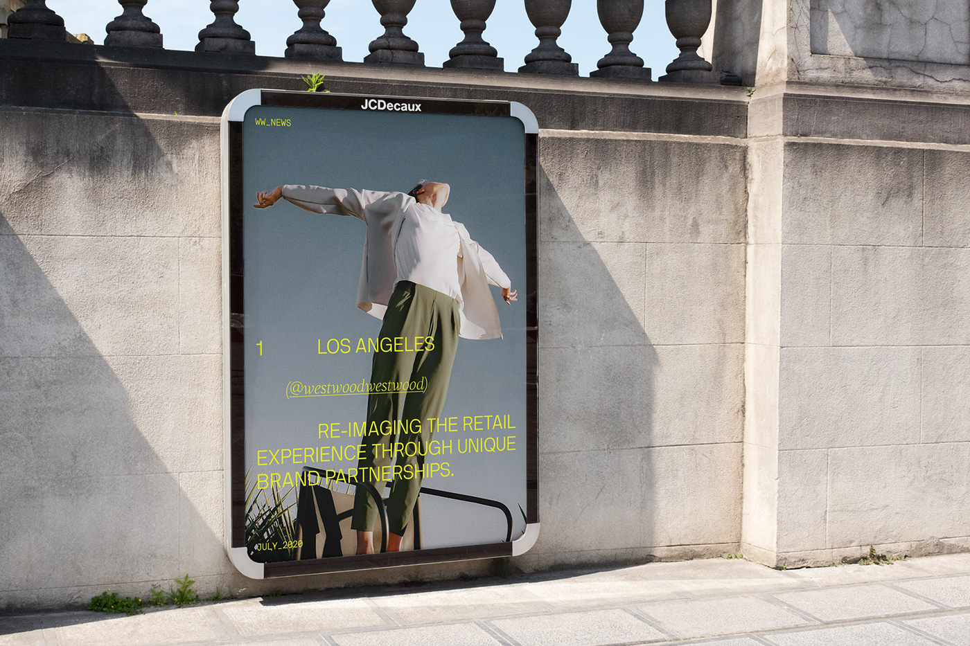
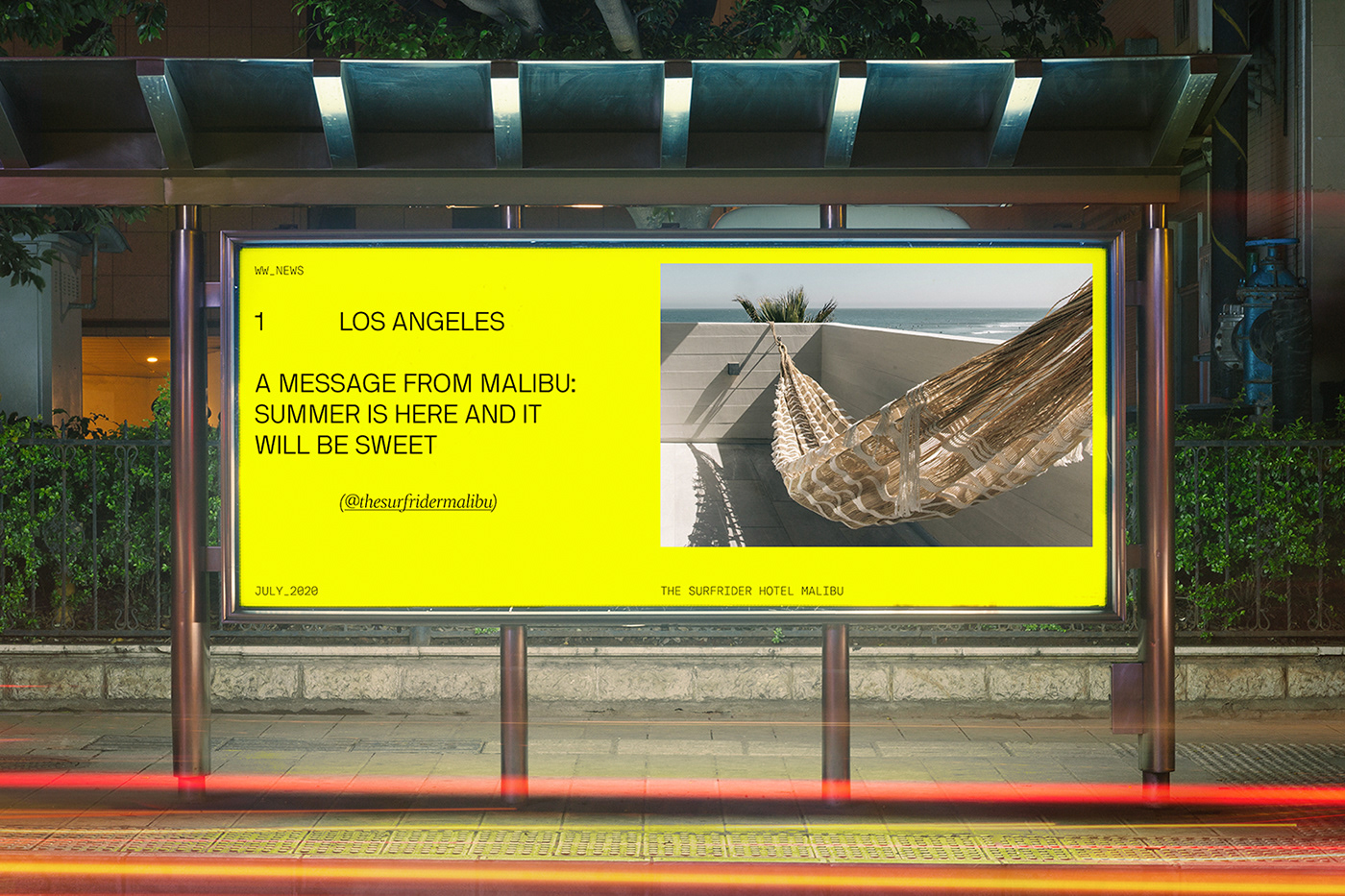
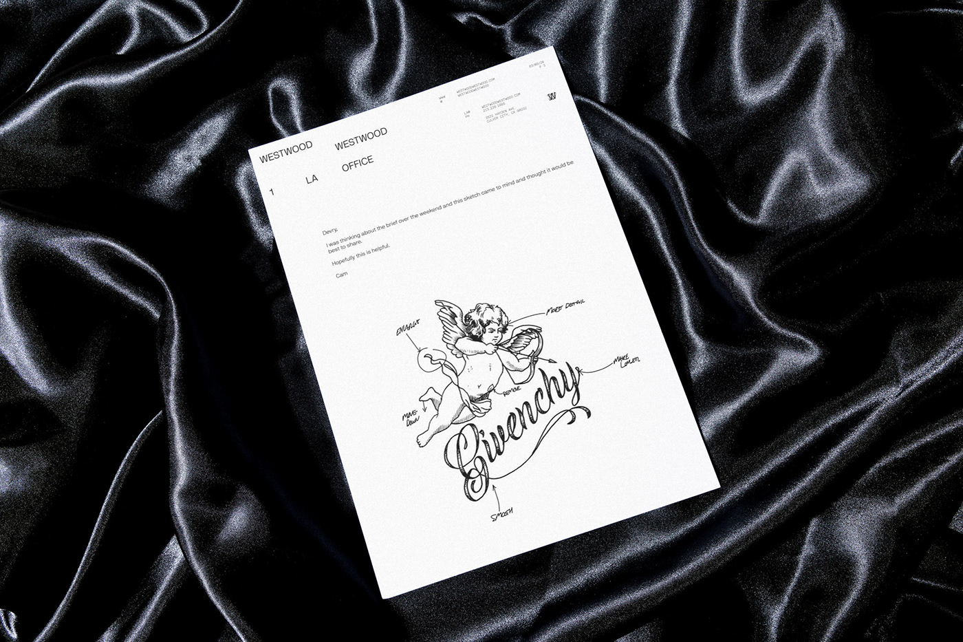

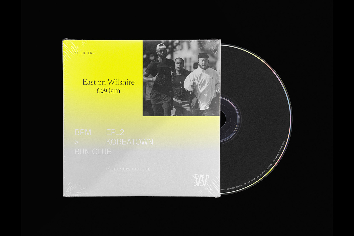
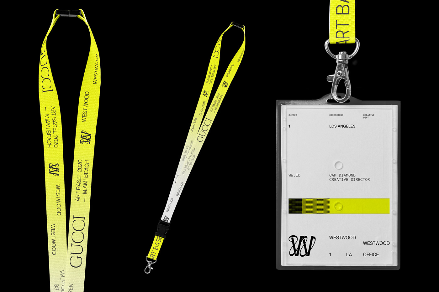
1.2 IP — (Internal Projects)
Our IP a manifestation of the WW brand and distribution channel for our cultural knowhow.
World Wide (Web)
Working across categories and in close conversation with some of the most progressive creative minds gives us unique insights and perspectives that are invaluable to understanding today’s audience and culture as a whole.
+ Learnings & Insights
+ Limited Edition Products
+ Exclusive Collaborations
+ BTS Interviews
+ Private Events


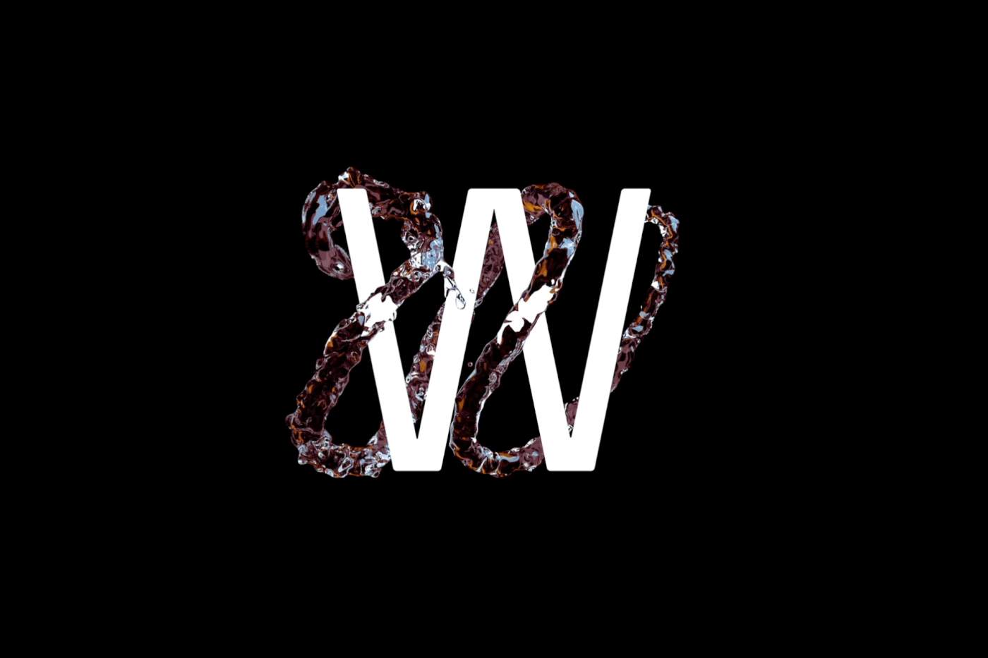
1.3 Fluid Brand Mark
The BrandMark is made of two W’s—one that is structured and detailed. The other is a fluid form meant to feel more visceral, seamlessly weaving in and out of the structured to connect at both ends.
These contrasting W’s represent our agile but structured approach, balancing experience with playful, experimental ideas.


1.4 Digital
The website is home to the Editorial & Studio arms of WestwoodWestwood and is our key touchpoint in sharing the content we create and curate.
The site’s architecture was built on the backbone of a detailed tagging system that seamlessly serves up all content into a single integrated content feed. This system allows WestwoodWestwood's hybrid business model to blend the two content forms (Editorial & Studio) into an endless stream that users can take a 'choose your own adventure' path or let the AI of the site serve you related content.


