

We deeply sympathized with Sandawha’s past process.
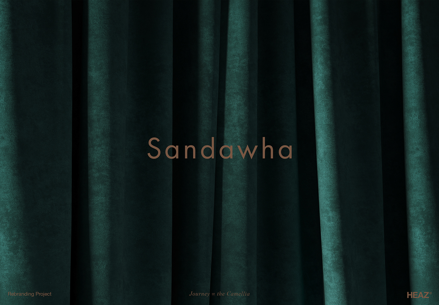
For the better brand, we organized Sandawha’s philosophy and created a concept and story.
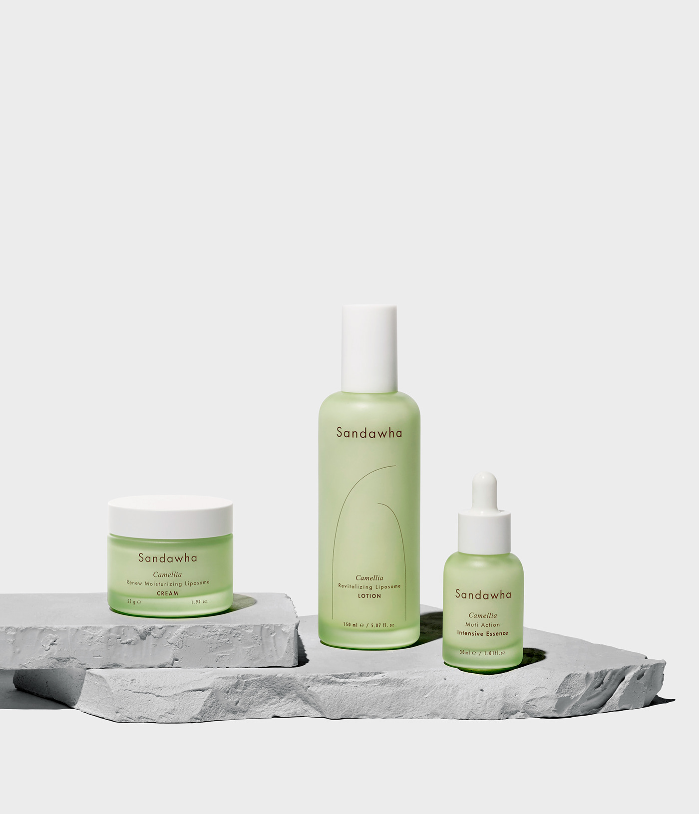
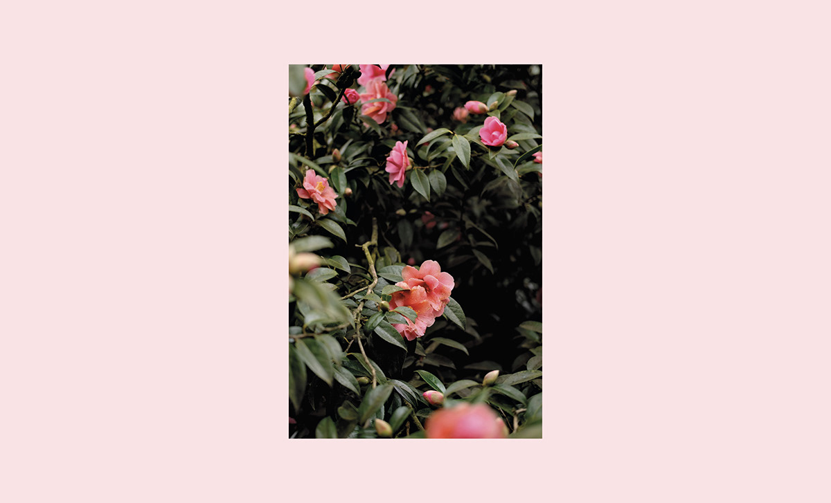
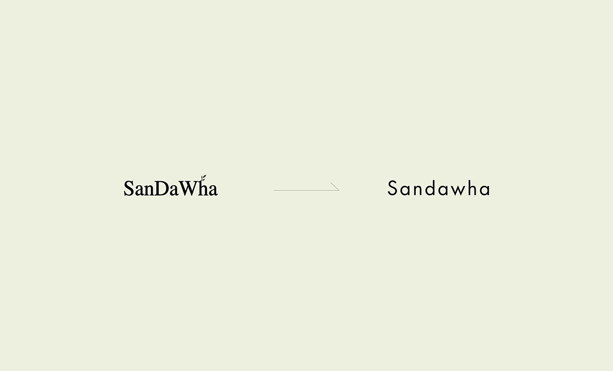
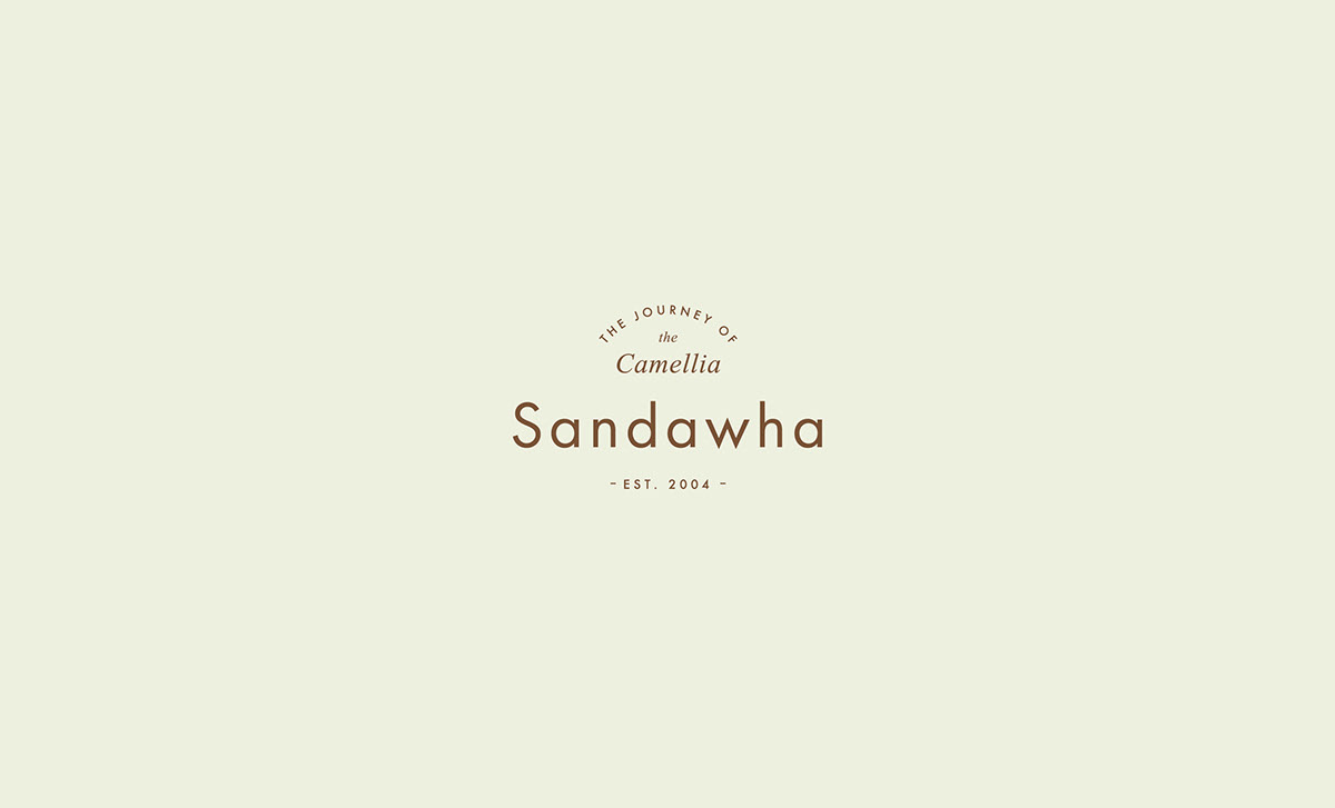
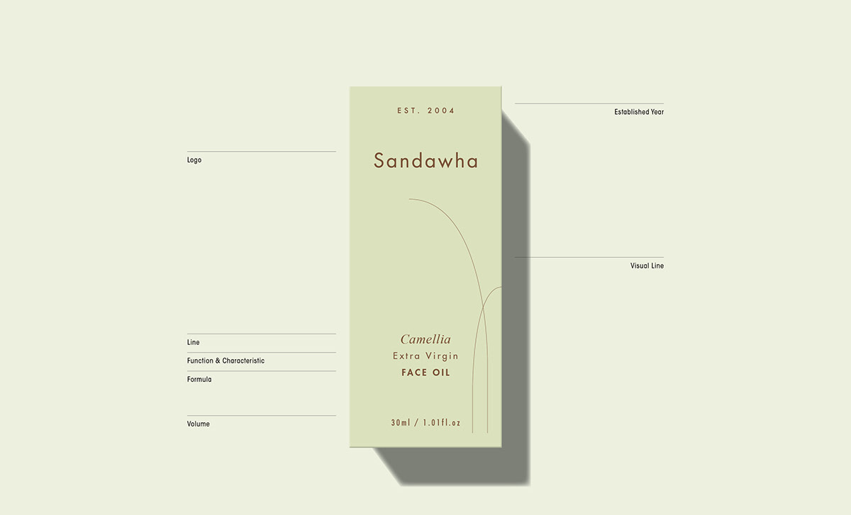
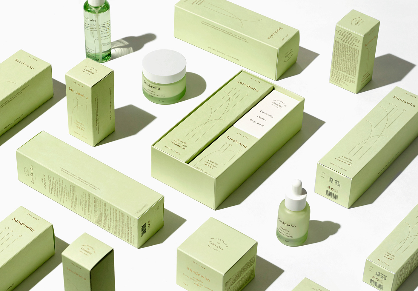
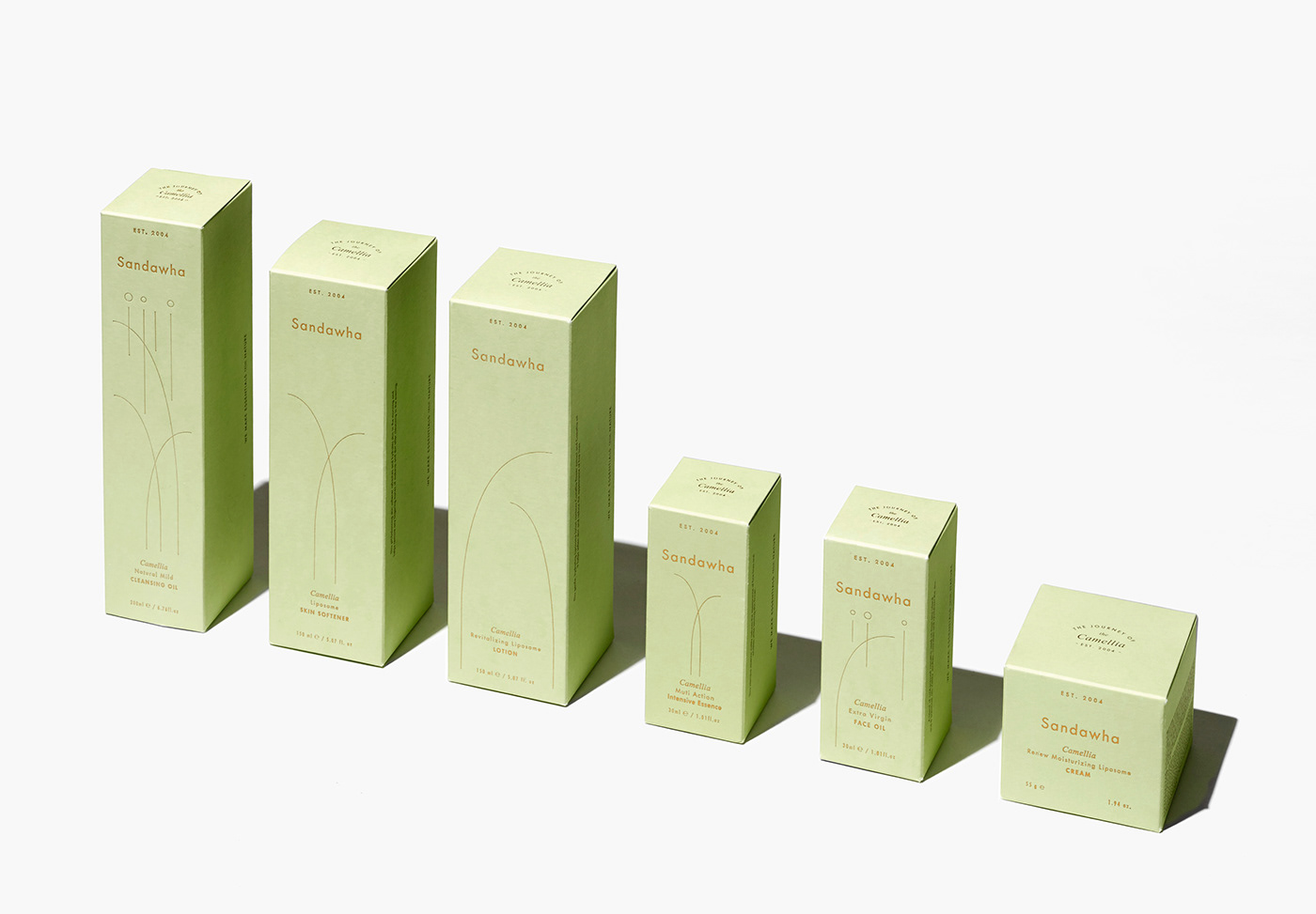
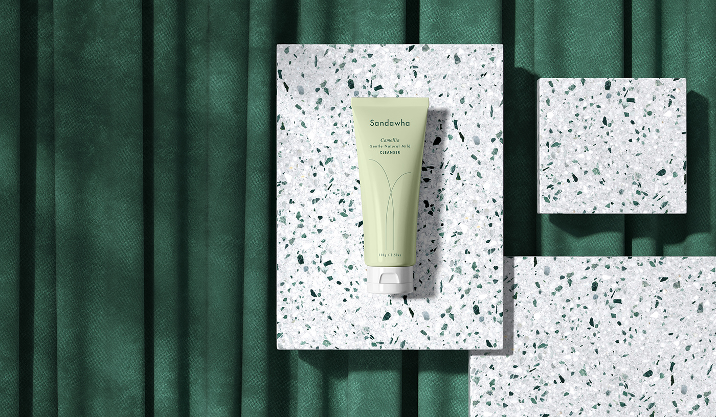
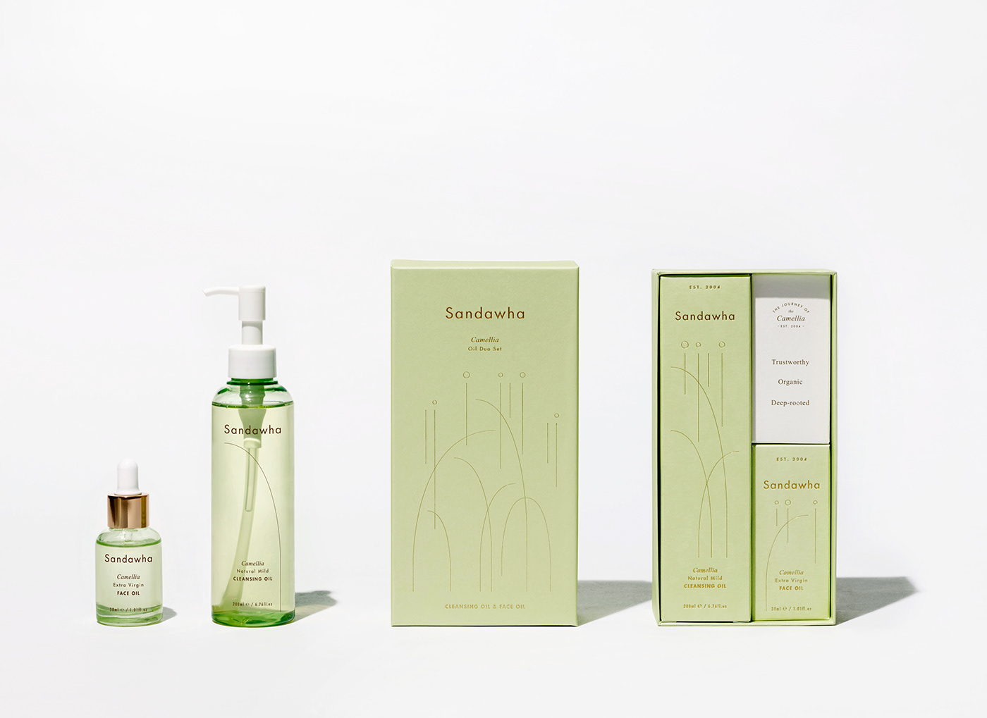
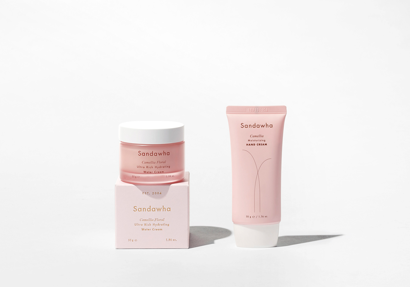
The graphic line and color, motived by camelia flower are properly positioned on the package.
For the better brand, we organized Sandawha’s philosophy and created a concept and story.
The graphic line and color, motived by camelia flower are properly positioned on the package.

Creative Director Kyoung soo Na
Contents Director Seung eon Lee Copywriter Hyun seung Yun
Art Director Sung yoon Kim
Designer Saerom Lee, Nahyun Jin, Suna Jung, Swan Lee, Hansol Ryu, Kihun Lee

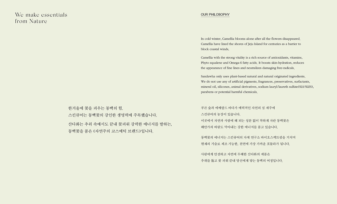


자연에서 피어나 피부에 닿는, 동백의 여정.
한겨울에 꽃을 피우는 동백의 강인한 생명력을 담은 산다화의 리브랜딩 & 패키지 디자인을 진행한 프로젝트.
우리는 산다화가 걸어온 지난 과정에 깊이 공감했습니다.
보다 나은 브랜드를 위해 철학을 정리하고 컨셉과 스토리를 함께 만들었습니다.
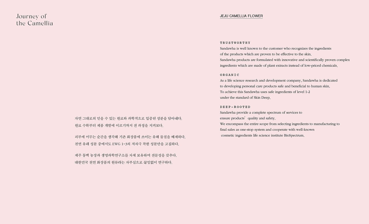
동백의 여정을 모티브로 ‘자연의 힘, 식물 에너지를 그대로’ 전달하는 메세지와,
산다화의 주원료인 제주 동백꽃을 활용하여 심플하게 디자인된 그래픽 모티브 & 로고는 자연주의를 지향하는 브랜드 이미지와 맞닿아 있습니다.
더 많은 이야기는,
https://m.post.naver.com/viewer/postView.nhn?volumeNo=30253201&memberNo=50675055


