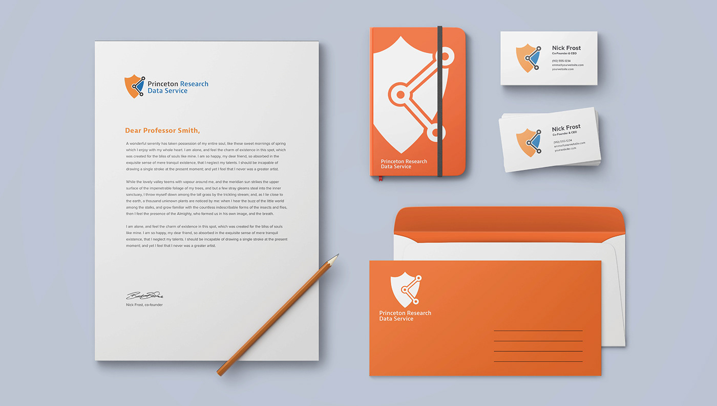
Princeton Research Data Service (PRDS)
This new research-driven department at Princeton University provides expert services and means needed to store, manage, retain and curate research data. PRDS makes research data accessible to the public and the expansive research community outside the university.
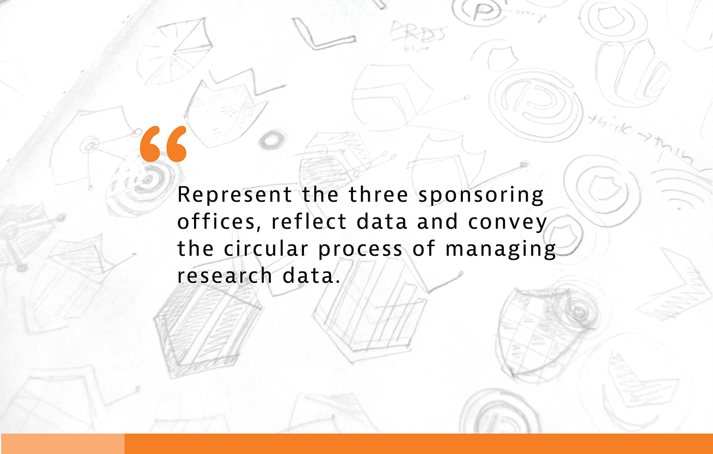
The department had three requirements for the logo to represent: the three sponsoring offices (the Princeton University Library, the Office of Dean for Research, and the Office of Information Technology), to reflect data and to convey the circular process of managing research data.
This project was a transformative opportunity to turn a abstract concept that can encompass almost any study into a tangible, simple and bold logo.
--
Logo Design: Lauren Meyer
Client: Princeton University
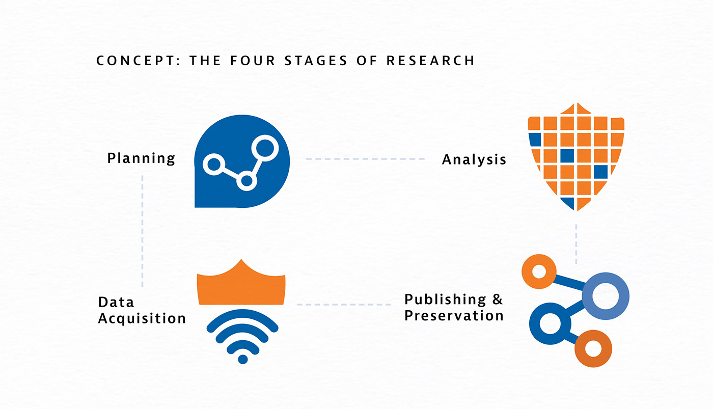
I visually broke down the elements of research planning listed on the PRDS website in order to create the four different logo concepts that were presented to the department:
Planning is represented through a thought/dialogue bubble with connected circles of varying sizes and hues. Planning includes managing funds and donors, working with large data sets and simplifying the complicated research process.
Data Acquisition is represented through the wifi signal showing the use of digital technology and showing the growth of research from start to finish. Data Acquisition includes keeping the data secure, organizing tests and documenting the process.
Analysis encompasses analyzing and editing the final data. This concept is represented through abstract binary code or a checker pattern in the shape of the iconic Princeton University shield
Publishing and preservation is represented through different color and size circles that connect to symbolize the many steps that have been taken to finally publish the data. This step helps students to find credible places to showcase their findings and how to publish and archive their research.


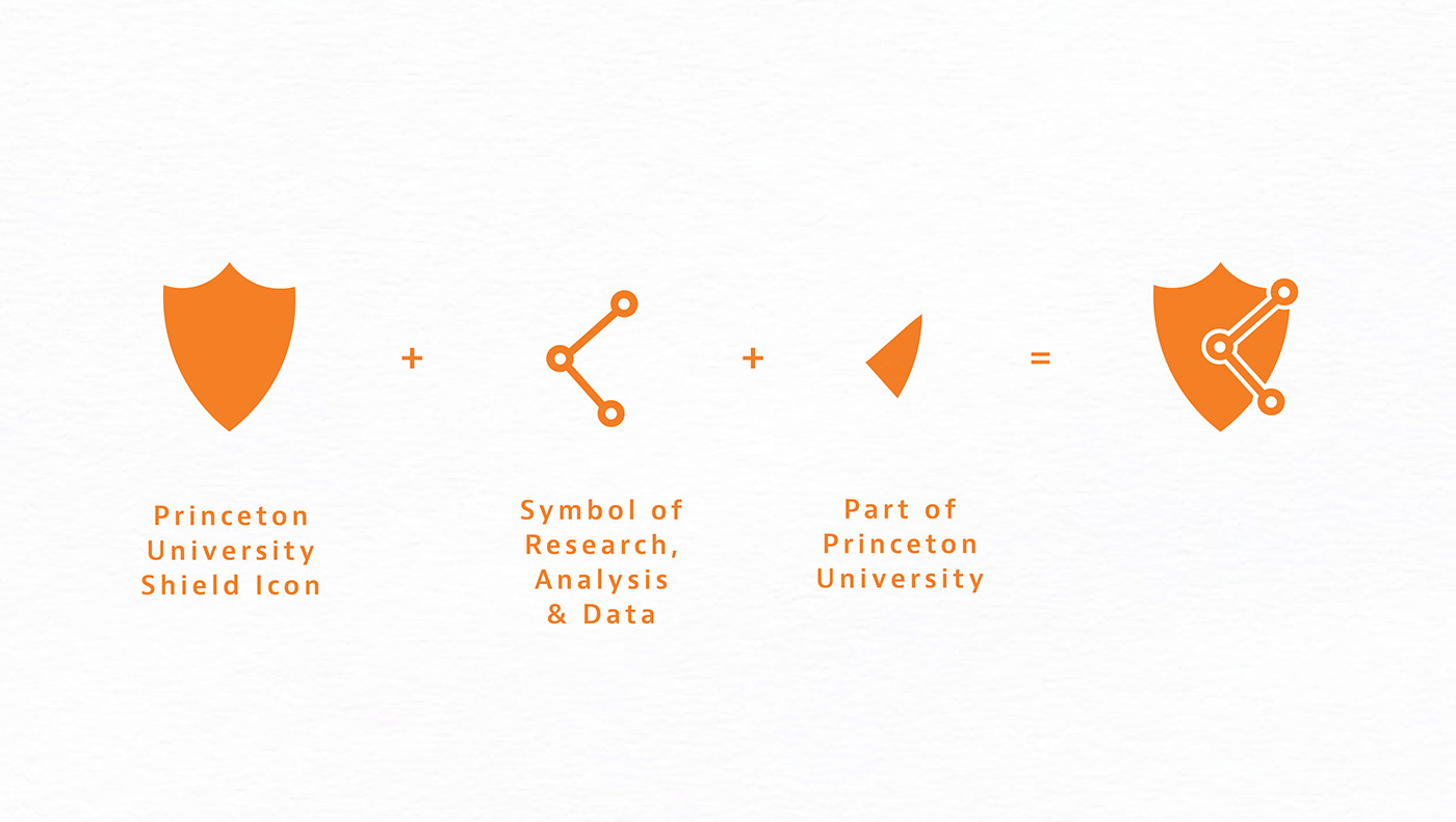
The logo that was chosen includes three main elements:
1. The Princeton shield that students and public instantly recognize, filled with the quintessential Princeton University orange seen across campus and used in wider Princeton University branding.
2. Three black circles connected from the center to the edges of the shield. The circles represent the circular process from research to analysis to data.
3. The blue sliver within the shield is sandwiched between the black circles. This acts as a symbolic pie chart showing the PRDS department within the larger Princeton University community. It can also be viewed as the final data results within the larger process of obtaining the data—showing that the results are just one small piece of the research puzzle.