Company Name :
LINEZ
Background Overview :
LINEZ is design & construction company (LLC) founded in 2016. LINEZ specialized in engineering, architecture, interior design and construction services. LINEZ have the optimal resources to satisfy the customer's needs with optimal quality, on time.
LINEZ aspire to deliver exceptional design ideas and solutions for clients through the creative blending of human need, environmental stewardship, value creation, science, and art.
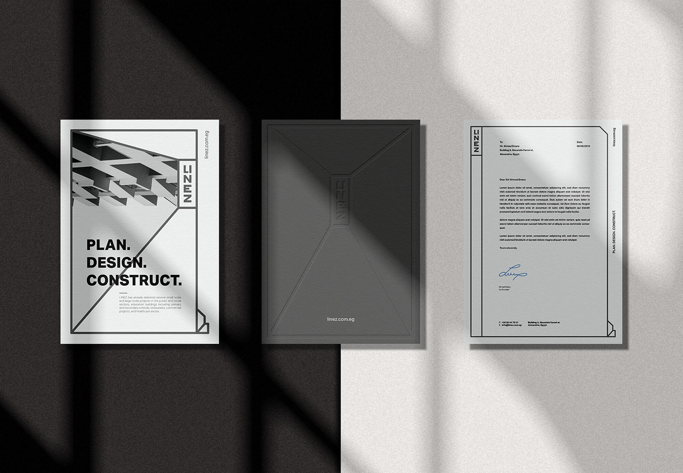
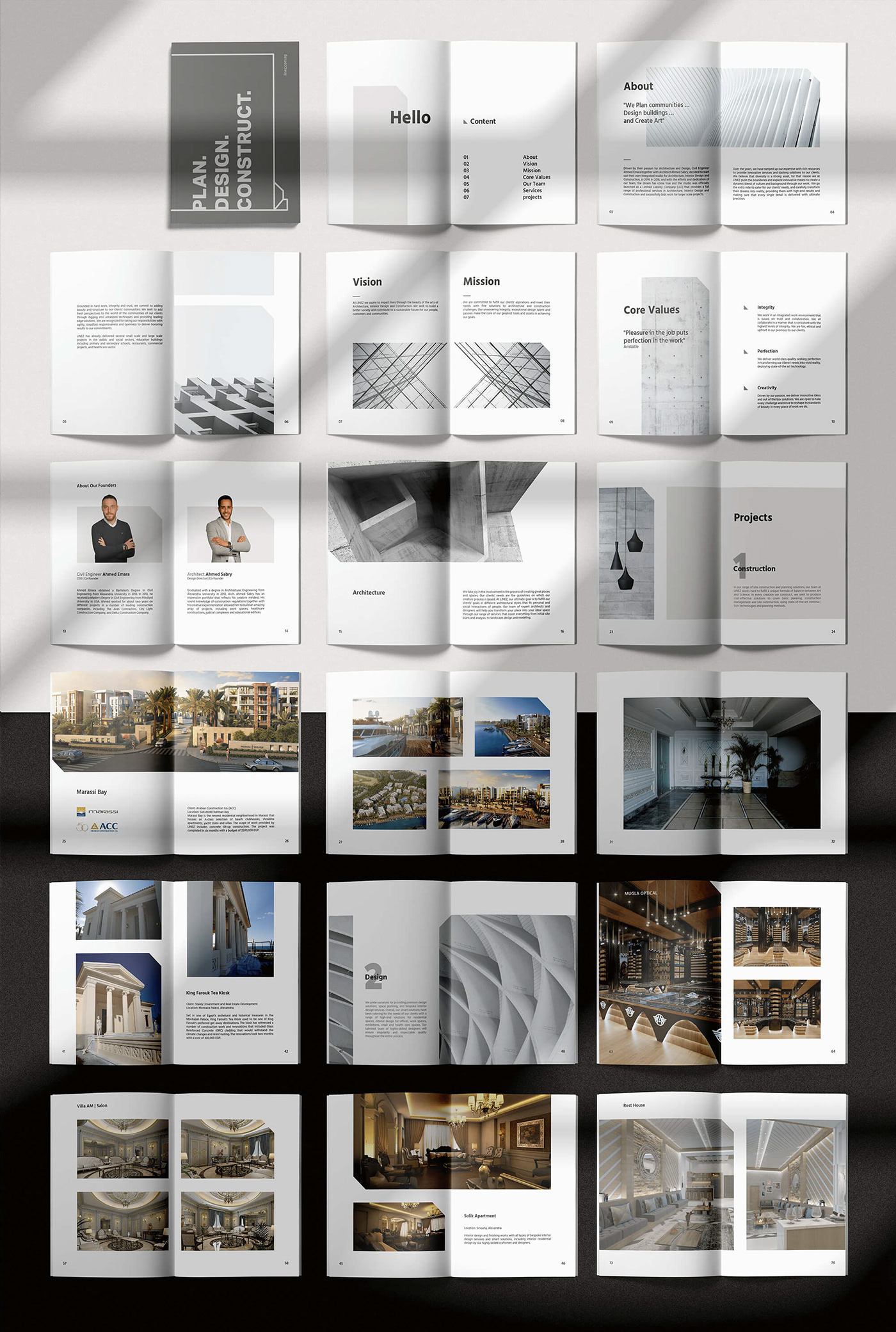
LINEZ has already delivered several small scales and large scale projects in the public and social sectors, education buildings including primary and secondary schools, restaurants, commercial projects, and healthcare sector.
LINEZ has already delivered several small scales and large scale projects in the public and social sectors, education buildings including primary and secondary schools, restaurants, commercial projects, and healthcare sector.
Concept :
LINEZ company set Bo Shanab in the challenge of developing a brand strategy that could better serve their clients. So Bo Shanab began with a series of workshops to audit external perceptions and find out how the target audience see design & construction companies. From these perceptions, we identified the key themes that differentiate LINEZ from other leading companies.
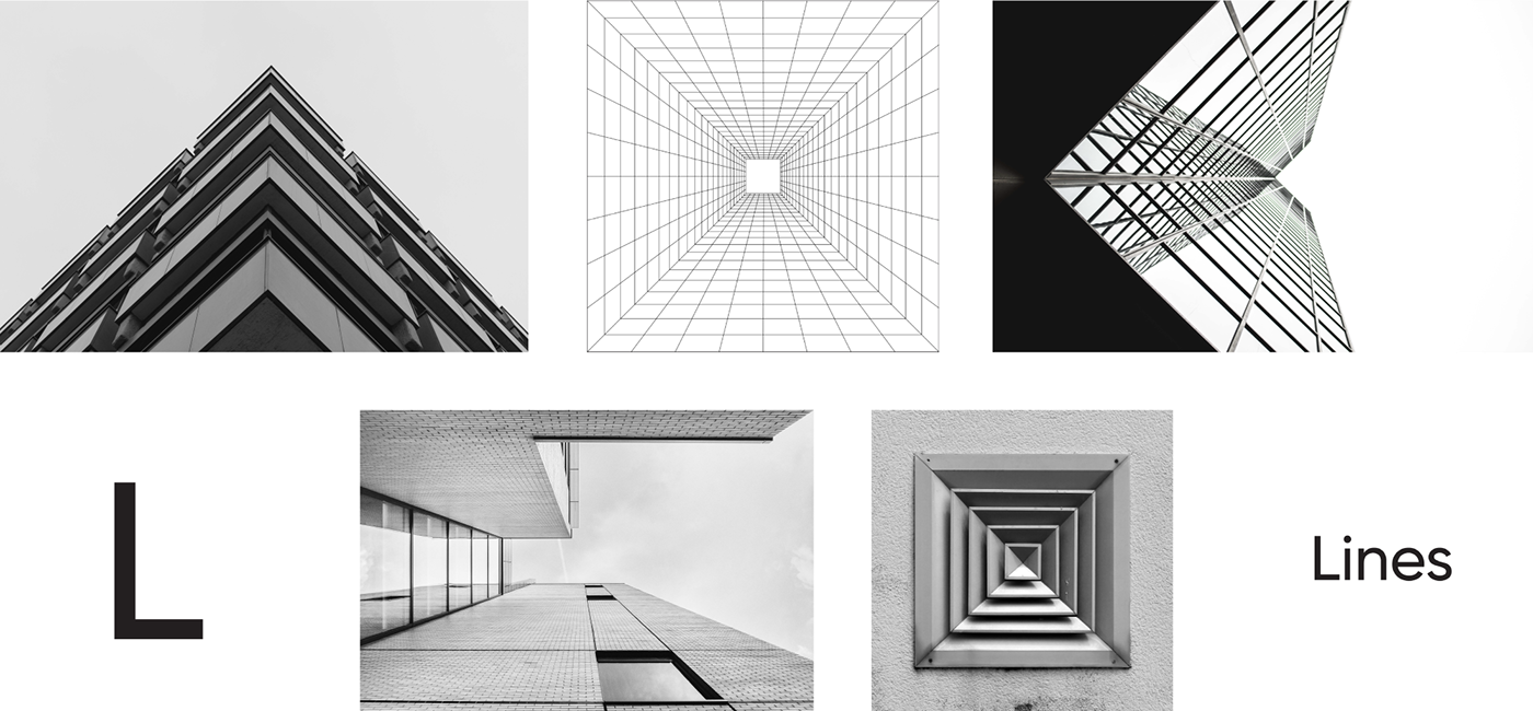
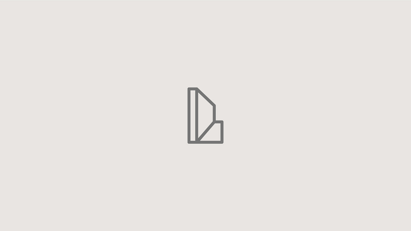
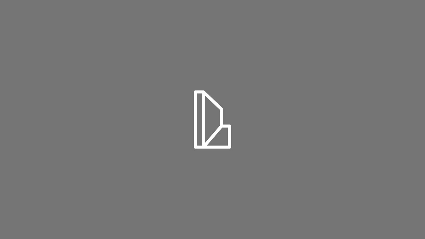
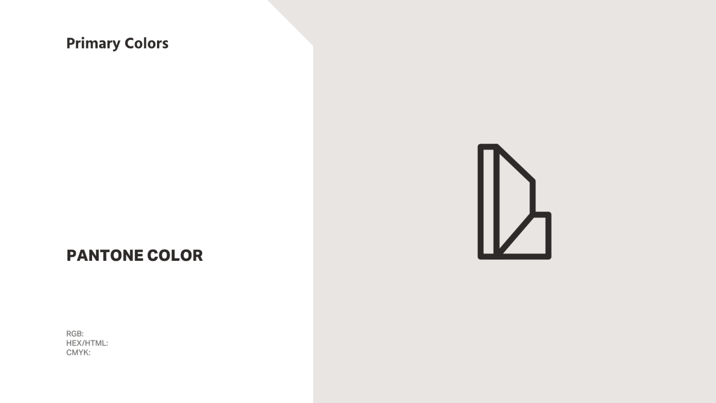
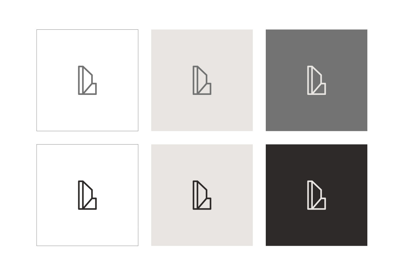
The logo is designed by combining the letter "L" with the perspective with the lines, to form the logo that expresses the name of the company and give a sense of geometry in the logo.
Most of what you need to see about the new identity are in the video above and it’s convincing. it leaves little doubt that everything is where and how it needs to be. The identity's already strong enough in static applications, based on a breadth of identity elements.

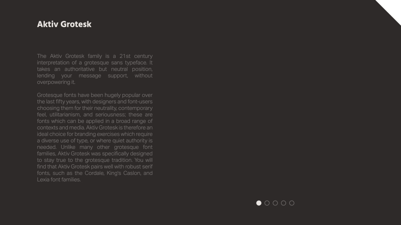
Bo Shanab has developed a separate font which is a central part of the identity. It is inspired by geometric straight lines. The font is designed for good readability and to provide a functional and timeless expression.
Golden Ratio

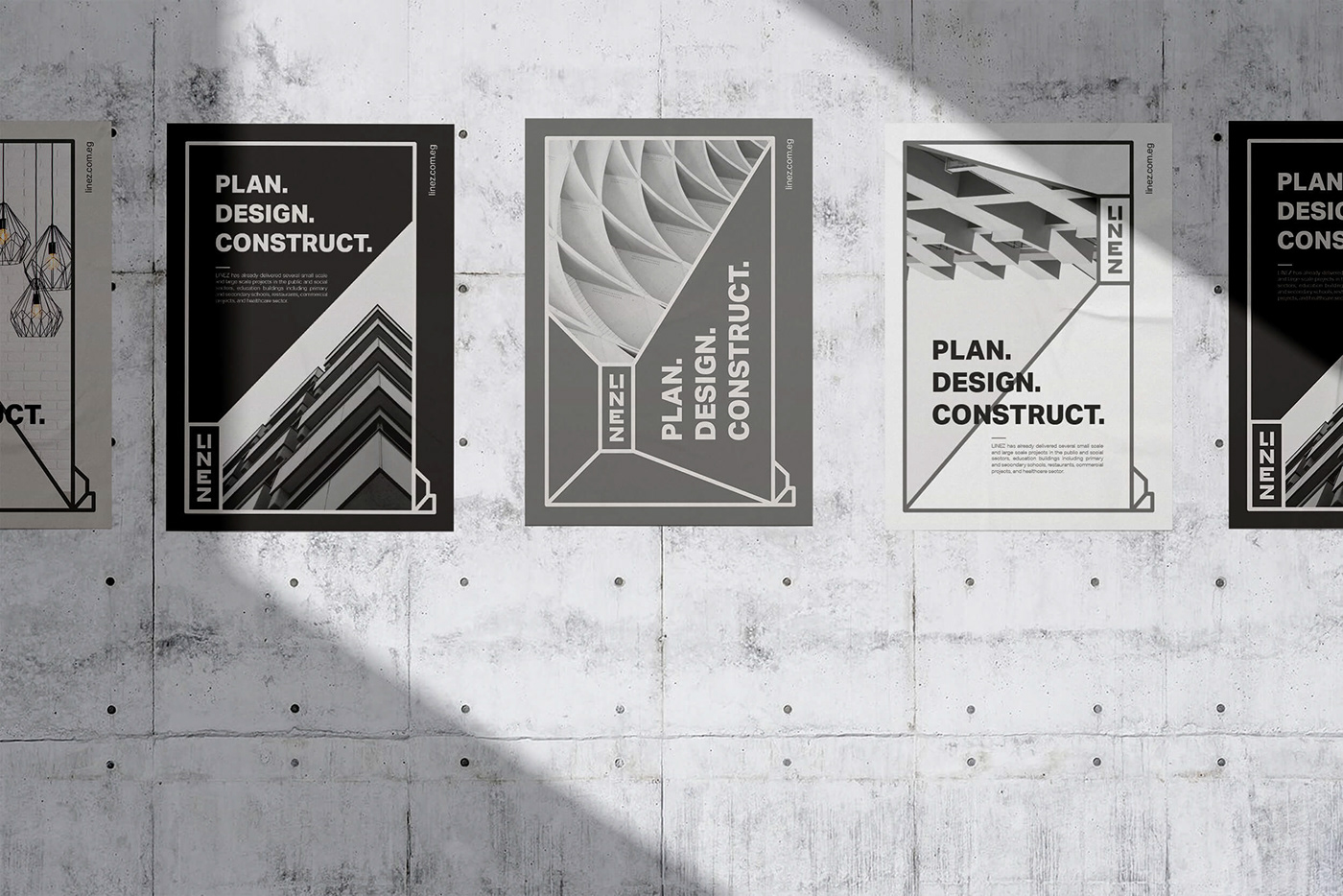
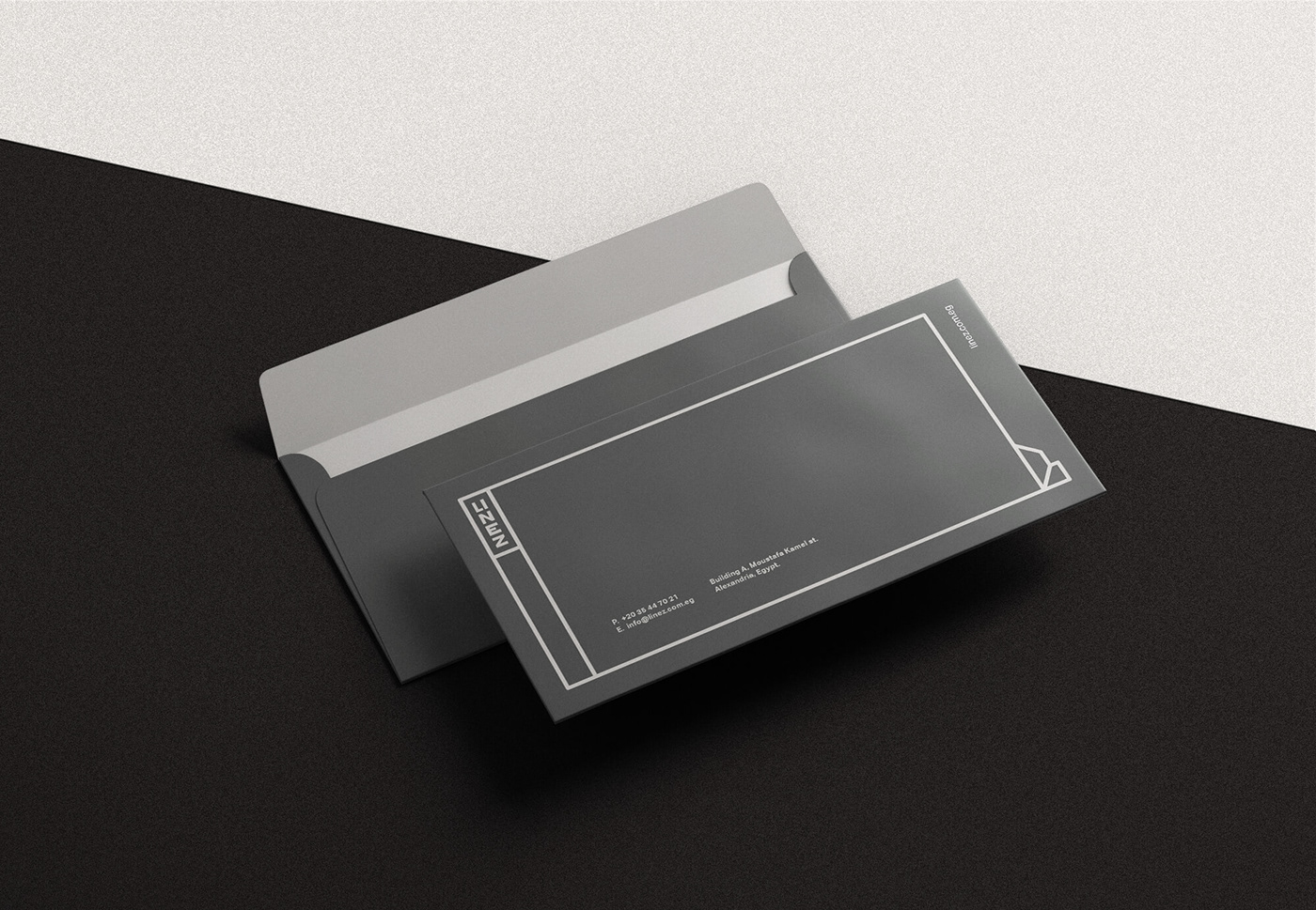
Colors
The colors of the identity are taken from construction works colors.
Typography
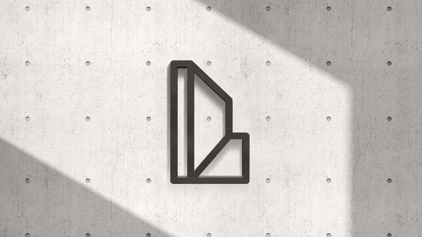


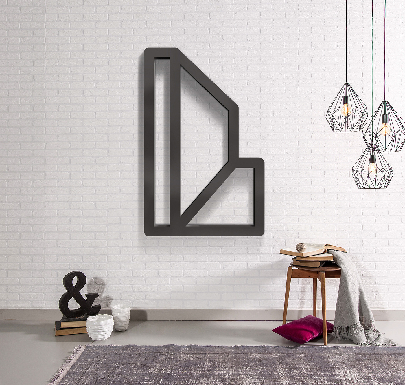
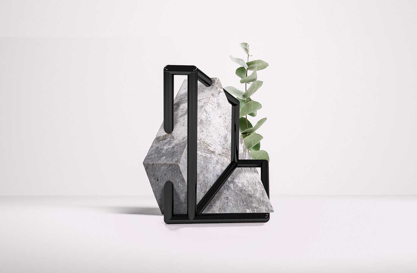
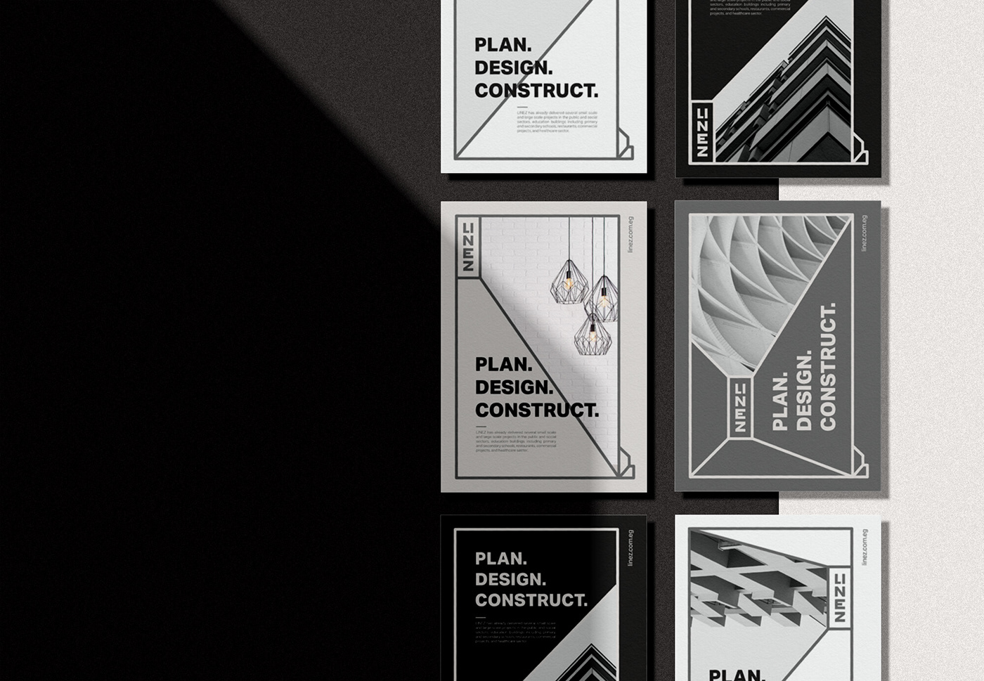
The main attraction of the identity is the flexibility of the logo that can convert its left part into a holding shape for text or image, creating an always-on relationship between the company and its message.
The logo has the flexibility to open up and accommodate all kinds of content, from messaging to groovy images and text.
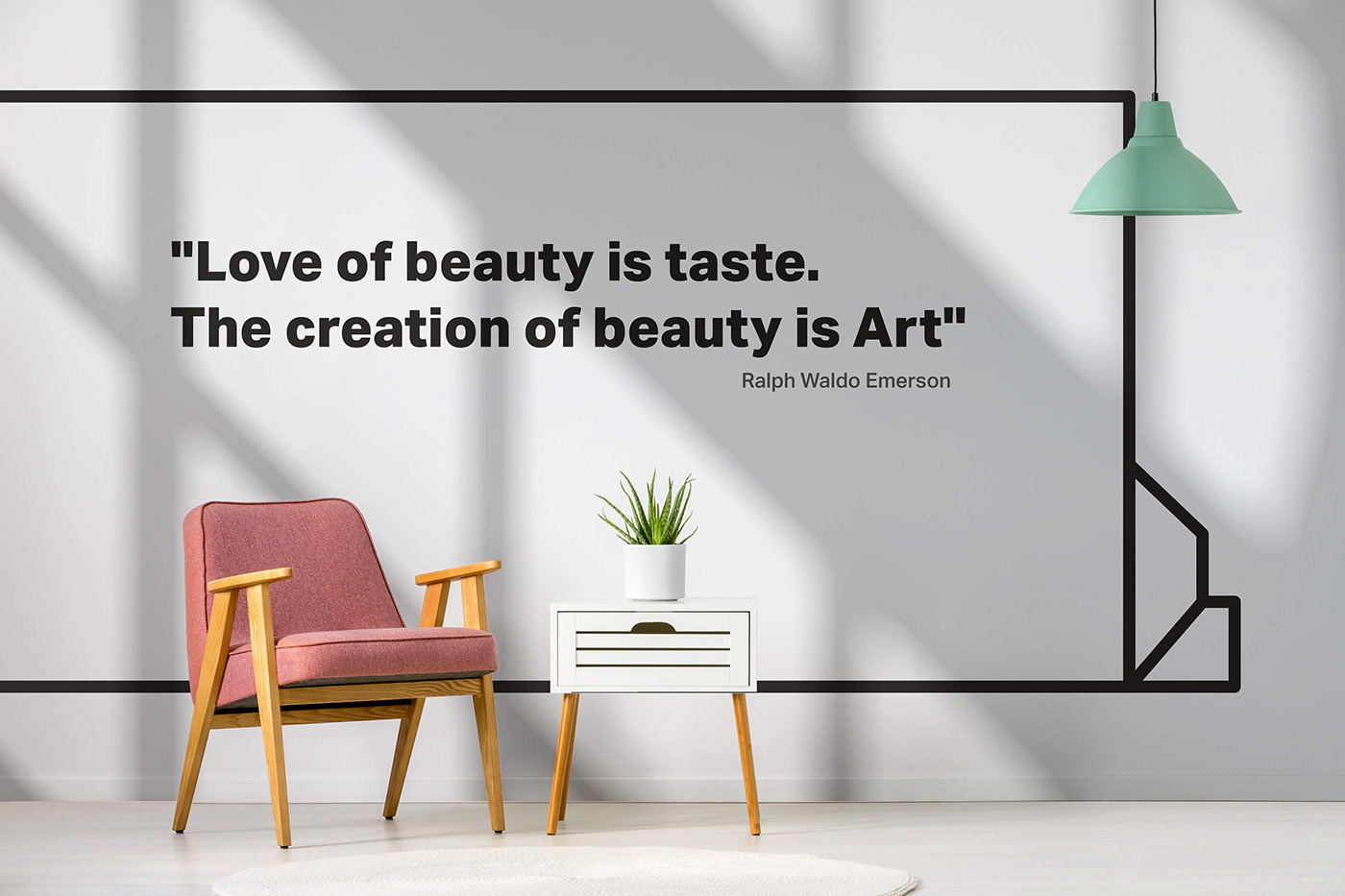
This allows a more effective and efficient mode of operation, service delivery, and communications.
To achieve the ambitions of LINEZ company, Bo Shanab has been working on creating a new brand. Focusing on brand strategy, visual identity and engagement.

The identity had to be clear, useful and relevant.
The layout system is great in its simplicity and ease of application while establishing a fairly recognizable style that should help company communications be more effective and more clearly coming from a single source.
The logo can be formed in different ways for different uses and this has plenty of potentials to bring in varied styles to the Logo.
LINEZ company had a clear need to appear clearer and more uniform. The solution is a new visual identity In a way that helps.
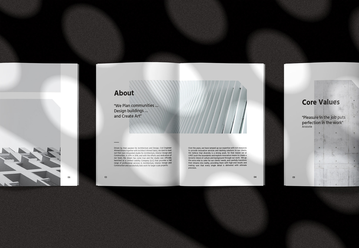
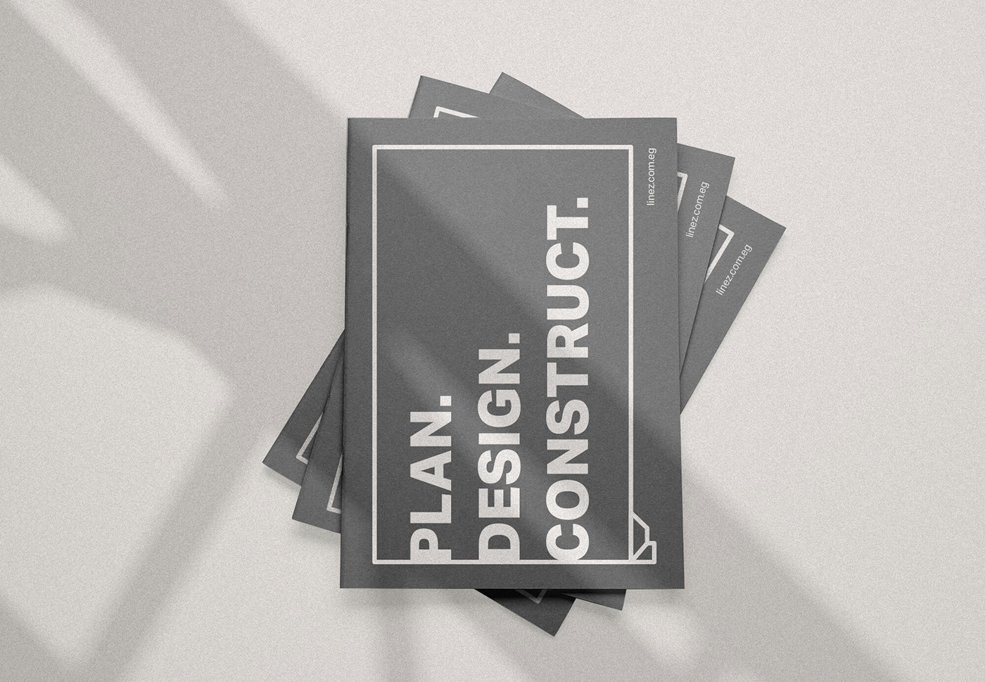
Brochure
Overall, this is a really great identity with a lot of moving parts that manage to look both fun and organized, giving LINEZ company a lively and effective system to support and present all the great work.
To ensure that the brand development would make a difference with the clients, we ran a series of workshops with other designers and some users, then analyzes. From identified weaknesses and strengths we agreed where changes could feasibly be made to bring the new brand idea to life through the company’s services.


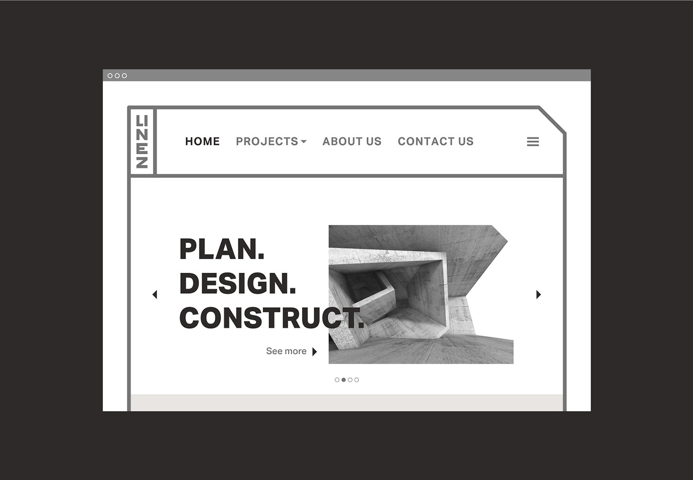
Website
LINEZ company now has a brand that can support the company’s ambition and continue to achieve the vision, mission, and value of the company. Clients will now be able to better recognize company services and have a consistent and unmistakable design identity for their company.