Hopewell Valley Green Team
The Hopewell Valley Green Team is a community-run group that promotes sustainable living practices in Central New Jersey.
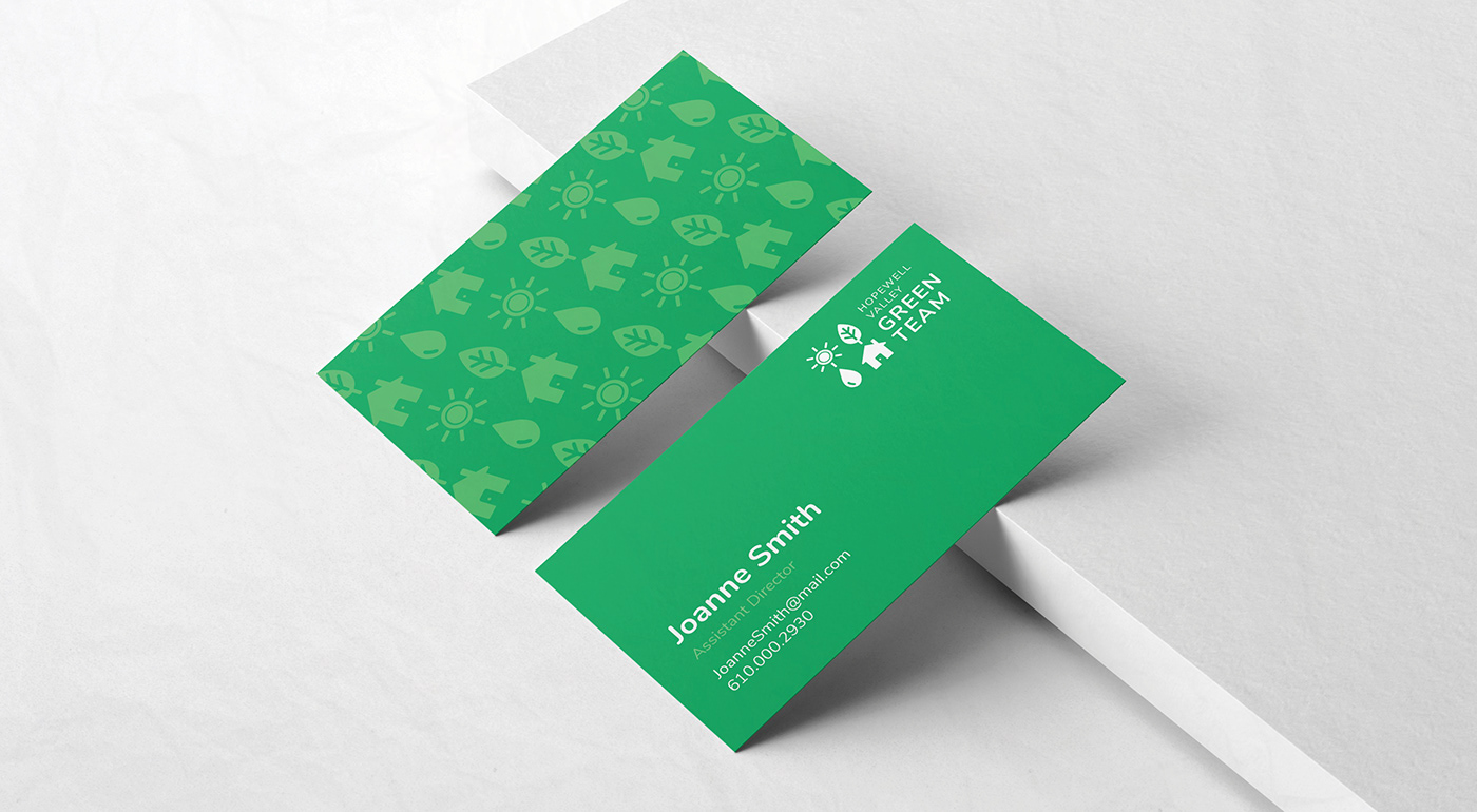
The goal of the logo was to encompass the many roles that the Green Team plays in the community, such as promoting how to live sustainably, conserving energy and the environment and promoting renewable resources.
While working on this project I learned how to cooperatively and effectively work with a large number of community members who shared ideas and input during the design process. The final result is a balanced logo that is instantly identifiable to the community that it serves.
--
Logo Design: Lauren Meyer
Client: Hopewell Valley Green Team

I wanted to create a logo that was easily adaptable to the many different branches of the Green Team. The logo as a whole is made of four simple icons in a grid with juvenile, saturated colors distinguishing each icon. The icons can also be separated and used to represent the different committees within the Green Team.

The sun icon represents renewable resources, such as the Green Team's effort to increase solar panel use throughout the area.
The leaf icon represents sustainability and can easily summarize the purpose of the Green Team to anyone who views the logo. It also represents their biggest project- recycling materials including toothpaste containers, athletic balls, batteries and more.
The water droplet represents conservation of resources. Such as conserving and reusing rain water for local home gardeners to conserving energy and gas.
The house icon represents community, the members of the Green Team and the towns that they serve.


Accessibility was really important in the design process.
The logo is composed of simple and recognizable shapes so that even young children could easily point out the name of each shape.
The type is large and the font easy to read for the senior members of the community who are active participants in the Green Team events.

The Green Team sports bright kelly green shirts for visibility at outdoor events (including farmers markets, recycling days, environmental festivals and more). Volunteers can stand out easily in a crowded area with the bright and recognizable green color that instantly symbolizes sustainability and the environment.
For this purpose, take away materials such as business and reusable bags were also designed using hues of the bright green.


This project pushed me to make a logo that is accessible for everyone, easily conveys the many ambitious goals of the Green Team and can be repurposed in many different ways, much like the Green Team itself.