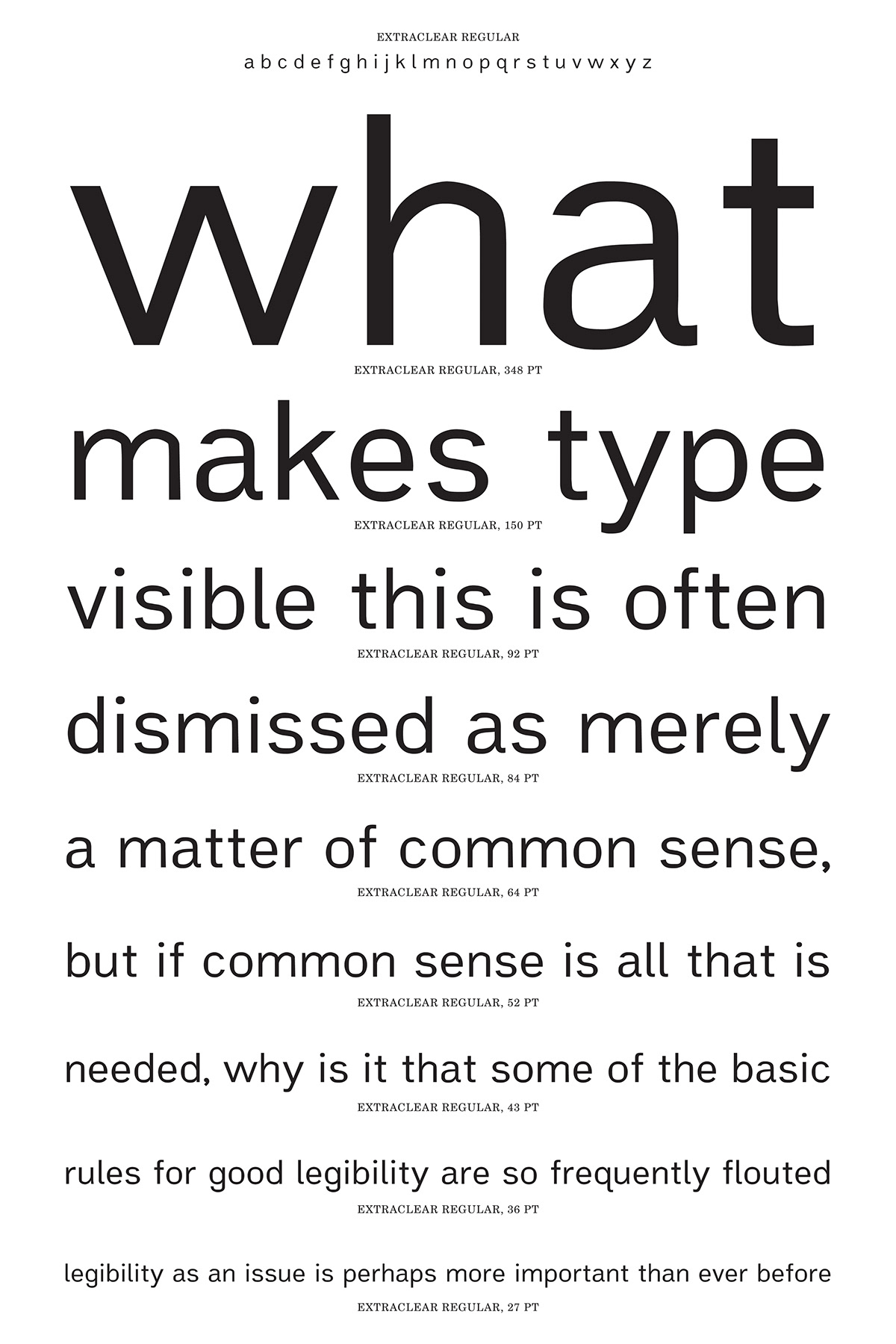
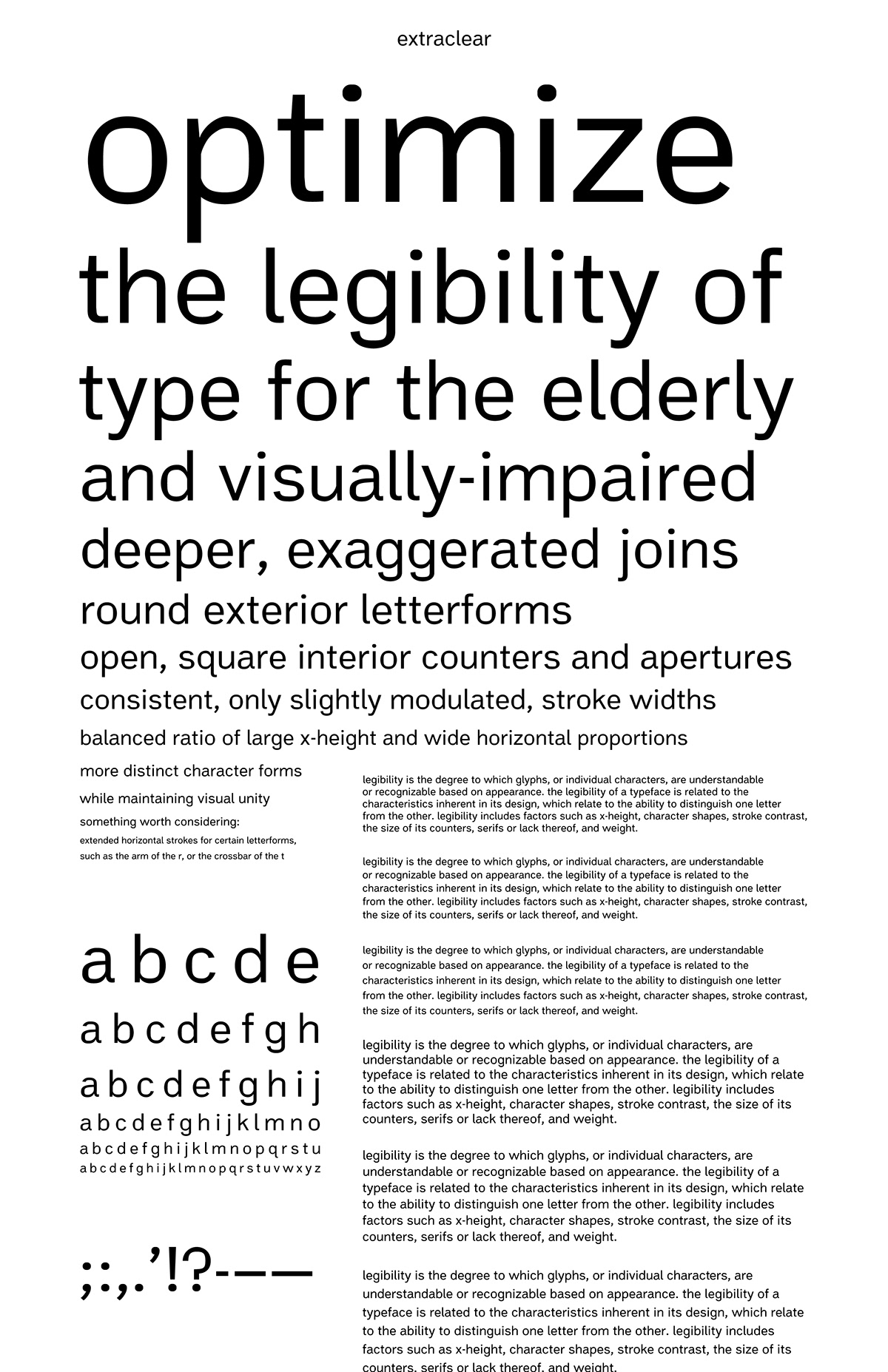
Extraclear: A Typeface for Optimal Legibility
a typeface project in progress
Extraclear was a final project in a lettering and typography class I took last semester (Lettering & Type with Bruce Willen and Nolen Strals, MICA). The main purpose of this typeface is legibility. Gathering what I knew, new research I did on legibility and common sense, I tried my hand in FontLab Studio (so fun!) to design these letterforms. A few of the letters, like the y and others, are still pretty wonky, and the punctuation was thrown together without much direction. I'm trying to figure out where I should be heading from here to get this closer to completion.
Thanks in advance for any and all help!

additional project info
creation date May 2013 (still in progress)

