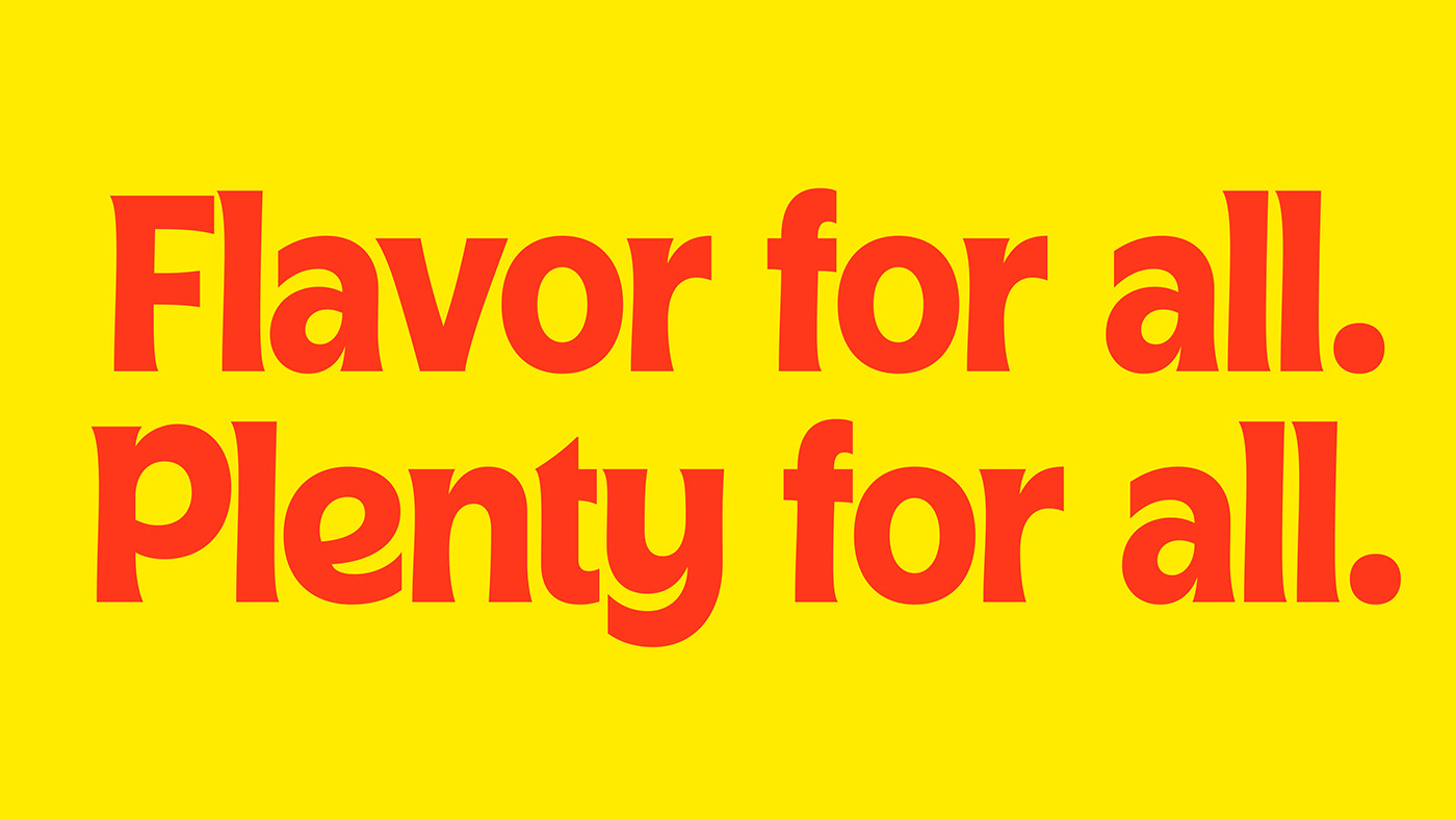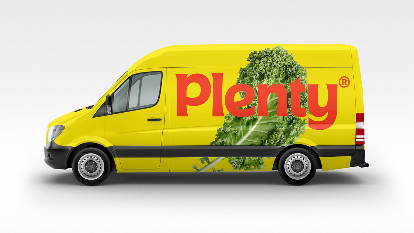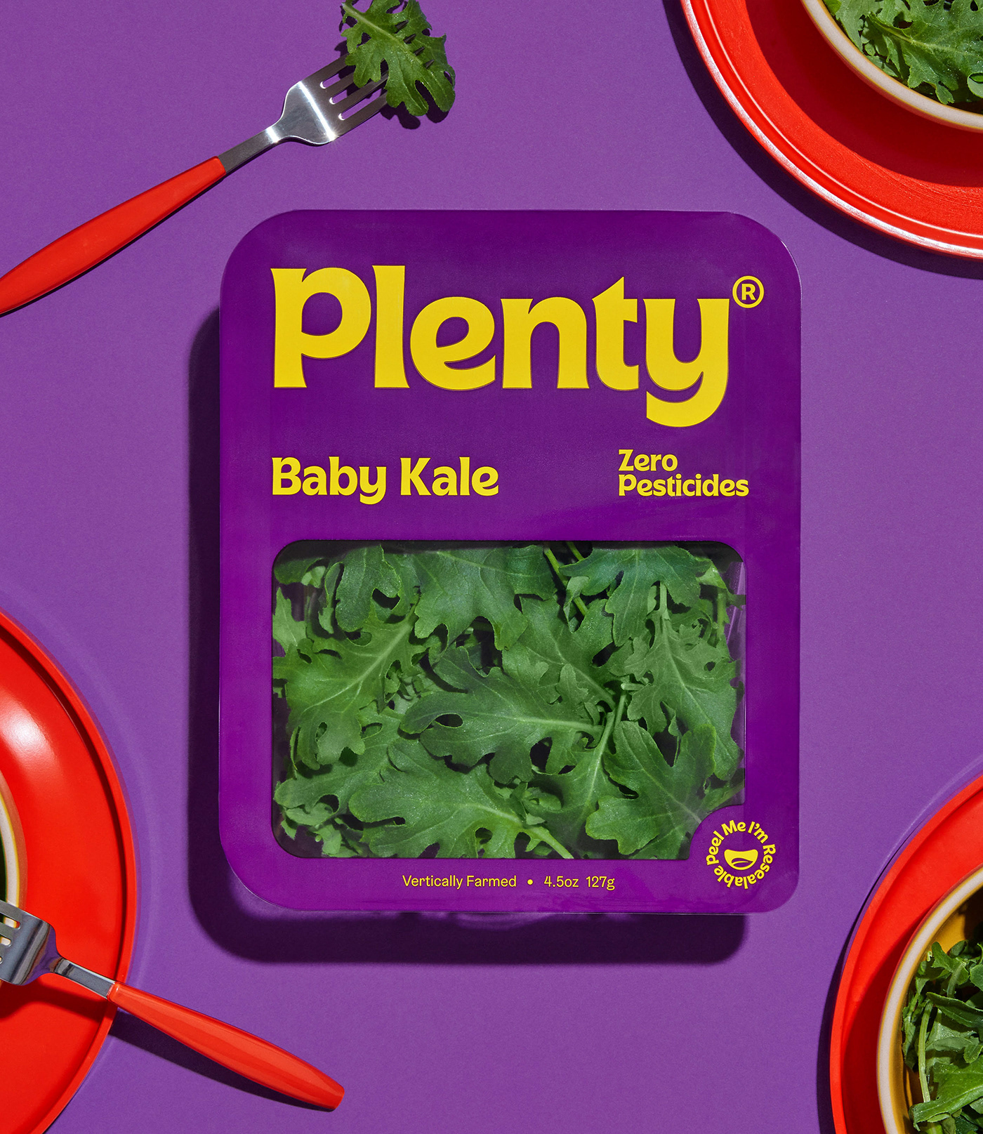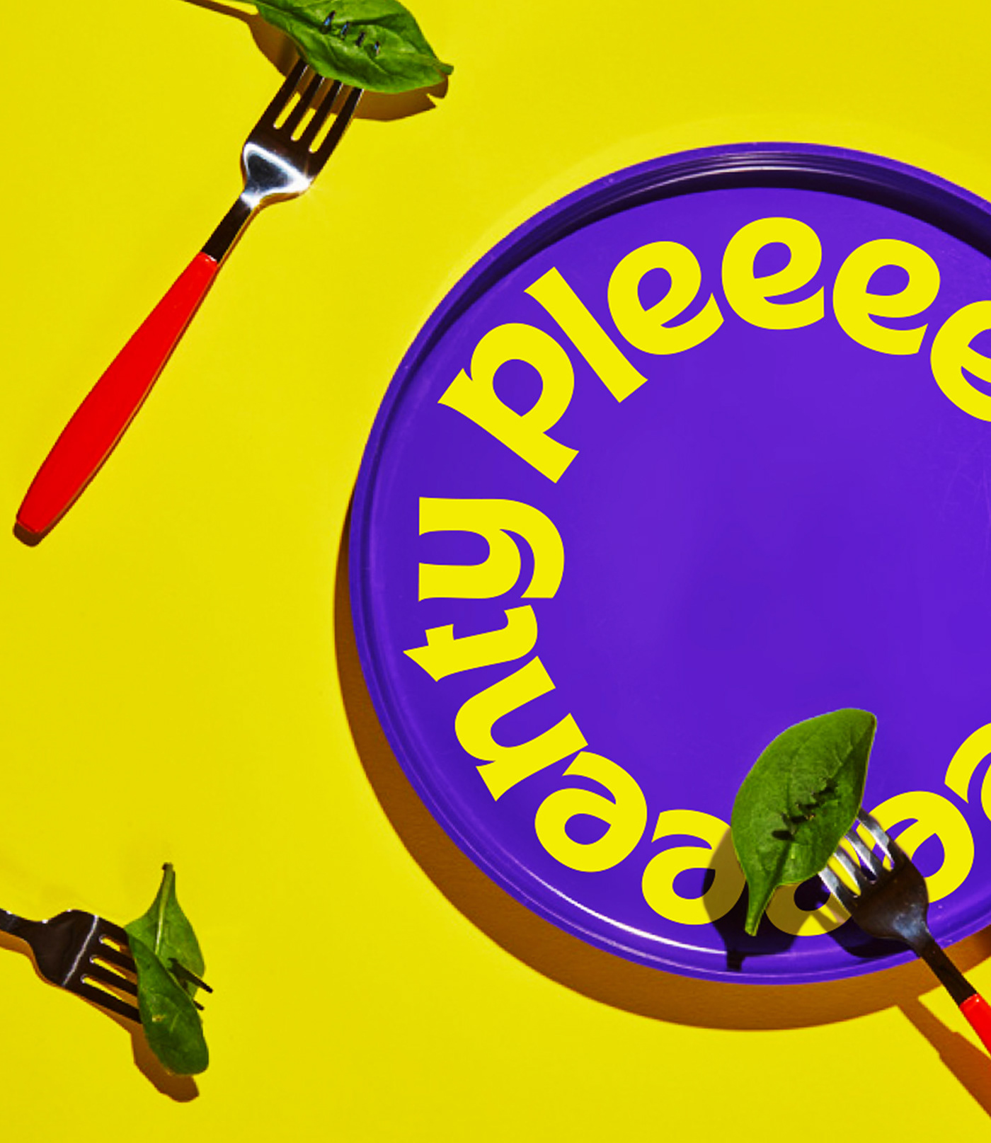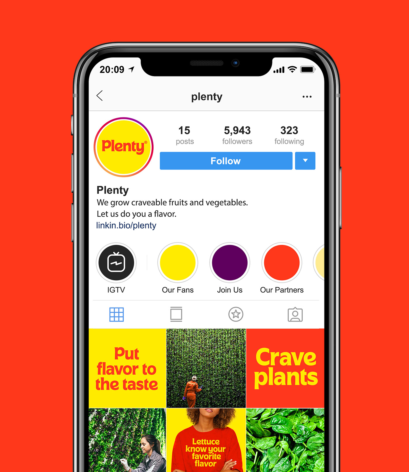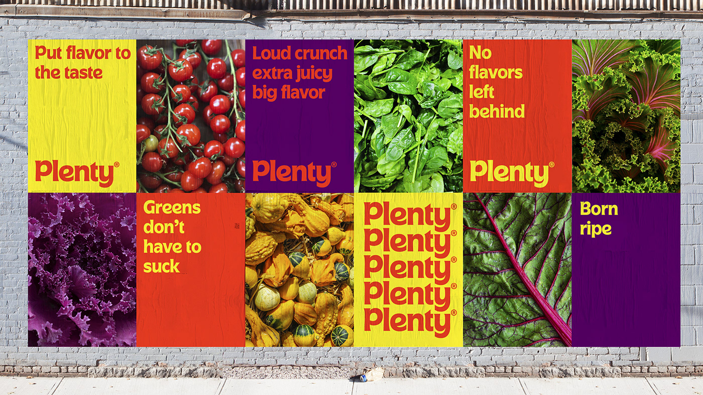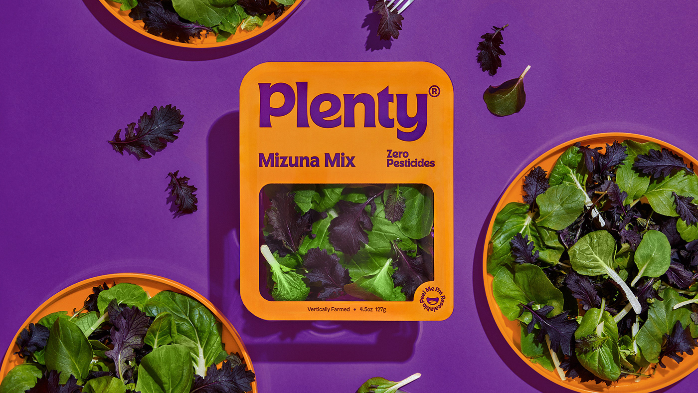
Plenty is an indoor vertical farming company that uses less space and fewer resources to grow flavorful produce. Imagine fruits and veggies replacing chips and soda. They came to us for a rebrand with two goals. The first was to convey the uniquely craveable flavor of Plenty produce. The second was to create a warmer and more approachable brand that felt accessible to all. We used a playful color palette with a welcoming custom font that is intended to look and feel delicious. Rather than sticking to typical healthy green visual cues, we took inspiration from desirable food categories which reflects in both the identity and packaging work.
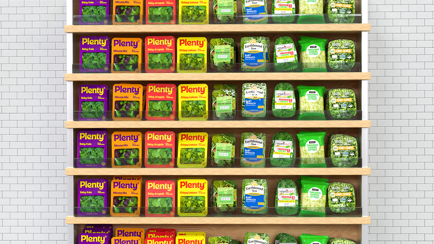
We wanted the packaging to look more like overtly flavorful food than leafy greens.
&Walsh, 2020.
Visit our Case Study for more information.


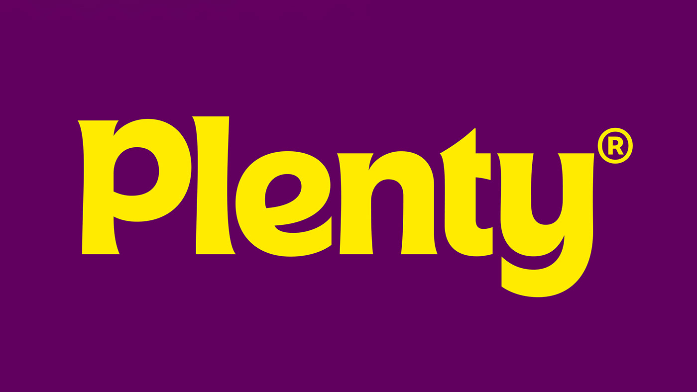
Our team created the Plenty custom typography. It was crafted for display sizes 32pt and above. The construction of Plenty Custom was inspired by plants. It is a humanist sans serif with leaf-like corners and terminals. Wherever possible, the font avoids straight lines and is made up of curved and tapered strokes. The stroke endings are sharp and the curves are as round as a ripe tomato. The Plenty brand is driven by bold typography which makes Plenty Custom the most significant part of the visual language.