


Mirakals was a 2nd-year university project where we had to create a new brand of biscuit for Ernest Adams that fit into the packaged biscuit category. I was placed in a team of 3 (Phoebe Lockett, Livia Huang) and together we had to create a branding concept package in 5 weeks.
Livia and I were in charge of the visual designs. We would design separate components (packaging, mascots, logo, badges, etc) and hand the design to each other to iterate and repeat this until we were happy and so were our tutors. Phoebe was our main copywriter and mediator for our designs using the brand identity blueprint.
Livia and I were in charge of the visual designs. We would design separate components (packaging, mascots, logo, badges, etc) and hand the design to each other to iterate and repeat this until we were happy and so were our tutors. Phoebe was our main copywriter and mediator for our designs using the brand identity blueprint.


Our team scheduled two meetings a week and went through a stage each week in development. The 1st week was market research and understanding our competitions branding strategies. We utilise this information to find a viable gap in the market. We decided to focus on making packaged biscuits for families that were healthy for growing kids that didn't source its dairy and eggs from unethical practices like other biscuit companies.
The 2nd stage was developing the brand with a brand identity blueprint, our values, and key messages. Our name Mirakals comes from combining the words Miraka and Miracles. Miraka means milk in Maori, which represents our connection with New Zealand and how it’s 100% locally owned, operated, and ethically sourced, and Miracle representing how a treat can be good for you at the same time.
The 2nd stage was developing the brand with a brand identity blueprint, our values, and key messages. Our name Mirakals comes from combining the words Miraka and Miracles. Miraka means milk in Maori, which represents our connection with New Zealand and how it’s 100% locally owned, operated, and ethically sourced, and Miracle representing how a treat can be good for you at the same time.

The 3rd stage was concept development, especially brand name, themes, packages, and colour palettes. We wanted the packaging to be white and bright to present the purity and angelic nature of our product. We wanted friendly cow mascots with personalities to connect with children in the family while subtly provoking emotional empathy with animals making them think about animal well-being in biscuit products. We also brainstormed the main flavours we would launch with.

The 4th stage was polishing the logo and finalising packaging concepts. We found our visual hierarchy was messy so we spent a lot of time culling unnecessary information and balancing the hierarchy.
We had fun facts added to the side to create publicity with the children talking to their peers about what they learnt and create engagement with the packaging. Then made the varied mascots and packaging around the theme of each flavour.
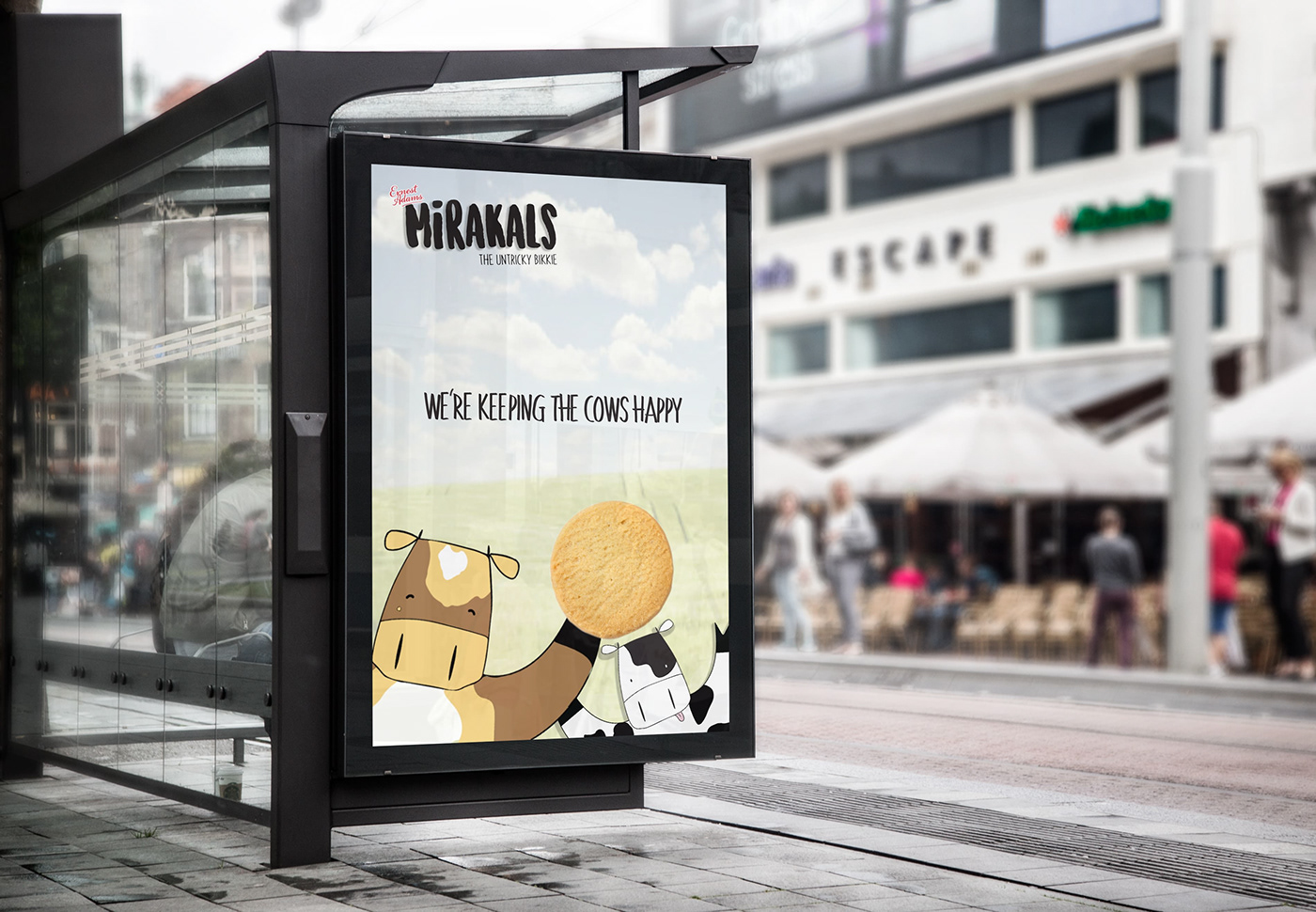
The final stage was developing promotional material to launch the brand and pitching the brand package in a short seven-minute presentation. We wanted the promotional material to be inviting and create a relationship between the customer and the mascot.
This relationship is meant to have kind, inviting, and happy connotations which make the customers experience the feeling that they are making a positive difference when they buy Mirakals.
This relationship is meant to have kind, inviting, and happy connotations which make the customers experience the feeling that they are making a positive difference when they buy Mirakals.


Our final result was an A with a lot of positive feedback from our tutors and peers. This was a great experience that allowed us to learn a lot of ways to increase the productivity of branding and product design. There is a lot of room for improvement and some key messages we could have emphasised more like “loaded with calcium” or similar messages to emphasise it being tasty but also a lesser evil when it comes to biscuit bags.
Thank you for taking the time to view this project.


