Amo Petric 2021春季视觉
这是我第三次给阿默做品牌季度视觉策划。阿默是一个致力于给宠物提供有机护理产品的公司,产品以科技、严谨、天然且具安全功效著称。在前几次的视觉策划中,我尝试过实验室、植物光影等符合品牌调性的主题,本次策划希望在保持其一如既往严谨、有机的调性基础上增加高级、富有想象、意味深长的视觉语言。
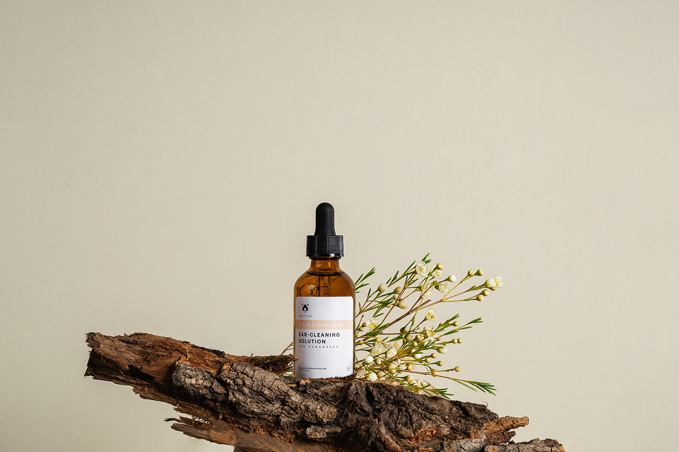
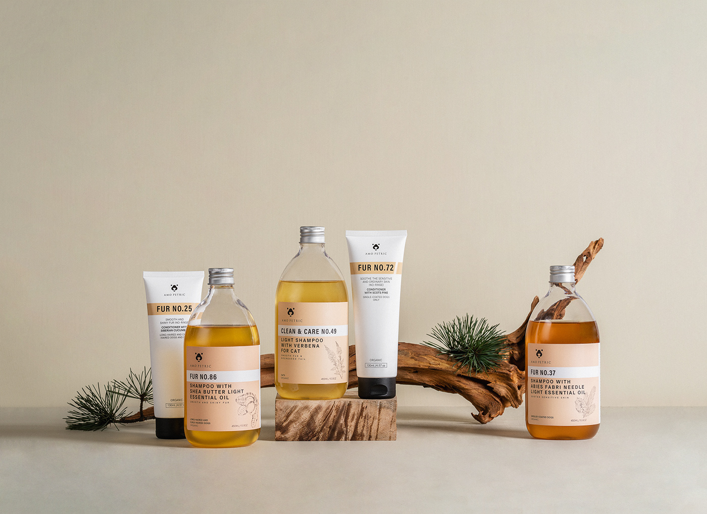
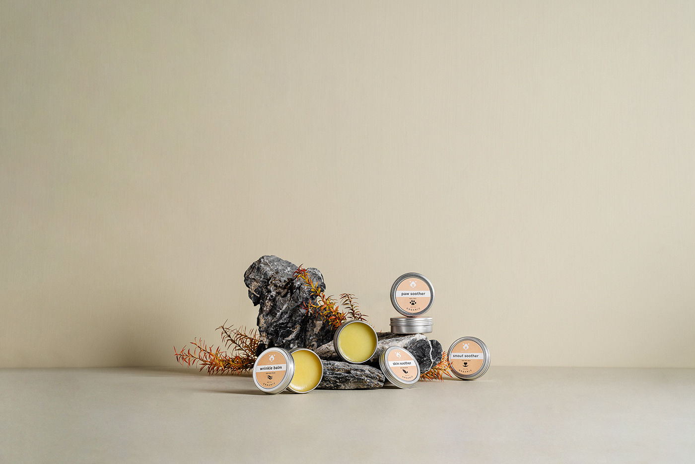
本次表现天然的关键词是:野生。大自然赋予人类美好和深沉的品质,而如果视觉上将品牌和大自然关联也让消费者感受到产品的天然和由此产生的信赖感。
拍摄时我选用松竹、带有斑驳的枯木、附着青苔和灰尘的树皮、山石,以及具有生命力的植物作为展现野生的视觉道具。整体置景中,以日本花艺意犹未尽的简约构图为灵感,旨在启发观众和为图片注入更多情感。
创意 置景 摄影 后期 | 梦静
Amo Petric spring vision 2021
This is the third time I have done a brand season visual planning for Amo Petric. Amo Petric is a company dedicated to providing organic care products for pets. The products are known for their technological, rigorous, natural and safe effects. In the previous visual planning, I have tried laboratory, plant light and shadow and other themes that conform to the brand tone. This plan hopes to add high-level, imaginative and meaningful on the basis of maintaining its rigorous and organic tone as always. Visual language.
The natural key word this time is: wild. Nature endows human beings with beautiful and deep qualities, and if the brand is visually associated with nature, consumers will also feel the naturalness of the product and the resulting sense of trust.
When shooting, I chose pine and bamboo, mottled dead wood, bark with moss and dust, mountains and rocks, and vital plants as visual props to show the wild. In the overall setting, inspired by the simple composition of Japanese floral art, it aims to inspire the audience and inject more emotion into the picture.
Creator Setting Photographer Retoucher | MengJing