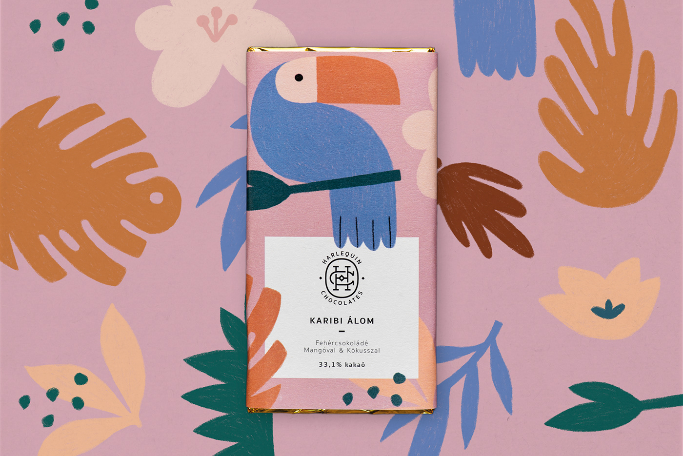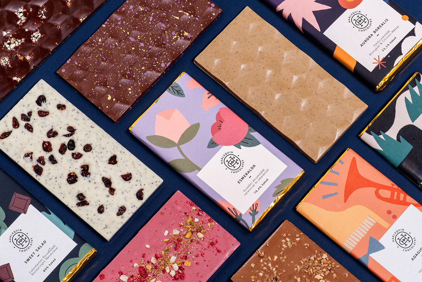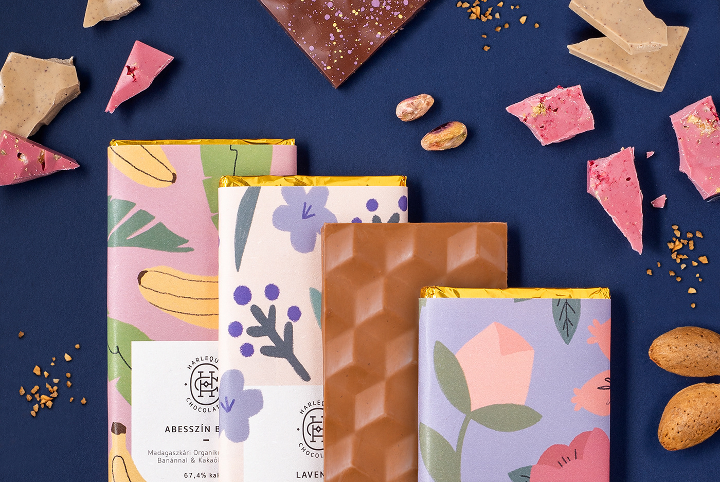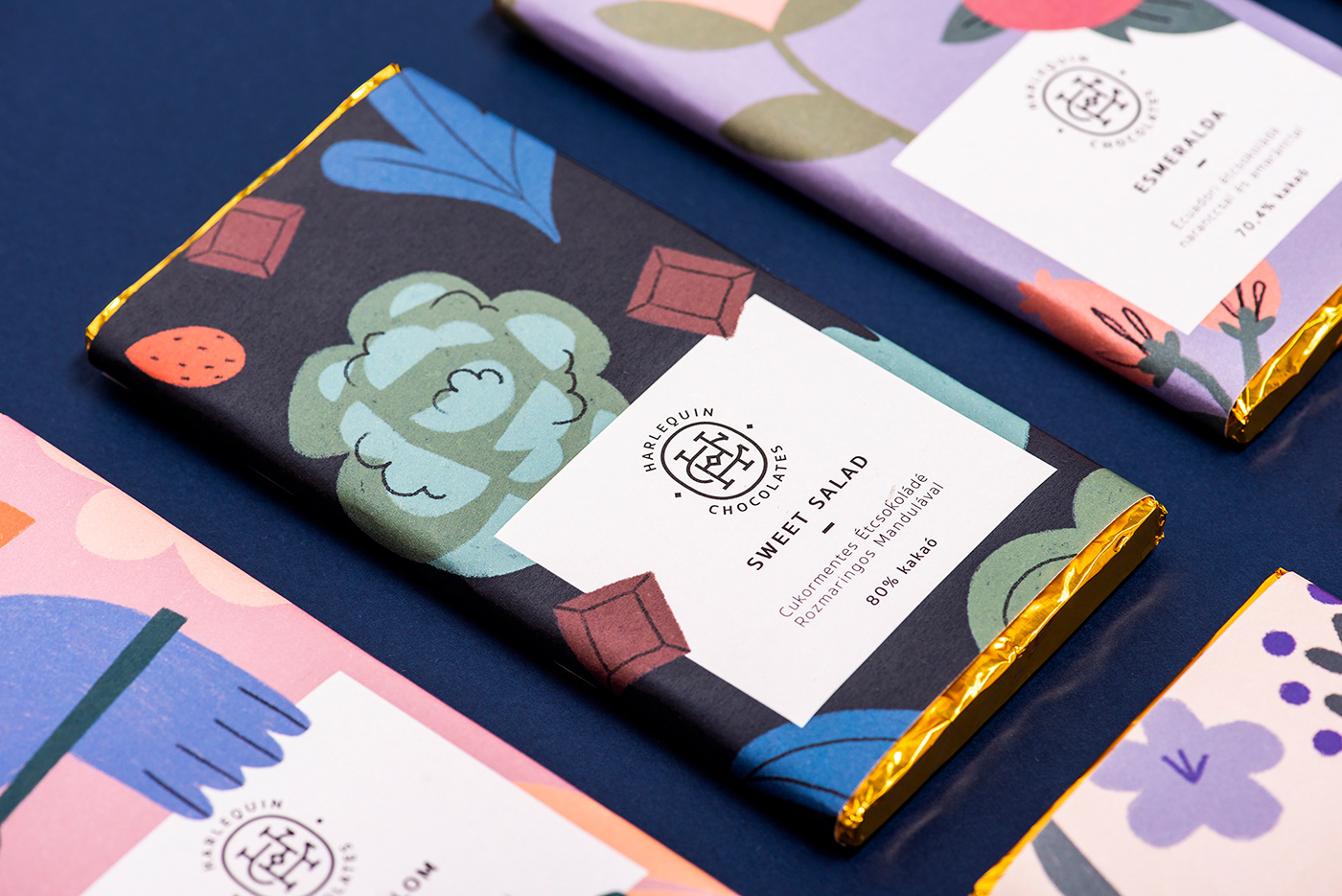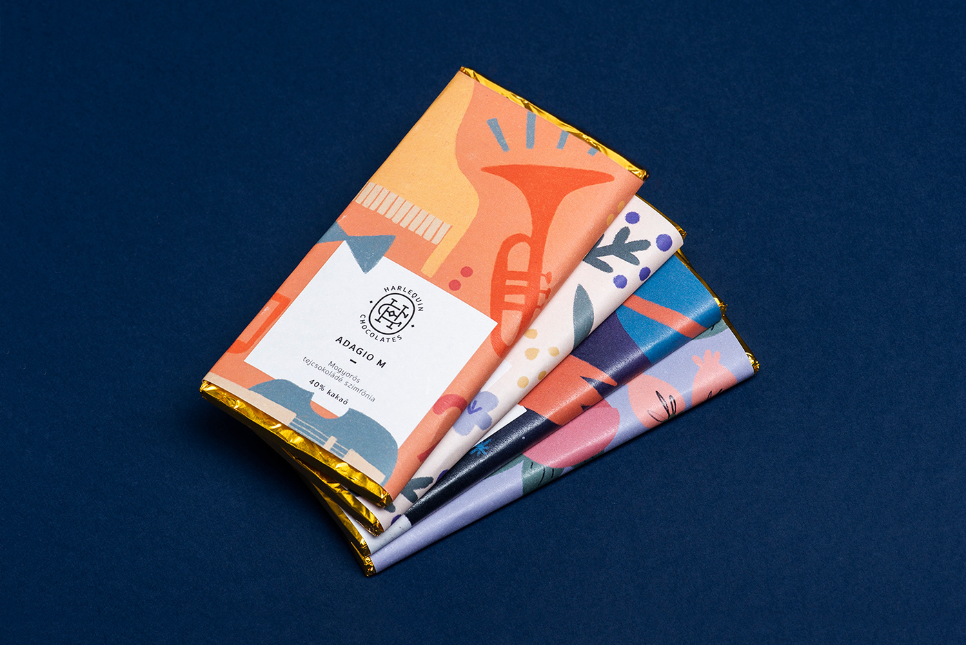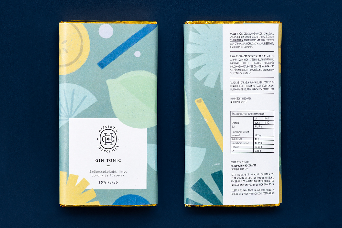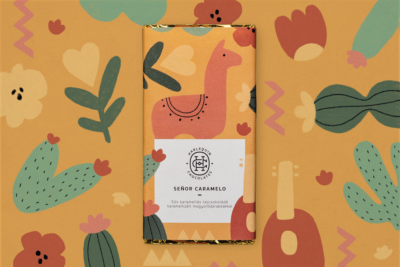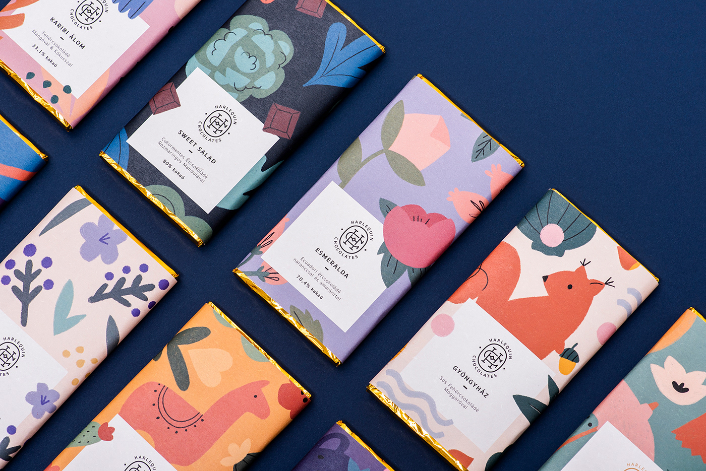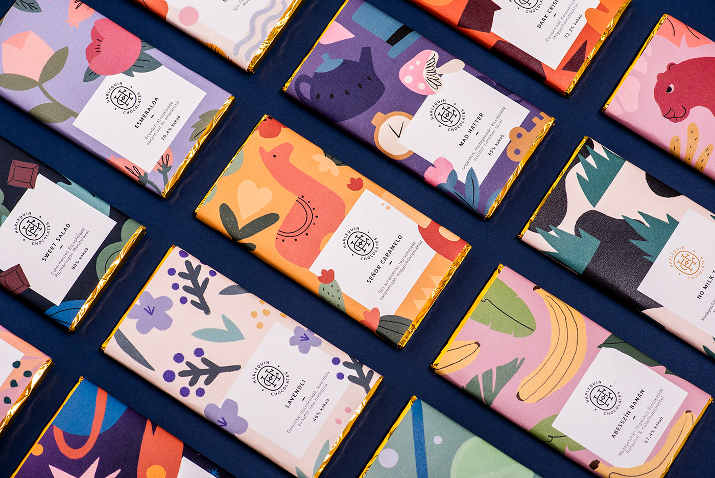
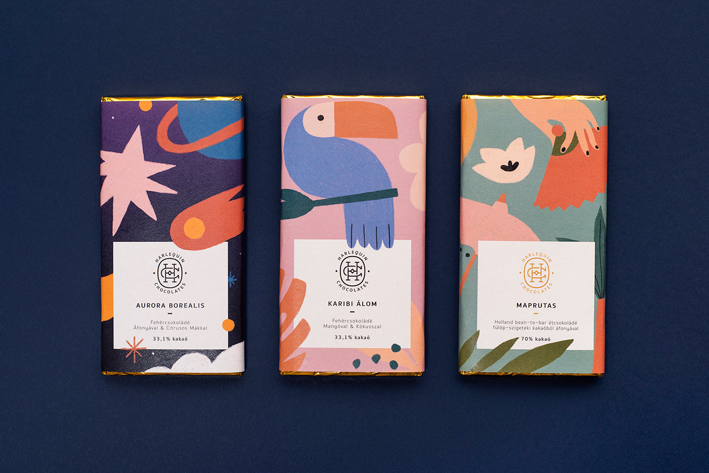
Brand and packaging design with illustrations for Harlequin Chocolates. As it is a small manufactory producing high quality handcrafted chocolates, the aim of this project was
to create an elegant logotype combined with unique illustrations that shows the diversity
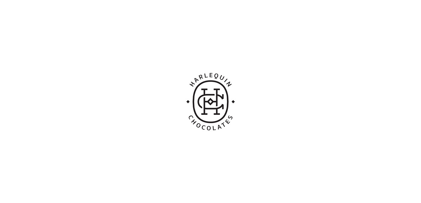
of the flavours and colourfulness of the chocolates. The logo is the combination of the letters H and C, but also refers to the shape of a harlequin ladybird.
Client: Harlequin Chocolates
Photography: Ilka Olajos
to create an elegant logotype combined with unique illustrations that shows the diversity
of the flavours and colourfulness of the chocolates. The logo is the combination of the letters H and C, but also refers to the shape of a harlequin ladybird.
Client: Harlequin Chocolates
Photography: Ilka Olajos