


Overview
- W Concept Korea operates FRONTROW, a contemporary classical brand that marks its 12th anniversary this year. We needed a brand that intensively showed the casual mood that came into our daily lives in the COVID-19 era through the expansion of our customer base. FRONTROW's denim collection aims at contemporary easy casual and is reborn as the second label FRRW.
- For the launch of the 2021 FW season FRRW, we developed a brand identity and applied it to various clothing subsidiary materials and package designs. I worked with the product planning team for nearly a year and took charge of all designs.


Visual Exploration
Based on the brand persona and mood board, I worked main visual in 6 ways of directions. The designer visually expresses the words that can be interpreted as dual in the planning stage, that is a process to find consensus among members.

Visual concept board
The comfortable and soft visuals that focused on deep blue and butter colors were close to the brand image drawn by internal members. We found images that match the brand, discussed the overall picture with colors, and created a visual concept board.

Logotype Development
- The draft of logotype minimized deformation using the slap serif series Freight Macro Pro. It intended a comfortable and bright atmosphere using the attention of slap serif and the large inner space.
- The final design complements the three problems of the draft, while maintaining the ratio and space naturally when used with the framework of the Freight Macro Pro. The conclusion of the Ascender and Descender strokes was neatly modified and applied to the terminal of r.


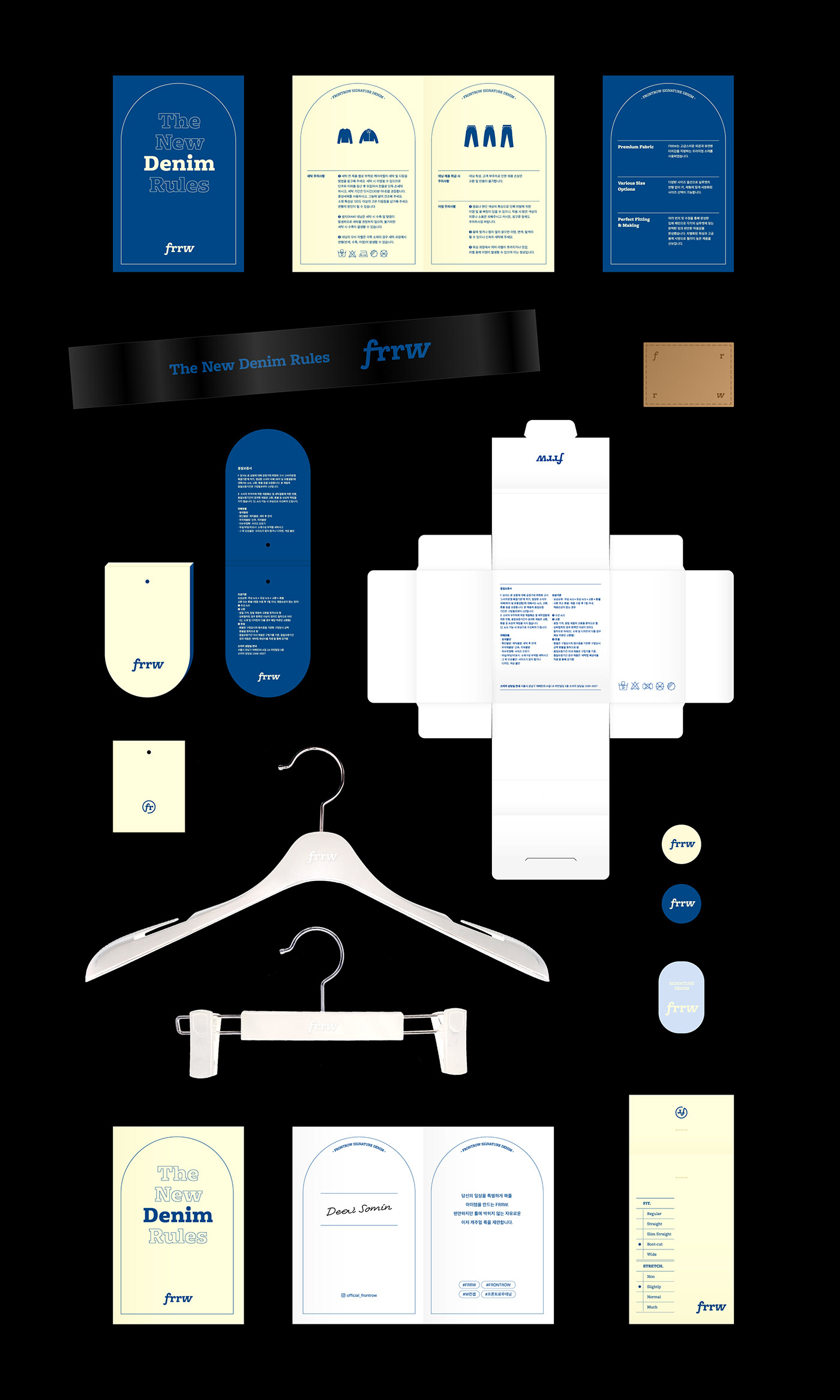
Logotype variation
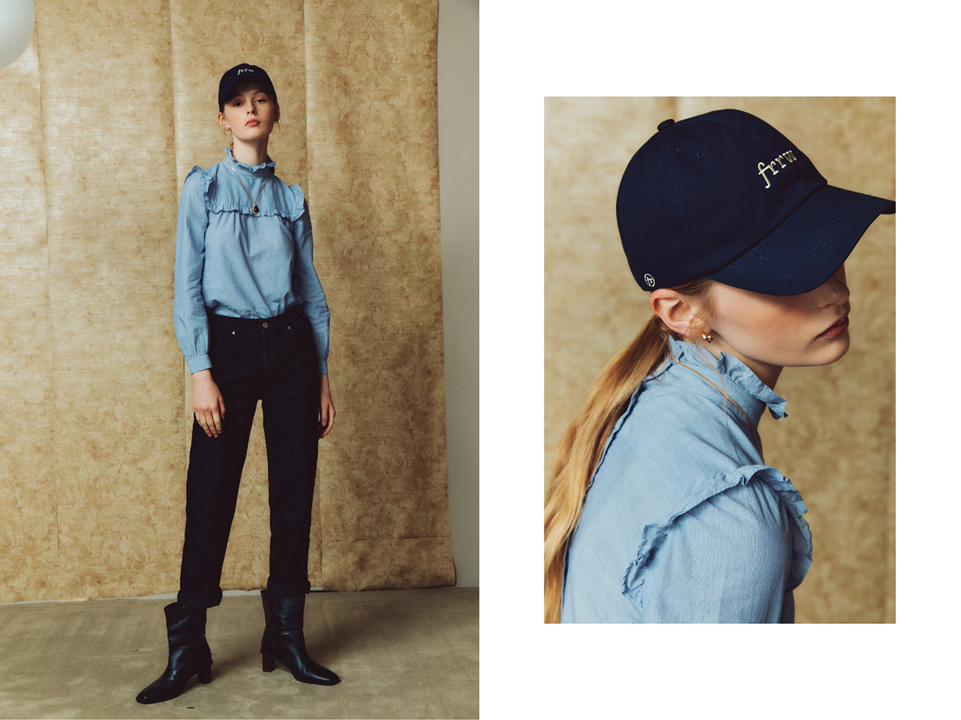
As FRRW is FRONTROW's second label and new brand, we have created a version that can be used in combination with FRONTROW's logo type so that existing customers can recognize it. Fashion brands are required in various forms online, including clothing subsidiary materials and packages, so we have created an application version of emblem that can be applied to various media.

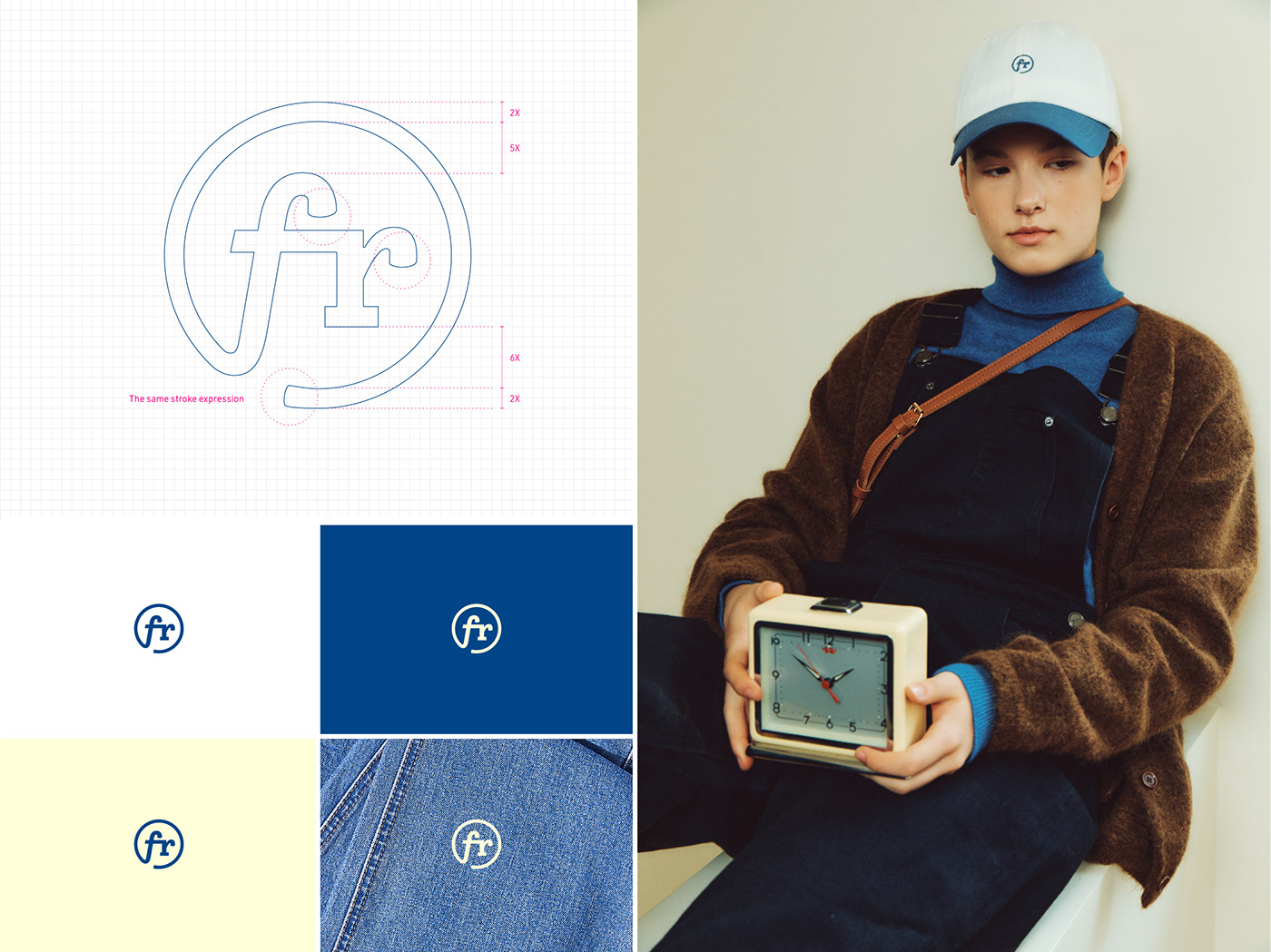


Brand symbol
The symbol, which is particularly important for fashion brands, is a simple form, but a part of the logo type is combined with a circular line so that you can recognize FRRW at a glance. It is used for various subsidiary materials for concise impression communication.


Identity color & typeface
- In addition to the two colors of the butter and blue sets on the initial visual concept board, we set up beige and soft blue colors that can be used as an auxiliary. Pantone chips, CMYK, and RGB color values were also set to increase practicality.
- The dedicated typeface was set to the URW DIN series and Noto sans, which can be used for long articles, including the Freight Macro Pro used for logo types.
- The dedicated typeface was set to the URW DIN series and Noto sans, which can be used for long articles, including the Freight Macro Pro used for logo types.


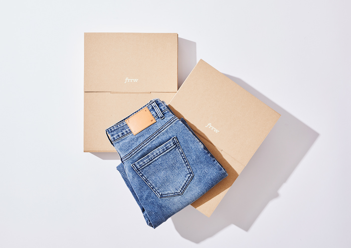


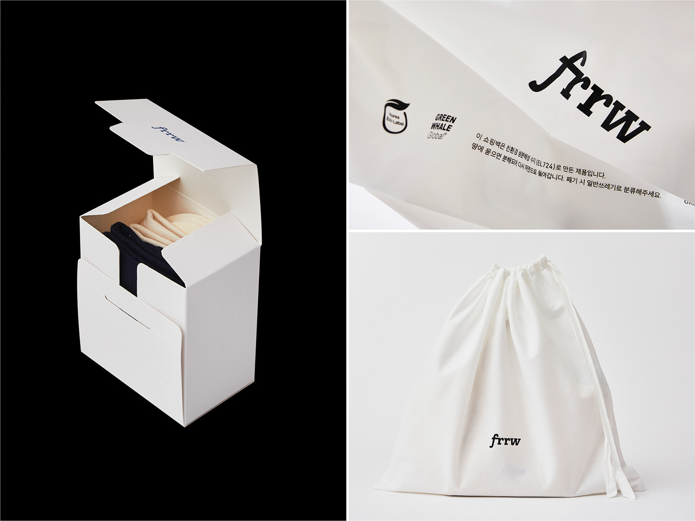
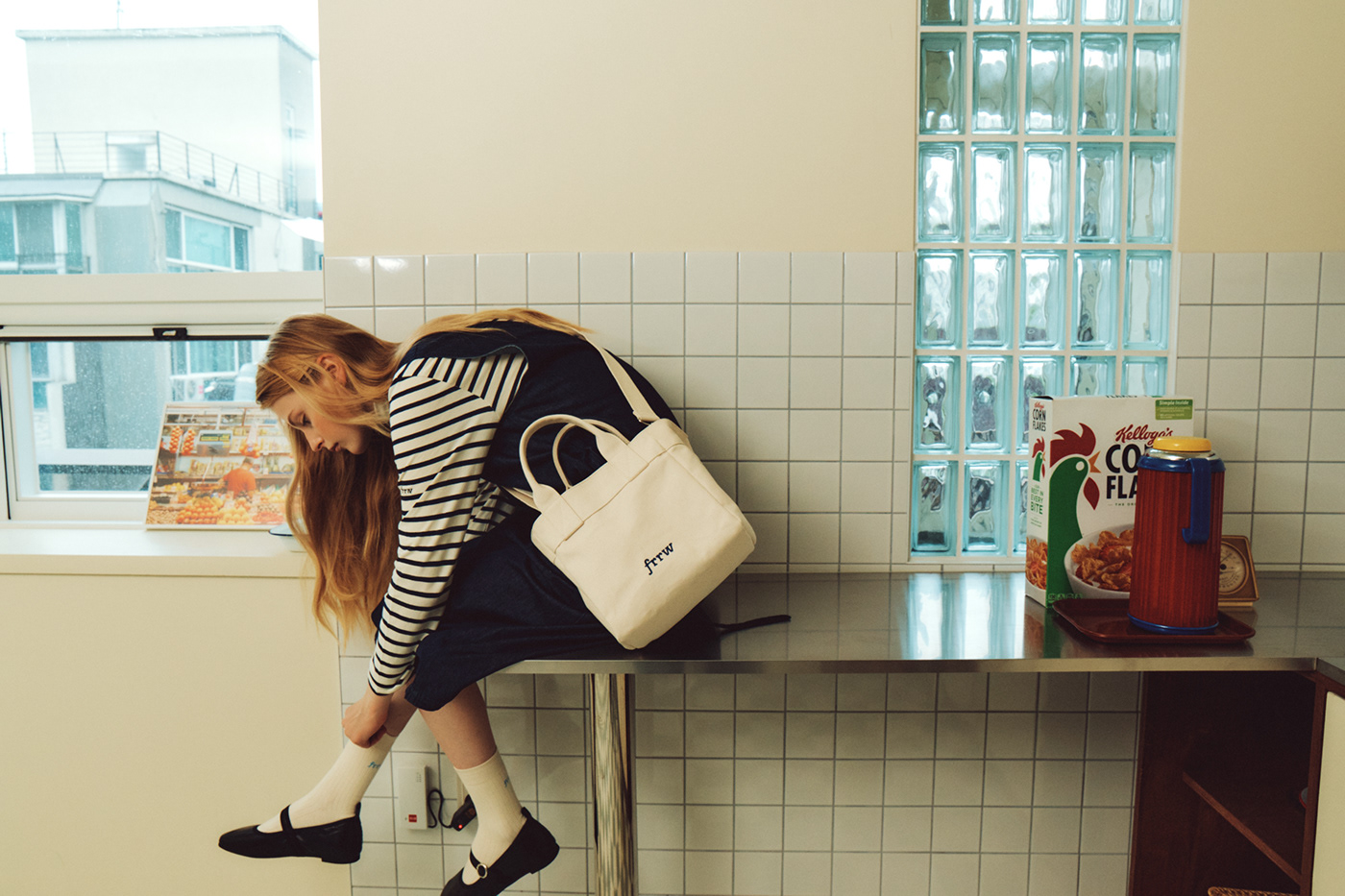
Package design
The package, which is delivered when consumers receive the product, is designed to contain a comfortable and soft image of FRRW, both when viewed together and separately while using the main color. In the print, an arch graphic that can reveal the mood of FRRW was used as a motif.

Management: W Concept Korea
Brand plan: FRONTROW Product planning team
Brand identity design: Kyeongah Ko
Project Period: 2020.10~2021.8
Copyright 2021. W Concept Korea All right reserved.


