
Tilt
Icon design and branding devlopment for a green design and marketing firm – 2007
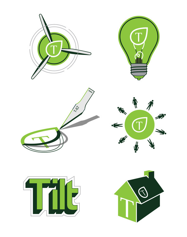
This series of five icons and one typographic logo were designed for Tilt Studio Inc. Each icon represents Earth (wind turbine), Knowledge (classic light bulb), Innovation (graphic designer's
x-acto knife), Community (circle of people), and Sustainability (a home). A goal during the design process was to implement the Tilt leaf logo into each icon, as a method of indicating Tilt's involvement in each of the five areas of interest. It was also important that the icons correlated with Tilt's mission as a green design firm.


Visit my facebook page or follow me on twitter for Super Rad updates!
See work in progress on dribbble
See work in progress on dribbble


