Self-introduction video.
Please view my Demo Reel on:
https://www.bilibili.com/video/BV19S4y1m79S
This demo reel mainly contains 4 parts from video I have made in recent two years. Sadly the url is not support by Behance, but hope you can enjoy viewing it!
Magazine - Manifesto &
As a well-known brand design company, Han Jiaying Design Studio also publishes its own annual magazine. I was working in this studio for the 2021 Chinese new year and was part of the production team for the magazine. The creative point of the elements series comes from a Chinese concept: ‘harmony is the most valuable’. I use different forms of “&” and other punctuation to express this concept. Also, the outcome of the symbol “&” is related to Han’s logo.


Search: Find yourself in the virtual community
The project is using Cinema 4D as a tool for creating the promotion of the imaginary activity. Search: Find yourself in the virtual community is a speaking holding in May, telling people that they can find so many things through the virtual community.

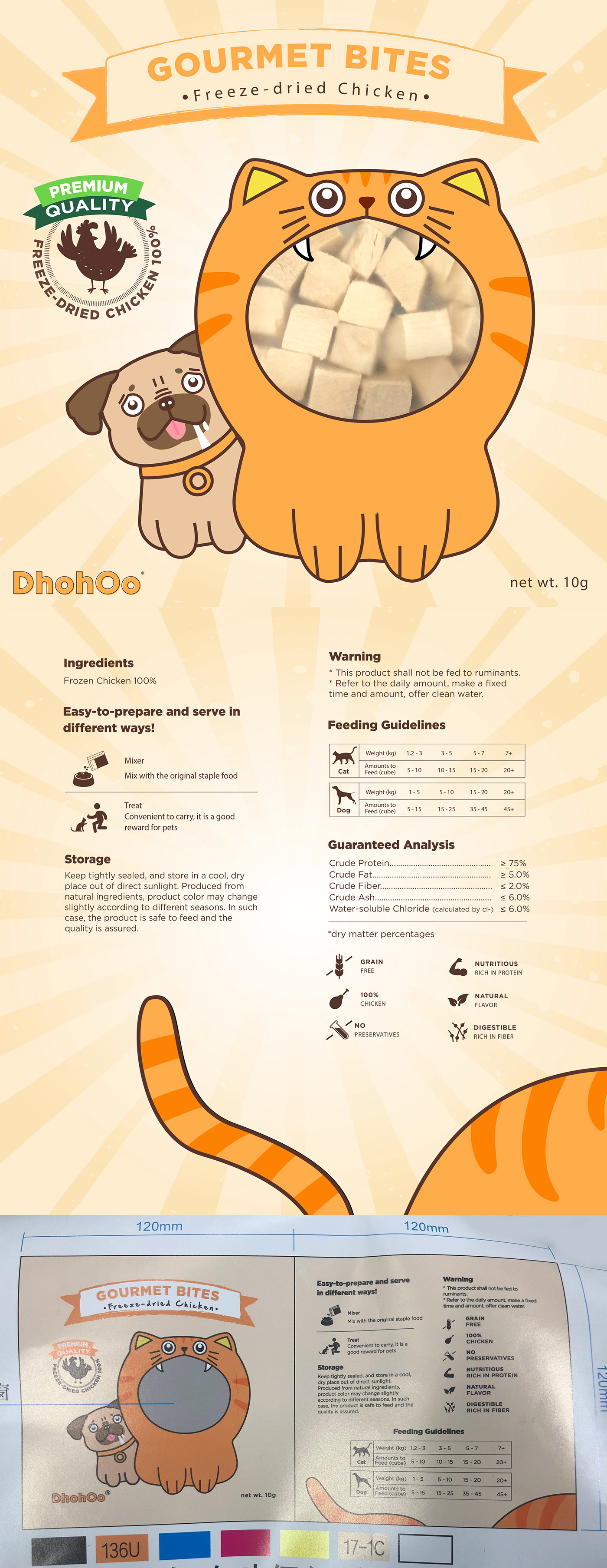

Product design - Dhohoo
DhohOo originated in France. Basically their main business is making nutritious and delicious pet food.
While working on this program, I felt like I was part of a large group of pet lovers who understand the value of friendship and unconditional love that pets bring. DhohOo's goal is to care for pets' complete well-being and provide them with the greatest possible care.
The following section brings together all our brand elements to demonstrate how the Dhohoo brand works. When I'm designing, I constantly keep in mind that I need to use things in a consistent manner. Examples of these applications I built may work as a visual guide to help people to better understand the Dhohoo brand. In addition to the package design, I also created a series of emoticons. It was printed not only as a gift sticker inside large containers of frozen chicken pieces, but also on the Wechat shop. "Dohoo Cat and Dog" is the name of the emoji series.

Emoticons Design for BoW.
In this project, an emoticon set is asked to design for the app of Bank of Wenzhou. The app allows customers to manage their money online, and the emoticons were asked to be made clear, bright, and fun to attract people.

Brand design - Hekka
The Hekka initiative had just begun when I joined at AIG. Witnessing and participating in the birth of a brand is a thrilling experience. Hekka is a marketplace that sells a variety of things at a low price. There are many products and categories on Hekka, ranging from electronics, clothing, and household appliances to pet products and specialized goods.
The initial symbol in hekka's emblem is a wick, which is pronounced "h." It was a wick used to ignite lamps that had been dipped in flammable liquid. It was made of linen, an ancient Egyptian cloth that was popular and trendy. Following the name selection, we created a more flat and stylish graphic for it. Hekka is also represented by the components circle and grient. I also created a large number of banners, blogs, and several variants of the logo using those as references

Pattern/illustration design - Sweet time
Sweet time is a work of pattern design for a fictional confectionery business. The company distributes brightly colored candy to children, and its newest product is candy in various animal shapes. The new packaging for their product features a variety of patterns. Warm colors and attractive shapes are used in this design to attract younger children.


Recent illustration


