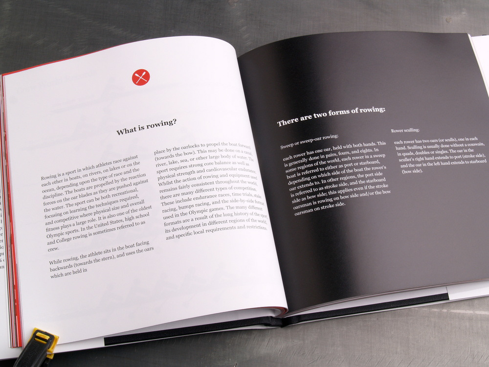
I designed this 109 page book to show off info graphics about exercising. The books text describes various ways to get fit, while the imagery show off each activity. I have used one figure to exemplify all forms of exercise.


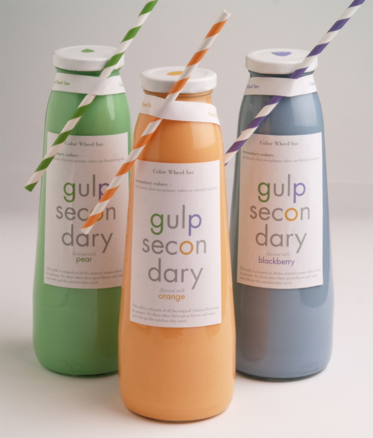
These six glass bottles are a product that I created for a package design assignment. I designed them to resemble the primary and secondary colors to attract children. These vibrant milks allow the white labels to show off their specific details. This includes the matching fruit stickers and straws, which are assigned to their exclusive flavors. These product names inform young children about the two main color groups. Be Primary and Gulp Secondary are an educational and delicious beverage.

During my 2013 Fall study abroad at the Willem de Kooning in Rotterdam, I participated in class called Design Research. We were assigned to research topics that could compare Russia with the United States. I started by looking at the drinking age and how differently they reflect each nation. The left side displays all of the American beers and on the right Russia's. I used there size, variety, and packaging to explain how restriction reflect the beer market.

(TEXT FROM UPPER RIGHT) The Russian and American beer market both have certain restrictions within the industry. It’s because of the drinking age and advertisment that certain beers sell more. Displayed here are each beer brand and type: left (USA) and right (Russia). On the right hand side every centimeters represents one million barrels.


