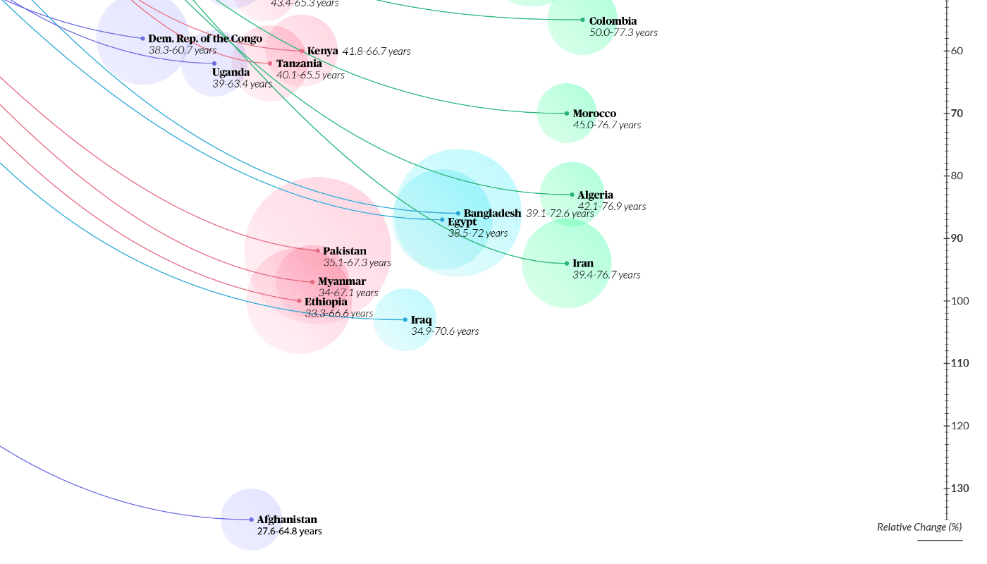
A data visualisation experiment to represent the increase in life expectancy around the world. This piece was created after taking the course 'Data Visualization and Information Design: Create a Visual Model' by Federica Fragapane. I followed the process she set out which includes finding inspiration from organic forms to visualise data in novels ways.
Tools used: Adobe Illustrator and Microsoft Excel.
Data Sources Used:
Our World in Data
Life Expectancy: https://ourworldindata.org/life-expectancy
Population: https://ourworldindata.org/world-population-growth

Inspiration found on Pinterest:

Sketches:

Iterations:

Final Chart: