


What is 100 Thieves?
100 Thieves is a gaming and lifestyle brand, based out of Los Angeles, CA. With teams competing in various esports, as well as a full range of content creators, 100 Thieves is a giant in the gaming and esports scene.
Why this Project?
100 Thieves have a very unique branding within esports. Their designs have influenced many of my own designs in some way or another, so any time I work on 100T graphics it feels very natural. However, I had never made a full project for them, which is something I had to change. I also felt as though I could make great bodies of work for them, and wanted to test my ability to continue a design theme across multiple sectors of an Organisation.
Old vs New style of 100 Thieves (via @nowackdesigns - designer at 100T)

I wanted to follow the new visual style of 100 Thieves, to help keep the visual identity of my rebrand as well as the current branding similar, but give the branding a breath of fresh air, as to help with a seamless transition for fans and viewers, and not get confused when seeing the new graphics.
Mood board

Mood board for the project, showing different composition styles as well as drawn elements. Based on this mood board I knew I wanted to follow a very simple composition and have a lot of drawn assets around characters or players to help them stand out. Using minimal text to get the point of the graphic across.
Based on the graphic's use, I wanted to use the same background and colours to help fans know what the graphic was for. To do this I used the same background/textures for all Valorant graphics, as well as Black/White/Red for the graphic's colours.
Valorant Graphics
In June 2020, 100 Thieves joined VALORANT for the 2020 NA Season.


Why are Defeat graphics not used?
In an interview, George Nowack (Designer at 100 Thieves) was asked this question. He replied that 100 Thieves only like to share high points in their journey, and don't feel like highlighting defeats helps this. Which is why if they lose, a defeat graphic isn't posted, and I chose to not make them for this project.
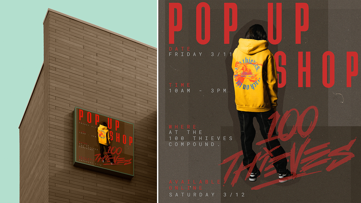
Attack On Titan Collaboration
What is Attack On Titan?
Attack on Titan (Japanese: 進撃の巨人, Hepburn: Shingeki no Kyojin, lit. "The Advancing Giants") is a Japanese manga series written and illustrated by Hajime Isayama. It is set in a world where humanity lives inside cities surrounded by three enormous walls that protect them from the gigantic man-eating humanoids referred to as Titans.
Why this Collab?
After a successful collaboration with Halo, it was clear to fans that 100 Thieves would follow up that collab with another one - this time with a popular anime that is known worldwide. After being teased for weeks, it was finally announced that 100 Thieves would be teaming up with Attack on Titan for the universal drop on March 12th 2022.

Based on this moodboard, I knew I would be using shades of brown for the background, to create boxes that would house different things in. I also noticed a reoccurring face throughout the Official Adverts, someone I would use too as it seemed to be an iconic character synonymous with Attack On Titan.


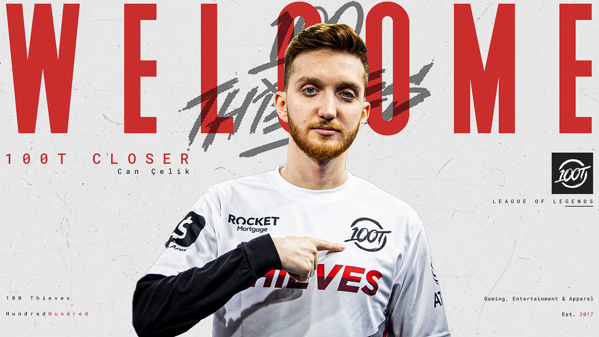
League Of Legends Graphics
In November 2017, 100 Thieves joined the NA LCS for the 2018 Season.
Graphic style
Keeping a similar style to the Valorant graphics with an interwoven 100T logo on the graphics, but the main key difference is the changed colour on the background, with LoL graphics having a white background. They also have a much more simplistic and clean look, with none of the drawn elements that are seen on the Valorant Graphics, creating a minimalistic appearance.

Roster Graphic similarities
The idea behind keeping the graphics similar for roster announcements was that it would allow fans to expect a similar graphic to announce the teams new roster, despite the different graphic styles for different esports. It also allowed me to have some kind of link between the different graphics for different esports, as it is something that would be continued beyond to further esport styles.

Why are they different to the Valorant Graphics?
Typically 100 Thieves use the same graphic style for all their different games. I however wanted to create some difference in the way each graphic looked so that fans could easily tell what the graphic was for off a first glance.
However, it was important to me that I kept some kind of unison between all the graphics, to keep them within the same branding family. This is where I adopted the 100 Thieves lines logo that weaves in and out of letters as the main branding point across all the different graphics, which helps tie everything together.
The aim
My intention with the 100 Thieves League of Legends graphics was to try and go back to basics with them, using a much more minimalistic style than the previous graphics, as well as taking some inspiration from the older style of 100 Thieves Graphics where there wasn't intricate details like the drawing in any of the Valorant work, but more so focusing on key text being included and nothing else, with them really utilising positive white space - something I tried to reflect in my designs.


