Little Mez
Client: Future Hospital Group
Location: Queenstown, New Zealand
Industry: Hospitality
Published at:
Asia-Pacific Design No. 19. Sandu Publishing, China
Published at:
Asia-Pacific Design No. 19. Sandu Publishing, China

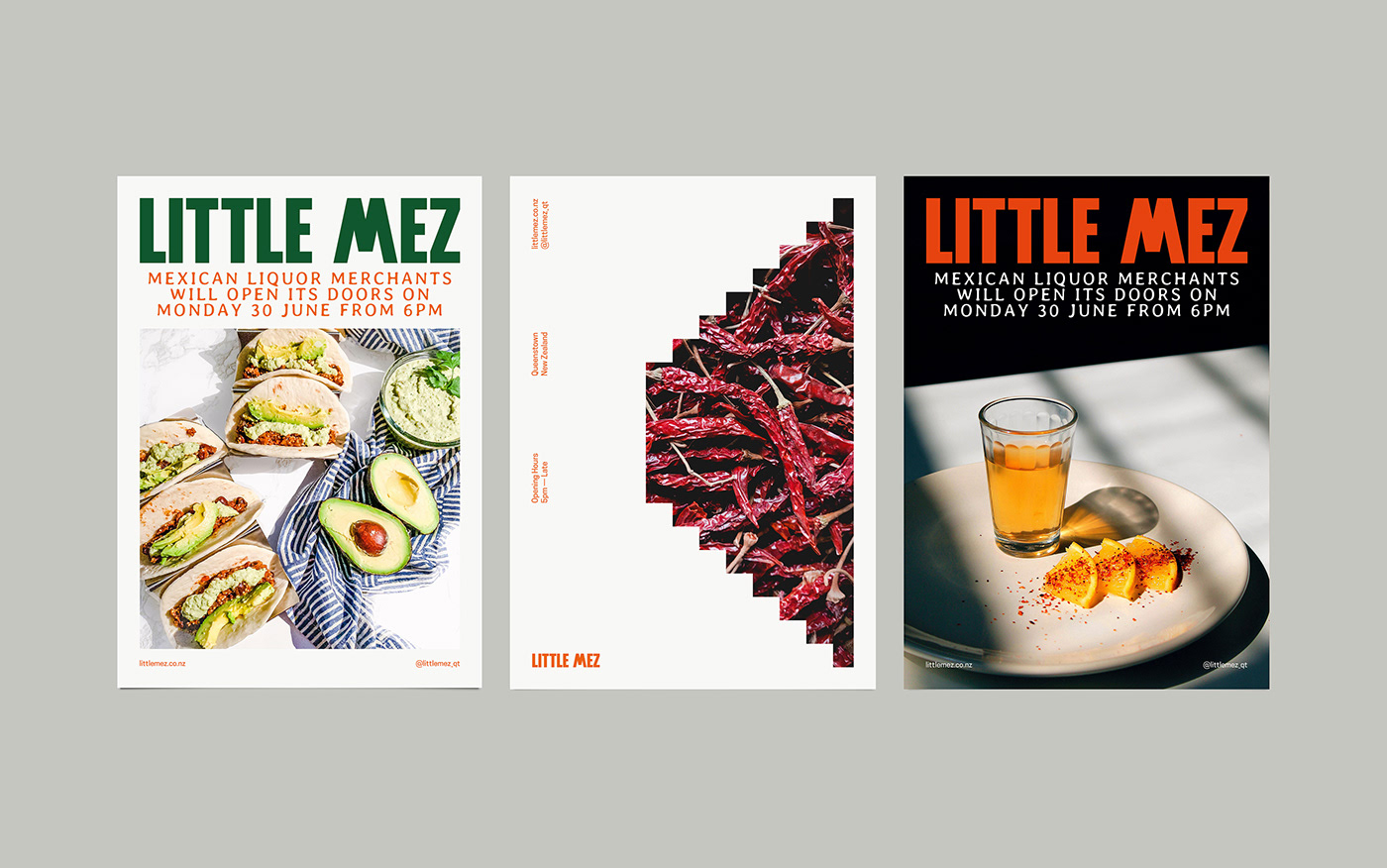
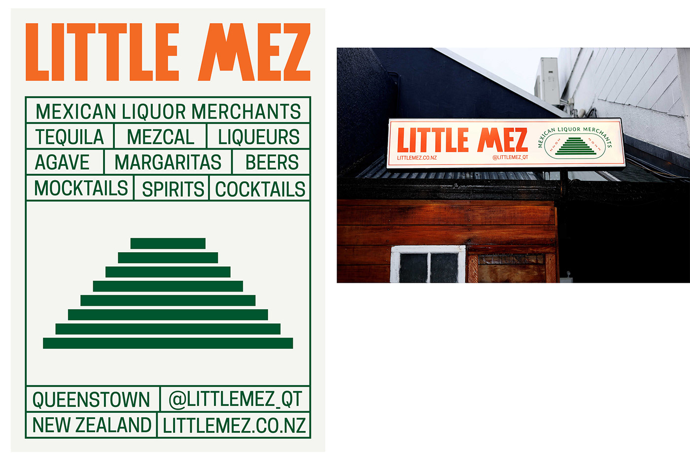
Little Mez is a Tequila and Mezcal speciality cocktail Bar. For the brand identity, we focus on developing it with clear Mexican roots. The brand concept was built through the main feature of the venue, its stairs. You can only access the Bar through them. And paradoxically, the staircase morphology when is seen in perspective, you can also see a Mayan temple. That coincidence became our purpose when developing the brand. The union of our small venue and the Mexican culture are amalgamated through a forceful and significant pictorial mark. On the other hand, metaphorically, the stairs symbolise the path or access, in this case, to an authentic Mexican experience. In turn, the colour palette and the bespoke wordmark, a bold sans-serif typeface created from the steps of the pictorial mark—It has the exact size of the steps and the same space between the steps for each glyph— make a perfect closure for a unique brand for the Queenstown's first Agaveria.
Our Work
Brand Design
Concept Development
Print Design
Visual Identity