This portfolio showcases work that centers around typography in an editorial context. With these 6 projects, my ultimate goal was to create smooth and elegant interfaces that enable readers to peruse the material while being distracted as little as possible. I believe design is most beautiful when it enhances the reading experience by allowing its essence to come through the pages:
1. Newspaper redesign of the local publication The Baltimore Sun, and giving it a more professional facelift.
2. Website redesign of an existing text-heavy site that had little to no usability. I wanted the redesign to include a more user-friendly interface, chock full of pictures for easier navigation. Includes desktop and mobile versions.
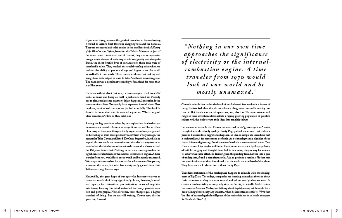
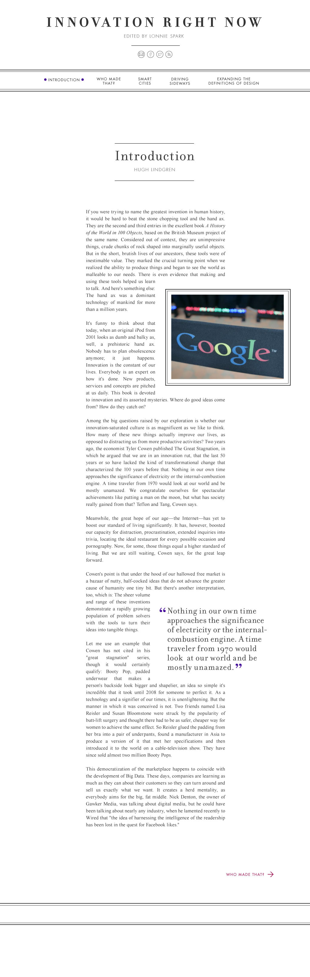
3. Manuscript layout of an article that focuses on Innovation in the 21st century.
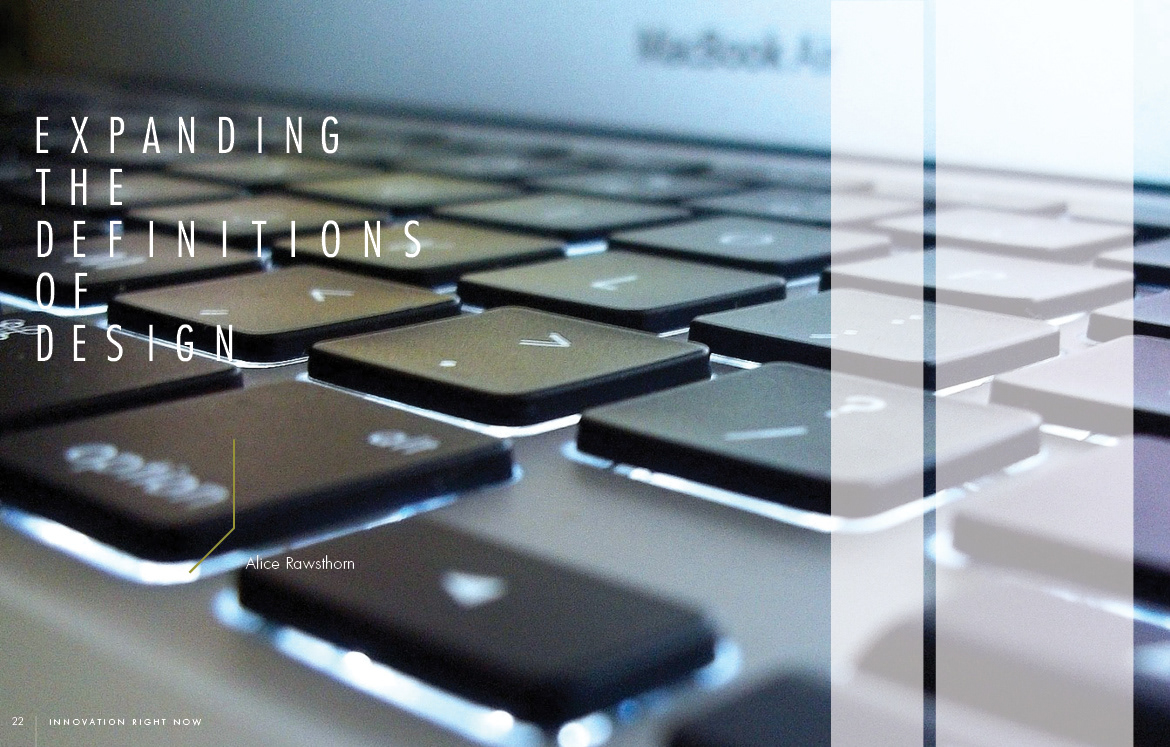
4. The same article set in a magazine layout. It was tricky balancing consistency while avoiding monotony.
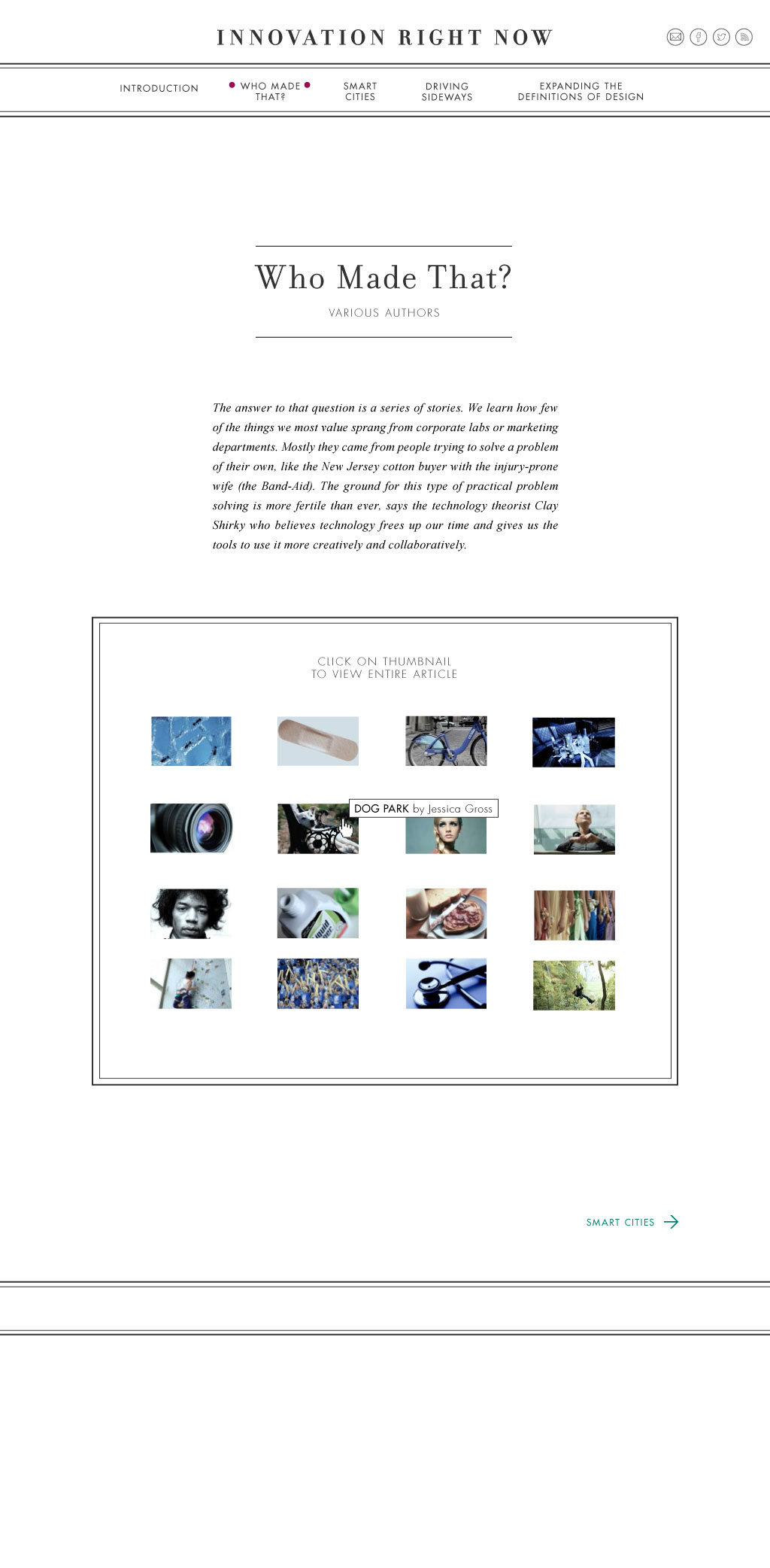
5. The same article set as a navigable website.
6. Hand lettering exercise with Ken Barber of House Industries.

Newspaper Redesign, Spring 2014
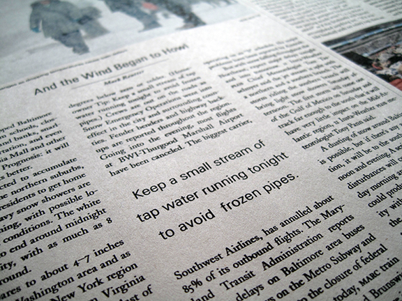
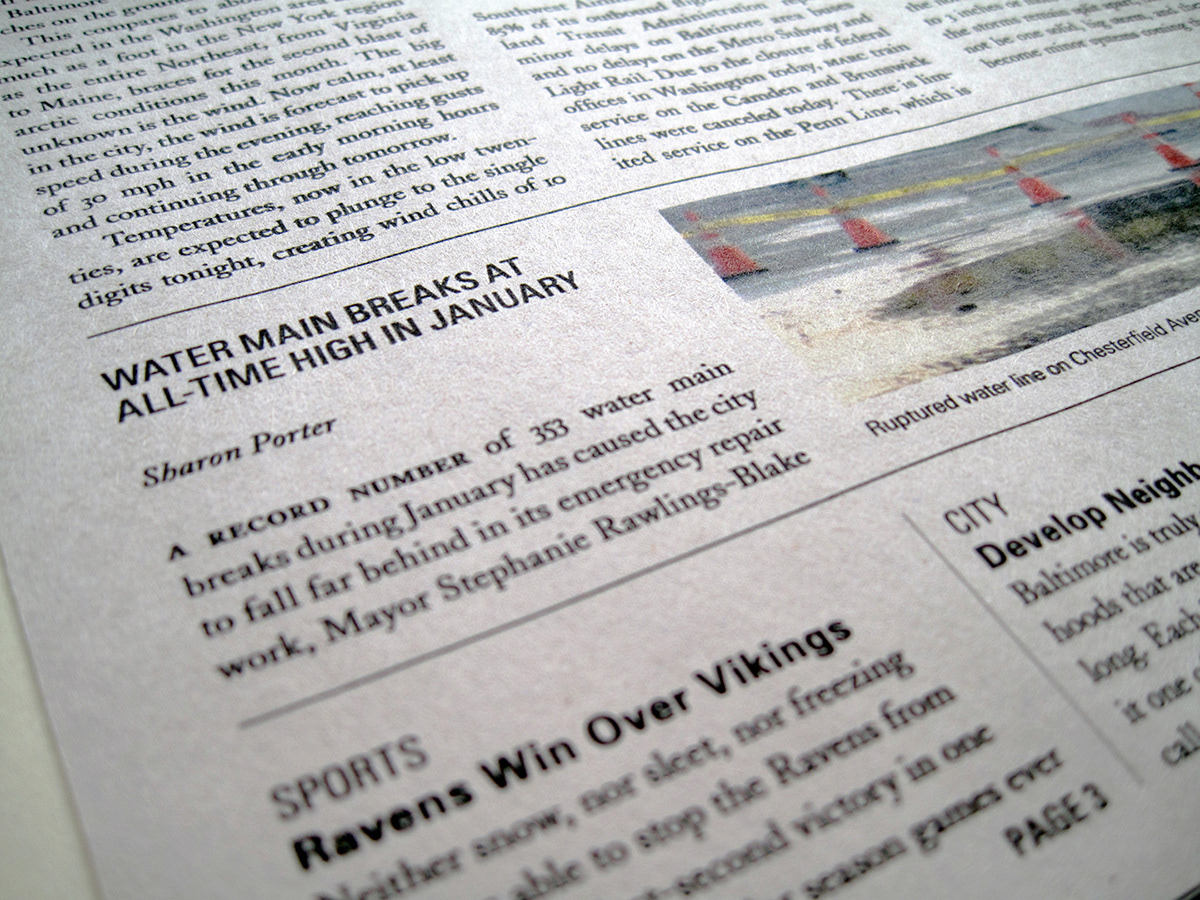
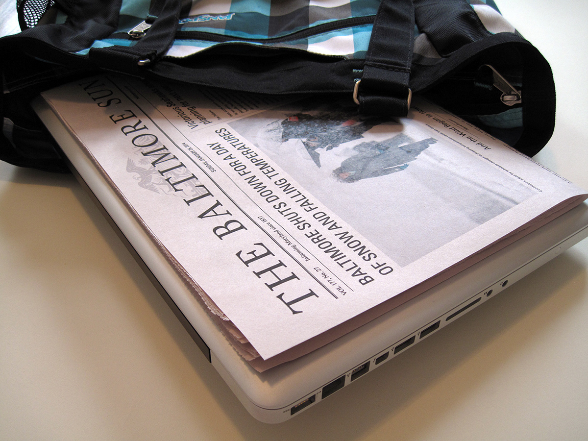
As part of our Publication class we had to redesign the outdated Baltimore Sun frontpage. As with all projects, design first begins with a list of requirements, and layout sketches. The innovation of this design centers around the fact that when folded, the newspaper fits easily inside a laptop bag, protecting it from environmental damage. I enjoy thinking about the product in its entirety, as well as focussing in on the little details.
Newspaper Redesign, Spring 2014
Details, pull quote.
Details, pull quote.
Newspaper Redesign, Spring 2014
Details, article title and by line.
Details, article title and by line.
Newspaper Redesign, Spring 2014
Laptop-sized.
Laptop-sized.

Website Redesign, Spring 2012.
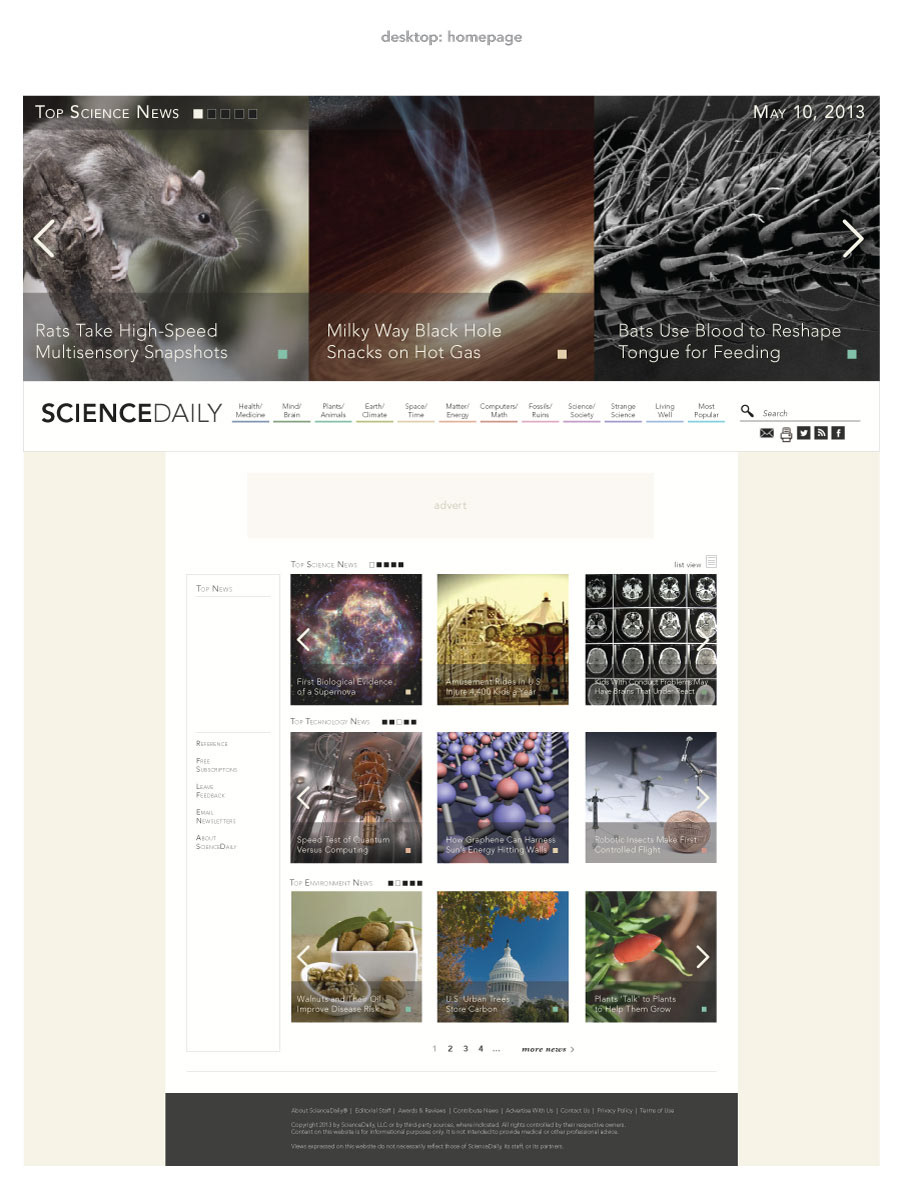
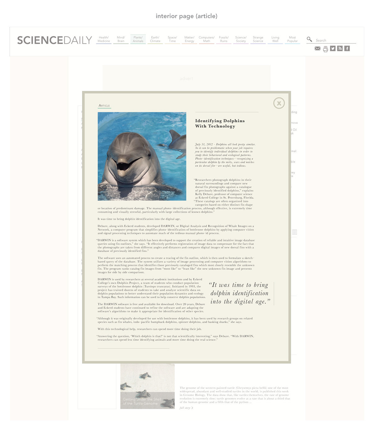
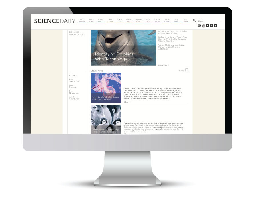
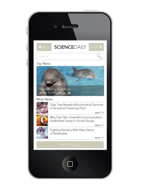
For this project I chose to redesign an existing, published site (http://www.sciencedaily.com/). The original site was confusing and mostly text-based, making it difficult for its readers. The approach I took was more image-heavy; I redesigned it so that it was easier to navigate databases and find its numerous articles. These screenshots include UI interaction (mouse-over menu, article reading, and desktop/mobile components). I also used a color palette that was less sterile, thereby creating a more welcoming feeling even for the non-science audience.
data architecture
Website Redesign, Spring 2012.
Landing page

Website Redesign, Spring 2012.
Page interactions
Website Redesign, Spring 2012.
Article focus
Website Redesign, Spring 2012.
Desktop version
Website Redesign, Spring 2012.
Mobile application.
Mobile application.
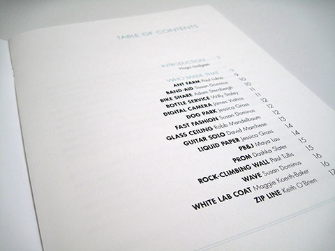
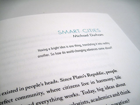
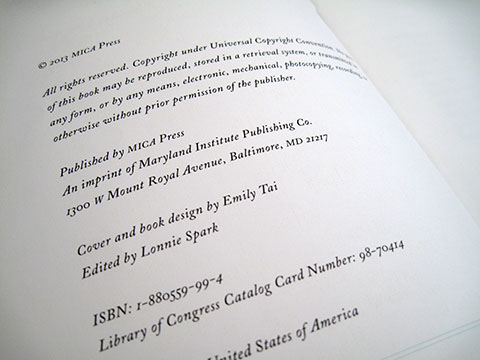
Manuscript Design, Fall 2013.
For this project we were given a long reading to set in manuscript format. The key was to choose typefaces that would complement the text and highlight areas of interest, but at the same time look consistent across the board. We also had to keep legibility in mind, and design for lengthy periods of reading time. I kept the design to a minimum because I wanted the reader to focus on the text, and used a blue accent color throughout.
Title page.
Manuscript Design, Fall 2013.
Table of Contents
Manuscript Design, Fall 2013.
Details, head, by line, and deck.

Manuscript Design, Fall 2013.
Details, chapter layout.

Manuscript Design, Fall 2013.
Colophon.
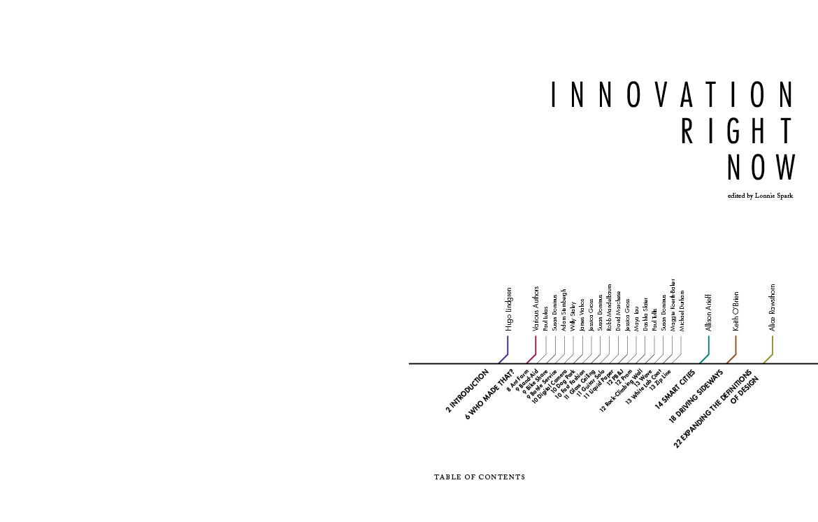
Magazine spread layout, Fall 2013.
Taking the same article from the previous project, our challenge was to design a magazine iinspired layout that would utilize text in combination with imagery. The challenge for me here was to maintain a sense of consistency, but not so much so that the reader would get bored.
Table of Contents.
Magazine spread layout, Fall 2013.
Interior spread.


Magazine spread layout, Fall 2013.
Interior spread.
Interior spread.
Magazine spread layout, Fall 2013.
Interior spread.
Interior spread.
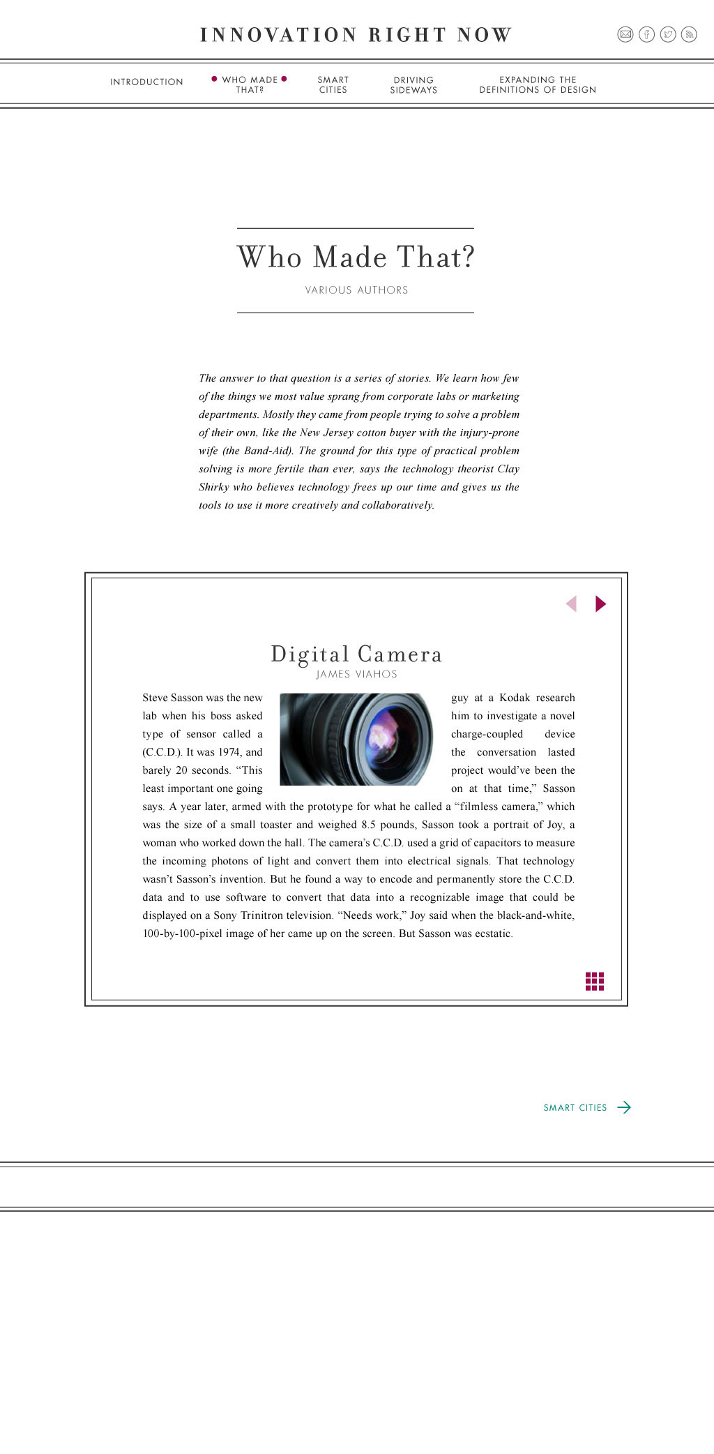
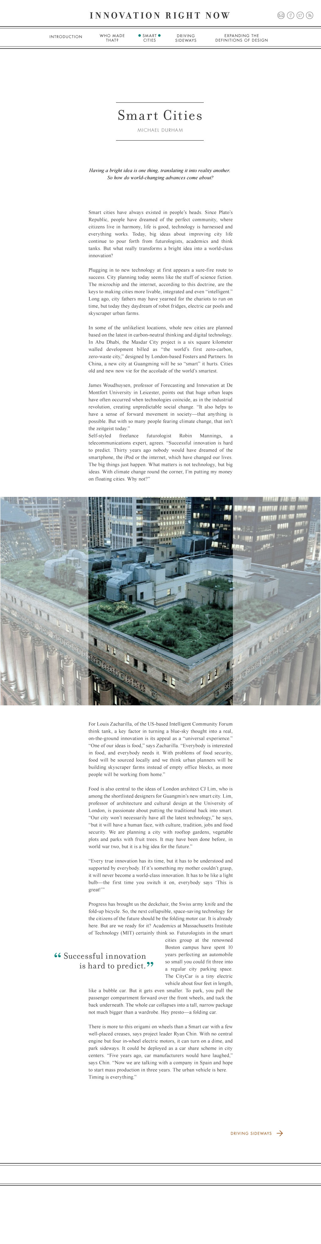
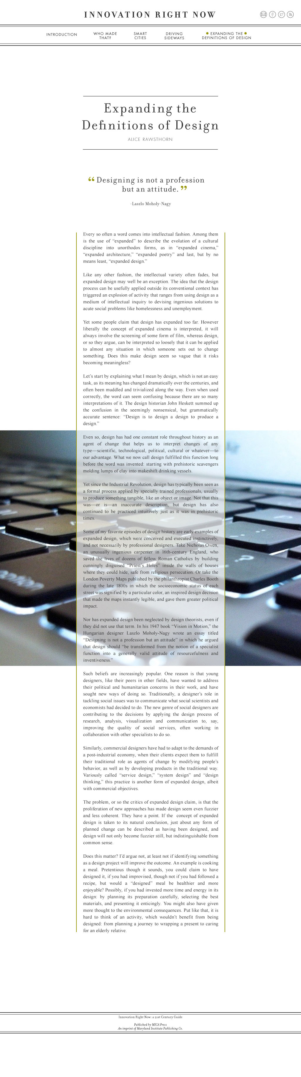
Website layout, Fall 2013.
Using the same article from the previous project, our task was to set it in the style of a navigable website. I wanted to make the reading experience as seamless as possible for the reader, and to use whitespace in an interesting way. The middle section on "Who Made That" features about 16 smaller articles, each of which could be accessed from the main thumbnail grid.
Website layout, Fall 2013.

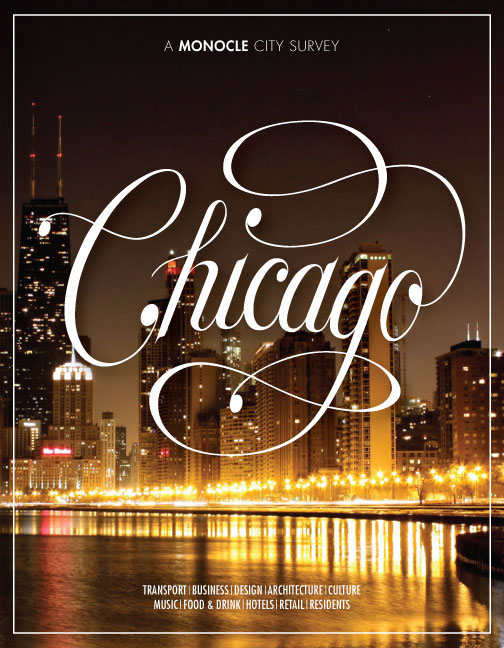
Hand-lettering for Monocle magazine, Fall 2013.
Working closely throughout the semester with Ken Barber of House Industries, this project showcased the hand-lettering process that was emphasized by the instructor. The lettering demonstrates my understanding of individual letter mass (or "color") but I also learned that it's important to make them all work together as a whole. The resulting mark evoked a sense of classiness and sophistication that is reminiscent of the historical city of Chicago.
Pencil sketch.
Hand-lettering for Monocle magazine, Fall 2013.
Final vector.
Final vector.

Hand-lettering for Monocle magazine, Fall 2013.
Closeup.
Closeup.


