This is a academic project done by me under the guidance of Tarun Deep Girdher along with my batchmate Hena Najeeb ( Exhibition Design ) with whom I covered the main phases of this project.
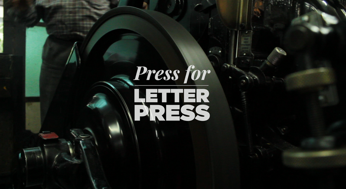
The aim of this project was to celebrate the technique of letterpress. Bringing the NID print legacy into light, by sparking conversations amongst the design community, about the relevance of letterpress in the past, present and future."
The aim of this project was to celebrate the technique of letterpress. Bringing the NID print legacy into light, by sparking conversations amongst the design community, about the relevance of letterpress in the past, present and future."

These are the available letterpress facilities ( machinery and typesetting material ) still existent at
the Print Labs of National Institute of Design, Ahmedabad.
the Print Labs of National Institute of Design, Ahmedabad.
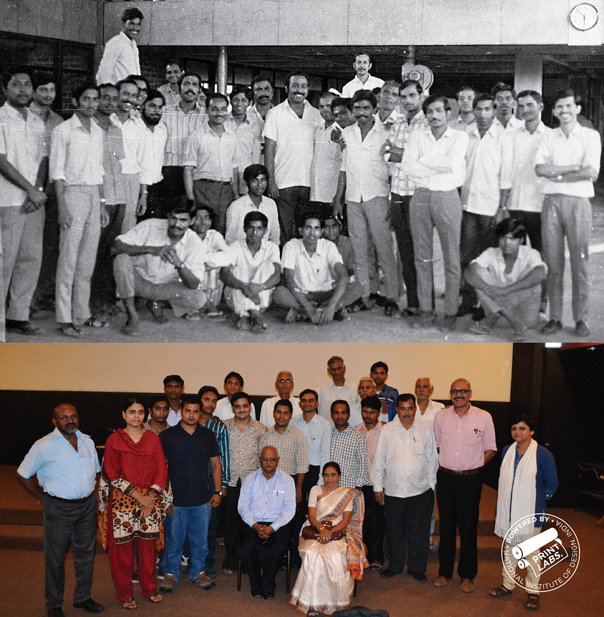
The Print Labs, An integral part of National Institute of Design, Ahmedabad completed a glorious 50 years.
From 35 staff members in 1970 to 7 members in 2014, this department, once having the title of the best printers in the country is now seeking a new role as a lab which encourages experiments in an academic context.
From 35 staff members in 1970 to 7 members in 2014, this department, once having the title of the best printers in the country is now seeking a new role as a lab which encourages experiments in an academic context.
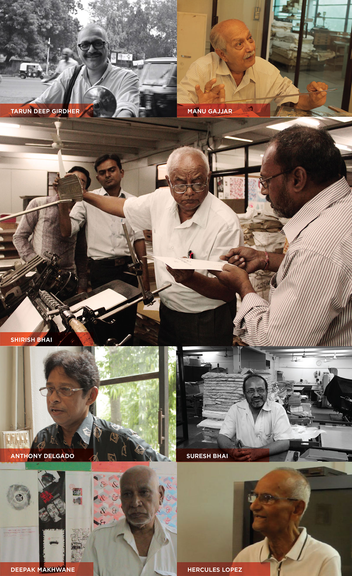
Even though I started out my basic research on the web and books from our library, I quickly shifted to interviewing people, especially staff and seniors at the printing department of NID. Listening and recording their experiences really enhanced my understanding towards this medium. It gave me a wonderful insight on how letterpress has transformed over the years. Their opinions and views is like a backbone to my project.
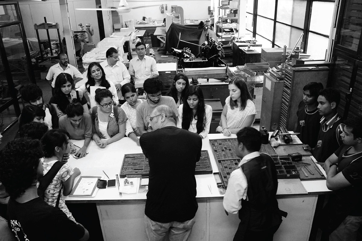
A still from a typography class held for undergraduate Graphic Design students ( Semester 3 ) under
Tarun Deep Girdher ( Head, Print Labs , NID ). The basics of typography and publication design is rooted with this process and thus is still used in the academic context, especially with the graphic design students.
Tarun Deep Girdher ( Head, Print Labs , NID ). The basics of typography and publication design is rooted with this process and thus is still used in the academic context, especially with the graphic design students.

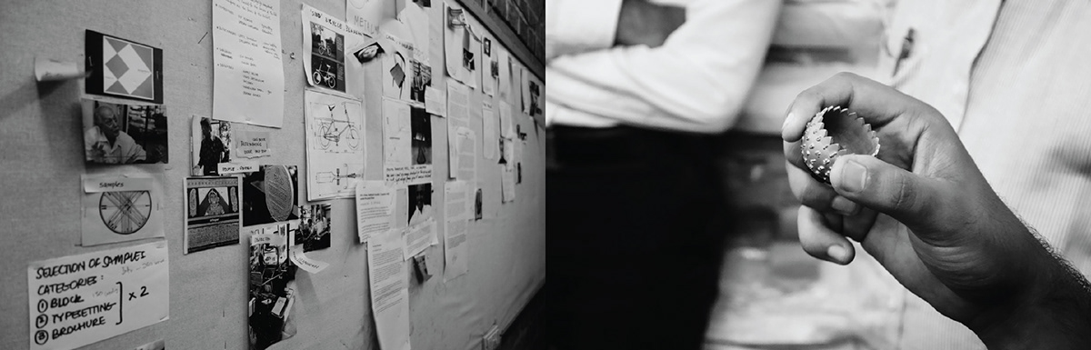
I mapped put the basic information and keywords together to see the oppurtunities and scope of this project ahead as well try to see how the eventual visual language will develop. I studied similiar structures of letterpress associations and accordingly simulated how the intention would be translated through a medium.
As the project went on, I not only went ahead with making the final deliverable but along with Hena identified oppurtunites where the project could be invloved with other relevant events and conferences.
The DHS ( Design History Soceity ) conference held at NID from 5 - 8 September 2013 was one of them.
The DHS ( Design History Soceity ) conference held at NID from 5 - 8 September 2013 was one of them.

All the samples collected by the print department for the past five decades collected, which we term as the
" Treasure Chest " was at display during this particular conference. These reflected the infinite amount of effort gone into each, right from the design to production as the detailing and finesse really stood out more than anything.
" Treasure Chest " was at display during this particular conference. These reflected the infinite amount of effort gone into each, right from the design to production as the detailing and finesse really stood out more than anything.

This is a front view photograph of the temporary exhibit at the Print Labs, highlighting the rich historical context of this department especially through the lines of Letterpress.

I decided to explore the domain of web design as an appropriate way of showcasing this collected information. The web being a more dynamic, flexible and accessible medium for the target audience. I decided to create a visual backend and frontend structure for other people using this domain.

Mapping all the information together, I created a hierarchy and brainstormed about the current and future prospects to this project in each category that was about to be featured.

Initial explorations to devise a visual mood.

I used this phrase " Letter Impress " to symbolize the impression & tactile feel of this medium as well as the intensive human engagement involved with it.

I made mockups as web layouts that could be either translated together as a website or into a blog that could be accessed by people in the future. These mockups reflect how the information, colours, fonts and visuals come together to create different layouts.
This is a still from a series of videos that eventually become a very important of the project. These reflect the experiences and opionions of different individuals involved with respect to this process.
A link to this channel will be up very soon.
A link to this channel will be up very soon.
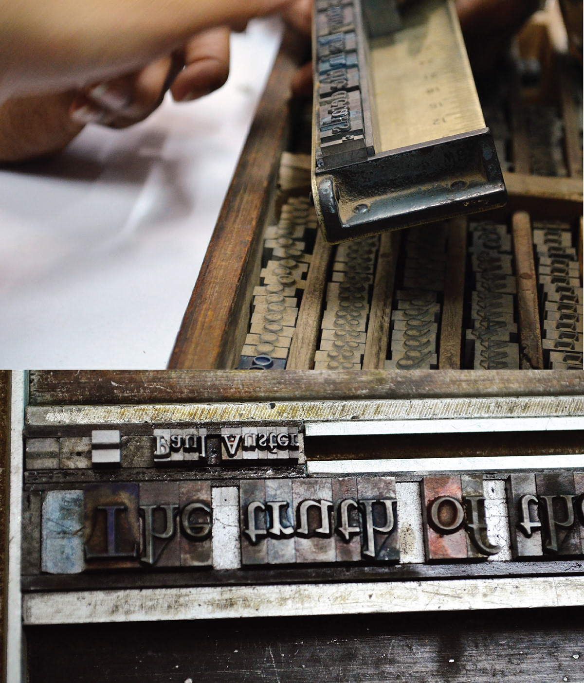
Even though I got my hands dirty with this technique at much later stage, It was an enriching experience nonetheless. The event being Shirish Bhai's farewll. He was one of the stalwart in the print department who had headed letterpress jobs for almost four decades.
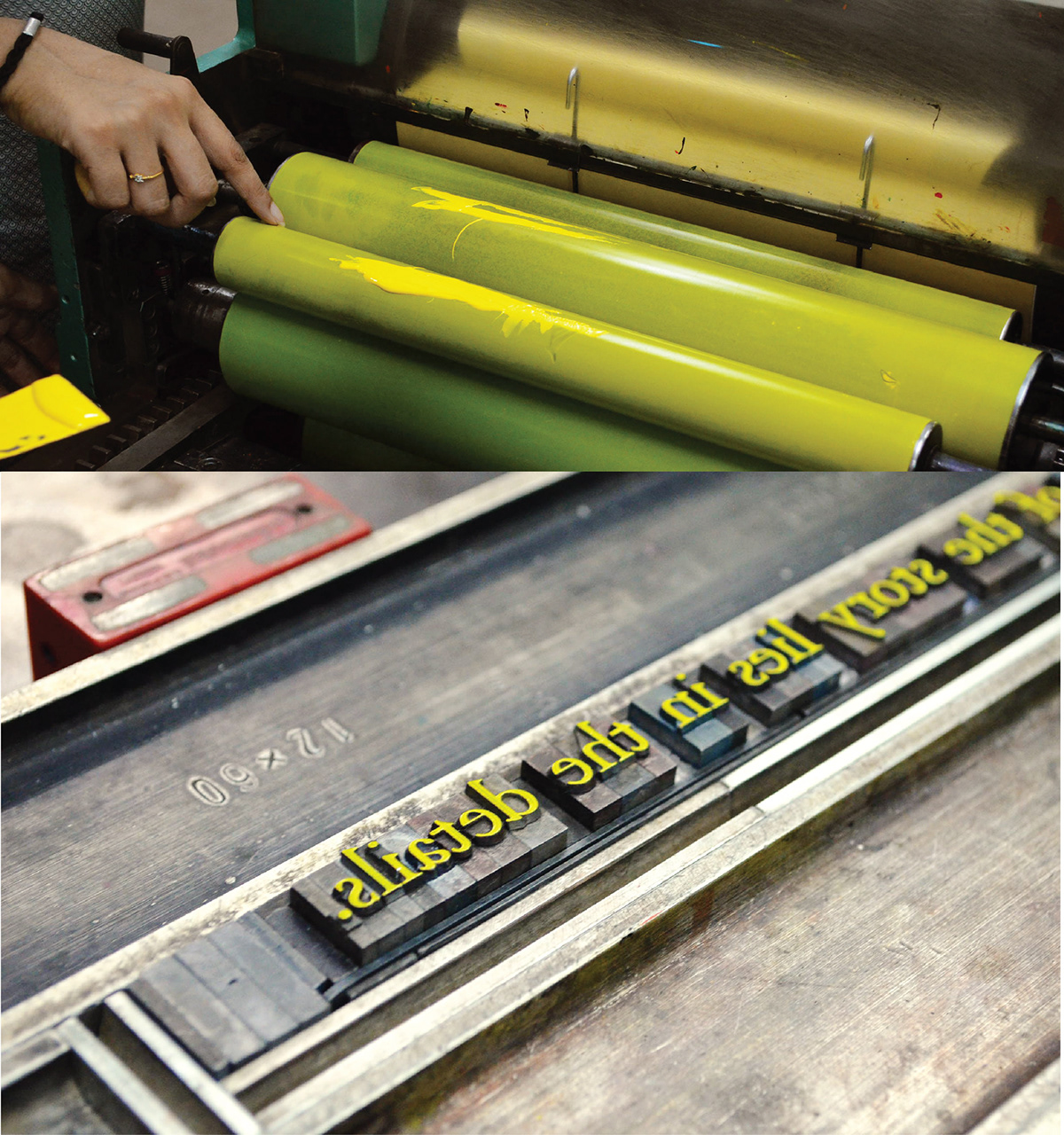
Me and Hena decided to use letterpress and typeset the a quote by Paul Ester that says " The truth of the story lies in the details " on a photograph I had taken of Shirish Bhai. The quote clearly relfected the countless hours he put in to make every print job to be perfect and up to the high standards that the department had set.

Using gold powder on the wet yellow ink was the icing on the cake. It really gave a feel like no other.

This is a photograph of a sample made by the undergraduate students of graphic design ( 2012-13 ).
Seeing the scope and possibilities ahead, I along with my Guide and fellow letterpress enthusiasts see this project diversify and develop into a concrete structure. Almost like a re-incarnation.


