The concept: from lettering to “lettering”
This project was specially carried out as a contribution for the exhibition BCNMCR, an event curated and organized by Dave Sedgwick in Manchester. My exhibition consists in my personal recreation of three letters taken from signs in Barcelona and three from Manchester.
The exhibition was held at Manchester’s TwentyTwentyTwo venue and open from the 27th of March till the 23th of April 2014. This project originated from a self-commissioned project I did two years ago, an alphabet made of manifold letters taken from signs that I photographed in different locations in Barcelona and other cities (shared on my Instagram account).
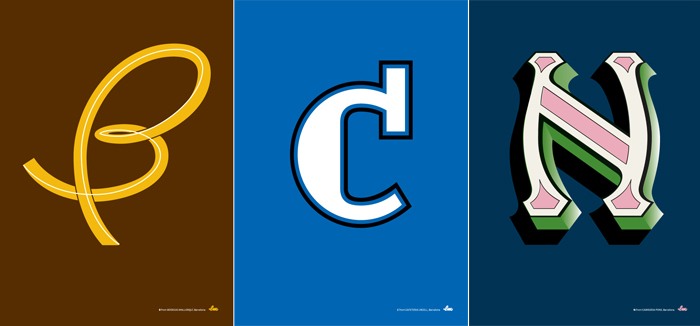
B from Bodegas Mallorquí, C from Cafetería Urgell and N from Camiseria Pons. Barcelona
The BCNMCR project was the opportunity to repeat this process with letters from Manchester —photographed by the students of the Shillington Graphic Design School, and selected by me — but also from Barcelona. This time, a higher level of interpretation would be necessary, through illustration, colour and various graphic treatments. My personal challenge was to achieve a balance between the original lettering and an illustrated reinterpretation in a more ‘typographic’ way by redefining the proportions and design, keeping in mind the final poster format, all by following my intuition.

M from Midland Hotel, C from Hanckoks and R from the John Rylands Library. Manchester
Choosing the letters
The challenge was to achieve a balance between the original lettering by redefining proportions and design and create the final set of posters for the exhibition, keeping in mind two key aspects: choosing the letters that would be most representative of a city but would also need to favour the design project.
Process & resolution
Once the letter was chosen, it was first redrawn by hand, then digitized and finally coloured. I tried different solutions until I found the right one for each letter. The references and experience I have acquired over the years are present in this project, and the alliance between the old and the new creates a tension that becomes a new way of expression.

The BCNMCR letters in show. TwentyTwentyTwo venue, Manchester. Photo © by Drew Forsyth
The exhibition
Their display as independent pieces in the exhibition gives them a visual expression that they would not have if put all together on a single poster for instance; this is why I decided to show them individually. Moreover, each poster mentions the location of the original letter, so it can be seen in its actual environment… if you visit Manchester or you come to Barcelona! If you fall in love with any of them, just let me know, they will be on sale at the end of the exhibition, and later in my own online shop.
Conclusion
I have taken hundreds of photos of the letters in Barcelona with the aim of showing them to the people that walk these streets and don’t usually see them, but also to others that don’t live here. Therefore, this heritage of anonymous sign painters and craftsmen who decorated houses, gave their identity to shops, and produced, without intending to, the (typo)graphic identity of the city, is a treasure we have to share.
I hope I will have contributed some awareness of our patrimony, breathing new life and value to the city.
You can buy the posters at Tipofino
Thanks to everybody who made it possible and specially to: Dave Sedgwick, for his great work organizing it all by his own, Team-Impresion for doing such a superb job at printing, GF Smith for suplying those beautiful papers and of course to all the sponsors for their support: Shillington College, Nine Sixty, Creative Review, Estrella Damm, TwentyTwentyTwo, and The Skinny. Thank you.


