
Branding Project, Spring 2012.
For this project I chose to brand an imaginary cafe that showcased its organic tea selection. My goal was to evoke a sense of calm and warmness not unlike a good cup of hot tea. Through research and iteration, I was able to devise a mantra - "Steep: strong tea, happy you" which communicated the essence of the brand in a concise manner. The hand-lettering and icon comprised the brand's signature mark, and a pastel color palette and corresponding typography contributed to the brand's mood.
Overview of brand design, various shots of individually crafted pieces, and birds eye view of completed brand components (11 pieces).


Informative process poster, Fall 2012
This poster uses whimsical drawings and hand-lettering in order to illustrate the process of making wine. Final poster size is 18x24".

Website Redesign, Spring 2012.
For this project I chose to redesign an existing, published site (http://www.sciencedaily.com/). The original site was confusing and mostly text-based, making it difficult for its readers. The approach I took was more image-heavy; I redesigned it so that it was easier to navigate databases and find its numerous articles. These screenshots include UI interaction (mouse-over menu, article reading). I also used a color palette that was less sterile, thereby creating a more welcoming feeling even for the non-science audience.
For this project I chose to redesign an existing, published site (http://www.sciencedaily.com/). The original site was confusing and mostly text-based, making it difficult for its readers. The approach I took was more image-heavy; I redesigned it so that it was easier to navigate databases and find its numerous articles. These screenshots include UI interaction (mouse-over menu, article reading). I also used a color palette that was less sterile, thereby creating a more welcoming feeling even for the non-science audience.
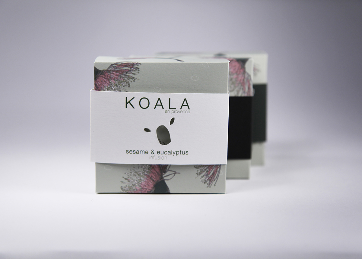
Soapboxes, Fall 2012.
For this project, we had to incorporate select imagery into our own designs. Merging "sesame" and "eucalyptus" imagery, I settled on this design that highlights the elegance of the eucalyptus flower, but also adding a bit of playfulness with the koala cutout on the band. A color system for the band was created to add variety and interest.
For this project, we had to incorporate select imagery into our own designs. Merging "sesame" and "eucalyptus" imagery, I settled on this design that highlights the elegance of the eucalyptus flower, but also adding a bit of playfulness with the koala cutout on the band. A color system for the band was created to add variety and interest.
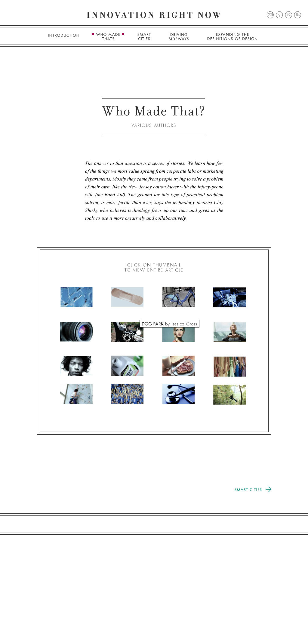
Website layout, Fall 2013.
Using content provided from our instructor, our task was to set it in the style of a navigable website. I wanted to make the reading experience as seamless as possible for the reader, and to use whitespace in an interesting way. The middle section on "Who Made That" features about 16 smaller articles, each of which could be accessed from the main thumbnail grid.
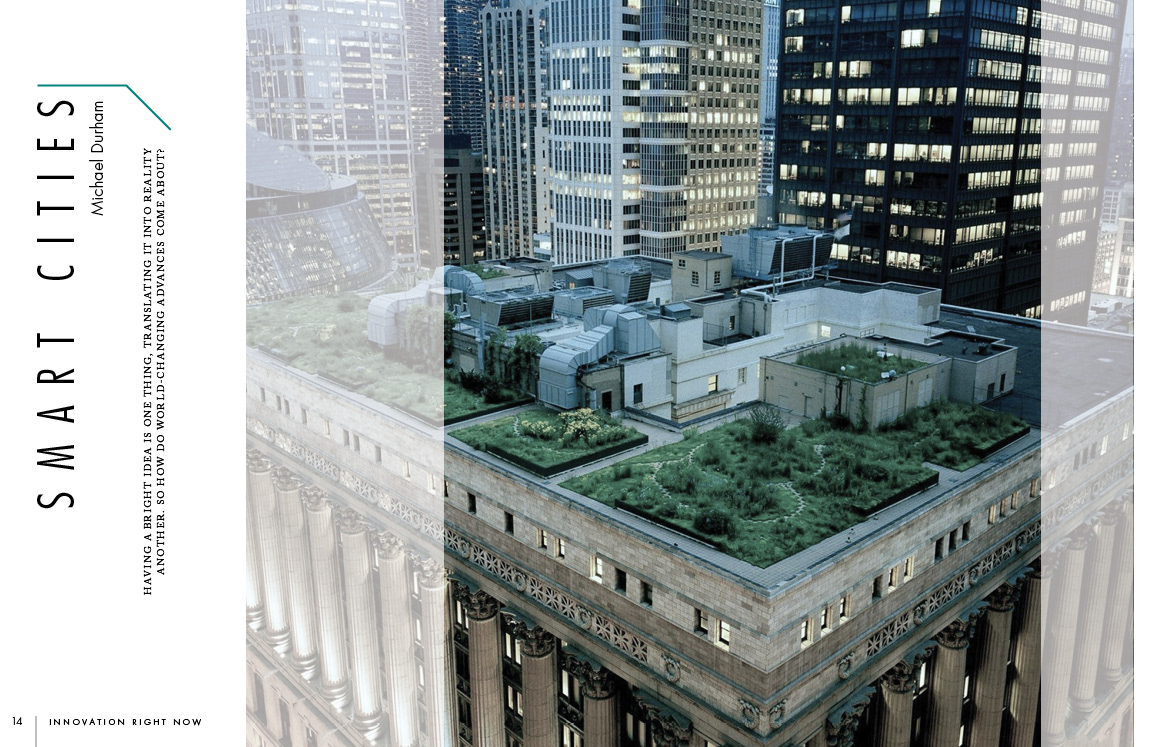
Magazine spread layout, Fall 2013.
Taking the same article from the previous project, our challenge was to design a magazine iinspired layout that would utilize text in combination with imagery. The challenge for me here was to maintain a sense of consistency, but not so much so that the reader would get bored.

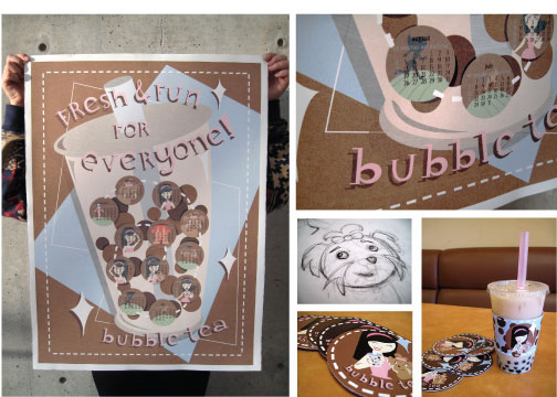
Calendar Poster, Spring 2012.
Bubble Tea is a refreshing sweet drink with origins from Taiwan. I decided to add some retro American flair into the mix and came up with this fun and friendly 18x24" calendar poster. Using inspiration from our family dog, I wove a narrative into each month, starring Coco the Yorkie. Drink bands and coasters add an overall sense of whimsy to the brand design.
Final poster, 18x24".

Newspaper Redesign, Spring 2014
As part of our Publication class we had to redesign the outdated Baltimore Sun frontpage. As with all projects, design first begins with a list of requirements, and layout sketches. The innovation of this design centers around the fact that when folded, the newspaper fits easily inside a laptop bag, protecting it from environmental damage. I enjoy thinking about the product in its entirety, as well as focussing in on the little details.

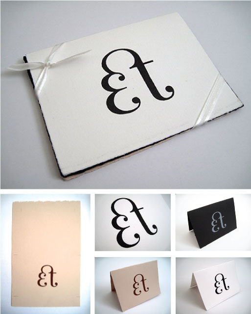
Monogram greeting cards, Fall 2013
Combining skills from both Lettering and Screen Printing classes, I made these greeting cards as a personal side project. After finalizing my initials on paper, I screen printed these cards on different toned paper. The final package includes a set of 3 cards, one in each color. It is finished off with an elegant ribbon.
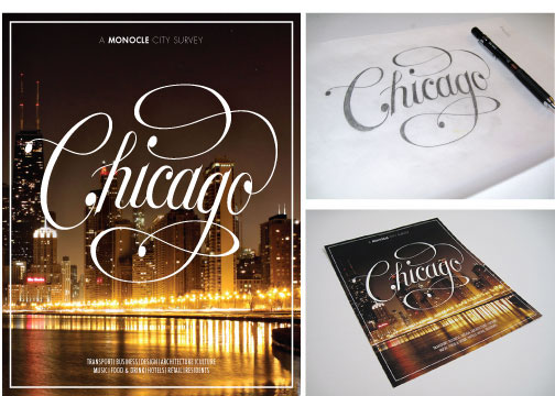
Hand-lettering for Monocle magazine, Fall 2013.
Working closely throughout the semester with Ken Barber of House Industries, this project showcased the hand-lettering process that was emphasized by the instructor. The lettering demonstrates my understanding of individual letter mass (or "color") but I also learned that it's important to make them all work together as a whole. The resulting mark evoked a sense of classiness and sophistication that is reminiscent of the historical city of Chicago.
Working closely throughout the semester with Ken Barber of House Industries, this project showcased the hand-lettering process that was emphasized by the instructor. The lettering demonstrates my understanding of individual letter mass (or "color") but I also learned that it's important to make them all work together as a whole. The resulting mark evoked a sense of classiness and sophistication that is reminiscent of the historical city of Chicago.

Beer label, Spring 2014
For our flex design class we focussed on creating a typeface out of found lettering. I chose an ancient blackletter piece, and create an alphabet (plus numerals). After vectorizing them in Illustrator, I printed a menu and labels on handmade Japanese paper.


