


About
The entire idea started as a wish to participate in the 36 days of type. A couple of months before, I started learning 3D, so I thought a project like this could be a good practice. I wanted to make reusable letters, and this factor later became a decent challenge.
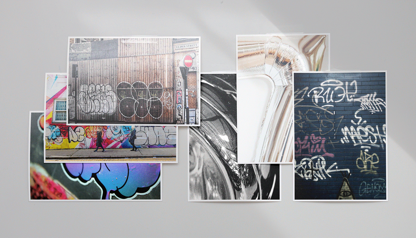
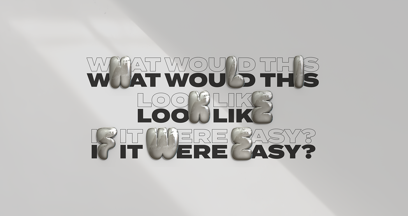
The entire style is inspired by a throw-up graffiti form. Simple but still effective. While I continued experimenting with hard surface modelling, I always learned something new. Again it opened a rabbit hole of perfectionism until it drained me a lot.


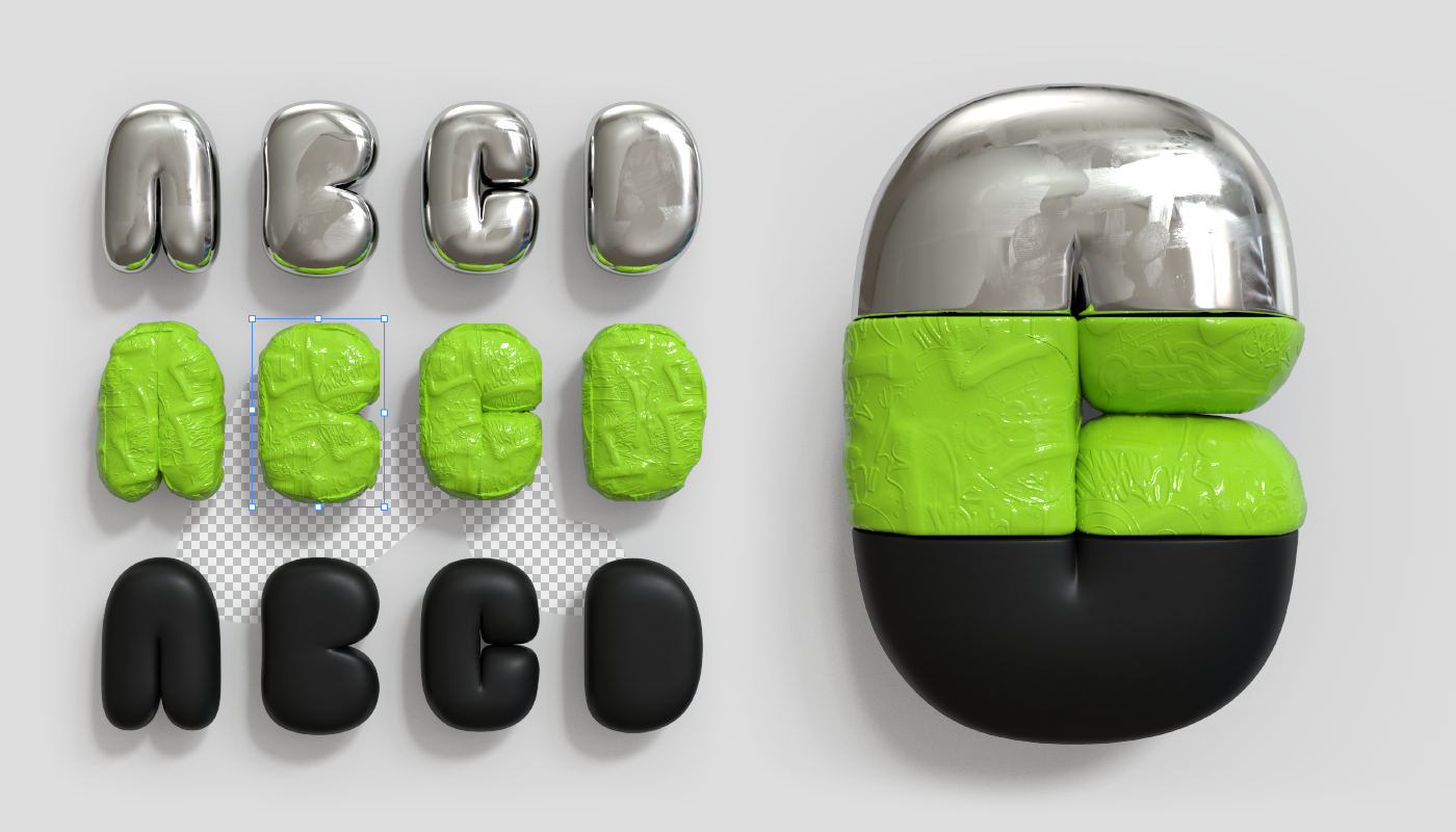
Characters
For now there are just uppercase letters without numbers and punctuations.
They can be used in 3D software as well as in any 2D graphic software of choice.
They can be used in 3D software as well as in any 2D graphic software of choice.


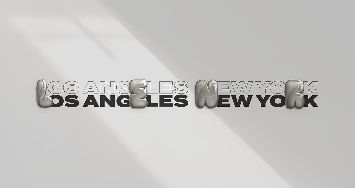
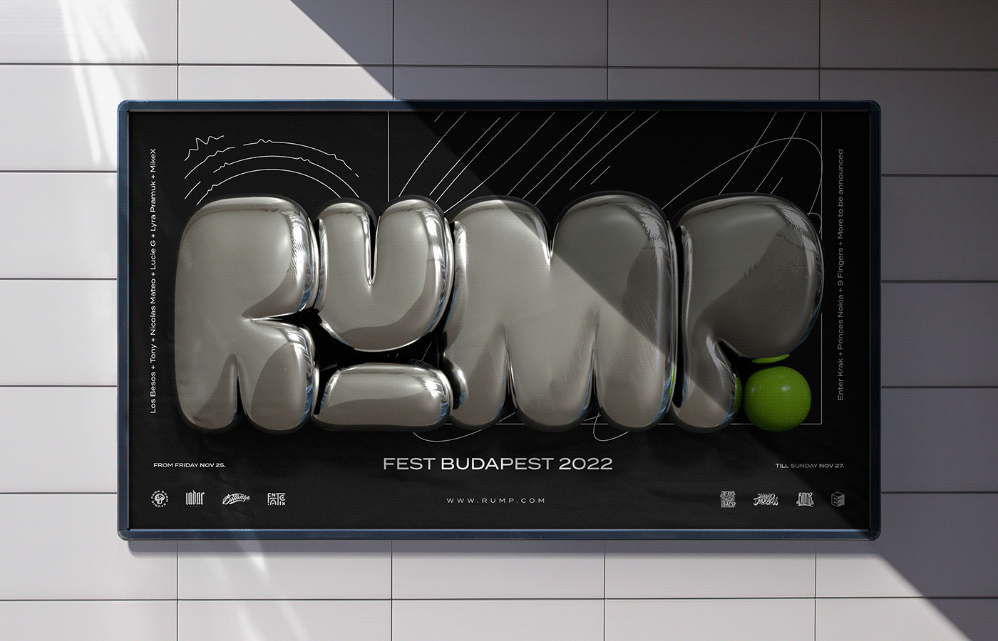
Usage
To be sure they can work together I continued experimenting and combining them between them selfs as well as with other flat elements.


Thanks for watching! ✌️
If you like it, help others finding it.
For work in progress, follow me on Instagram @petar.acanski
To download go to www.acanski.co
All Works Copyright © 2024 Petar Acanski


