WE ARE ROOI
PACKAGE DESIGN
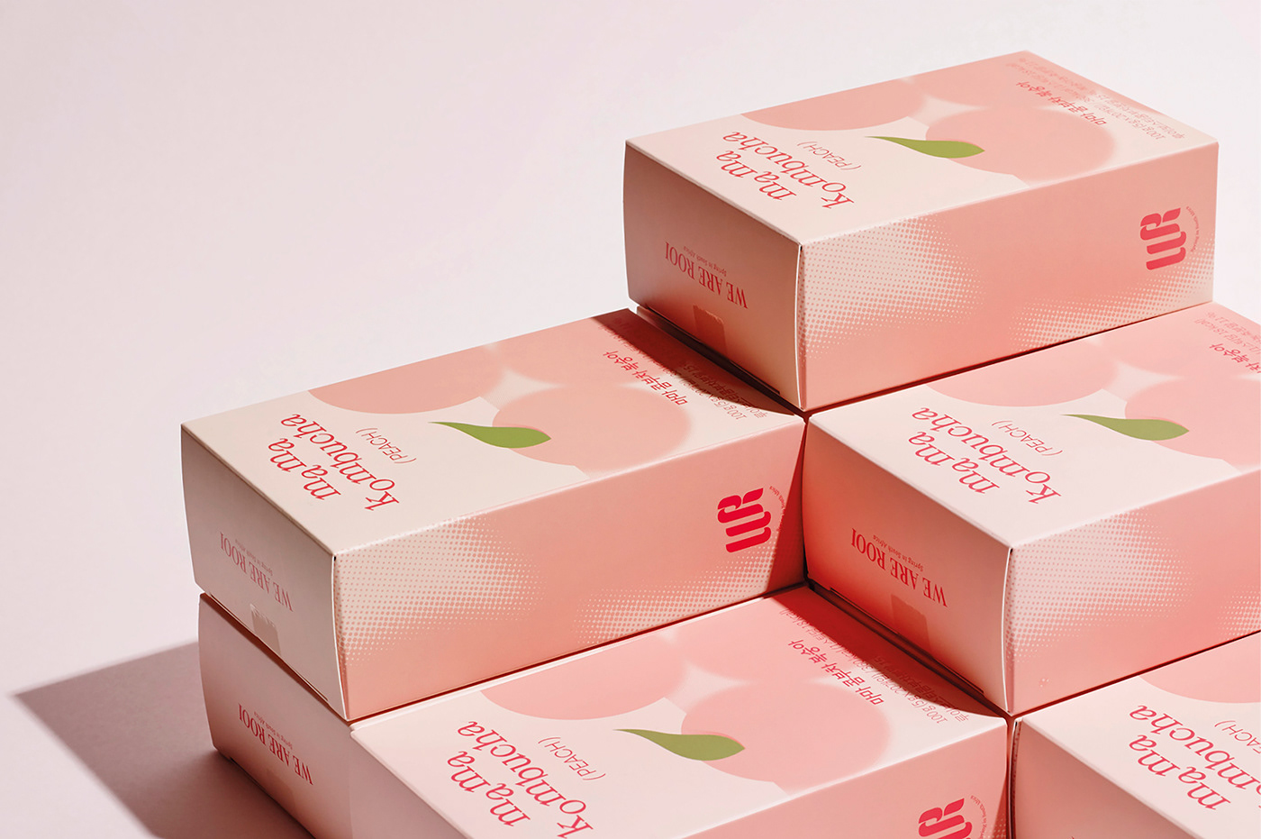
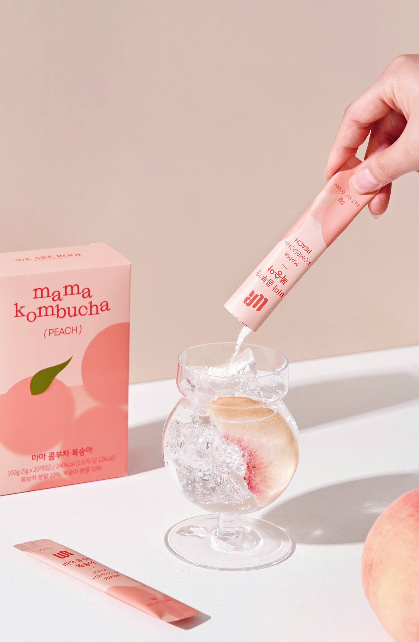
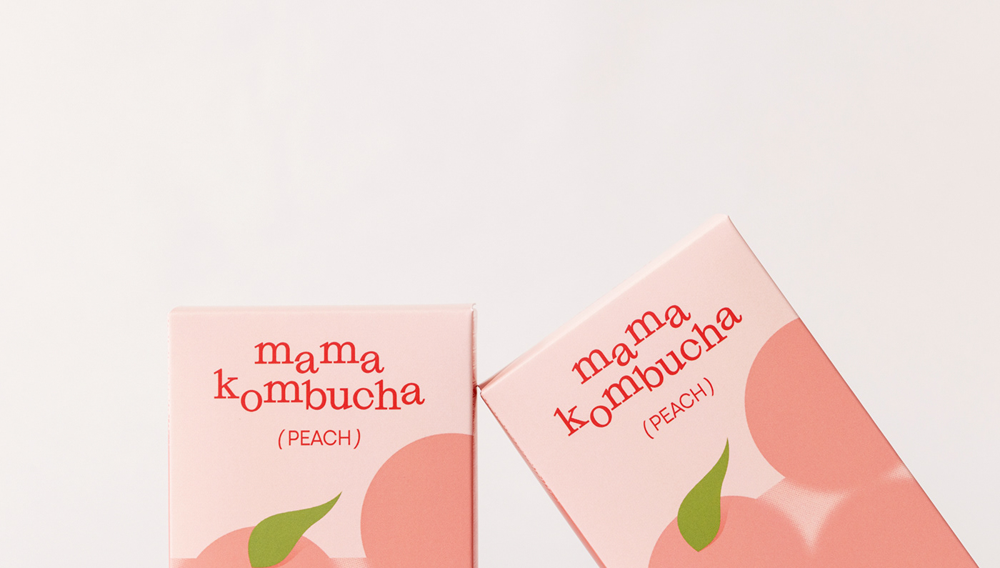
This is the package design for “We Are Rooi”, which involved two products, the new “Mama Kombucha” and
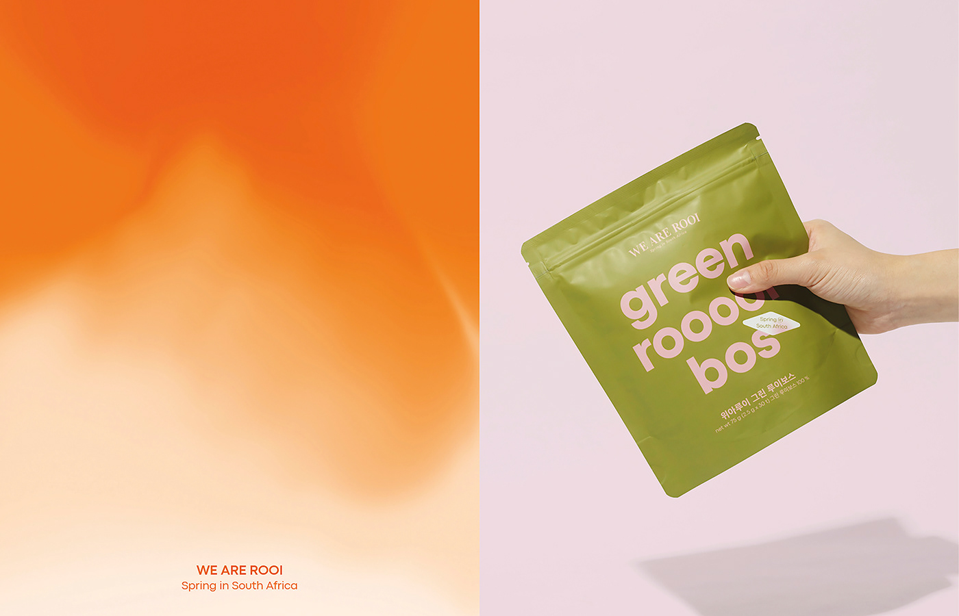
the second redesign for the brand’s flagship product, “Rooibos tea”. HEAZ revitalized the traditionally warm and
calm brand identity with a focus on vivid colors and a variety of typefaces to portray a more lively and youthful impression.
“Mama Kombucha” features a graphic of the sweetness of peaches immersed in refreshing carbonation,
juxtaposed with typography in an alternating configuration to express light movements as if floating in water.
We used a bold font and contrasting colors for the renewed design of their Rooibos teabag packaging for a clean look that also grabs the attention.
A sticker informs the consumer the main Rooibos ingredient was freshly produced and imported from South Africa,
while the gradation effect was inspired by a deeply steeped teabag.
Client. WE ARE ROOI
Location. South Korea
Year. 2023
Art Director. Saerom Lee
Designer. Swan Lee, Hyemin Jo, Yeaji jung
Photographer. Junghun Yeom