DeeBee’s Organics creates delicious, all-natural freezer pops & frozen treats. With a rapidly growing company and ever expanding product line, they were in need of a brand identity refresh that future proofed them for the next era in consumer packaged goods.
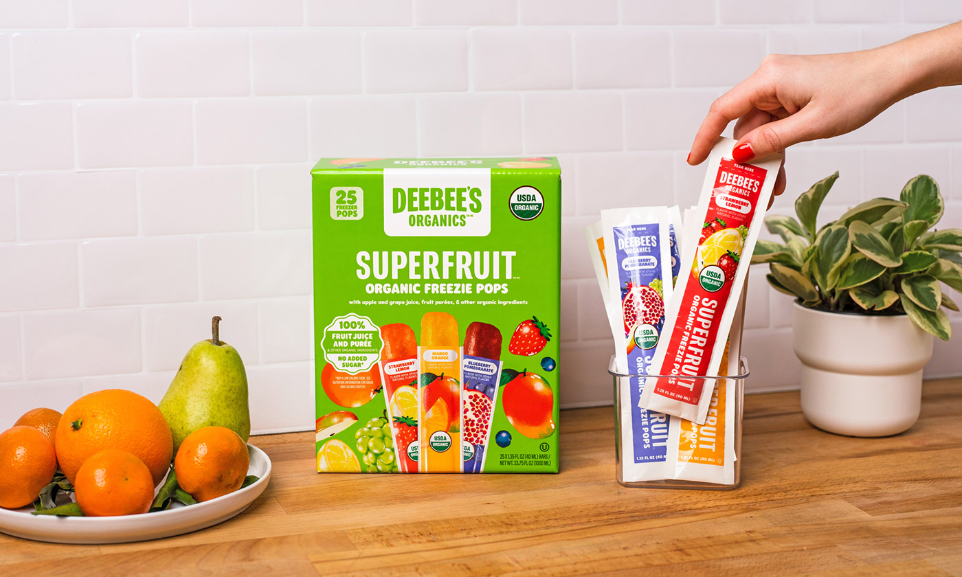
While they wanted a refresh, there were a few brand elements they felt held some equity and didn’t want to stray too far from. Those pieces were the word mark, and the pouch packaging for their marquee product, the Superfruit Freezie. In the end, we gave the word mark a very light refresh, simplifying it and making it much more scalable and useful across different mediums.
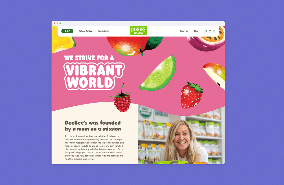
Outside of those two pieces, everything was up for discussion. We worked with their internal team to overhaul just about everything else; brand story, the visual identity, packaging, illustrations, website, and just about everything in between.


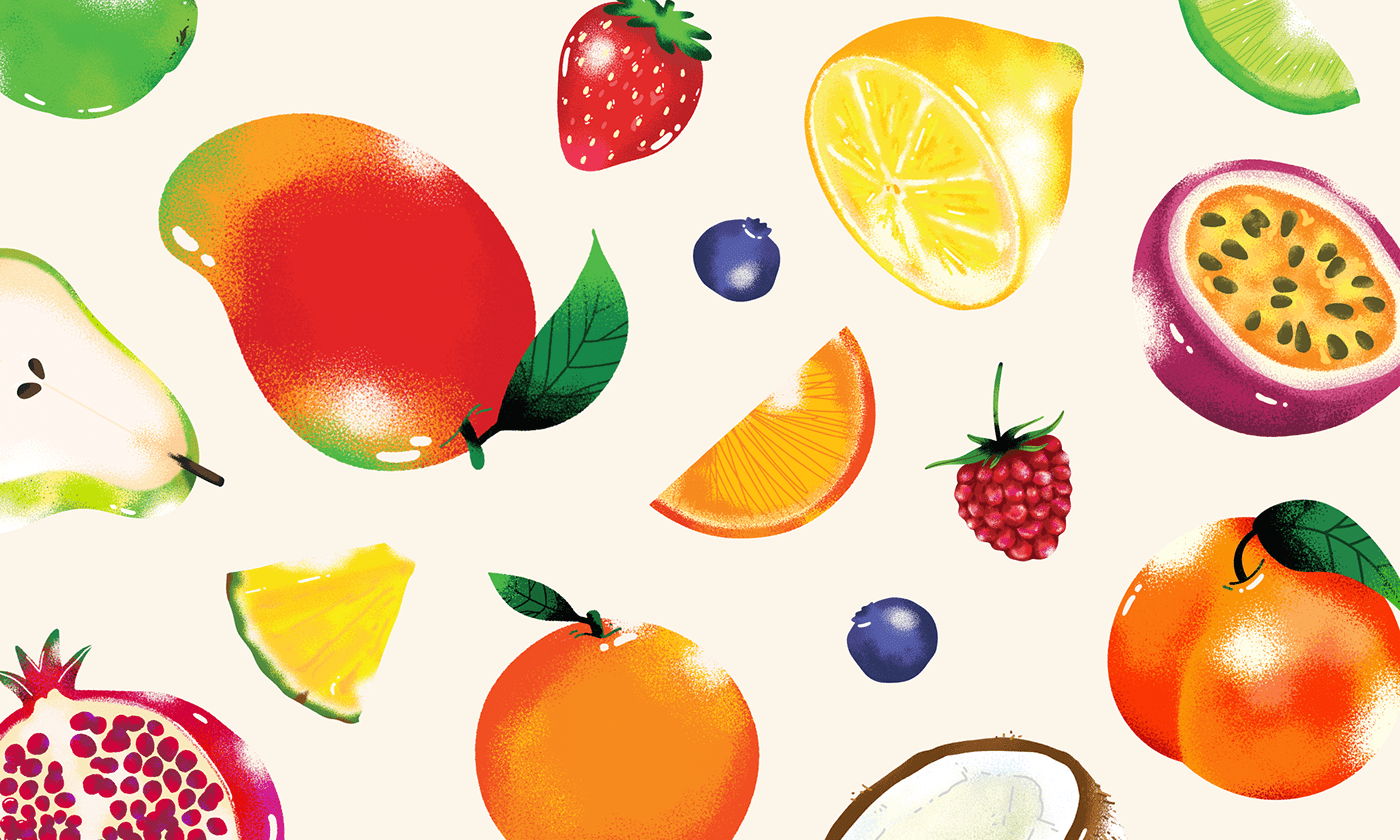
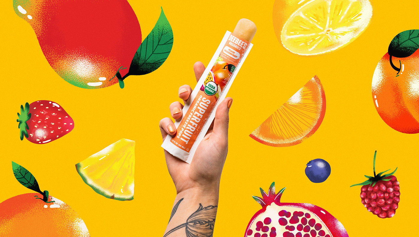
One major asset that was causing DeeBee’s trouble with their previous brand was the reliance on stock fruit photography. It was boring, felt expected for a grocery store brand, and was not very proprietary.
With the refresh, we pivoted to using illustrations instead of photographs for the fruit that appears throughout the brand. These illustrations were bespoke to their offering, flexible in their usage on just about everything, and the overall library is able to be expanded upon as the brand continues to grow.
Paired with a rainbow of punchy colours, and typography that felt more representative of their messaging, DeeBee’s started to come together in a whole new light.