Habibi is an ever-growing art project within Web3, started by the one and only Mark The Habibi. This all began with one word, Habibi. Habibi means so many things. It’s a word exchanged between passionate lovers, and it’s a word exchanged between caring friends. Simply put, it means “dearest” or “darling”. But that’s really selling it short.
It’s hard to explain just how deep the word Habibi goes. Habibis is Mark’s way of explaining it through art and community. Mark came to us to work alongside him to create a fresh, fun visual identity that reflected everything that Habibi’s are, and everything they can be.


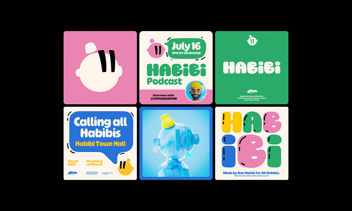
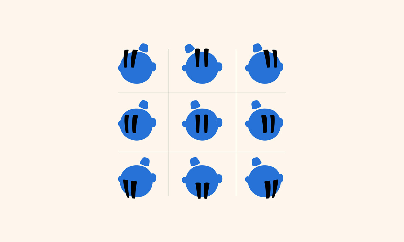
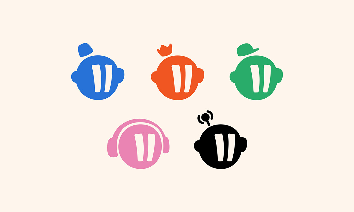
Probably the most integral part of the Habibi brand is the silhouette of the character, used as a base for all things. Instead of being purely static, we wanted to bring a sense of life and motion to the icon. Another important consideration was how this might scale with the Habibi as the “sub-brands” continued to grow and expand.
This was an opportunity to create a fun system to grow the Habibi brand in a way that did not dilute the primary logo while playing off the generative nature of some of the collections. We reworked the Habibi head into a dynamic logo system that can adapt to the placement, usage, and offering within the brand.


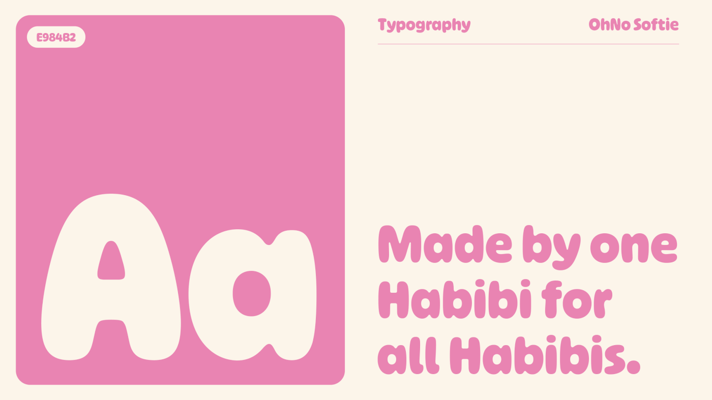
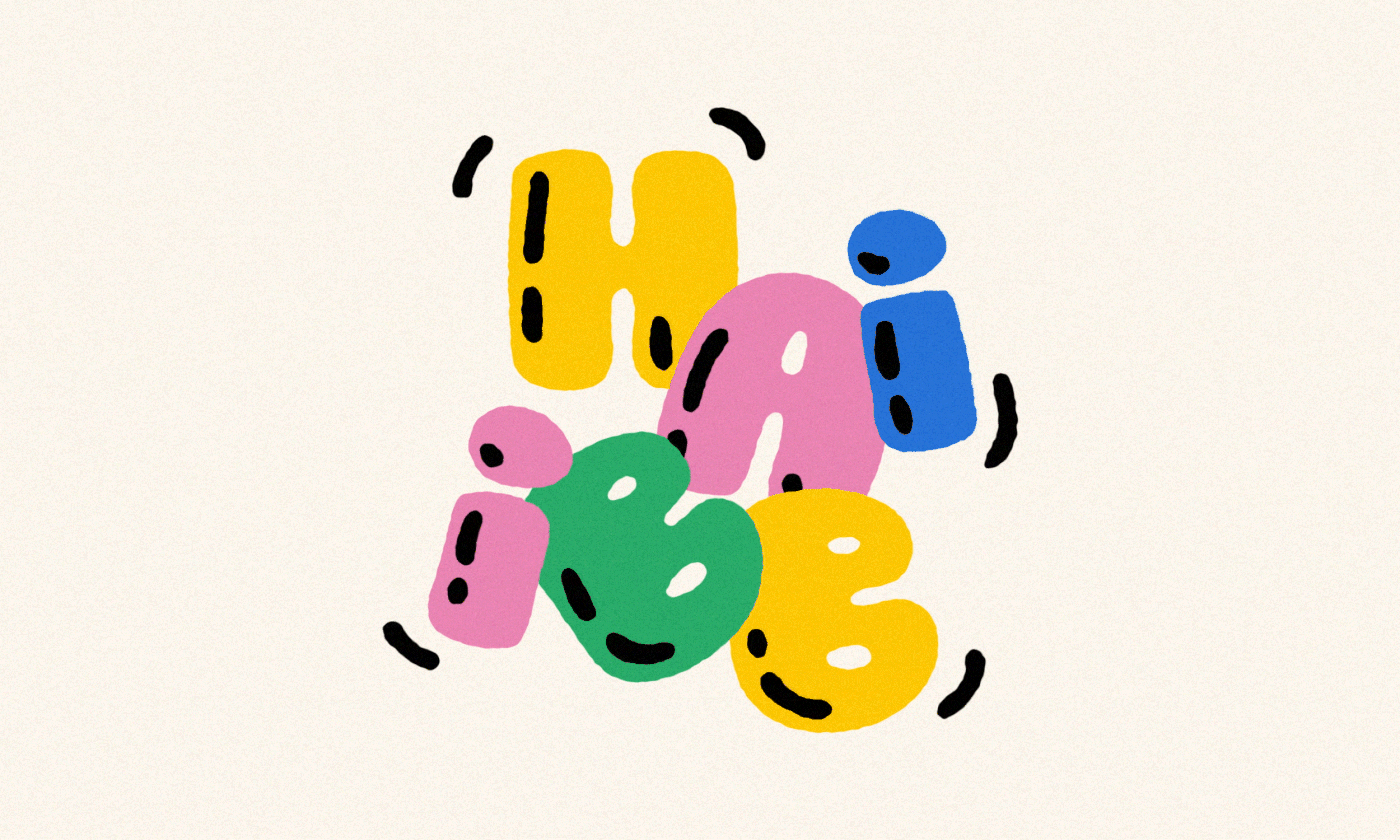
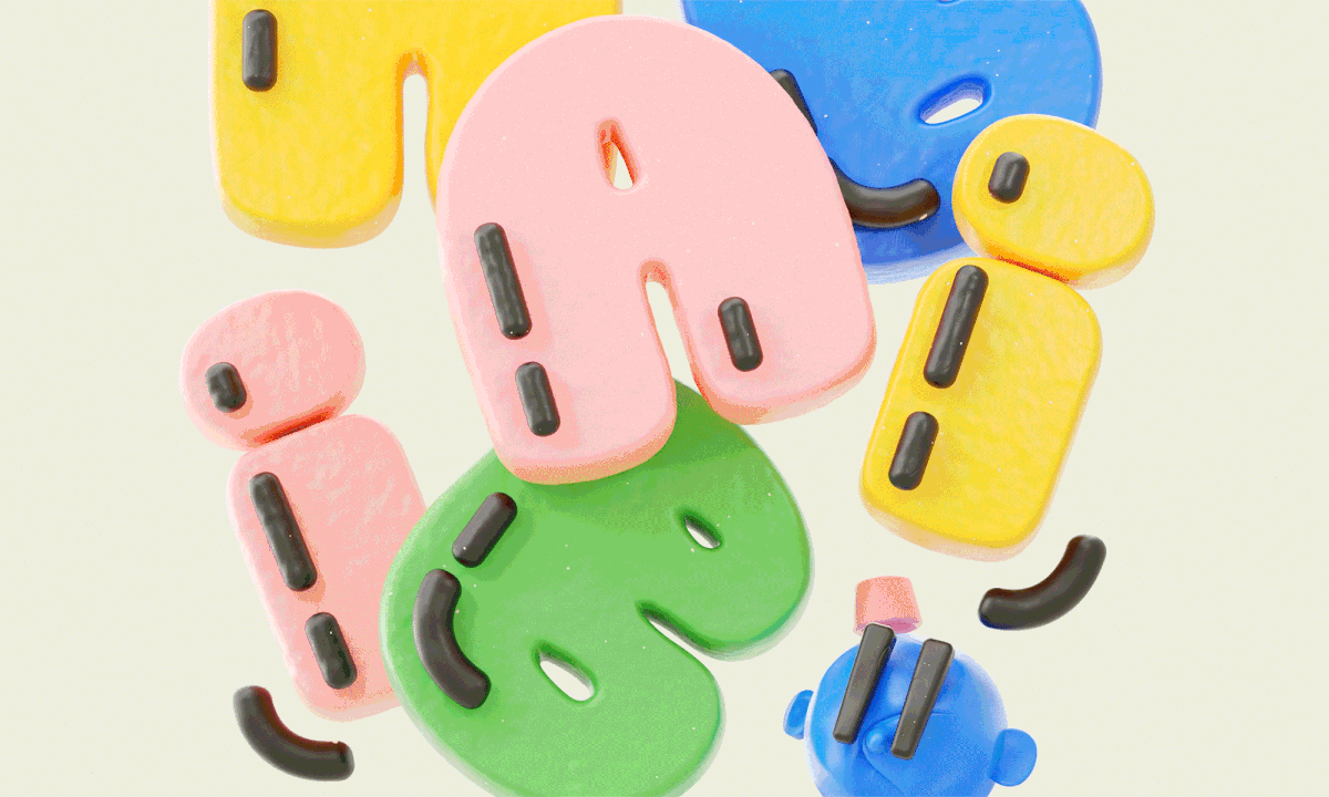
For typography, we worked with the wonderful Softie by OH no Type Company. This felt like a natural expression of the often playful and approachable voice that the Habibi brand holds. Paired with bright, welcoming colours that reflect the community behind Habibis, everything started coming together.
With all the key brand elements in place, we continued to build out a brand system that was friendly and fun, yet could adapt to the always-changing needs of a brand in the Web3 space. It was an honor to work alongside Mark The Habibi,and we’re excited for what the future holds!