


Daily Spoon is a Lithuanian superfood brand that offers various natural products to help you achieve a magical daily routine and feel much better!
Situation
Everything begins in our gut – from overall well-being to radiant skin and even our mood. We envisioned a product that could lay a foundation for our microbiome to flourish, using only the finest ingredients. We left out any unnecessary additives, focusing solely on what our gut needs to thrive. If we talk about the design, we aimed for a clean and reliable look, while avoiding a cold, clinical appearance.


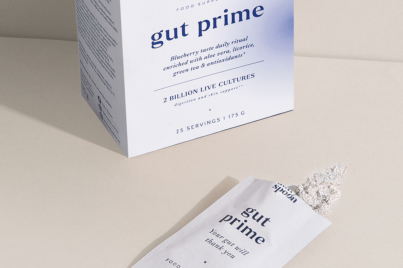
Solution
We wanted to create a design that looks great in your kitchen or bag, while also being reliable and approachable, unlike other supplements. Our goal is to provide a comfortable box opening that makes it easy to access and reuse our product. For the main design, we opted for a clean and minimalistic look, without cluttered elements or illustrations. We believe that a reliable design is one that is easy to read and understand, without hiding anything.Therefore, Gut Prime employs different font sizes and compositions to achieve a simple yet effective design. But there was something else that I needed - a gradient circle that would add a finishing touch to the overall composition and give a more dynamic and vibrant feel to the packaging design.
We wanted to create a design that looks great in your kitchen or bag, while also being reliable and approachable, unlike other supplements. Our goal is to provide a comfortable box opening that makes it easy to access and reuse our product. For the main design, we opted for a clean and minimalistic look, without cluttered elements or illustrations. We believe that a reliable design is one that is easy to read and understand, without hiding anything.Therefore, Gut Prime employs different font sizes and compositions to achieve a simple yet effective design. But there was something else that I needed - a gradient circle that would add a finishing touch to the overall composition and give a more dynamic and vibrant feel to the packaging design.
Try it & Your gut will thank you!
Client: MB "Daily Spoon"
Art direction & Graphic design: Gintarė Marcinkevičienė
Product photoshoot: Monika Paukštė, Monika Rukaitė

