
Visual Identity and Packaging Design for Amira Shawarma
CLIENT: AMIRA SHAWARMA
YEAR: 2019
SERVICES: BRAND IDENTITY DESIGN | PACKAGING DESIGN
SHOOTING: ALAN MIGUEL | PAULA PAZ
AGENCY: VINTEOITO
Overview:
Amira Shawarma is an innovative and distinctive Arabic fast-food-style restaurant based in Pelotas - Brazil. Their goal is to provide a unique gastronomic experience that combines authentic Arabic flavors with a Brazilian twist. With aspirations of becoming a successful franchise, they recognized the need for a strong and consistent visual identity that would captivate our target audience and differentiate them in the market.
Challenges and Objectives:
In a highly competitive industry, the primary challenge was to stand out in the crowded food market. The objective was to create a visual identity that reflected its innovative proposition and appealed to a young and food-savvy target audience. We aimed to establish an emotional connection with the customers, differentiate from the competition, and build a memorable brand.
PT
Visão Geral:
A Amira Shawarma é um restaurante inovador e distintivo, no estilo fast-food árabe, com base em Pelotas - Brasil. Seu objetivo é proporcionar uma experiência gastronômica única que combina sabores autênticos árabes com um toque brasileiro. Com aspirações de se tornar uma franquia de sucesso, eles reconheceram a necessidade de uma identidade visual forte e consistente que cativasse nosso público-alvo e os diferenciasse no mercado.
Desafios e Objetivos:
Em uma indústria altamente competitiva, o principal desafio era se destacar no mercado de alimentos lotado. O objetivo era criar uma identidade visual que refletisse sua proposta inovadora e atraísse um público-alvo jovem e aficionado por comida. Almejamos estabelecer uma conexão emocional com os clientes, nos diferenciar da concorrência e construir uma marca memorável.


Creative Process:
The creative process employed a combination of design thinking and strategic marketing. We conducted a thorough analysis of our brand, target audience, and gastronomic proposition. This research, combined with market analysis, enabled us to identify key differentiators and opportunities for our visual identity.
The chosen color palette for our visual identity, consisting of vibrant shades of pink and red, set them apart from the competition. By deviating from the traditional color schemes typically associated with Arabic cuisine, we aimed to catch the attention of passersby and create a lasting impression.
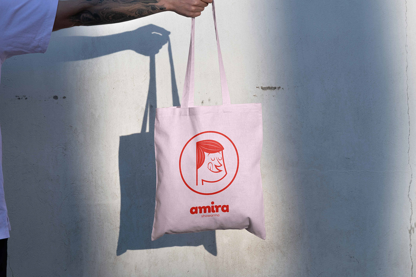
The logo design, a crucial aspect of Amira's brand identity, was meticulously crafted with rounded shapes and a bold weight. This visually striking logo reflects the commitment to quality and captures the essence of our brand. It embodies the brand's core attributes, including delicious shawarma and a vibrant dining experience.
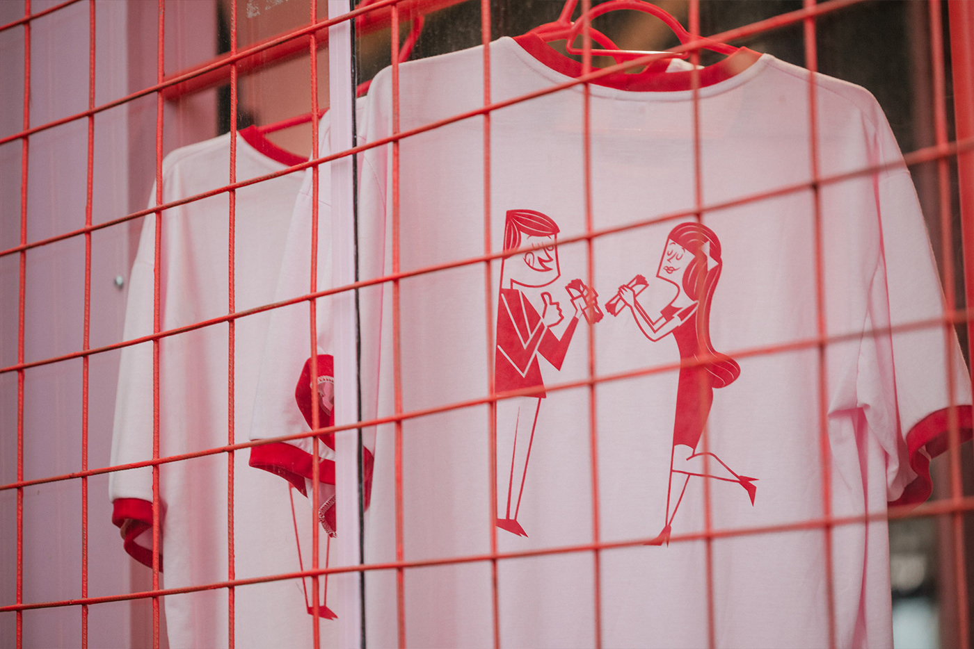
To humanize the brand and foster a deeper connection with its customers, we developed two retro-style character illustrations—a male and a female—that embody our friendly and inviting personality. These characters, reminiscent of the golden age of food culture, become our brand ambassadors, representing the joyful and flavorful experience of dining at Amira Shawarma Restaurant. They are featured across our packaging design and communication materials, further strengthening our brand identity.
PT
Processo Criativo:
O processo criativo empregou uma combinação de pensamento de design e marketing estratégico. Realizamos uma análise detalhada de nossa marca, público-alvo e proposta gastronômica. Essa pesquisa, combinada com análise de mercado, nos permitiu identificar diferenciais importantes e oportunidades para nossa identidade visual.
A paleta de cores escolhida para nossa identidade visual, composta por tons vibrantes de rosa e vermelho, nos diferenciou da concorrência. Ao desviar dos esquemas de cores tradicionais geralmente associados à culinária árabe, nosso objetivo era chamar a atenção das pessoas que passam e criar uma impressão duradoura.
O design do logotipo, um aspecto crucial da identidade de marca da Amira, foi meticulosamente criado com formas arredondadas e peso ousado. Esse logotipo visualmente impactante reflete o compromisso com a qualidade e captura a essência de nossa marca. Ele incorpora os atributos principais da marca, incluindo o delicioso shawarma e uma experiência de jantar vibrante.
Para humanizar a marca e promover uma conexão mais profunda com os clientes, desenvolvemos duas ilustrações de personagens no estilo retrô - um masculino e um feminino - que incorporam nossa personalidade amigável e acolhedora. Esses personagens, que lembram a era dourada da cultura gastronômica, se tornam nossos embaixadores de marca, representando a experiência alegre e saborosa de jantar no Restaurante Amira Shawarma. Eles são apresentados em nosso design de embalagem e materiais de comunicação, fortalecendo ainda mais nossa identidade de marca.


Results Achieved and Impact:
Our visual identity has been instrumental in Amira's success as a food business. The vibrant pink and red color palette, inspired by the fusion of Arabic and Brazilian flavors, not only differentiates the brand from competitors but also evokes a sense of excitement and adventure. This unique color scheme enhances our visibility and entices potential customers searching for a memorable dining experience.
Our logo design, with its rounded shapes and bold typography, captures the essence of our brand and facilitates instant recognition.
The retro-style character illustrations have humanized the brand and established an emotional connection with customers. We've successfully conveyed the brand's friendly personality through these characters, resonating particularly well with our young target audience.
The seamless replication of our visual identity across all touchpoints, including packaging, point-of-sale materials, and communication channels, has solidified the brand presence and messaging. This consistency has helped Amira Shawarma effectively position itself as a unique and memorable brand.
By implementing a comprehensive branding strategy and leveraging visual identity, we've successfully attracted customers and garnered positive attention in the market. Our commitment to exceptional restaurant design and a distinct visual identity has helped Amira to establish a strong foothold in the competitive food industry.
PT
Resultados Alcançados e Impacto:
Nossa identidade visual tem sido fundamental para o sucesso da Amira como negócio de alimentos. A paleta de cores vibrante em tons de rosa e vermelho, inspirada na fusão de sabores árabes e brasileiros, não apenas diferencia a marca dos concorrentes, mas também evoca uma sensação de empolgação e aventura. Esse esquema de cores único melhora nossa visibilidade e atrai potenciais clientes em busca de uma experiência gastronômica memorável.
O design do nosso logotipo, com suas formas arredondadas e tipografia em negrito, captura a essência da nossa marca e facilita o reconhecimento instantâneo.
As ilustrações de personagens no estilo retrô humanizaram a marca e estabeleceram uma conexão emocional com os clientes. Conseguimos transmitir com sucesso a personalidade amigável da marca por meio desses personagens, o que ressoa especialmente bem com nosso público-alvo jovem.
A replicação perfeita de nossa identidade visual em todos os pontos de contato, incluindo embalagens, materiais de ponto de venda e canais de comunicação, solidificou a presença e a mensagem da marca. Essa consistência ajudou a Amira Shawarma a se posicionar de forma eficaz como uma marca única e memorável.
Ao implementar uma estratégia abrangente de branding e aproveitar a identidade visual, conseguimos atrair clientes e conquistar uma atenção positiva no mercado. Nosso compromisso com o design excepcional do restaurante e uma identidade visual distinta ajudou a Amira a estabelecer uma posição sólida na competitiva indústria de alimentos.


In conclusion, the visual identity and branding efforts of Amira Shawarma have played a pivotal role in its success. Our logo design, graphic elements, and retro-style character illustrations have effectively communicated our brand's personality and values, enabling the brand to carve out a niche and position it as a standout player in the food scene.
PT
Em conclusão, a identidade visual e os esforços de branding da Amira Shawarma desempenharam um papel fundamental em seu sucesso. Nosso design de logotipo, elementos gráficos e ilustrações de personagens no estilo retrô comunicaram de forma eficaz a personalidade e os valores da nossa marca, permitindo que ela se destacasse e se posicionasse como um destaque no cenário gastronômico.