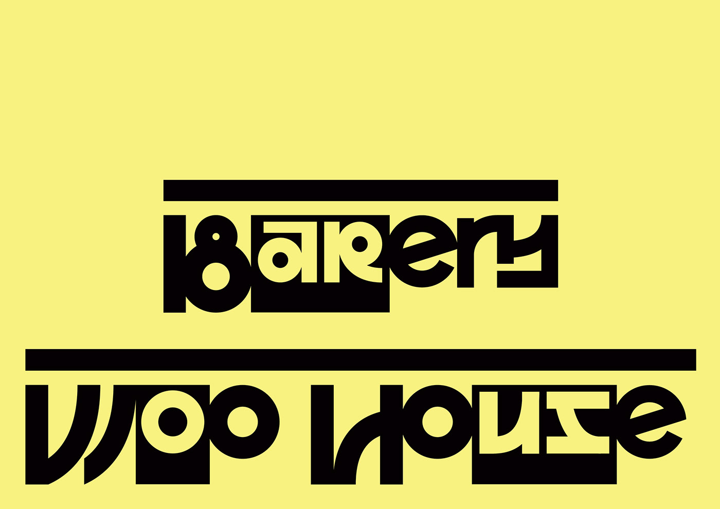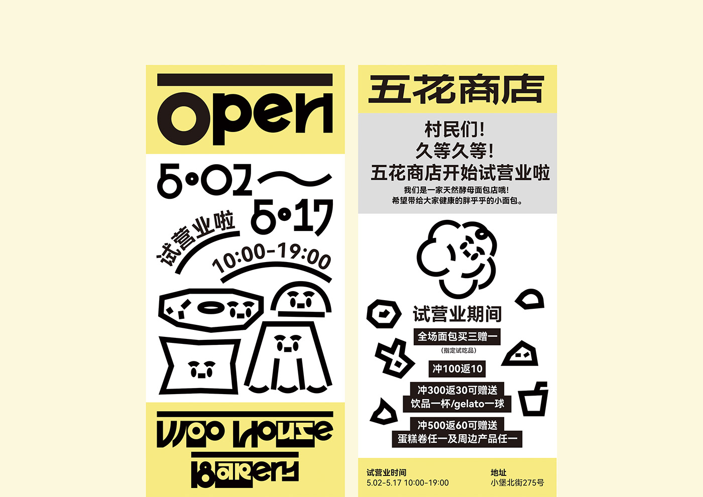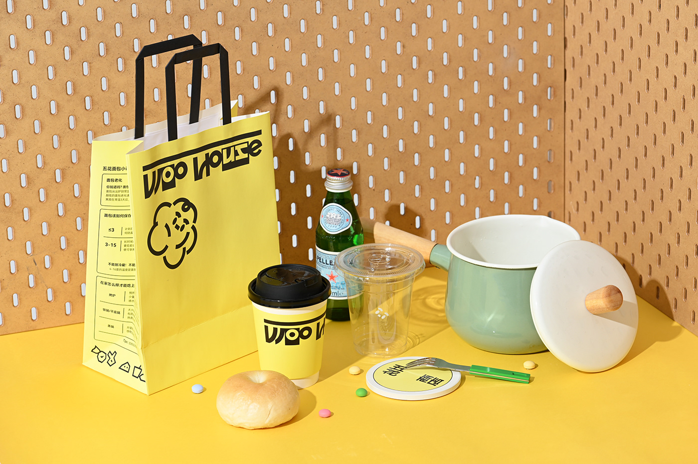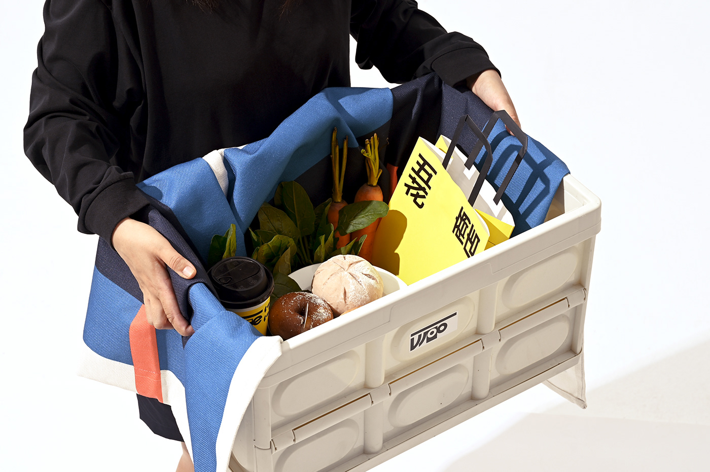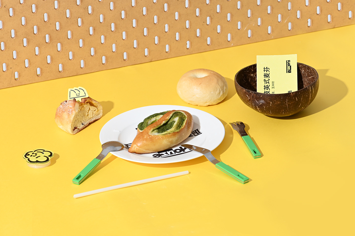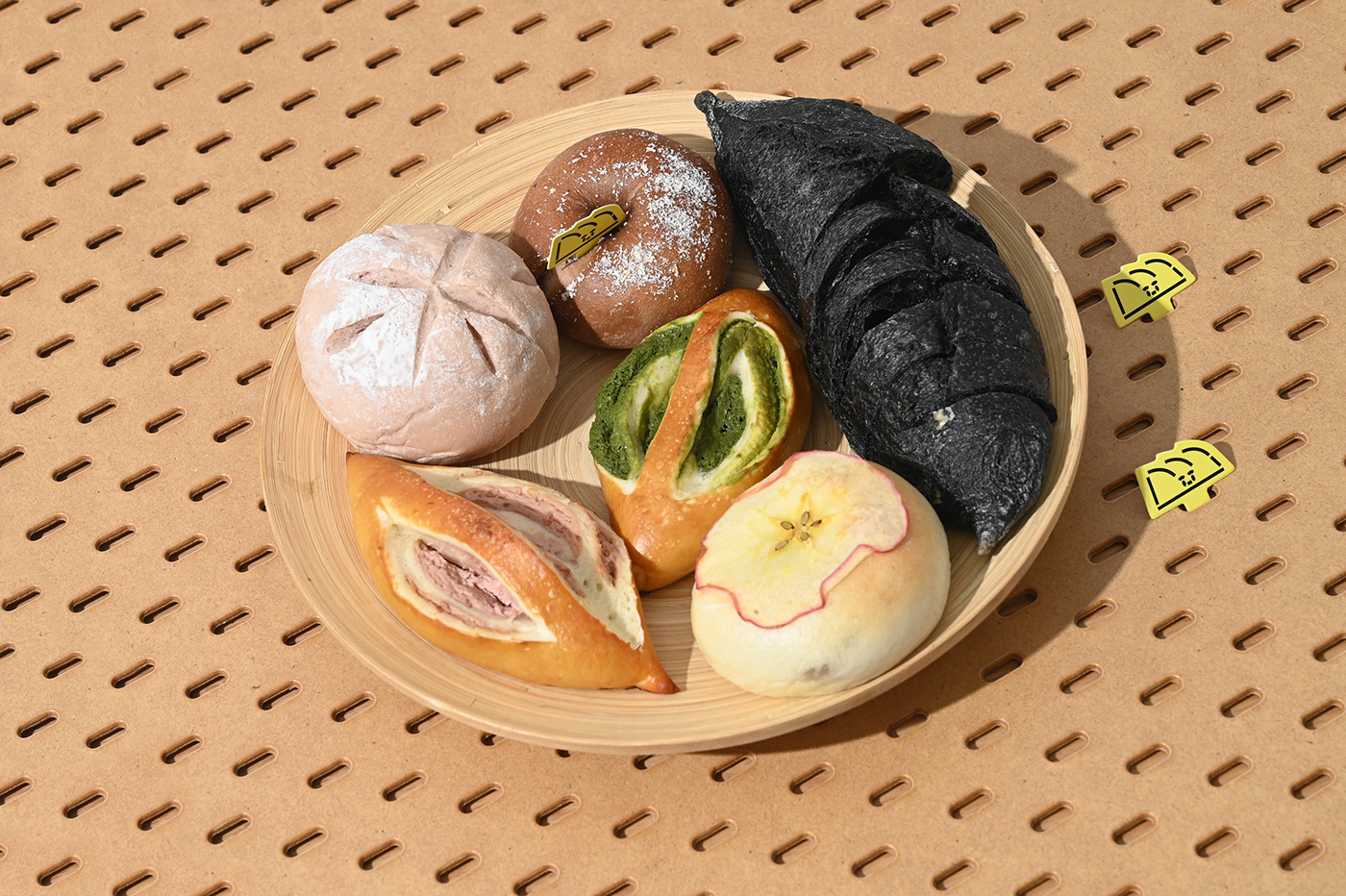


五花商店 Woo House
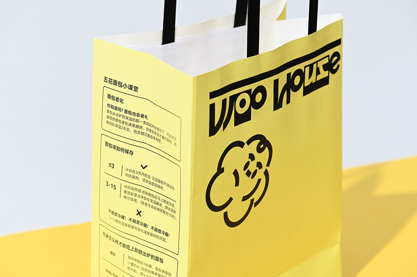
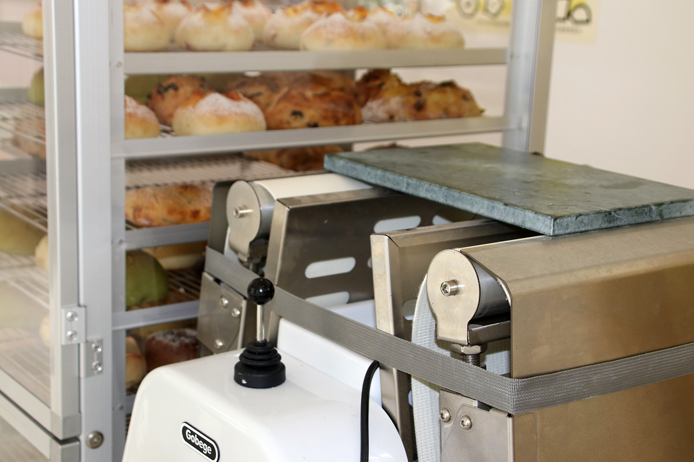
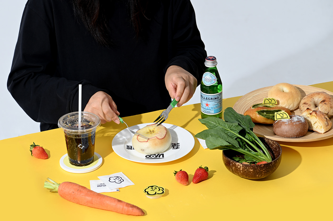
五花商店是一家以使用天然鲁邦酵种为特点的现烤面包店,由发酵中的面团而取名。天然鲁邦酵种不断冒出活力感泡泡,赋予面包Q弹的内芯,微酸的风味以及更朴实的麦香。
Woo House is a freshly baked bakery featuring the use of natural sour dough. It is named after the dough in fermentation. The chubby dough is like pork belly, and the baked bread is like crispy pork belly.The natural sour dough constantly emits energetic bubbles, giving the bread a springy core, a slightly sour flavor and a more earthy wheat aroma.
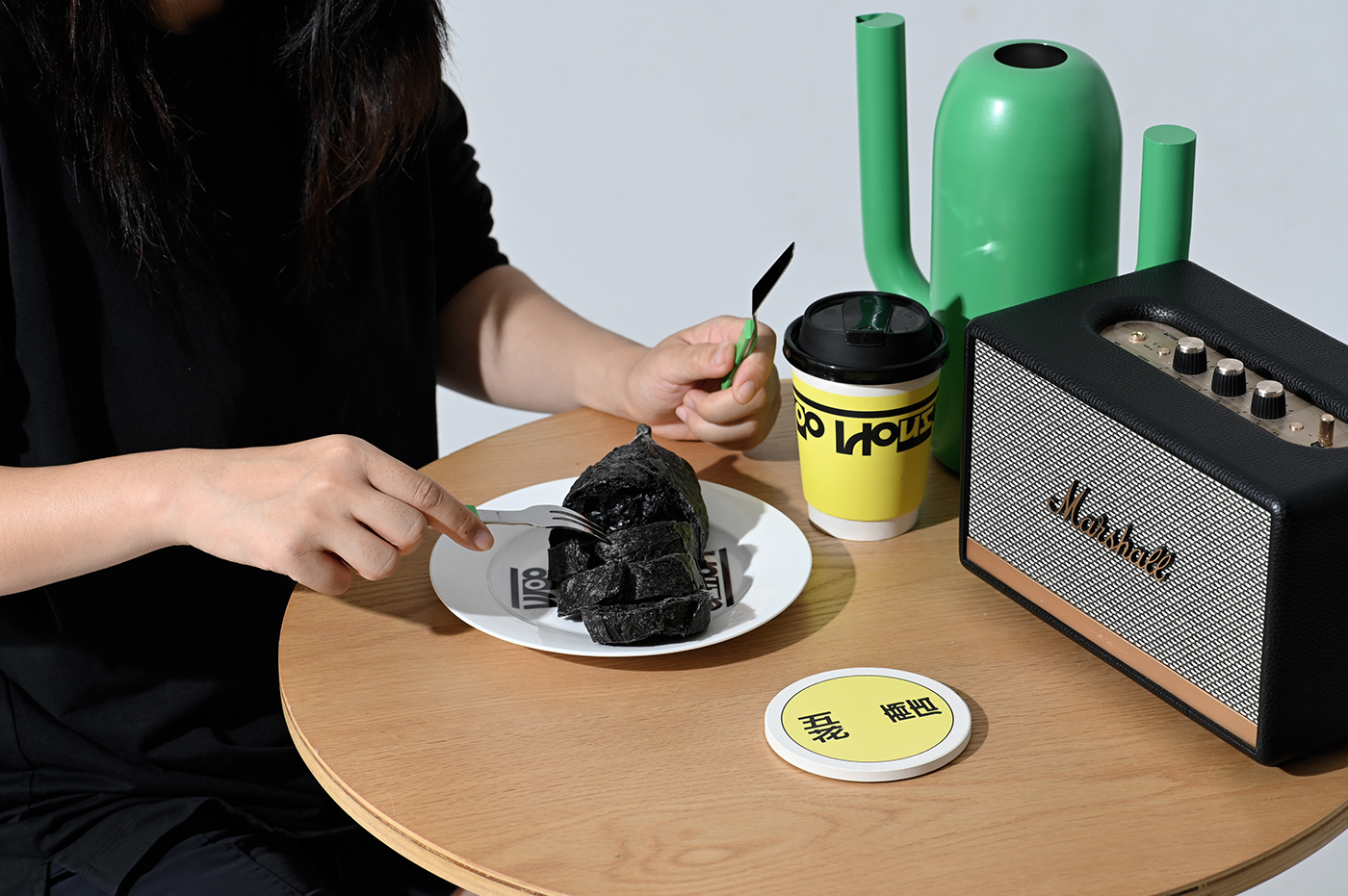
品牌设计时建立了一系列以圆为基础的设计语言,来赋予品牌视觉上的膨胀感,我们在设计时希望将天然酵种的活力感从宣传文字转化为顾客可以看到的直观形象,设计了有生命的小面团形象,小面团设计大量使用圆弧曲线,并具有简洁有识别力的五官形象,形成一个高识别度的符号大量使用,使面包品牌在烘焙市场上快速建立自有识别度。
A series of design languages based on circles were established to give the brand a sense of visual expansion. We hope to transform the vitality of natural yeast from promotional text into an intuitive image that customers can see. We create a small living dough mascot, the small dough mascot design uses a large number of arc curves, and has a concise and recognizable facial features image, forming a highly recognizable symbol that is widely used, enabling the brand to quickly establish its own recognition in the baking market.