Nourand
Crafting Nourand's identity was no small feat! When they first approached us, the challenge was clear: distilling complex technical information while ensuring accessibility.
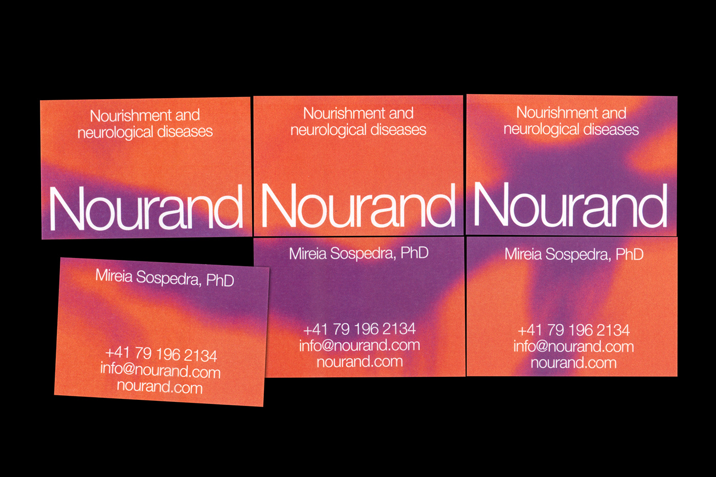
It all began with the creation of the name 'Nourand'—an approachable blend of 'Nourishment' and 'Neurological Diseases,' the very essence of their work.
Opting for lowercase lettering was a strategic choice, a departure from the typical acronym, and an embrace of a unique, personal name that resonates with their audience. Moreover, we delved into a dynamic, radiant color palette, drawing from resonance scans to meticulously find that sweet spot between vibrancy and subtlety.
An identity that mirrors the depth and uniqueness of Nourand's mission.
Naming in collaboration with NOM-NAM.