


The Client
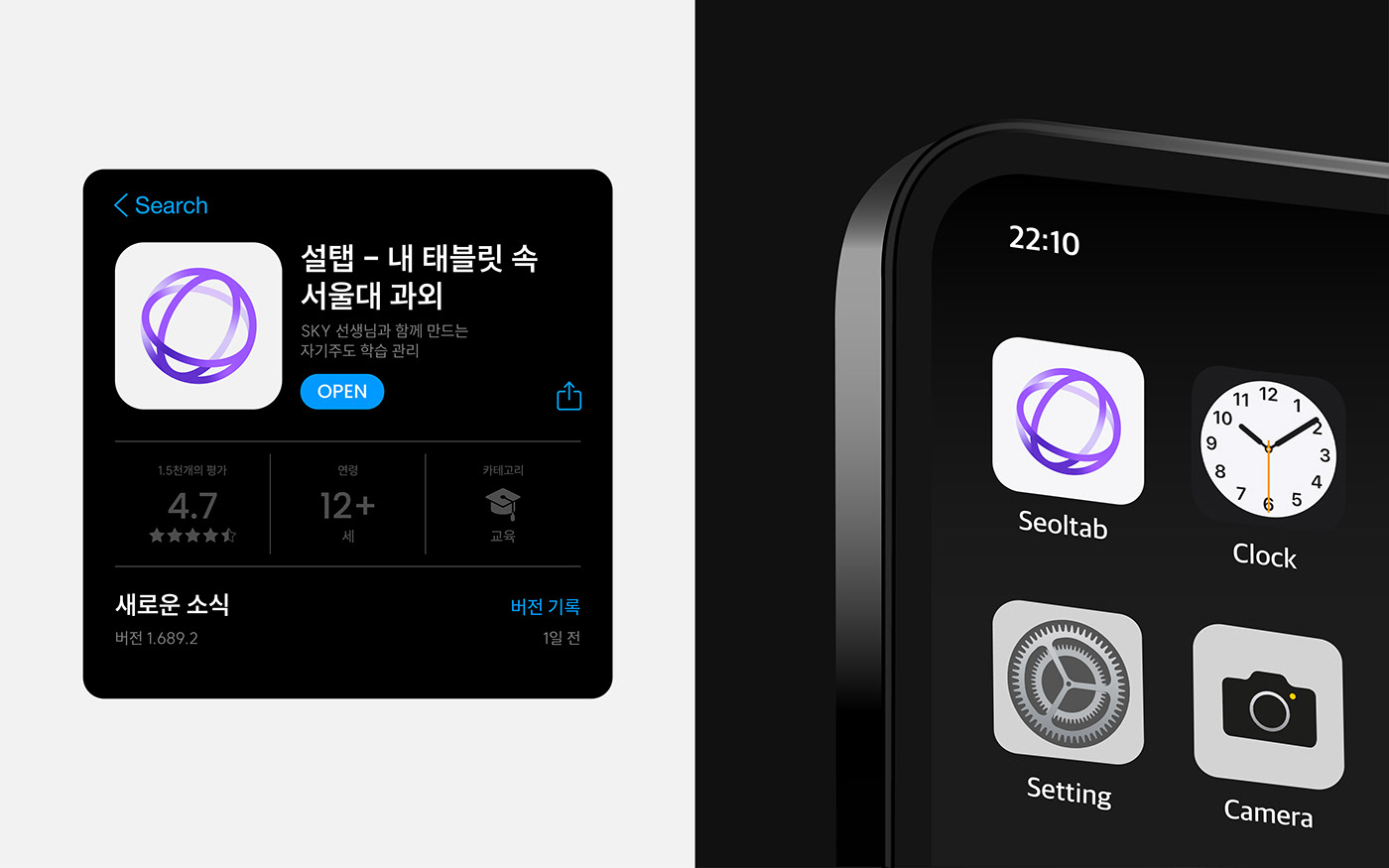
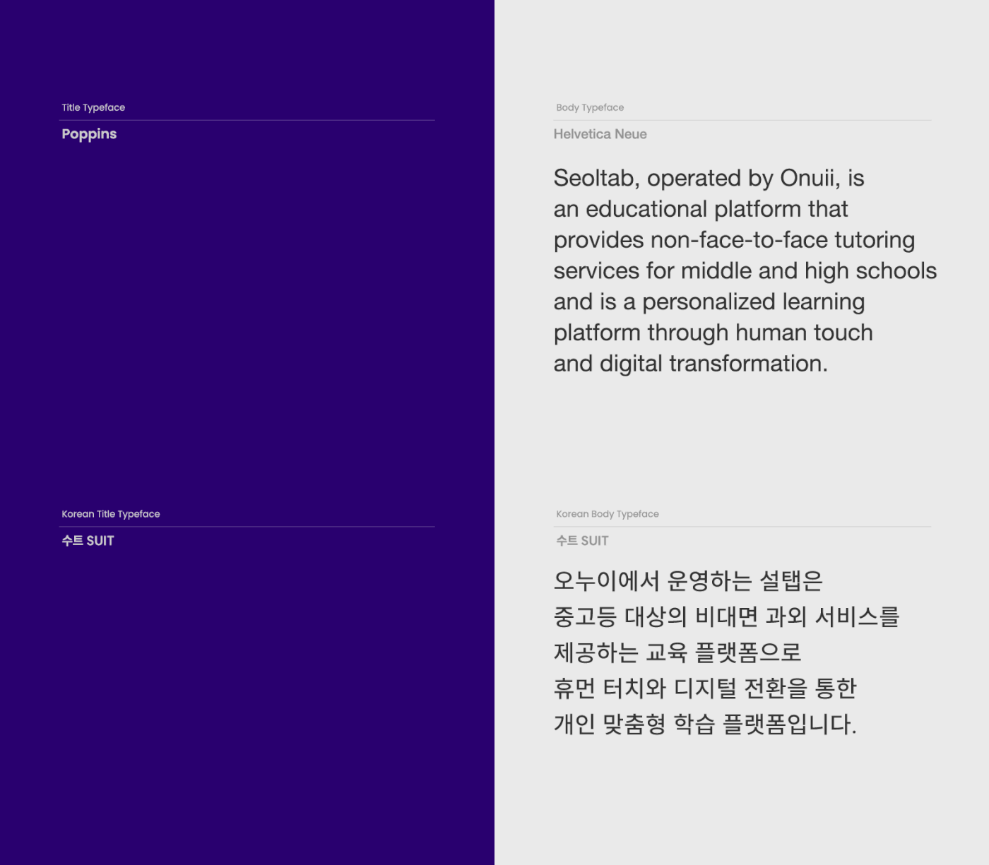
Operated by Onui, Seoltab is an educational platform that provides non-face-to-face tutoring services for middle and high school students. It is a personalized learning platform leveraging both Human Touch (HT) and Digital Transformation (DT). Bringing offline tutoring sessions to the online space, Seoltab facilitates 1:1 tailored non-face-to-face learning services for students and teachers, overcoming the constraints of time and space.
Through a blended learning approach that combines the advantages of 1:1 interactive teaching and digital instruction, Seoltab assists students in discovering their strengths and developing specialized knowledge and skills. Even without direct physical meetings, Seoltab considers the preferences and levels of students to match them with verified top tutors. Utilizing AI, Seoltab enables personalized curriculum development for each student, allowing effective learning management.
The Objective
Due to differentiation from other education platform brands and the expansion of its business scope, Seoltab recognized the necessity for rebranding. Since its launch, Seoltab had emphasized the non-face-to-face tutoring service nature to appeal to customers and convey its brand image. However, it struggled to establish distinct values beyond functional aspects, unlike traditional private education brands. With the emergence of similar services, there were limitations in the service approach, and the lack of a clear brand philosophy and direction hindered effective customer communication.
Seoltab aimed to strengthen its brand identity through a visual identity renewal and establish proactive communication methods with consumers. YNL Design developed a visual identity system throughout the project to clearly convey the brand values Seoltab sought, visually representing Seoltab's blended learning approach.


Color System
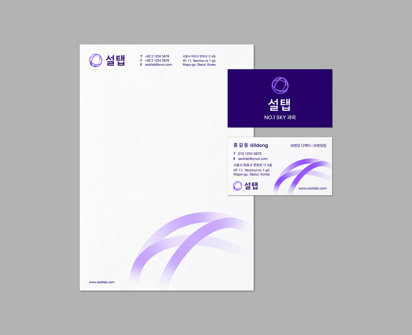
Rounded edges throughout the logotype contribute to a human touch (HT) aspect, delivering a soft overall image. Seoltab's colors visually express blended learning. Human Touch (HT), representing interaction with people, uses warm colors, particularly red symbolizing the heart, while Digital Touch (DT), representing a rational and technical aspect, is represented by the blue color. The blended combination of HT and DT results in Seoltab using purple as its main color for brand identity.
Purple symbolizes the universe and, functionally, reduces eye strain for students and teachers studying on iPads, ensuring excellent usability.
To facilitate user understanding and convenience in the expanding Seoltab system, a subject-specific color system was established.


Seoltab Brand Identity Renewal Design
Client
ONUII
Industry
Education
Service
Creative Strategy / Branding(BI)
Project Team
Brand Design : YNL Design
YNL Design
Art Direction & Design : Liz Yoona Lee
Brand Design : Heejae Choi, Minji Seo
Motion Design : Minji Seo, Maehee Jo
Client - ONUII
Branding Director : Jonghyun Hong
Brand Marketer : Dahee Hwang, Sooyoun Jung, Haekyung Lim, Hyeongsik Kim, Shua Jo
Brand Design : Hyosin Kim
Motion Design : Minsu Park (Studio DAH)
Copyright 2023. YNL Design all rights reserved.


