


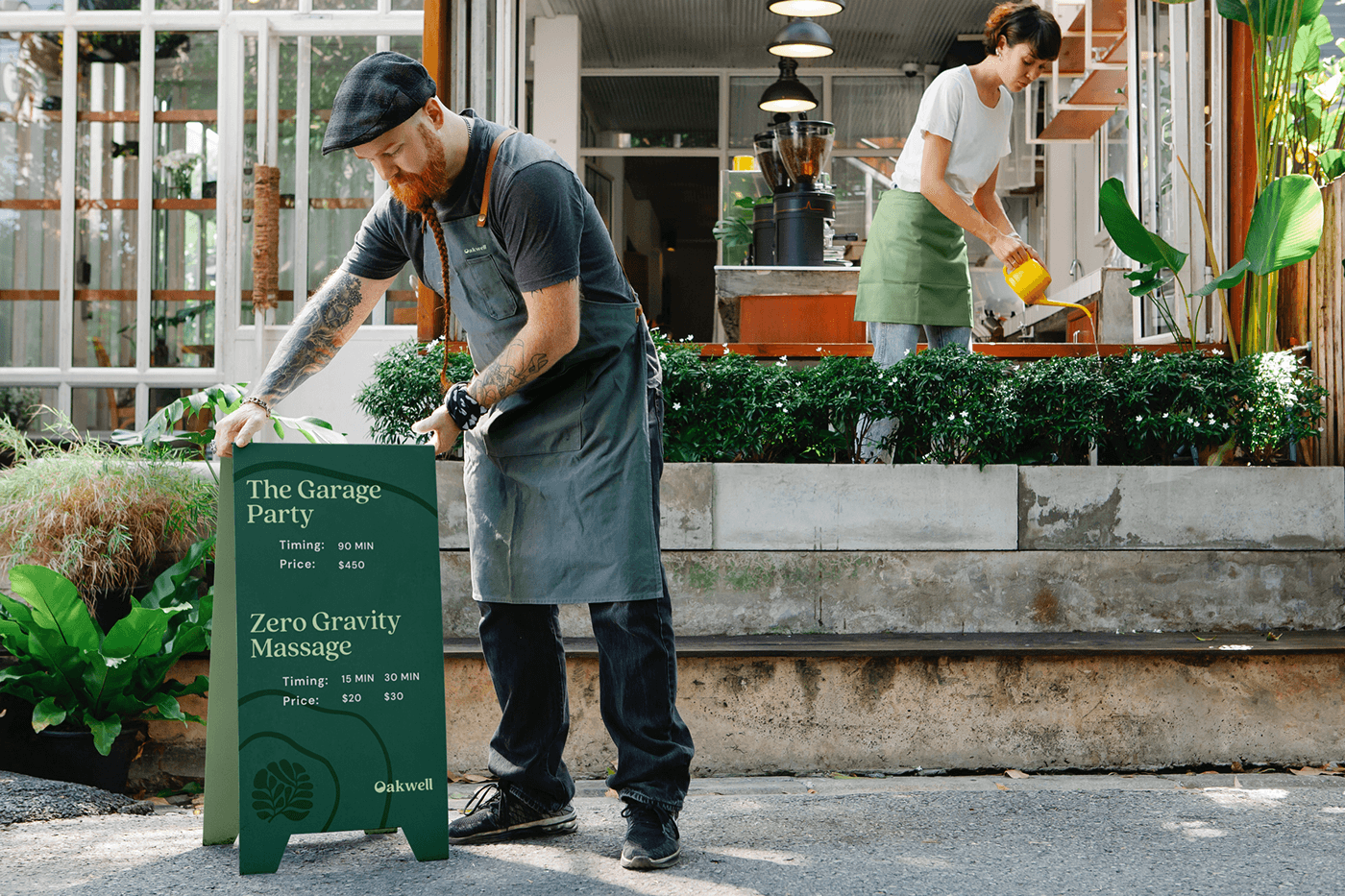
Oakwell Beer Spa — Creating an identity for a modern spa center
Design Type: Brand Identity
Specifics and Business Area: Wellness and RelaxationClient
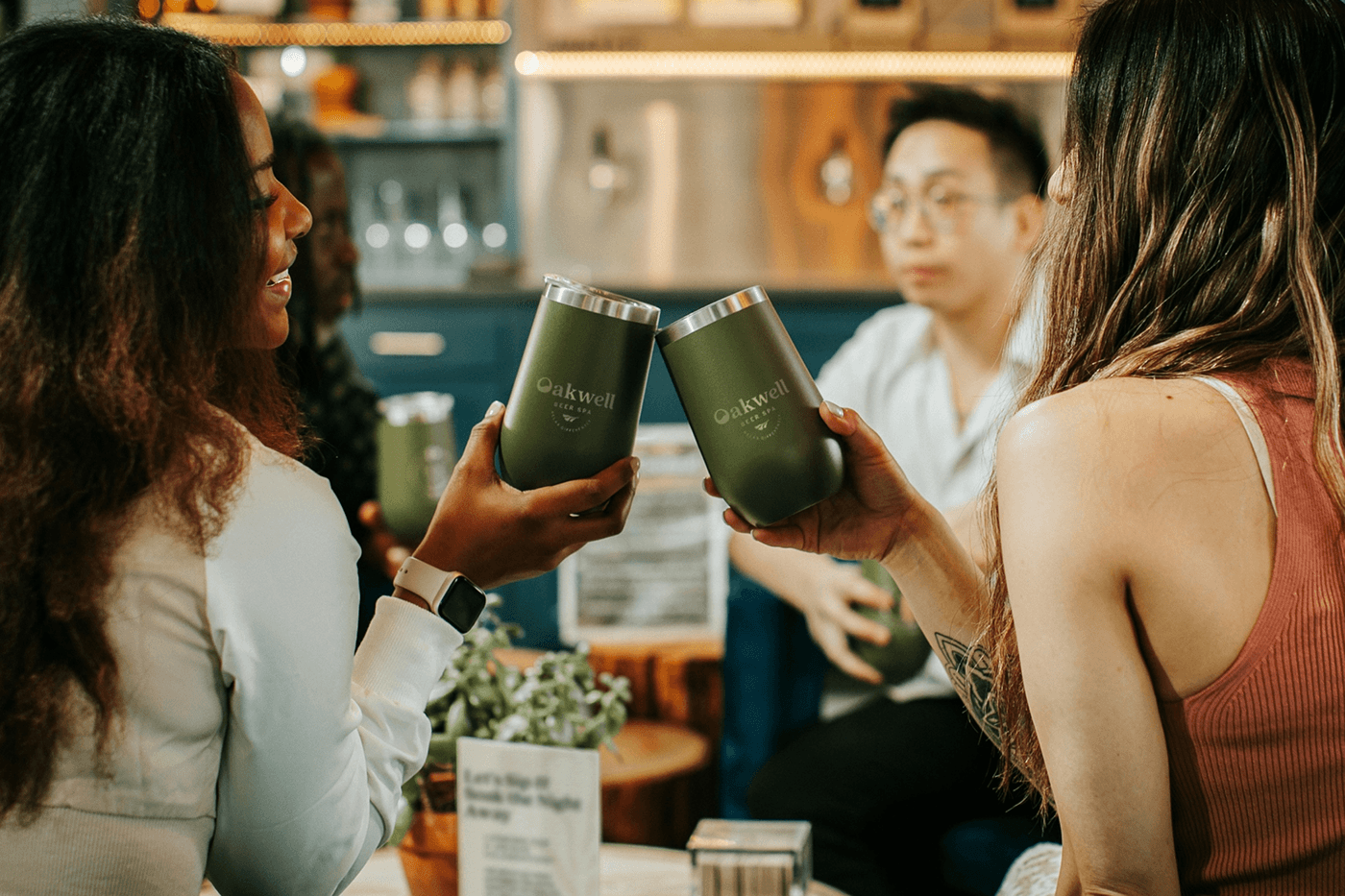
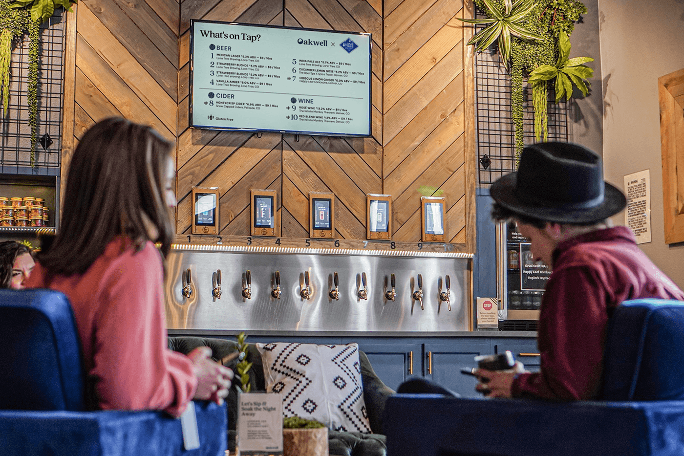
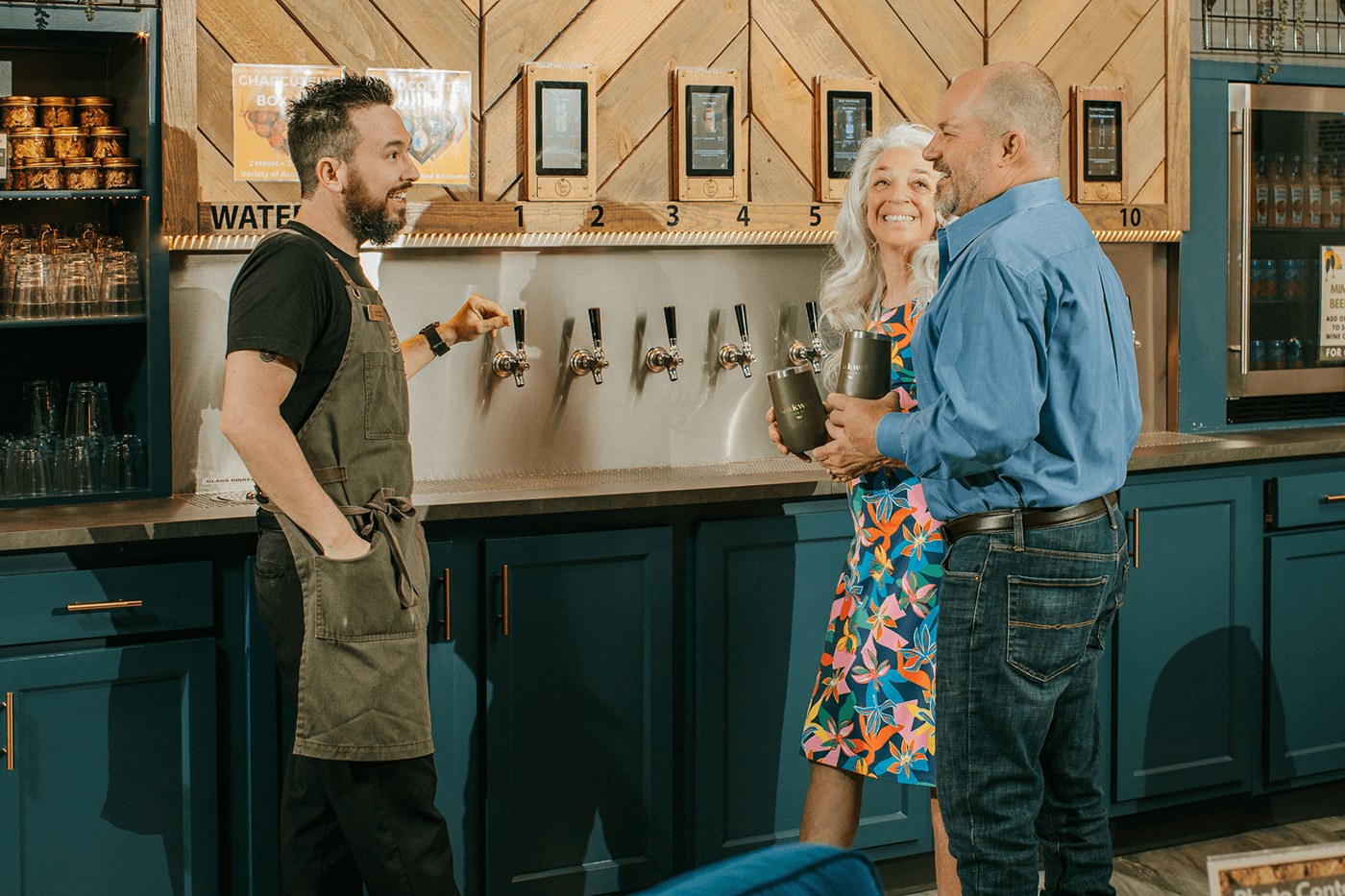
Oakwell Beer Spa is an inclusive spa oasis where nature meets modern technology to create a unique wellness experience. From beer baths to rain showers, Oakwell offers an immersion into the world of nature and water treatments. It's where you can feel nature’s touch and enjoy the harmony of its elements: water and plants.
Design Goals
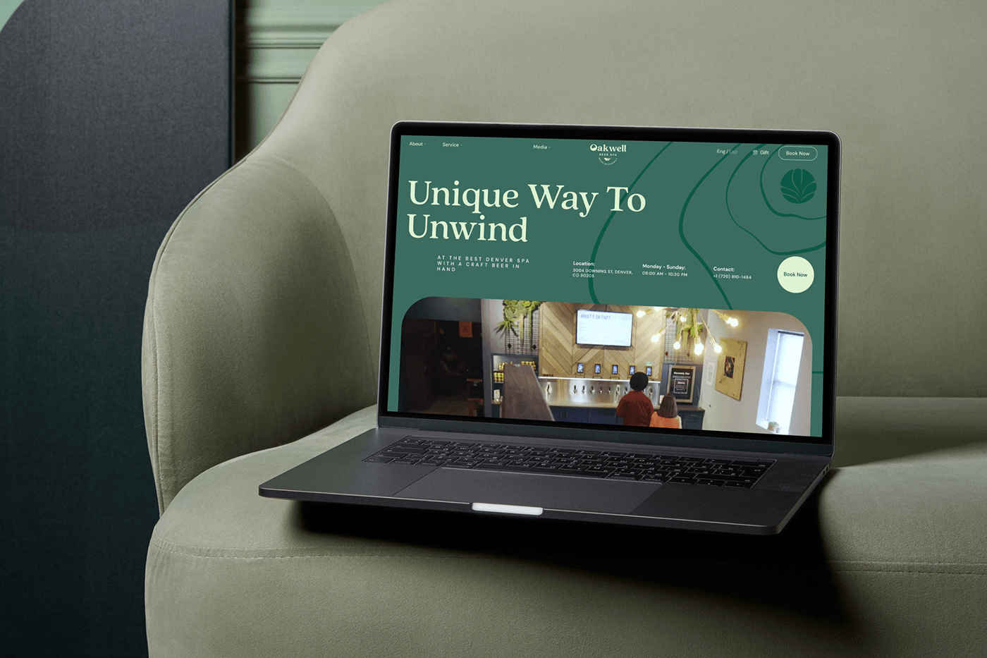
Our goal was to create an identity that reflects the uniqueness of Oakwell Beer Spa as a modern spa center, blending relaxation with nature — a place where people relax and converse. We aimed to emphasize the warm and welcoming atmosphere — key aspects of the brand. The founders' plan to scale the brand through a franchise model drove the business's need for a comprehensive brand identity. This task also causes a more minimalist and simple style. In addition, we meticulously compiled all the brands’ rules and constants into a detailed and accessible brand book.
Concept
The main idea is to visualize the combination of water and plants as harmony and relaxation symbols. This way, we open up Oakwell's uniqueness — a place where various herbs and water combine for a unique multisensory guest experience. Our focus is the moment a plant touches the water's surface — small ripples convey the idea of nature's touch. Oakwell is an oasis where guests can experience this touch firsthand, and we emphasize this.
Visit our website and look how we make so unique designs!
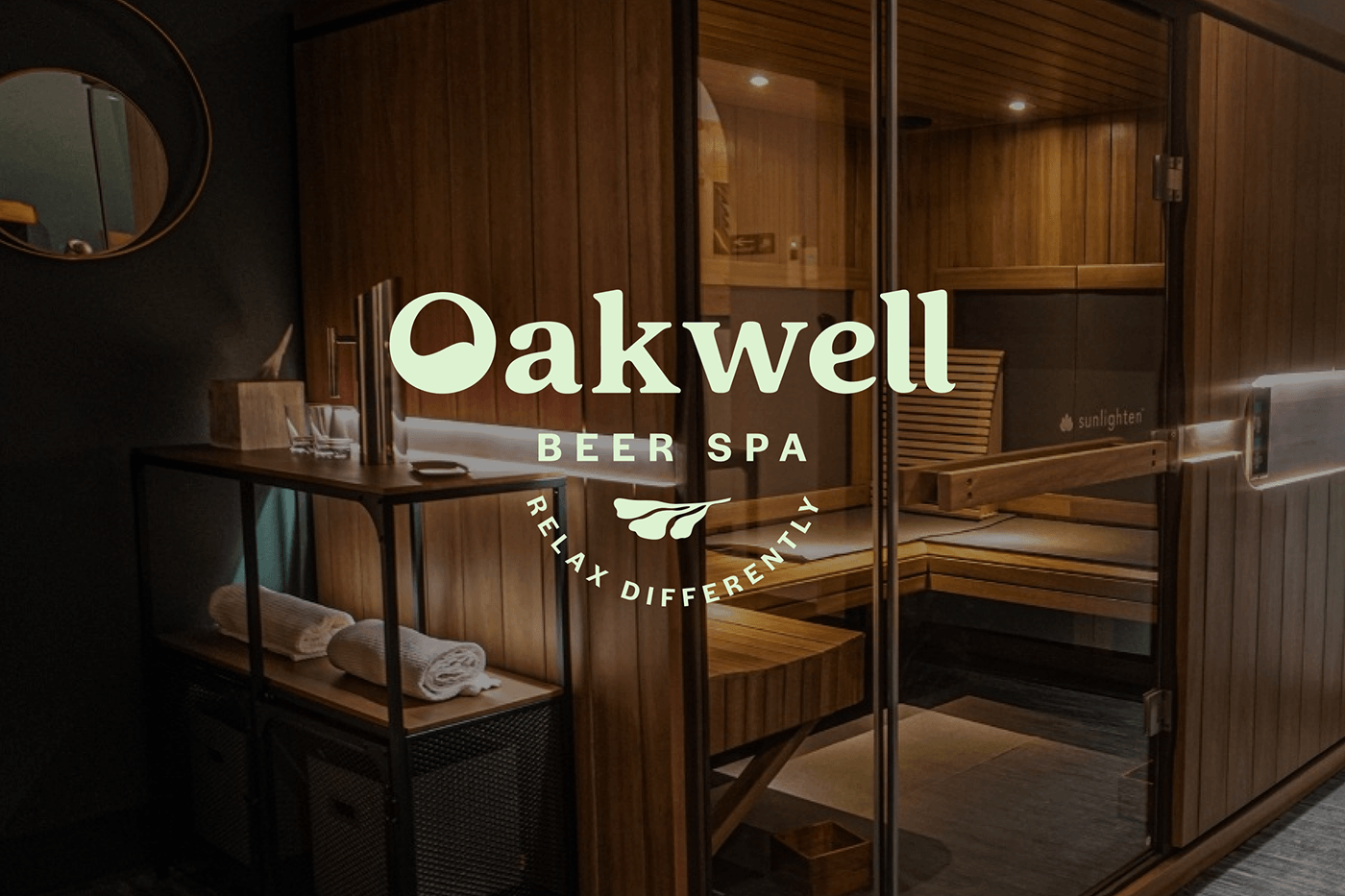
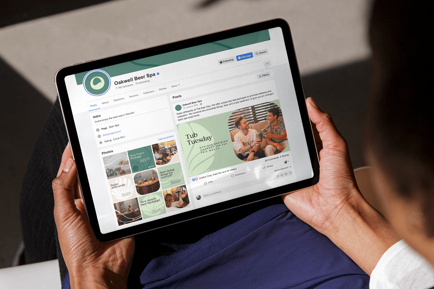
Logo
In the logo, we continue the idea of combining two natural components. The logos’ font references water through the first wave-filled letter. An illustrative leaf icon symbolizes the second component — plants and complements the font part.
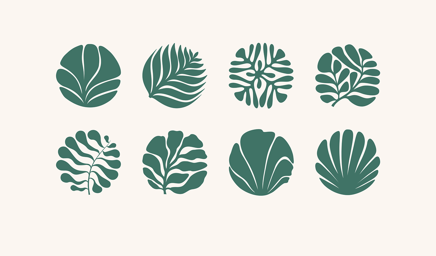
Graphic Elements
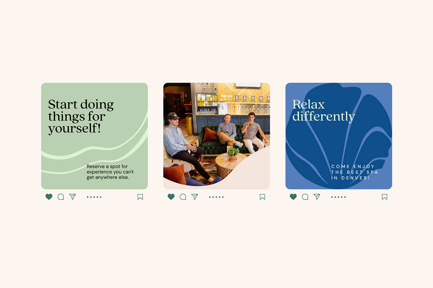
We convey the idea of nature's touch in graphics through abstract plant illustrations and smooth, wavy lines. We placed them within a geometric circular frame to convey a modern approach. This stylization helps to show the natural component while remaining transparent and minimalist. Wavy lines symbolize water and its calming merits. The lines move smoothly across the layouts, adding dynamic.
Typography
The Quincy CF font, with rounded edges and smooth, dynamic lines, accentuates the natural component and complements the graphics. The low-contrast and geometric DM Sans font supplements the header font and is easily readable in large text blocks. This font pair helps us highlight the natural, relaxing look and feel and create contrast.
Color
Natural green and blue shades reflect the colors of plants and water. The calm pastel beige tones help balance the palette, enhancing the welcoming, serene, and attractive aesthetic.
Composition
To support our idea and emphasize the flow and smoothness of water waves, we organized headlines and text to reflect the liquid flow. Separate text blocks are offset from the headlines to add dynamism to the layouts and complement the background's wavy lines.


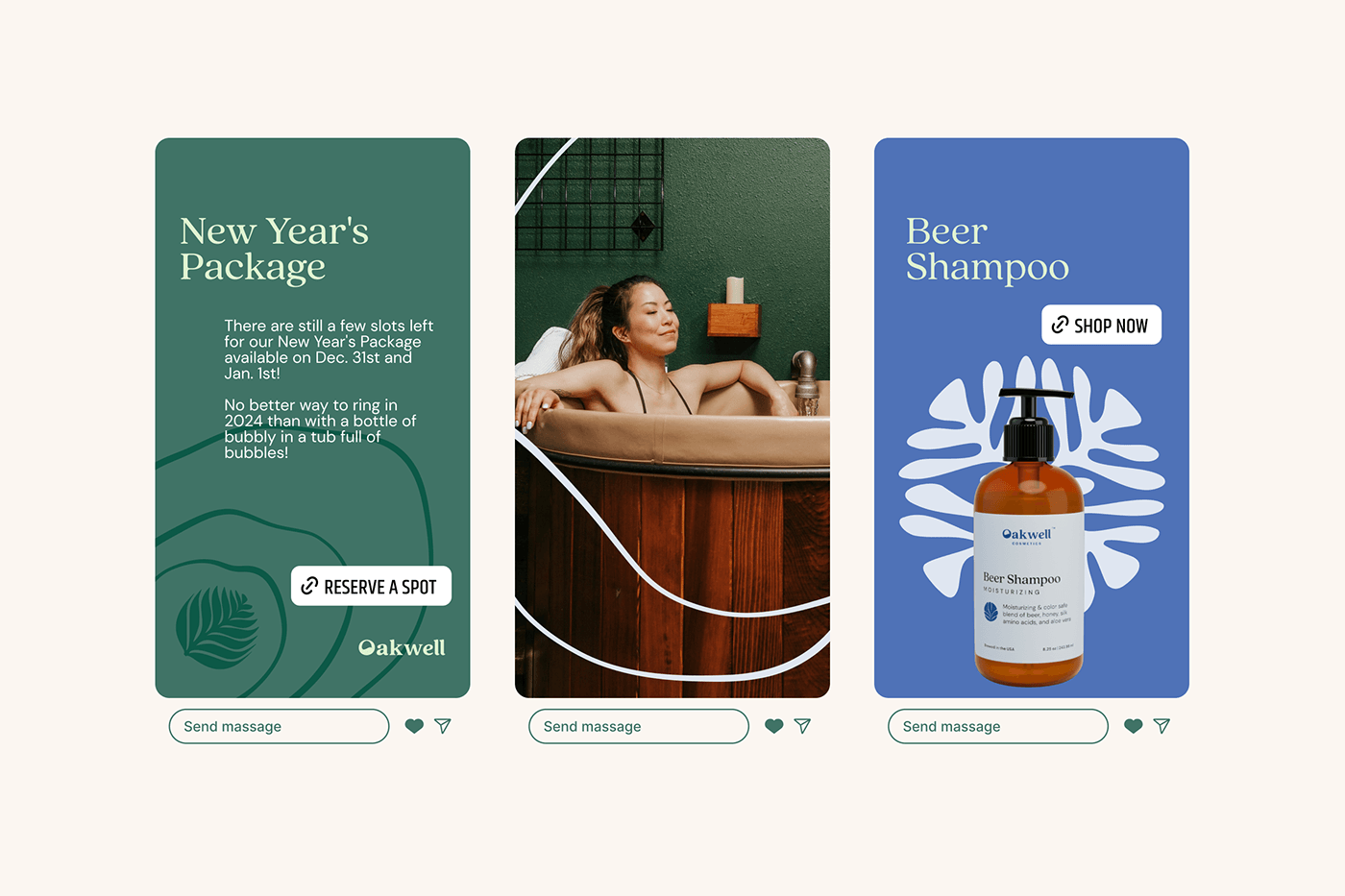
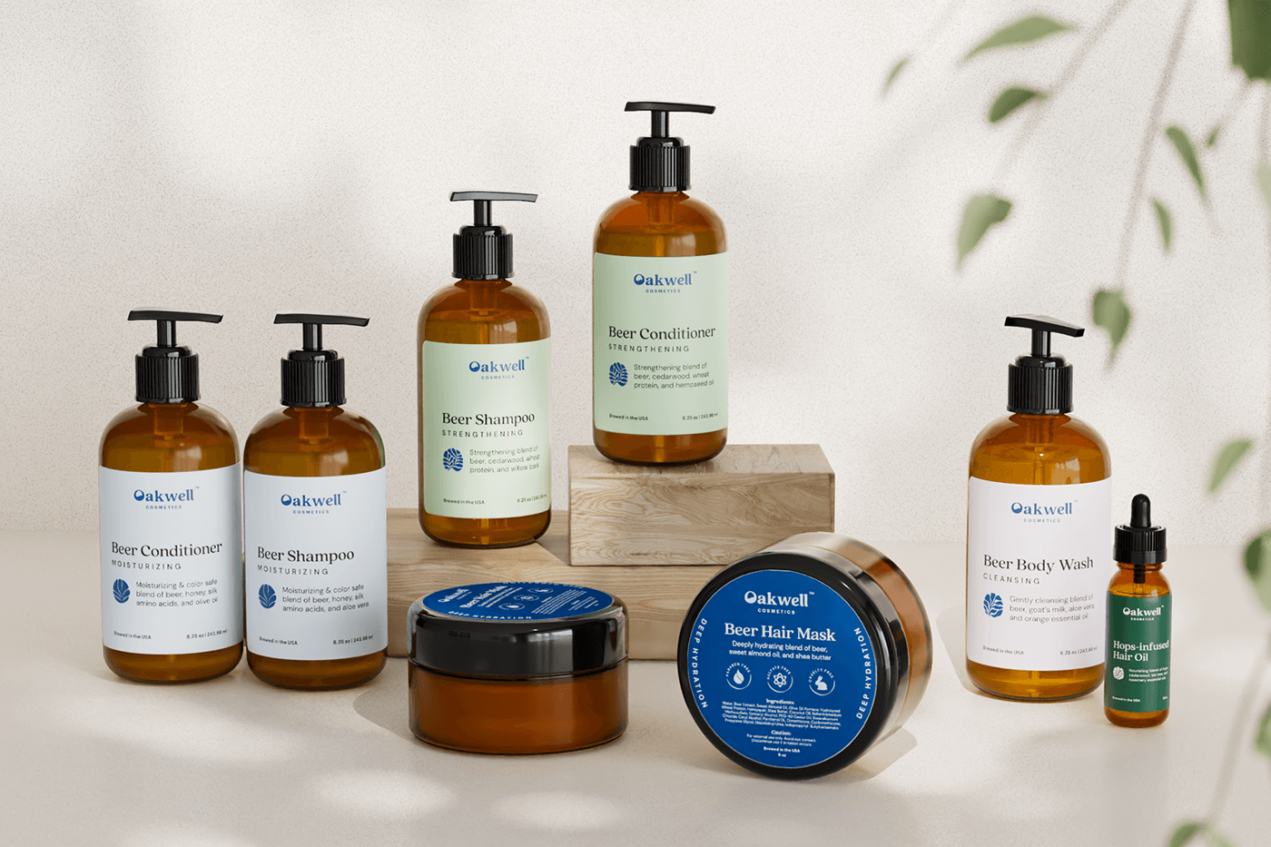
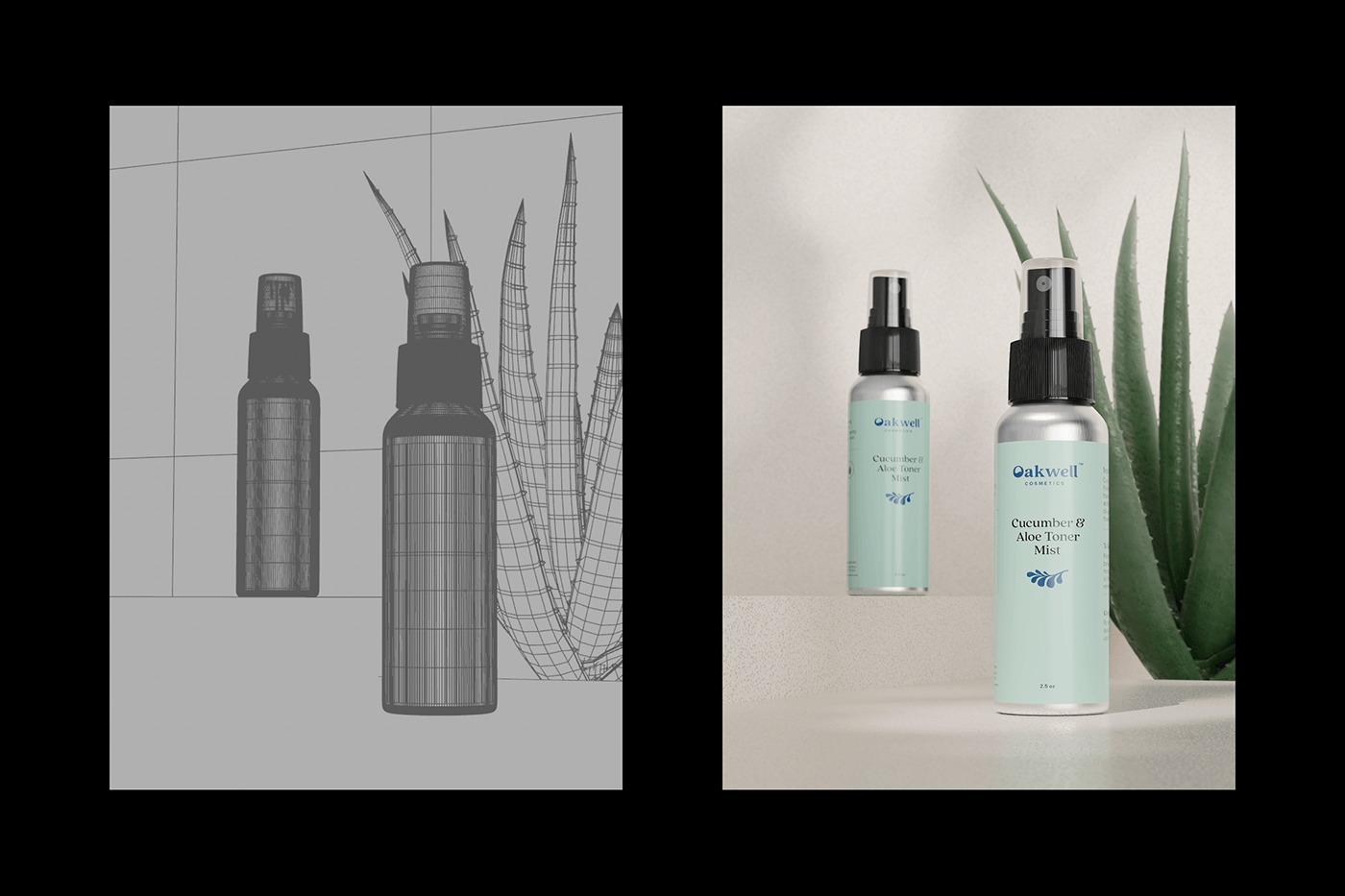
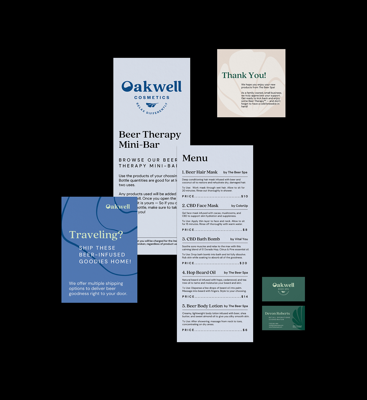
Oakwell Cosmetics

Composition
To support our idea and emphasize the flow and smoothness of water waves, we organized headlines and text to reflect the liquid flow. Separate text blocks are offset from the headlines to add dynamism to the layouts and complement the background's wavy lines..


League Design Agency Team:
Design Director: Mike Samovarov
Team Leader: Aleks Gusakov
Graphic Designer: Julia Zahura
Creative Project Manager: Maryna Blyzniuk
Design Director: Mike Samovarov
Team Leader: Aleks Gusakov
Graphic Designer: Julia Zahura
Creative Project Manager: Maryna Blyzniuk
3d and Motion Designer: Vadim Revin
Case Design: Anna Fedorovych, Anton Bukoros, Alina Kovalenko, Dima Kaliberda
Case Design: Anna Fedorovych, Anton Bukoros, Alina Kovalenko, Dima Kaliberda


