FF Good In-Use:

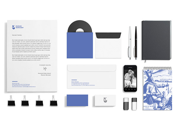
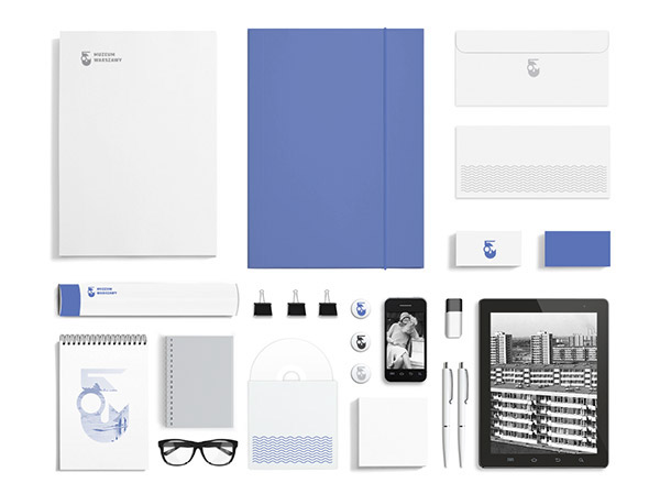
Museum and its recent branding overhaul. The stylish and tasteful rebrand saw a full update of all marketing material, stationary and advertisements.
FontFont’s largest (with an awesome 196 styles) and one of the most popular typefaces, FF Good was designed by the Warsaw-based designer Łukasz Dziedzic in the city itself.
As a sans serif family in the American Gothic tradition FF Good has
something of an old heritage whilst maintaining a new and modern feel. This helps the typeface to effectively convey the sense of the history held by the museum, whilst keeping its image firmly in the 21st century.


About FF Good
FF Good is a straight-sided sans serif in the American Gothic tradition, designed by Warsaw-based Łukasz Dziedzic. Despite having something of an “old-fashioned” heritage, FF Good feels new. Many customers agree: the sturdy, legible forms of FF Good have been put to good use in the Polish-language tech magazine ‘Komputer Swiat’, the German and Russian edition of British celebrity tabloid OK!, and AP’s (Associated Press) new corporate design.