


The Client
ShinhanCard is currently the leading card issuer in South Korea, boasting the largest customer base and highest market share. Holding the top position in the card industry, it offers a variety of card products tailored to customers' lifestyles. With the increase in demand for overseas travel following the transition of the COVID-19 pandemic, travel-related spending has surged.
Various card companies are swiftly releasing overseas travel-related products and conducting various promotions. In response, ShinhanCard, in collaboration with ShinhanBank, has launched the 'Shinhan SOL Travel Check Card,' providing total services related to overseas travel. As a latecomer among overseas travel card products, the 'Shinhan SOL Travel Check Card' aims to establish itself as an essential item for overseas travel by offering unprecedented benefits and premium services not seen in existing overseas travel products.

The Objective
The current designs of overseas travel-related cards in the card market mainly feature materials that intuitively depict images of travel such as airports, airplanes, tickets, and passports. Most travel-related card products had difficulty differentiating themselves as they had similar designs. ShinhanCard aims to offer more than just a simple travel card but a card that presents values beyond that and provides customers with a special travel experience. Through the development of a key visual unique to the SOL Travel Check Card, ShinhanCard seeks to enhance the identity of a travel card with attractive benefits and communicate flexibly with customers through trendy sensibility.

The Solution
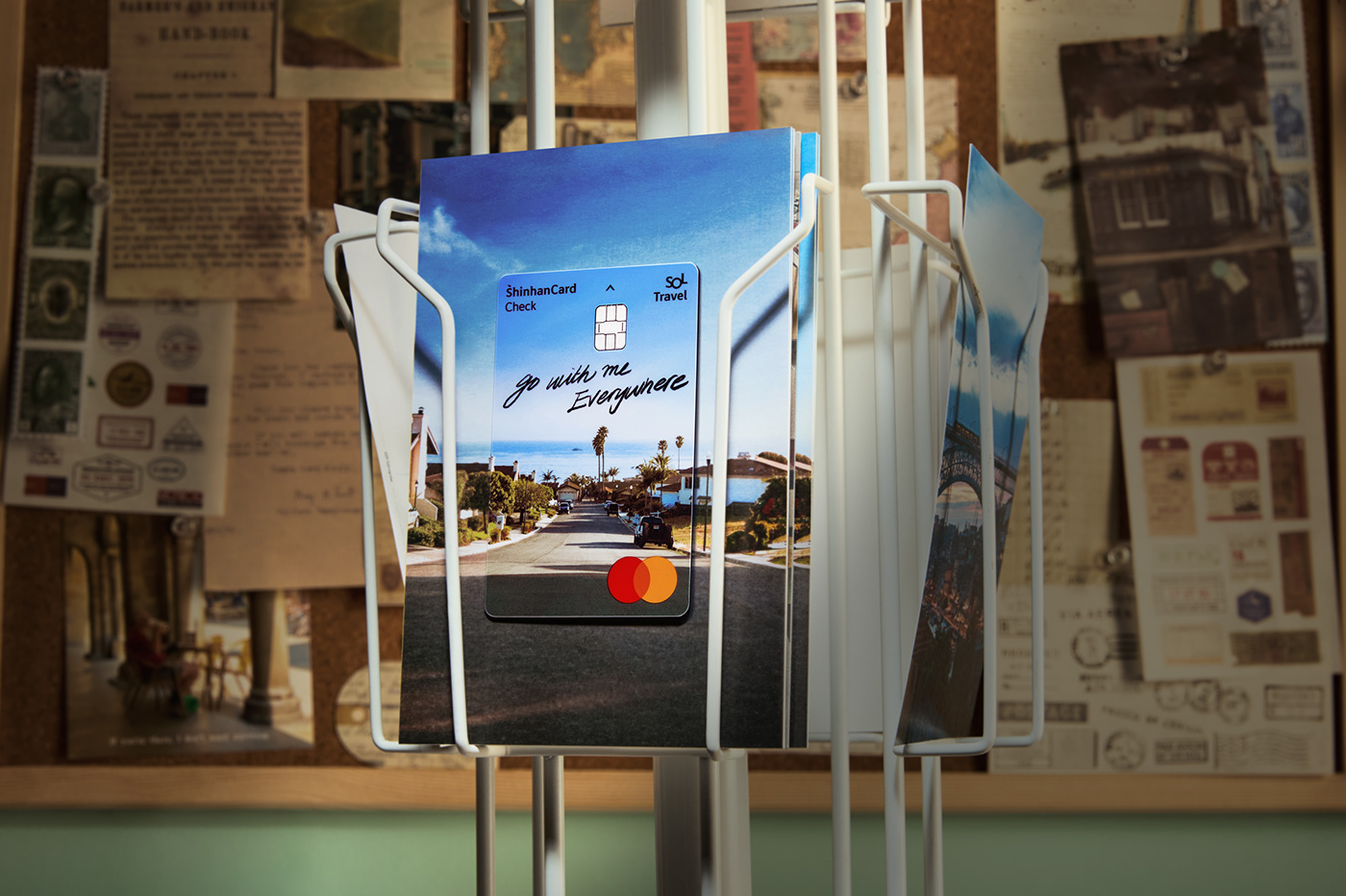
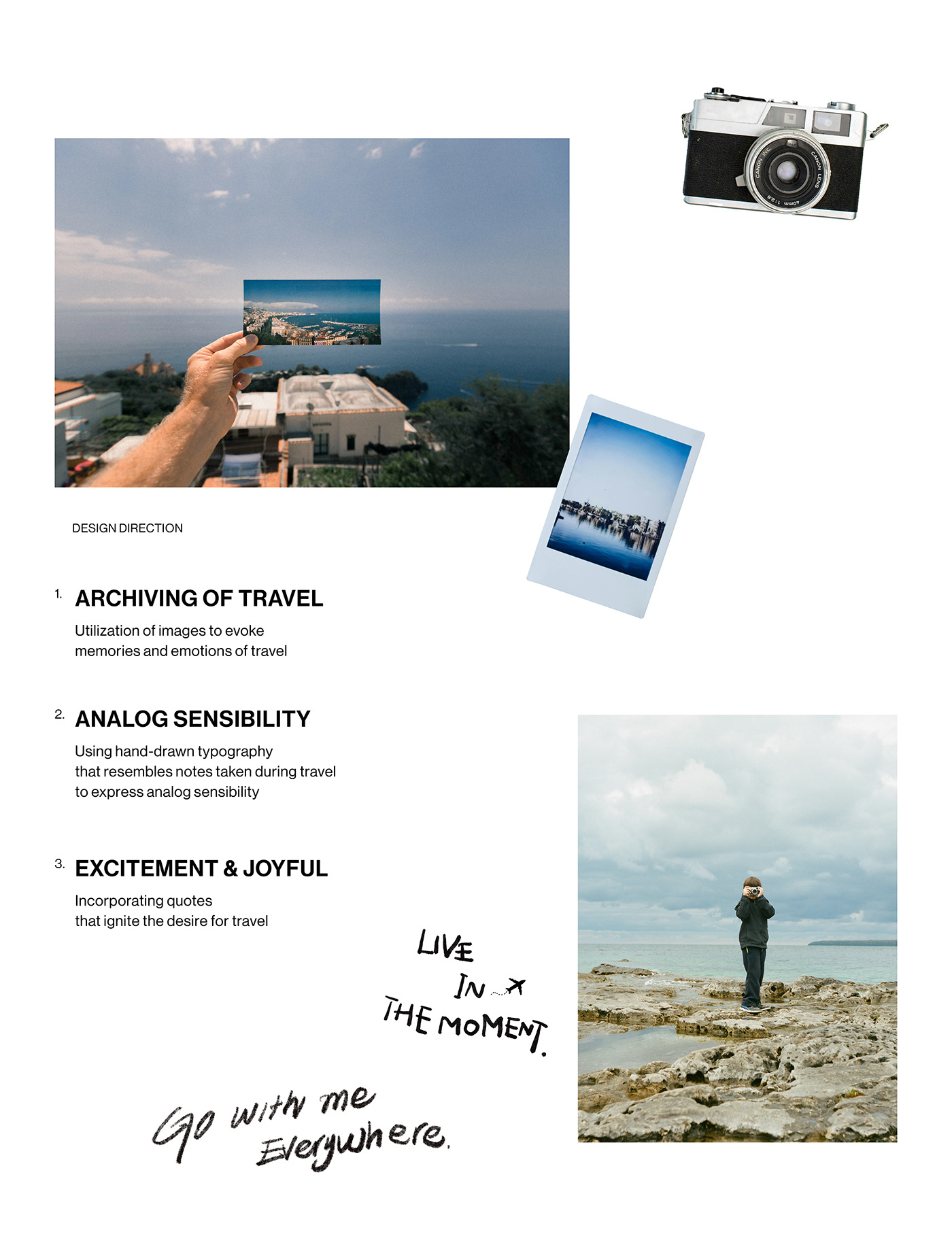
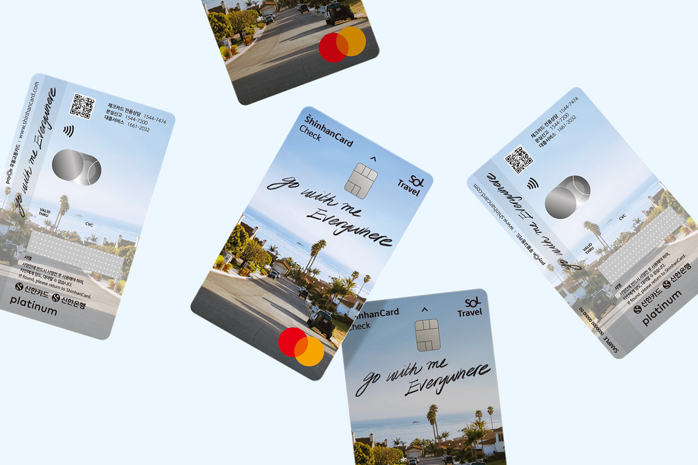
YNL Design aimed to establish the ShinhanCard Sol Travel Check Card as a brand that provides excitement and unique travel experiences under the concept of ‘the joy of travel’, infusing ShinhanCard’s own storytelling into a witty and enjoyable design system. Developing a visual identity system imbued with the unique sensibility of the Shinhan Sol Travel Check Card, with the design concept of ‘Capture the Moments of Travel’, capturing the excitement of travel moments. Utilizing images that evoke memories and emotions of travel to represent the ability to reminisce about travel through ShinhanCard Sol Travel.
Additionally, incorporating hand-drawn lettering in an analog style to evoke the feeling of recording memories during travel. The hand-drawn lettering evoking memories of travel stimulates the desire for travel, conveying the image of a special card that travels together with Sol Travel anywhere. ShinhanCard’s Sol Travel focuses on a card design that showcases excitement and joyful emotions towards travel, appealing to the MZ generation with its emotional design.


ShinhanCard SOL TRAVEL Key Visual Design
Client
ShinhanCard
Industry
Financial & Lifestyle
Service
Creative Strategy / Key Visual Design / Photography Direction
Project Team
Brand Design : YNL Design
YNL Design
Creative Direction & Design : Liz Yoona Lee
Brand Design : Heejae Choi, Minji Seo
Photography Direction: Liz Yoona Lee, Heejae Choi
Photography by: Seonghwan Jeon
Instagram @ynldesign


