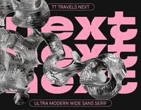


Introducing TT Travels Next—an experimental display typeface based on the original TT Travels!
TT Travels Next is an ultra-modern, wide sans serif. Wide proportions are one of the typeface’s distinctive features: there is almost no glyph narrowing when transitioning from bold to thin font styles. Besides, the font stands out for its extra closed aperture, low contrast, and noticeable ink traps. Interestingly, TT Travels Next does an exceptional job blending smooth and sharp forms, which makes it highly versatile, unusual, and attractive. We also increased the slant angle of the Italic font styles to 14 degrees so you can create a crisp and dynamic text look.
When designing TT Travels Next, we aimed to explore what the original TT Travels would look like if it were transformed into a rebellious and straightforward punk, rejecting its conformity and compromise. So, we infused the new typeface with a radical personality and put its expressive elements in the spotlight.
This stylish and ultra-modern typeface is a perfect match for working with layouts, be it printing or web formats. TT Travels Next has two outline font styles that complement the roman ones perfectly and can also serve as accent fonts. In addition, we implemented a variable font with weight and slant variation axes, allowing designers to adjust the font to fit their needs or requirements.
TT Travels Next includes:
-21 font styles: 9 roman, 9 italic, 2 outline styles, and one variable font;
-757 characters in each font style;
-26 OpenType features, counting in stylistic alternates, ligatures, arrows, and circled figures;
-190+ languages support.


