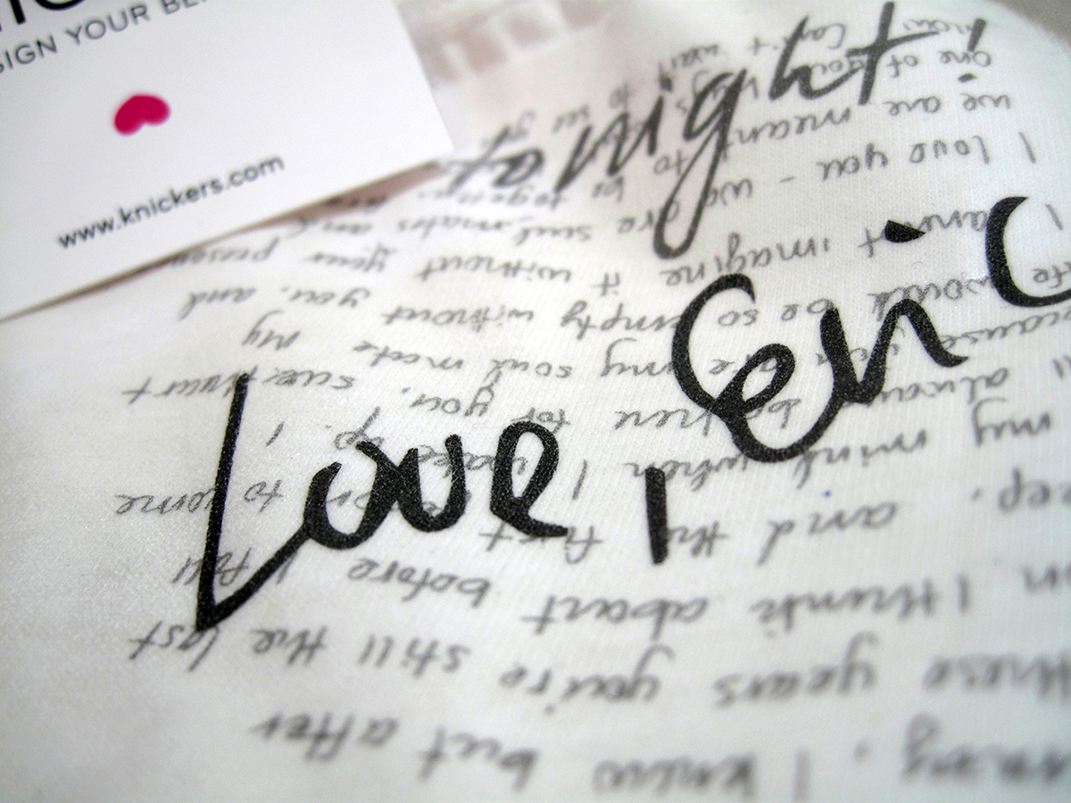
For our project entitled "Brandshift" for Advanced Design, we were to take an existing product and re-brand it in some way, whether it be a change in audience, or a change in strategy. I decided to take the idea of total customization and merge it with a lingerie line, and I call this new brand "Knickers." Knickers is an e-boutique that specializes in manufacturing custom-made undergarments. Patrons may upload their own artwork, have it printed on organic cotton, and shipped directly to their homes. Knickers appeals to non-artists too, as they can have text printed instead of imagery. It's a brand that's fun because the product is completely personalized, and appeals to those who are looking for an undergarment alternative that is a bit naughty without being overly provocative.
Project advisor: Jennifer Cole Phillips
Project advisor: Jennifer Cole Phillips
Fall 2014
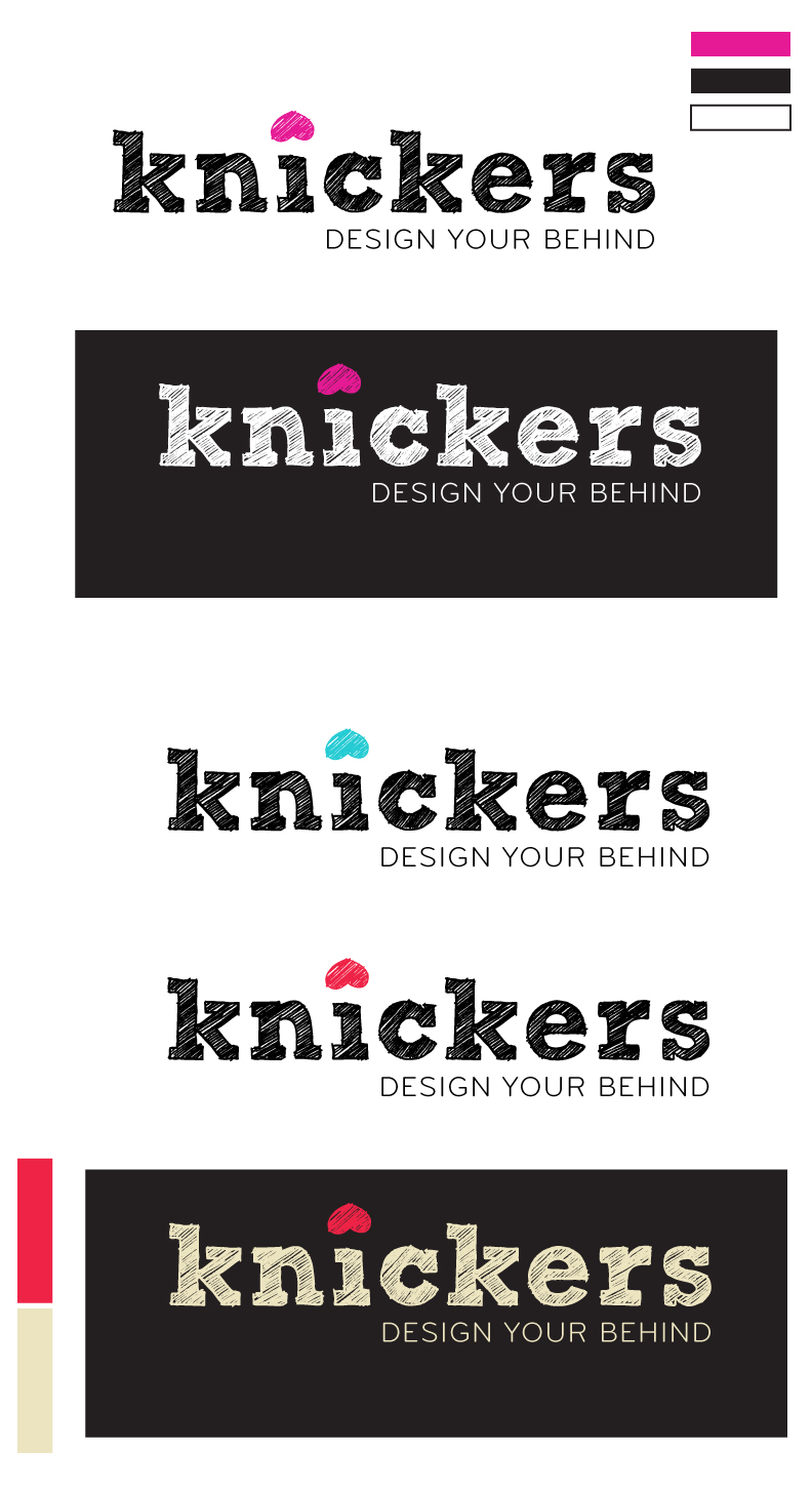
This is the evolution of the logo and color palette. Knickers went through a lot of changes in its lifetime, but showing this process is important at this stage.
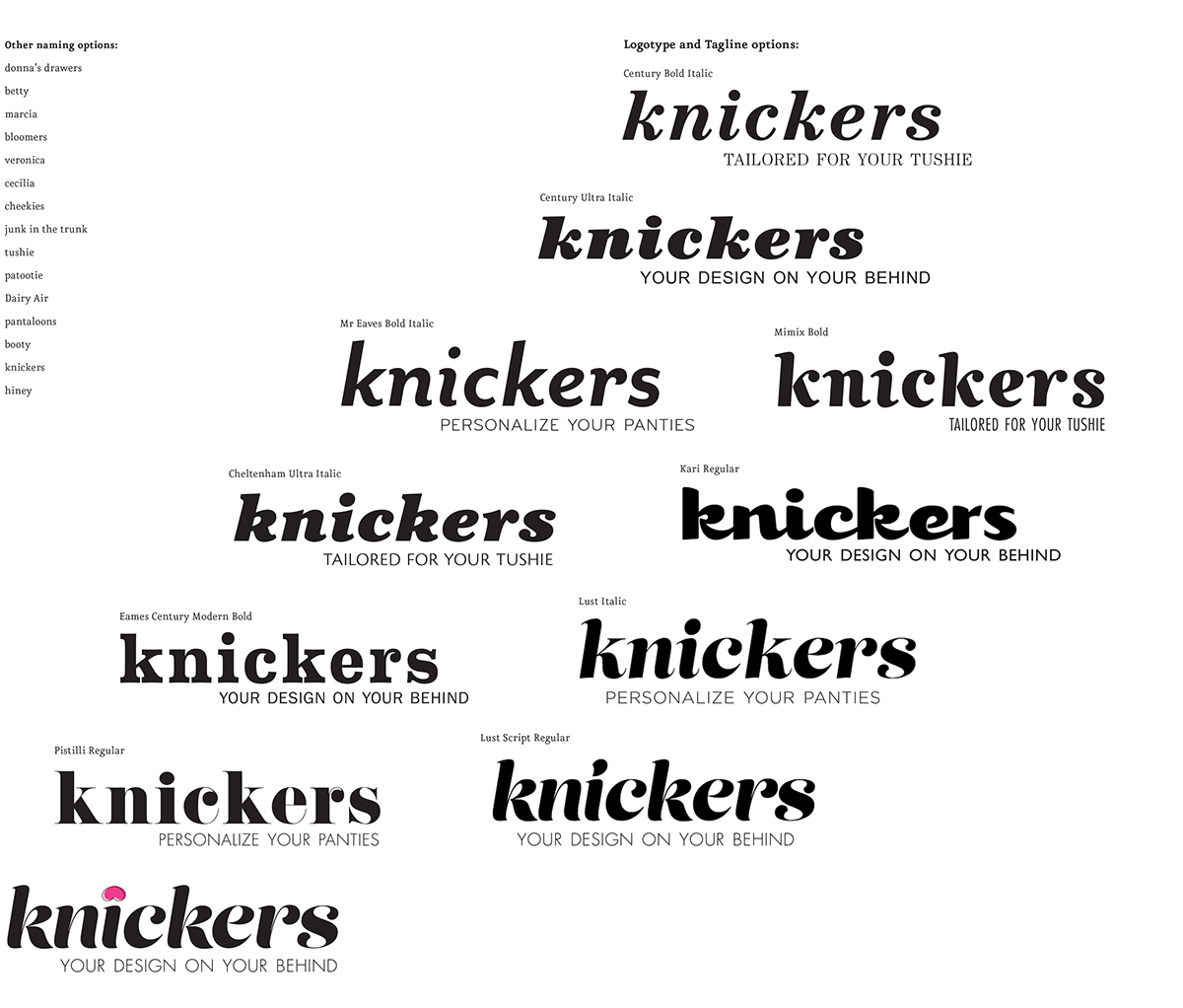
In the beginning, I did a lot of type-pairing studies to find which typeface worked well for the brand that I wanted to create. I knew that I wanted something quirky, so I chose from families that I wouldn't normally use for more austere projects. On the left are some brainstorming for alternate names (in the beginning I wanted to choose a female name, but thought that would be too close to brands like Victoria's Secret or Olga). I also had a lot of fun coming up with funny taglines that I felt would complement the brand's identity.
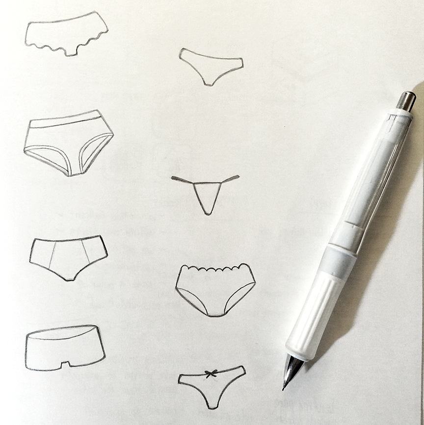
I wanted the iconography to utilize line because I wanted a minimal look. I also wanted a hand-drawn feel, so I went ahead and drew them by hand. I kept the drawings fun and youthful.
In this first iteration, I chose a retro-inspired color palette. The logomark also took on a retro look for consistency.

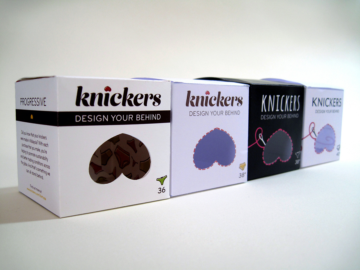
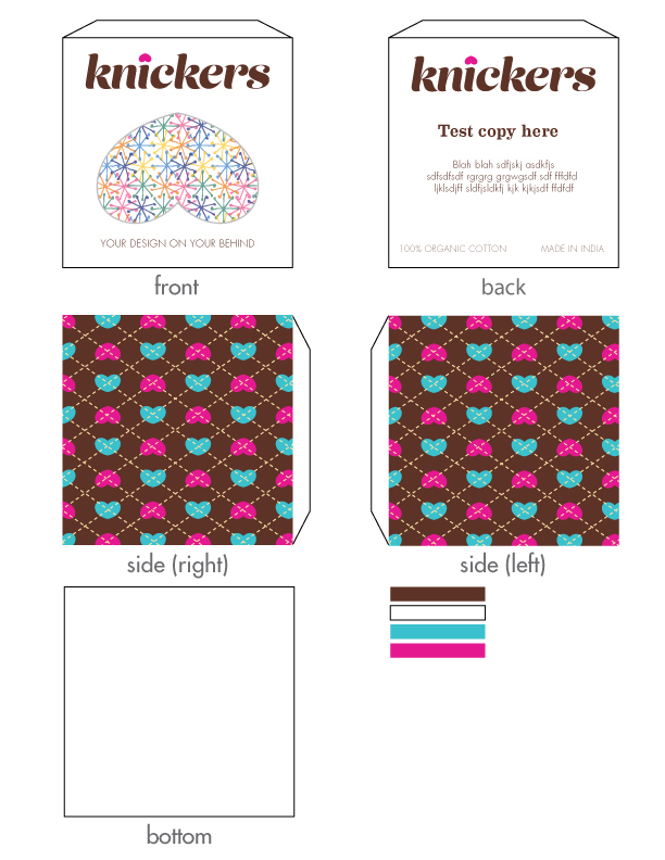
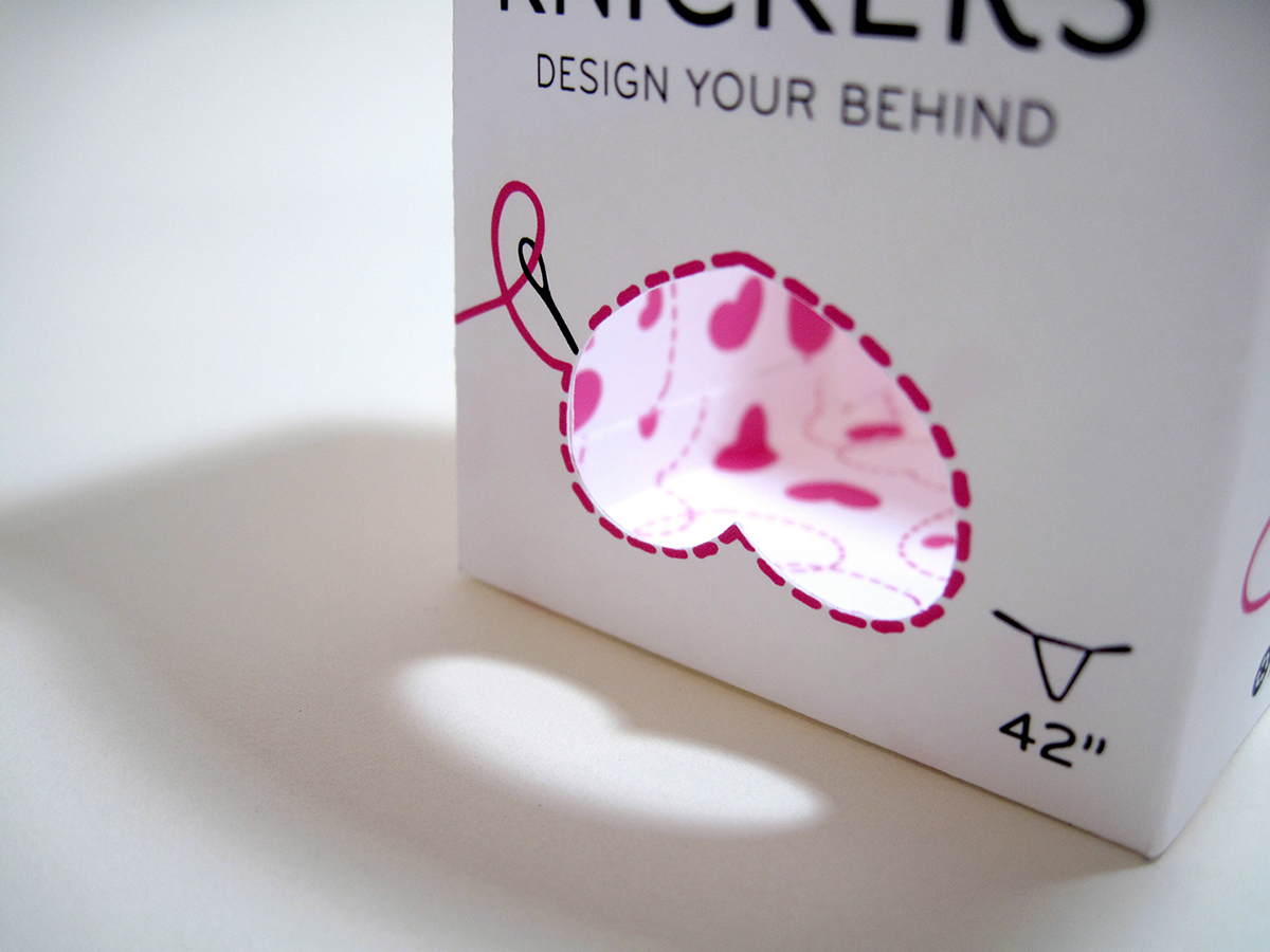
First round of package designs. I wanted the front to have a cut-out of the heart/butt icon, so that people can see the undergarment contained inside.
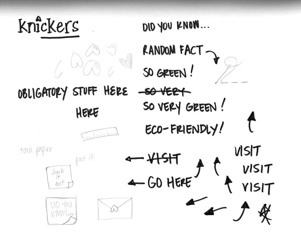
The more I thought about the brand, the less sense it made for it to have a retro-feel. So, I went back to the drawing board, quite literally, and sketched some more ideas of what I wanted Knickers to look like. It just seemed to be missing the fun and playful side that I was originally hoping to capture. Below are some loose, sharpie sketches that speaks that playful language a bit better. Most of these went into the ipad app.
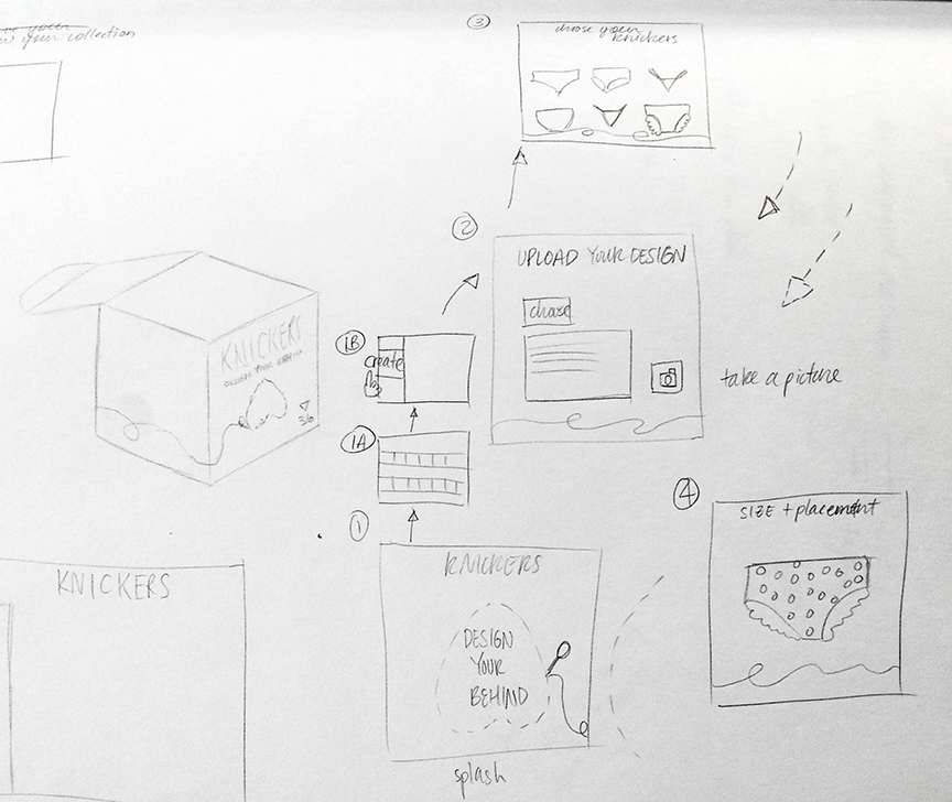
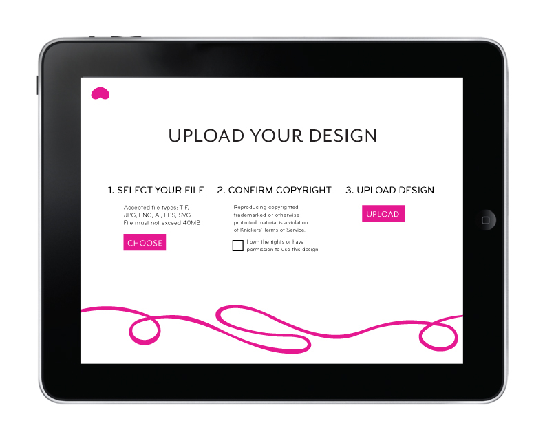
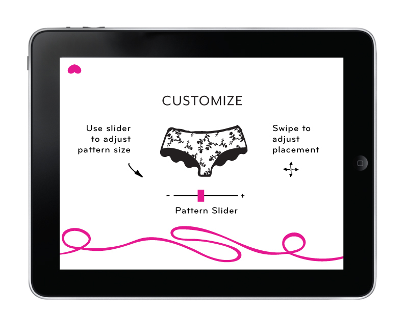
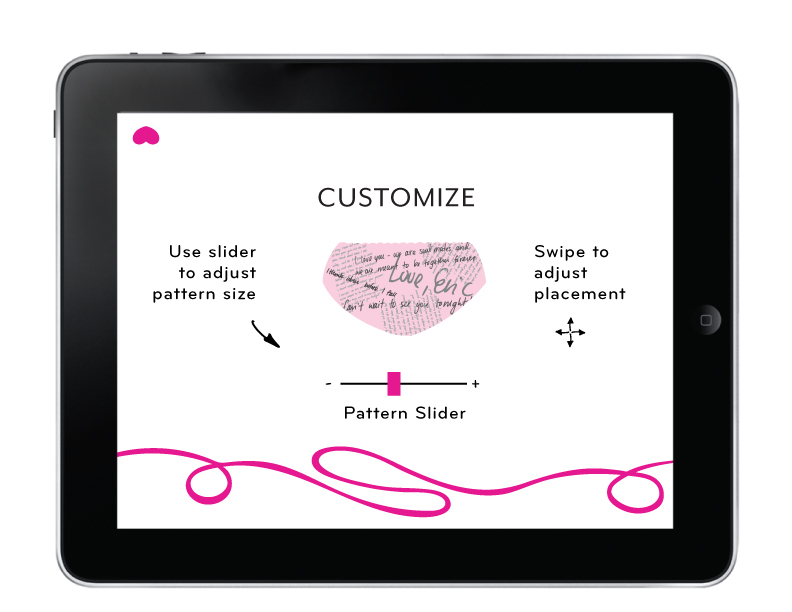
I also began thinking about an ipad app that would go along with the brand. Here are some notes I made, thinking about the workflow of a customer and how it should look and behave. There are definitely a lot of things to consider, and keeping notes helps me organize my thoughts and remember my intentions.
Since I basically started the deisgn over again, I once again played around with typography and looked for something bolder and simpler. Before I was getting caught up with more complicated patterns and colors. This time, I wanted the brand to be more straightforward, so the customer can focus on the actual product. I think that the pink and black combination was stronger because it was bolder, but still hinted at the youthfulness of my audience.
After deciding on the colors and typography, I went ahead and mocked up the box and wrote the copy which would convey the brand through descriptions and wordplay. It was fun trying to come up with butt puns!

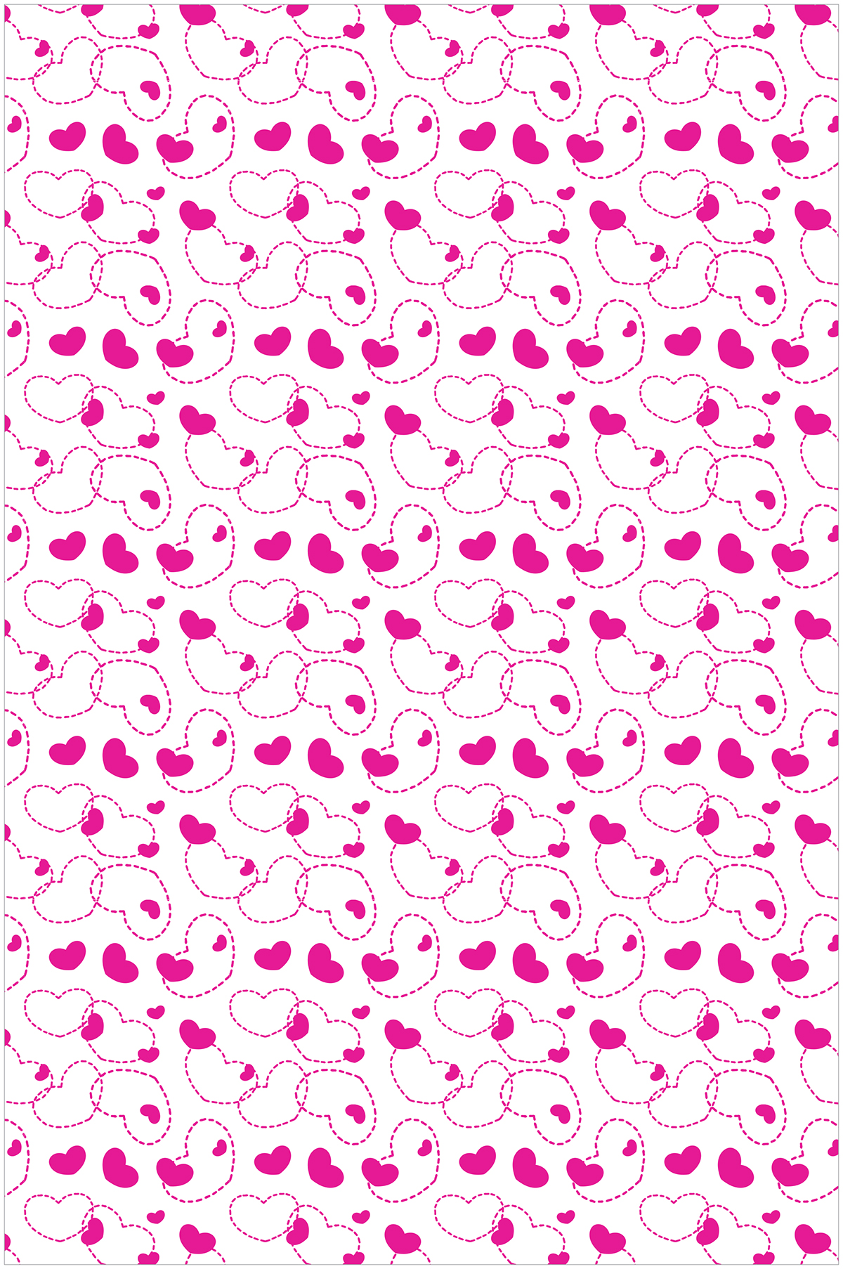
With the previous iteration, I focussed a little too much on patterning. With this round of edits, I simplified the pattern so that it would remain consistent no matter which undergarment the customer designed. Having this pattern repeated solidified the brand, which was desirable.
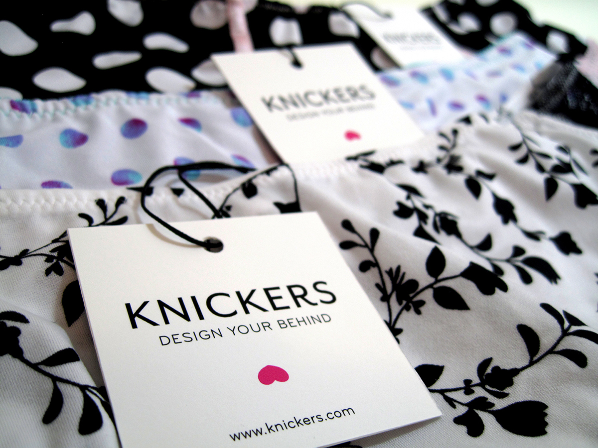
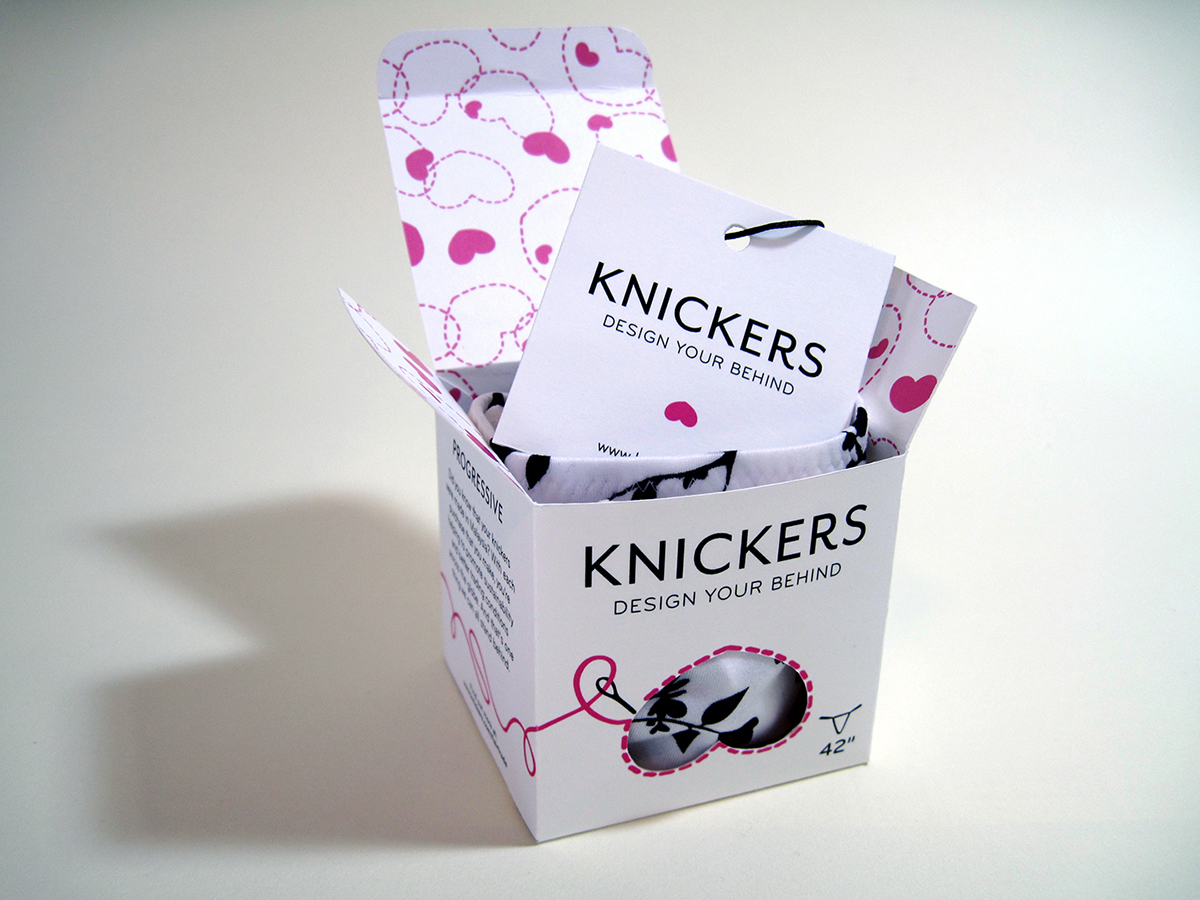
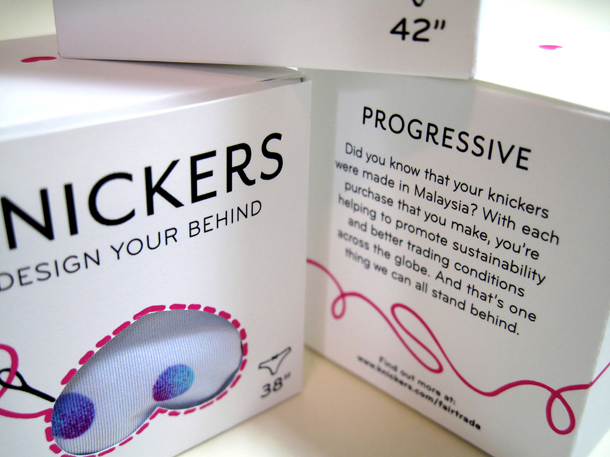
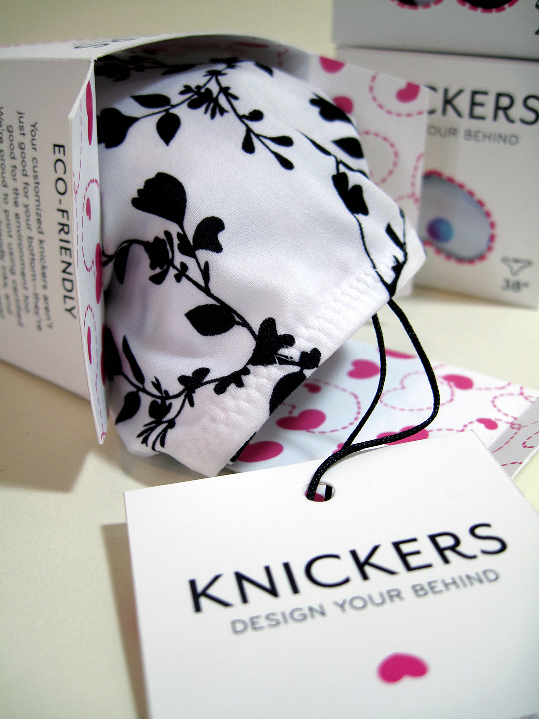
Final shots of the packaging and tag.

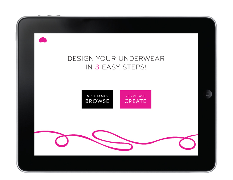
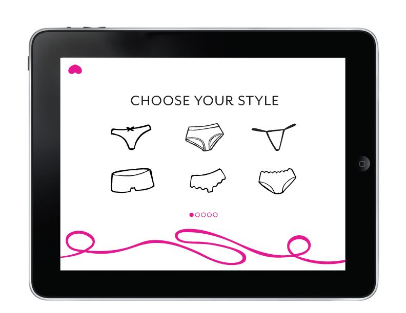
Final workflow for ipad application.

Advisor: Jennifer Cole Phillips
Design: Emily Tai
Fall 2014


