Intro
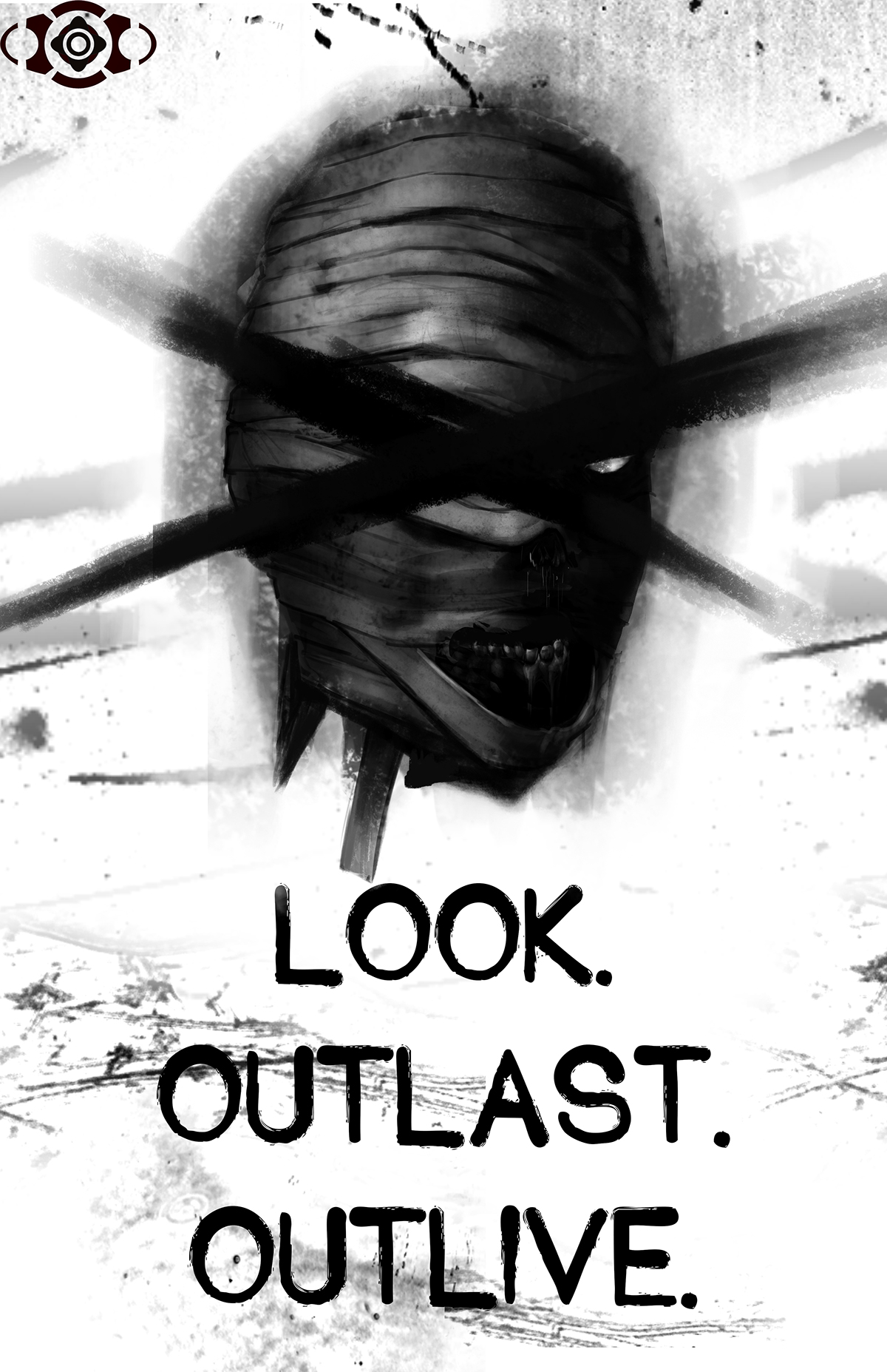
LOOK.
OUTLAST.
OUTLIVE.
// Our constructed world is an entirely bleak one
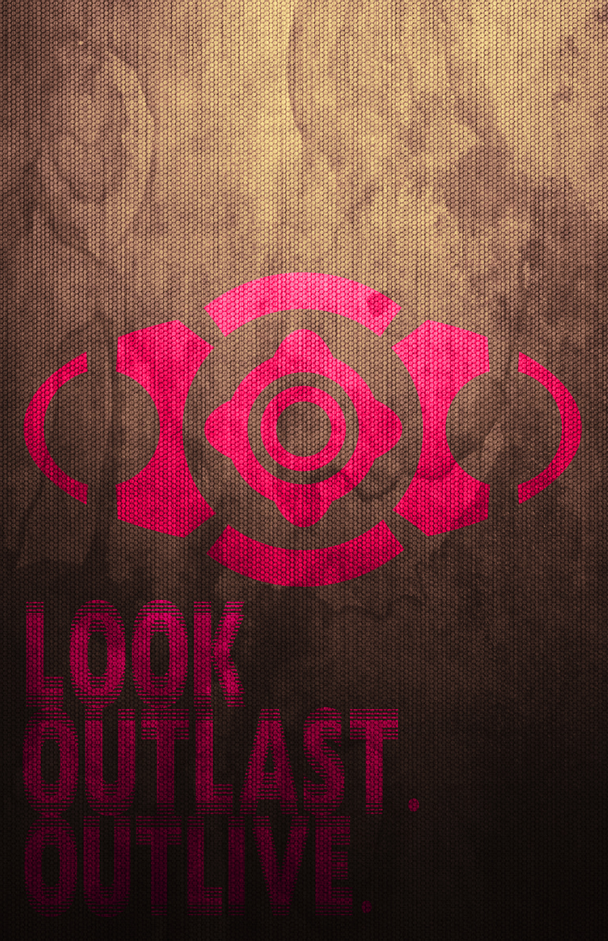
This concise phrase is exactly what we utilize to explore the synthetic world of exaggerated horror tropes and the spooks that lie under the bed. For our assignment, we not only looked to create a propagandic concept, but completely brand our new world and the ambiguous sense of chaotic order via our symbol and . Our insignia acts as the anchor of our nightmare-fueled world and not only extrapolates a sense of order, but also enhances the atmosphere of said world.
We sought to examine the bleakness through an aesthetically concrete insignia that pulls a sense of “order” and “realism” within a fantasmal plane. However, by placing the insignia along with the command: Look, Outlast, Outlive, we created an authoritarian figure that seems, in a way, to market “living” in this new dark world as a product. We based this idea off the way our society seems to be heading as a whole, where we are approaching sometimes essential medical treatment as a commodity to be sold to the highest bidder, effectively auctioning off survival to those who can afford it.
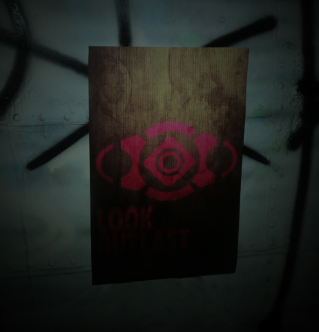
POSTERS
Design by Jaeho Lee
Design by Tom Rosenow
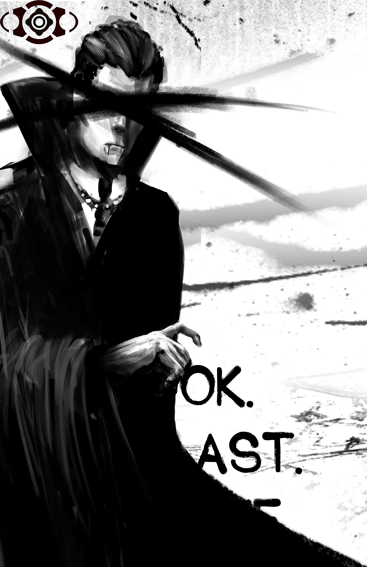
Design by Matt Clark
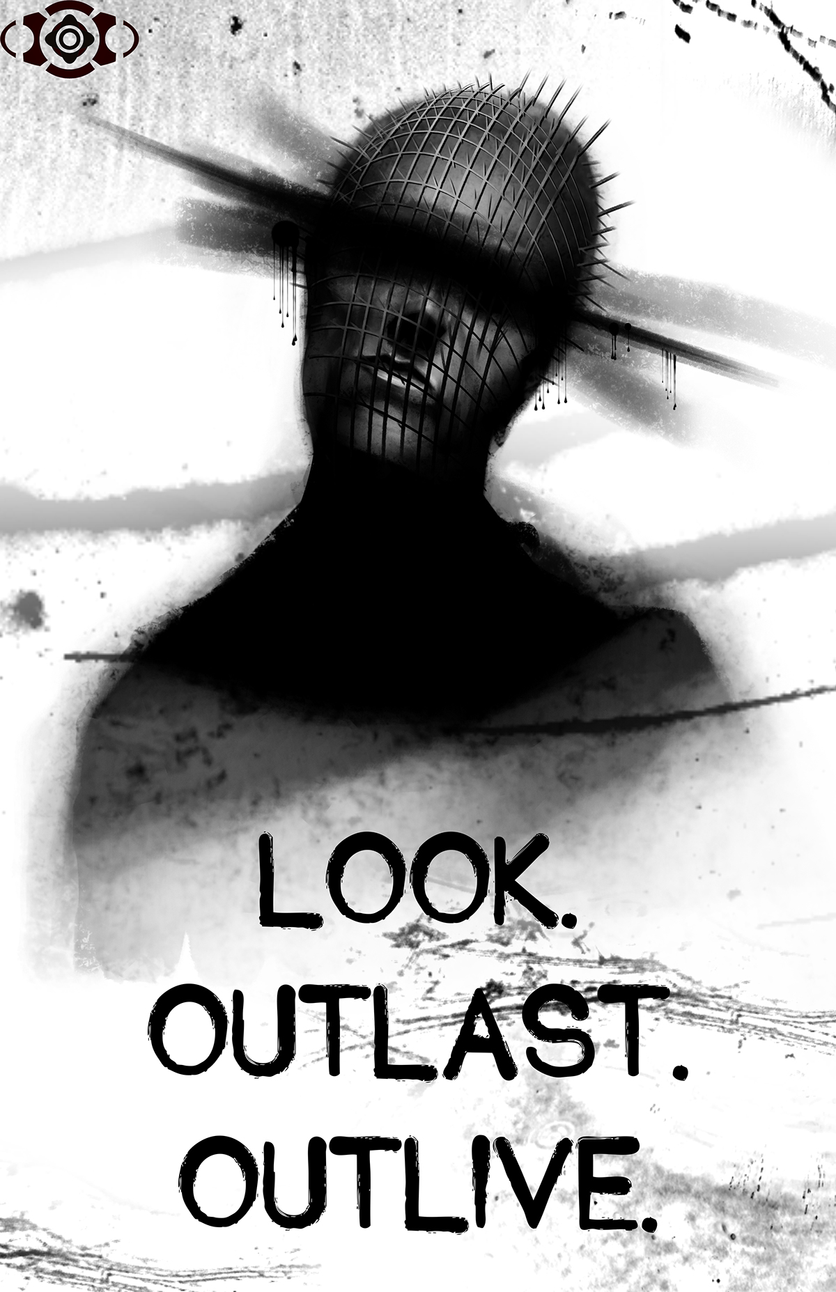
Design by Matt Clark
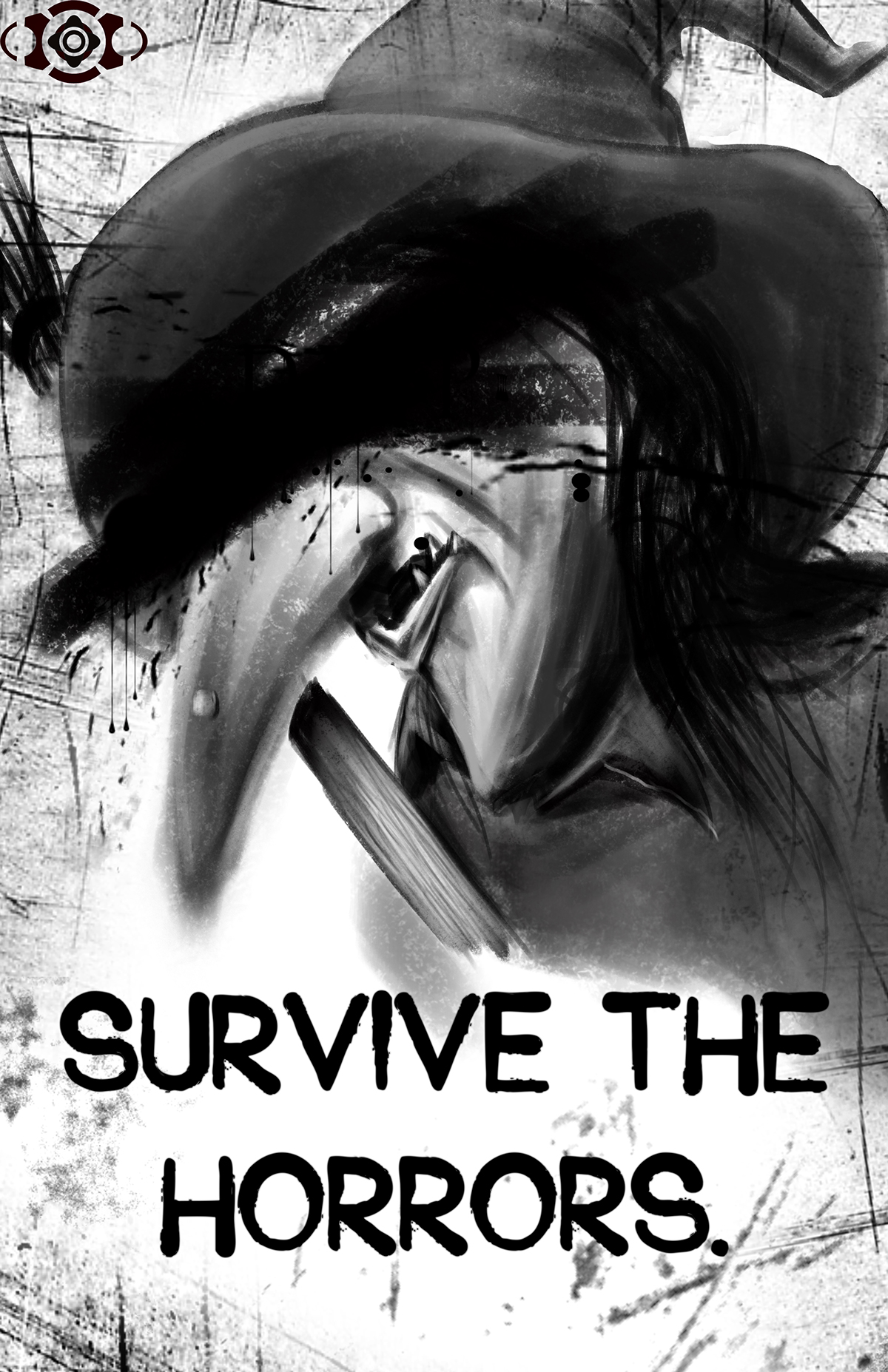
Design by Tom Rosenow


VIDEOS
Created by Jaeho Lee.
After Effect
Created by Jaeho Lee
After Effect: Plexus
Created by Jeffrey Chance, Tom Rosenow, Matt Clark
Created by Jeffrey Chance, Tom Rosenow, Matt Clark


