Virtual Reality - Innovation Legacy Map
Designed by Pallavi Kainady
In collaboration with Austin Hambling & Lishan Liu
2015
When approaching the innovation legacy map, we wanted to find the best way to visually demonstrate how our society has come to make virtual worlds a reality. Innovations are created to fill wants and needs, and in order to better understand why virtual reality has started to gain momentum and popularity recently, we wanted to explore just where in time these desires came from.
Our aim was to move away from simply creating a timeline and instead try to map out a more holistic and contextual overview of VR. To visualize this journey we identified the three most influential areas of interest that contributed significantly creation of virtual reality: culture, technology and gaming. These areas were thought of as pillars that have been built up and ultimately support the creation of the virtual reality innovation we see today. Once the main topics were established we were left with basic secondary research to learn more about the legacy of virtual reality, which was then organized into a chronological info graphic.

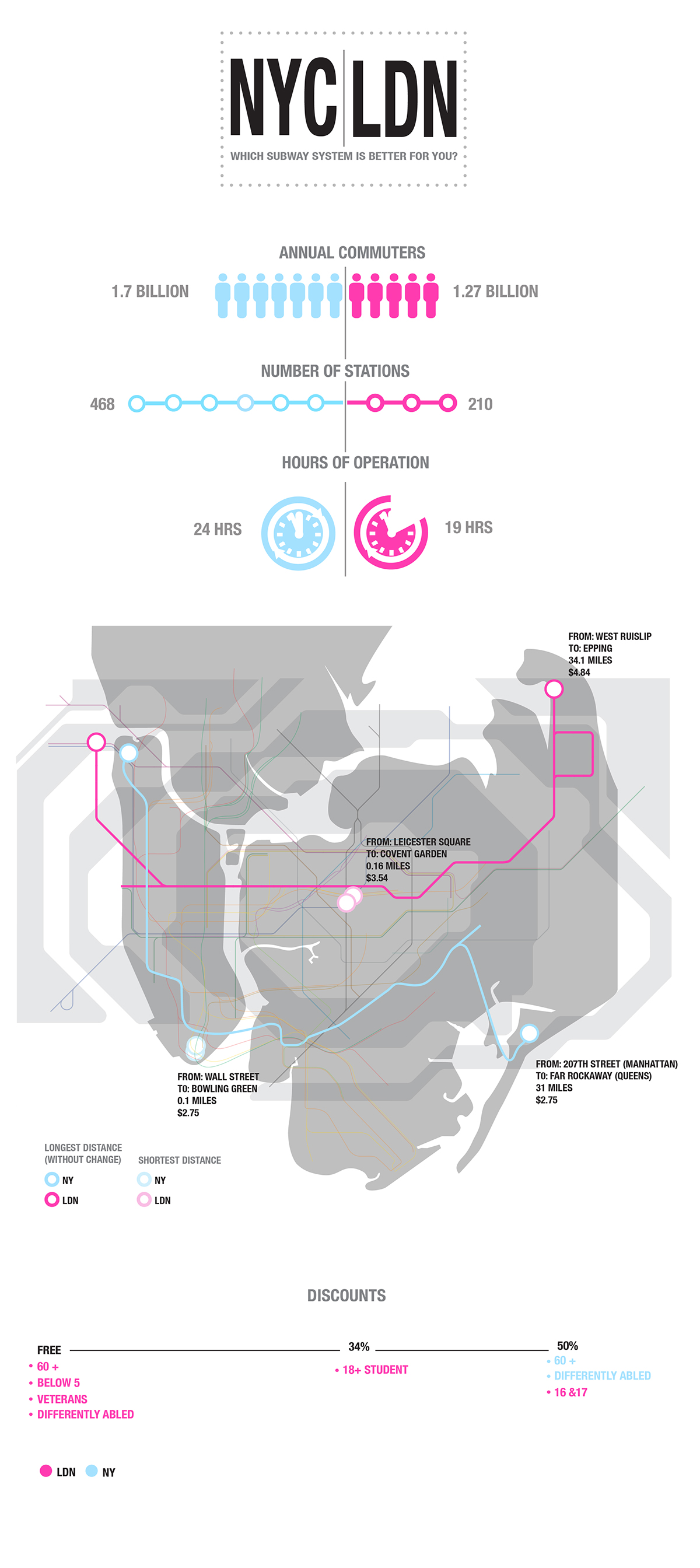
NY/ LDN
Designed by Pallavi Kainady
In collaboration with Gabrielle Cohen & Cesar Ricci
2014
Designed by Pallavi Kainady
In collaboration with Gabrielle Cohen & Cesar Ricci
2014
A comparative infographic study of the New York subway and the London Tube. Factors taken into consideration include: annual commuters, number of stations, hours of operation, cost/distance and discounts.