


UNSEE was inspired by a writing literature class I took from the California College of the Arts (CCA),
which explored the American identity issue. I self-directed this bilingual concept jewelry line called “unsee” with Manee Wong.
We played with the double meaning of the Chinese character “unsee,” which may be interpreted as “cannot see” or “don’t want to see,” and is subtly representative of Asian American immigrants’ experience of invisibility in American society. In order to visually express the “invisible” concept, each jewelry piece was painted to match the color of customer’s clothes.
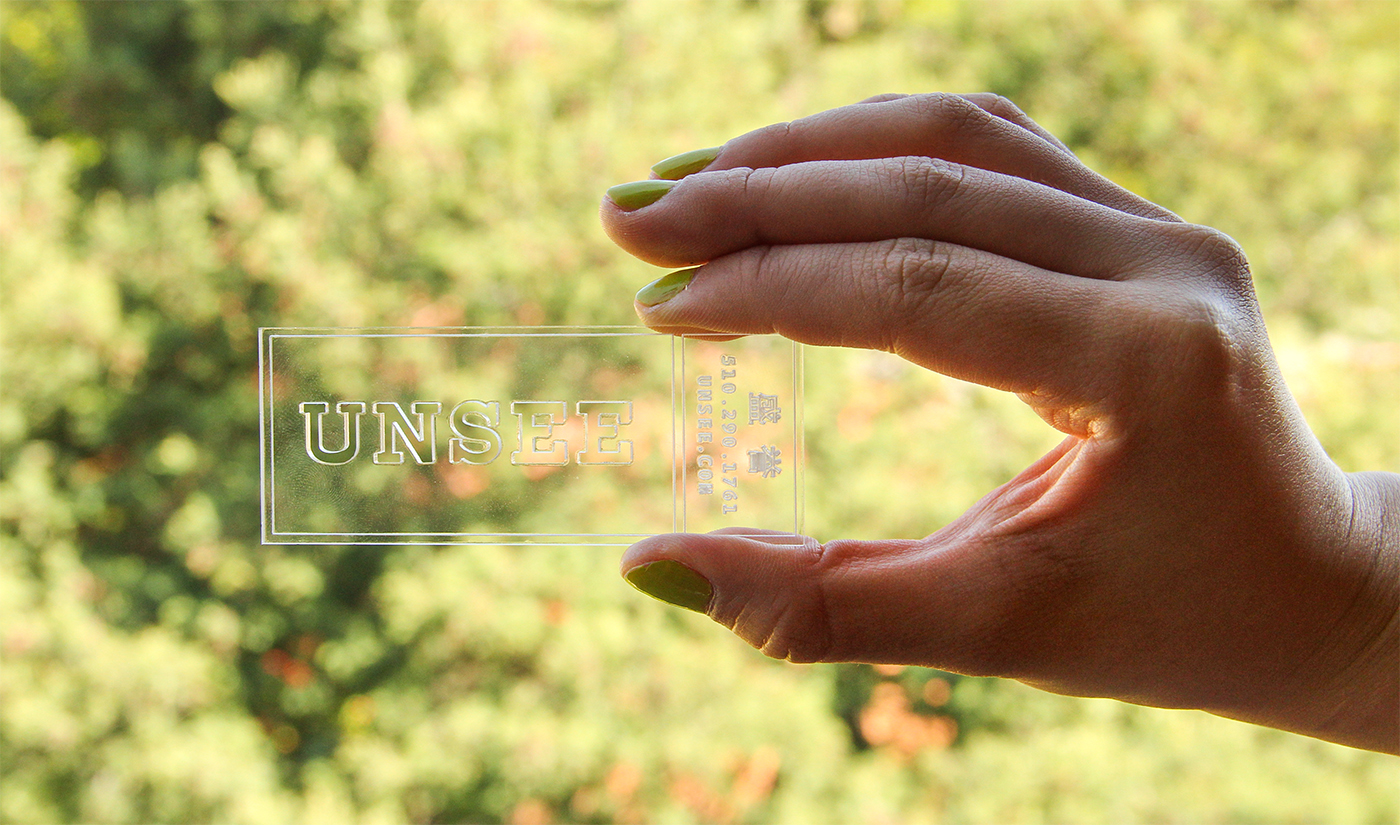
Signage
-
To translate the unsee concept into visual language. We chose the acrylic board as the signage material.


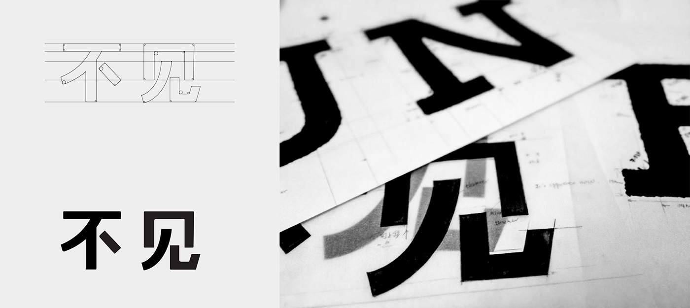
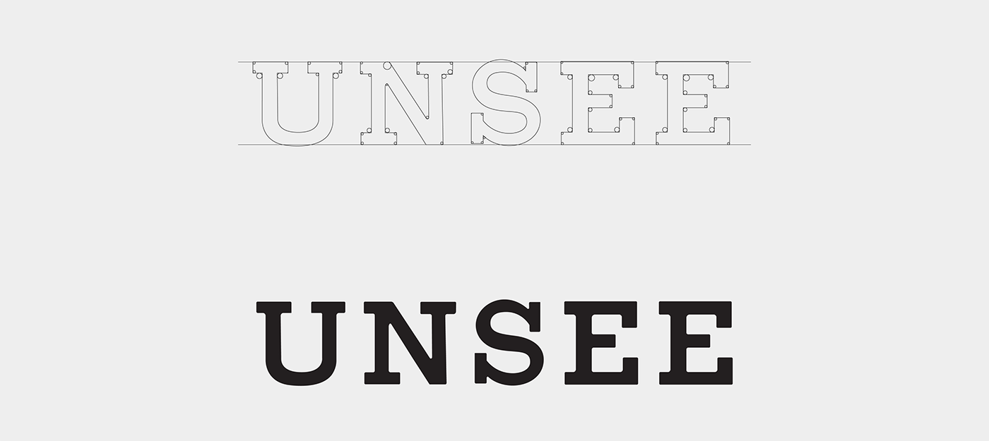
Logotype
-
Design Process:hand-inked Chinese and English logotype
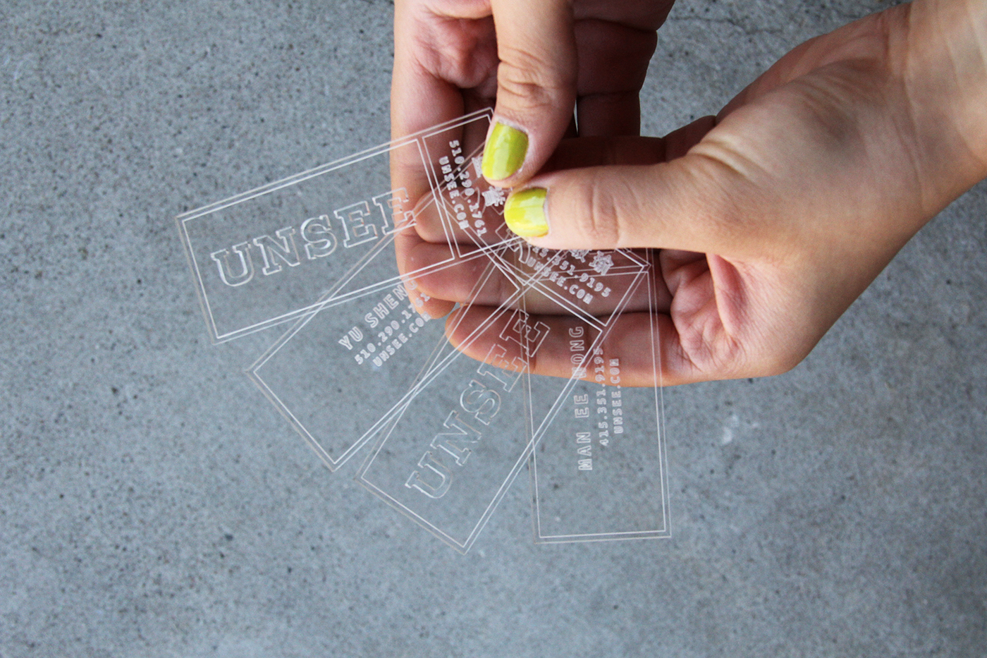
Business Card
-
We also chose acrylic board as the material of business card.
The logo part was whole way cut through and half-way cut for the other information.
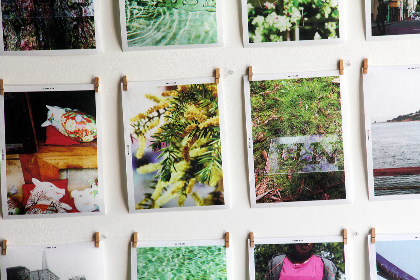
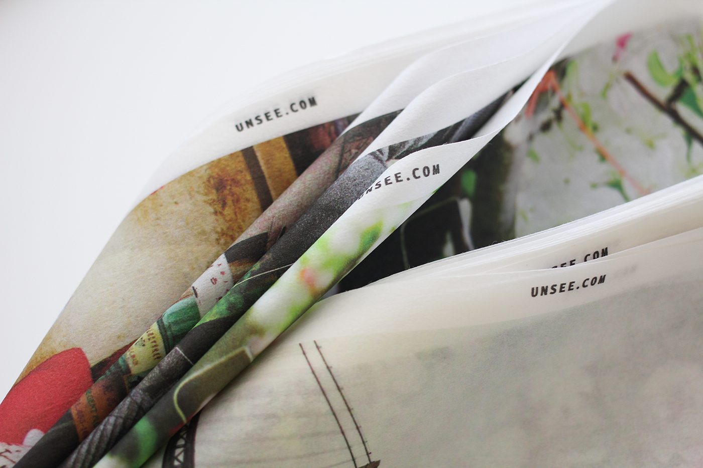
Poster
-
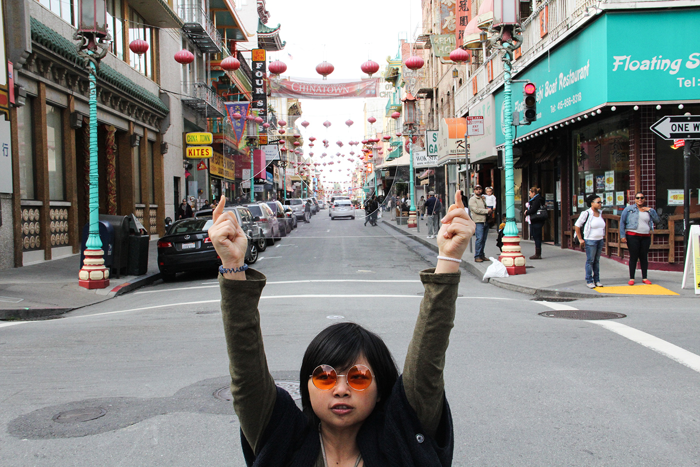
We took photos of the signages within different environments, then created a 28-piece poster set.
The posters are printed on limited edition rice paper (We love its texture!)


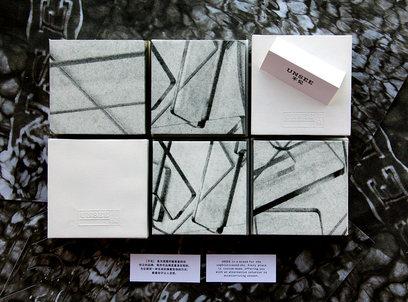
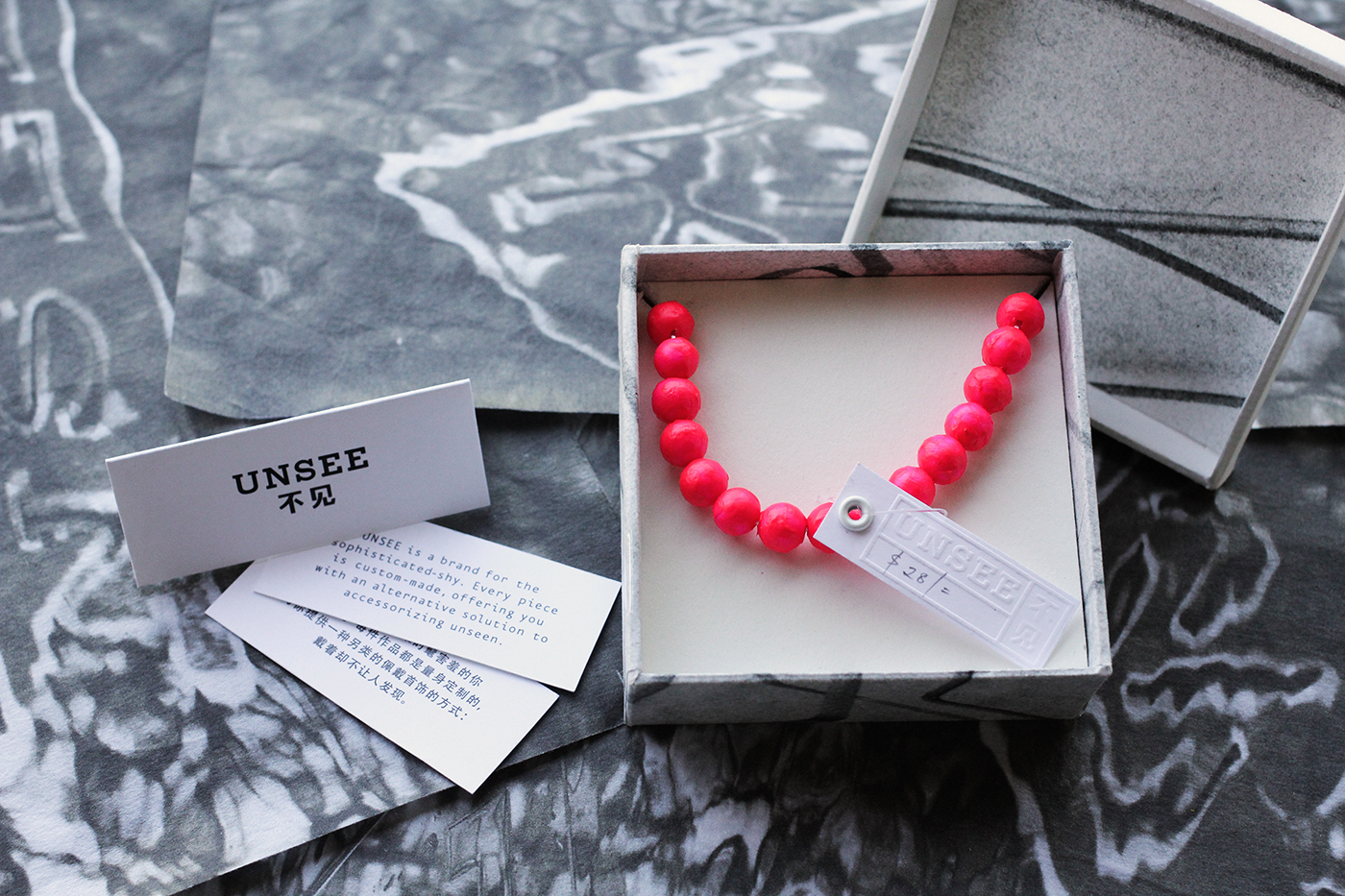
Jewelry Packaging
-
The paper packaging texture came from the photos of signage.
Embossed logo on the box lid and price tag, leaving space for writing price and the given person's name
Promotion Video
-
We made this stop motion for promoting and demonstrating the experience


