


This project started because of a conversation I had with a couple of old friends.
In this particular gathering, the topic of trust was brought up. Yes, the same kind of trust amongst friends or a significant other, but in the context of the design process. I’m glad we all made the extra effort to catch up, otherwise I probably wouldn’t have been inspired to create this lettering piece and case study.
Anyway, shall we begin?
Preliminary Concepts
Initially, I envisioned a brush pen for the base of the lettering. This has been my preferred tool for the past several months, so it made sense to start with it. As you can see, my first batch of sketches were done with a few different brush pens and still very exploratory.

Change of Direction
As I mentioned earlier, I intended to build upon the strokes generated by the brush pens in my sketches. I didn't do any roughs with pencil. I knew how the composition was going to look, but didn't have a clear objective. I still had questions to be answered like, "Why am I doing this and what's it for?" Maybe filling out my own questionnaire would've helped me narrow down my focus—maybe not. The one thing about designing for yourself is that it's never easy.
So I went back to the drawing board.
Inspiration
I spent some time away from sketching to really uncover my goals for the project. I knew I wanted to make this a great piece after some thinking, but how? I realized that I was going to have to invest more time and get slightly out of my comfort zone if wanted to do that.
During this time, I looked through some of my early work. I was reminded of all the beautiful swashes and flourishes I've missed. I did a Google search for "spencerian lettering," which I've been a fan of from the moment I set my eyes on the high-contrast style. After seeing a few examples from Keith Morris and Tony Di Spigna, I knew that this was going to be the new direction because it exemplified the elegance I was looking for. It's a perfect mix of familiar and unfamiliar territory.

Keith Morris

Tony Di Spigna
Sketches
My first round of sketches were purely compositional with a goal to find the right balance. I was happy with keeping each word on its own line because I liked the way "the" sat nicely between "trust" and "process." It also made the reading sequence clear, which was important to me. I didn't focus on weights, letter-spacing or any other details. I started with a lead holder, then switched to a ball-point pen. It felt smoother writing with the it than the pencil since I was using quick-gestural movements. Below is the original sketch with the rough composition.

In the next phase, I experimented with weights, swashes and flourishes as well as the individual character of each letter. Since this is my first attempt at Spencerian-inspired script, I sketched several variations to see what worked and what didn't. For the most part, the layout stayed the same throughout my revisions. The letters 'r' and 's' went through a lot of changes.

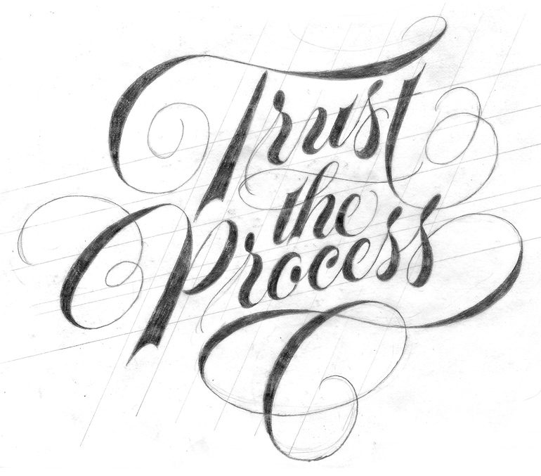
Here's the final sketch I took into Illustrator to vectorize.
Vector
Once I brought the final sketch into Illustrator, I named my layers and added guidelines. It's the first thing I do with all of my projects and it's a crucial part of my work flow. In an effort to keep things consistent, I attempted to utilize the Width Tool to build the highly-contrasted strokes. I discovered later, through trial and error, that this approach wasn't the best. I didn't have the control I needed to finesse the curves and things weren't looking as natural as I wanted. Although, I "wasted" a total of two hours, I learned from it, got some practice and moved on. The screen capture below shows some of that process until I finally abandoned it (you might want to lower the volume if you're not a fan of electronic music).
What do you do when things aren't working out?
You start over. And that's exactly what I did.
Luckily, I didn't have to start over completely. Everything was still set up and ready for the Pen Tool. The one thing I do enjoy about doing it the "old-fashion" way is that I have full control of the directional handles at all times and the ability to make adjustments as I go. Although I'm pretty comfortable with the Pen Tool, I had never vectorized a script like this without using the Width Tool (Let's grow old together and Without a box there can be no outside the box thinking were created using variable widths). It was a challenge in the beginning, but I knew my perfectionist-self would push me to get things right in the end.
Adjustments
Taking breaks, especially while vectoring, was very important throughout this step. I was able to see things with a fresh set of eyes every time and make the proper adjustments without settling so quickly. For instance, I noticed the swash on the stem of the 'P' was a bit long. I shortened it and enlarged the entire letter to fill in the gaps. I also adjusted the swirling swash of the 'T' cross-bar as well as the letter-spacing and other minor tweaks.
I spent about a good week just revising directly in Illustrator. It wasn't until all the subtle revisions were done that I noticed how weighted the thinner areas felt. It didn't feel sophisticated and elegant enough. So, to make the overall weight appear "lighter," I thinned out the strokes even more. You can see how much my original trace differs from the final.


Color
Since I knew I wanted a classic and timeless look, I went with a black and white color scheme. I didn’t want the black to be overpowering, which is why I chose white as the background.
Final Thoughts
Originally, this was going to be just another self-initiated lettering project. Having the discussion with old friends quickly changed that. I’ve gradually recognized the value of having a trustworthy process that works for me and who knew that one casual get together would spark this whole thing.
I guess that's what friends are for.

I turned this lettering project into a beautiful 8" x 8" letter-pressed print on 110 Lettra Pearl White paper.


