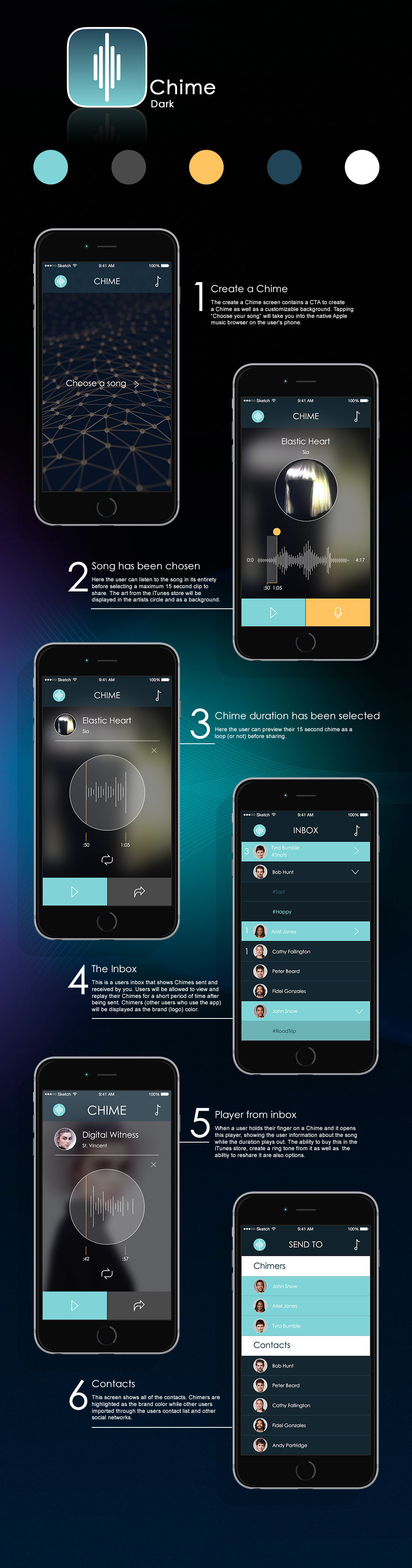
This simple dark version features an intuitive user flow and leverages artist cover artwork as backgrounds and icons. The brand color is a teal and is used in the design as a logo background, play button and the background for Chimers, other contacts who also use the app. Orange is used sparingly when related to sampling or selecting the music clip. The font is Century Gothic. The logo has 2 levels, on one level it represents the audio waveform we see and share when we “Chime”. It also represents chimes that hang around, delivering beautiful tunes.