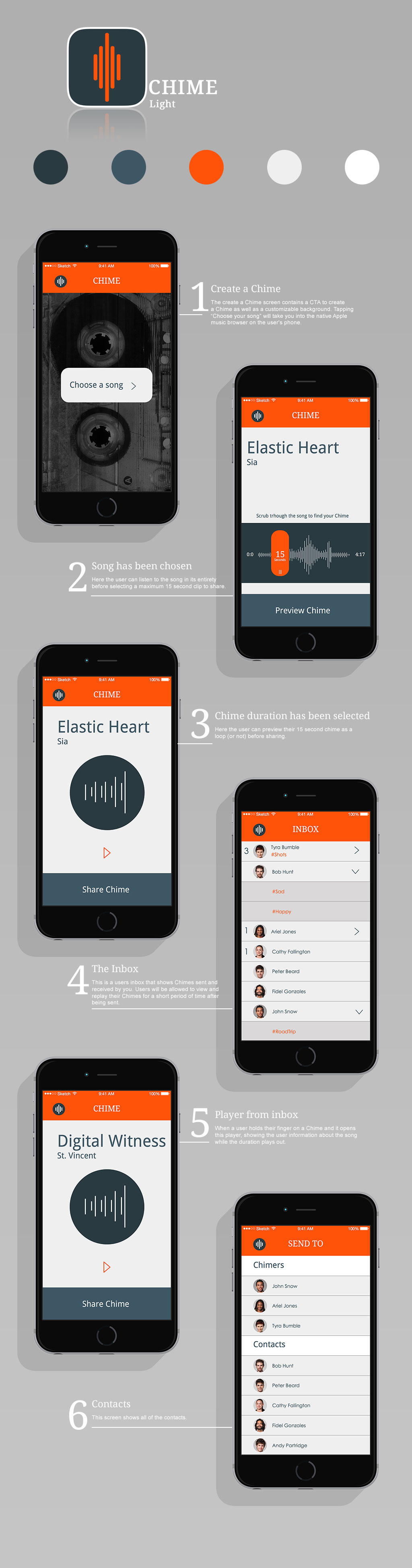
This simple light version features a intuitive user flow. This alternate version of the darker one eliminates the artist imagery, is a cleaner design and has a customizable log-in screen. The logo has 2 levels, on one level it represents the audio waveform we see and share when we “Chime”. It also represents chimes that hang around, delivering beautiful tunes. The font is Droid.