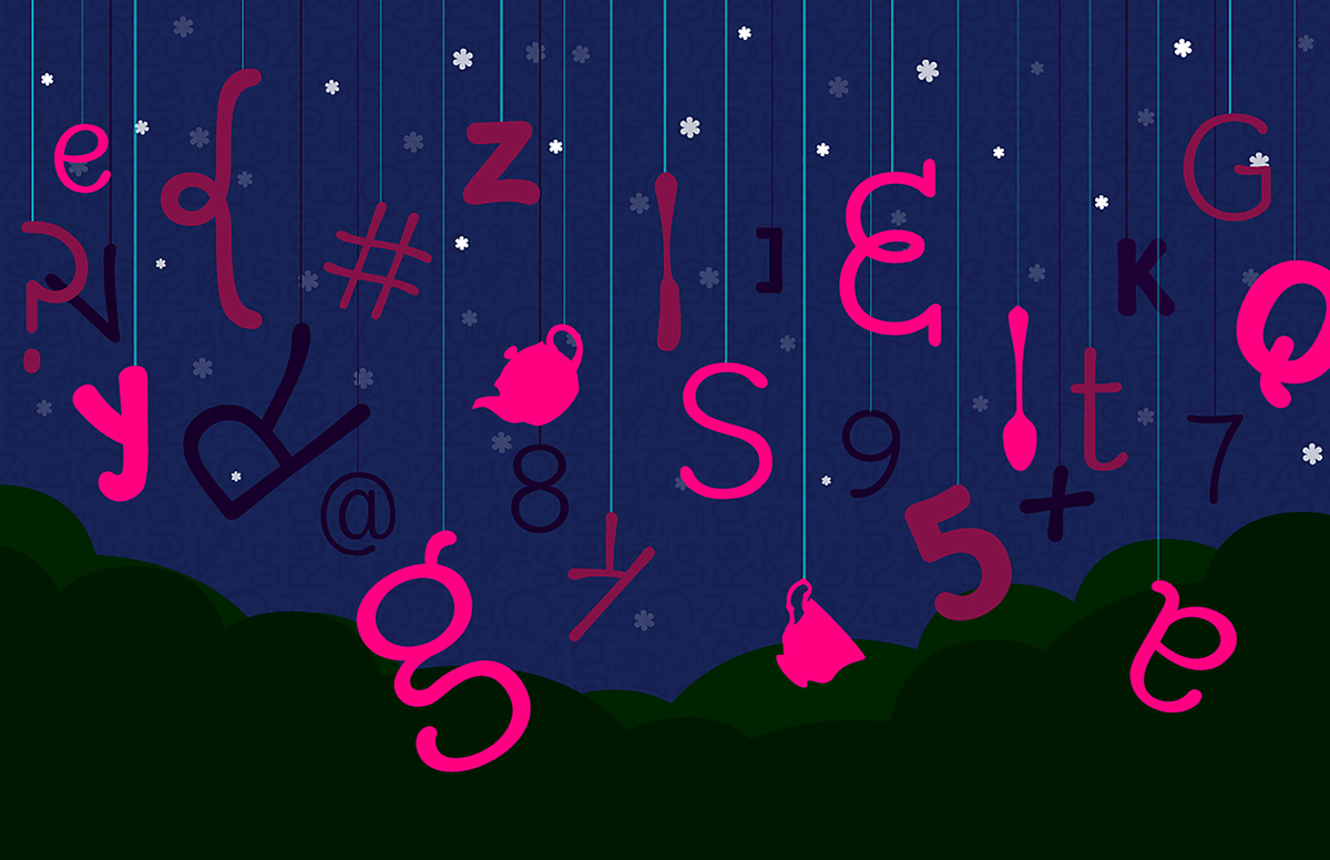
One of my last projects at MICA was to create a typeface. This typeface which I eventually dubbed "Betty" reunited me with typeface guru Tal Leming. Under his direction, I crafted a friendly typeface that would mimic the quirkiness of a handwritten font. As with almost all design projects, it all began with a sketch:
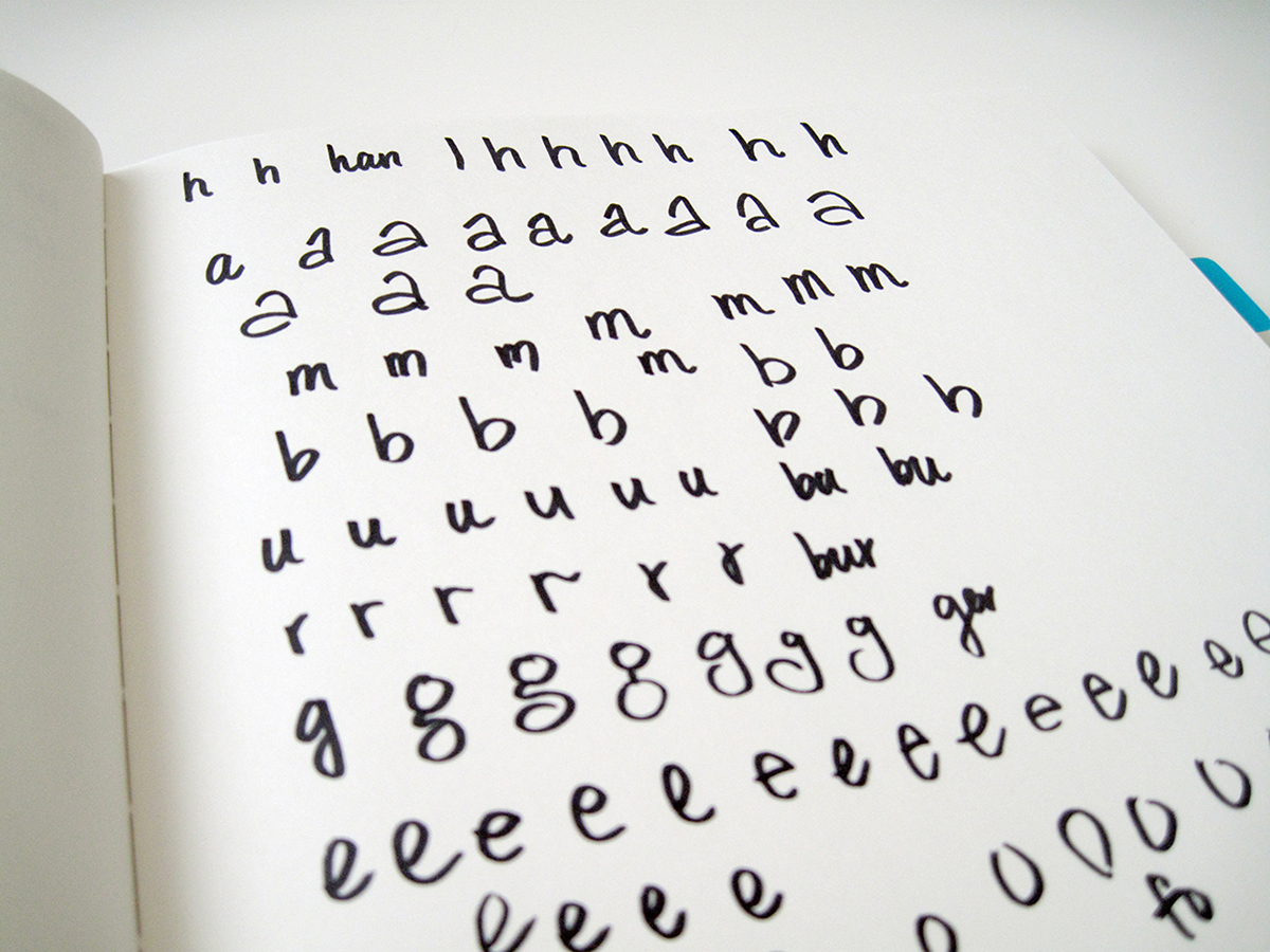
I've always been interested in how different people wrote letters differently, and over the years my own handwriting has evolved on a subconscious level. For this project, I really had to force myself to think about how I write, and to concentrate on each stroke, curve, line, and dot. It was difficult, but also strangely meditative.
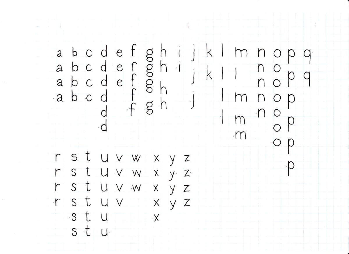
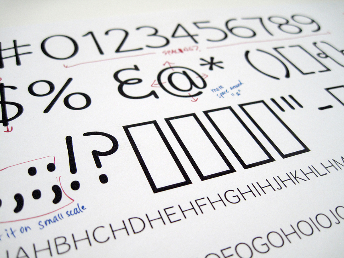
Next, I used graph paper to keep the width/height consistent as I perfected each letter to my liking. This included lowercase, uppercase, numerals, and various punctuation.

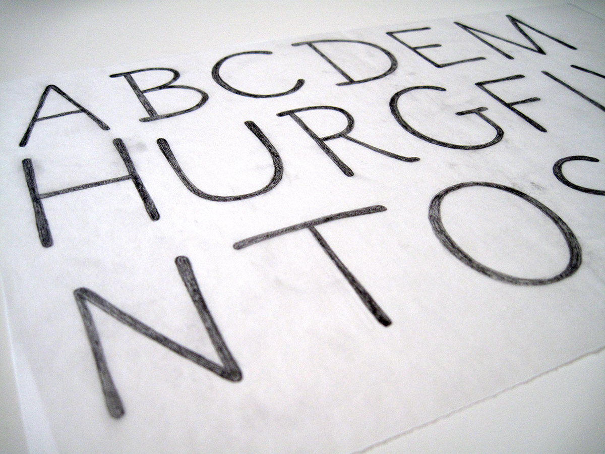
After reviewing with Tal, I began drawing each letter on tracing paper, but on a larger scale. This enabled me to focus on the forms of each shape, which I would eventually take into the computer to trace.
Tal is not only a big fan of Robofont, he is also one of the contributing developers and have drafted many plugins. I found it tricky to switch from Illustrator to Robofont, but also found some things easier to execute. It's a nifty tool that was developed solely for the purpose of typeface crafting.
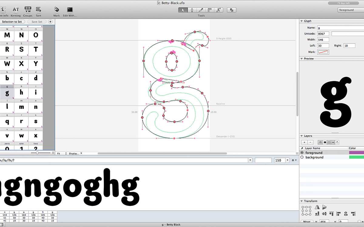
This definitely took the most time out of the semester. Although I was working from precise sketches, it was still time consuming to manipulate each bezier curve. I had to constantly readjust my heights, widths, and not to mention kerning pairs. I have such a newfound respect for typeface designers, as this process was rigorous and demanding.
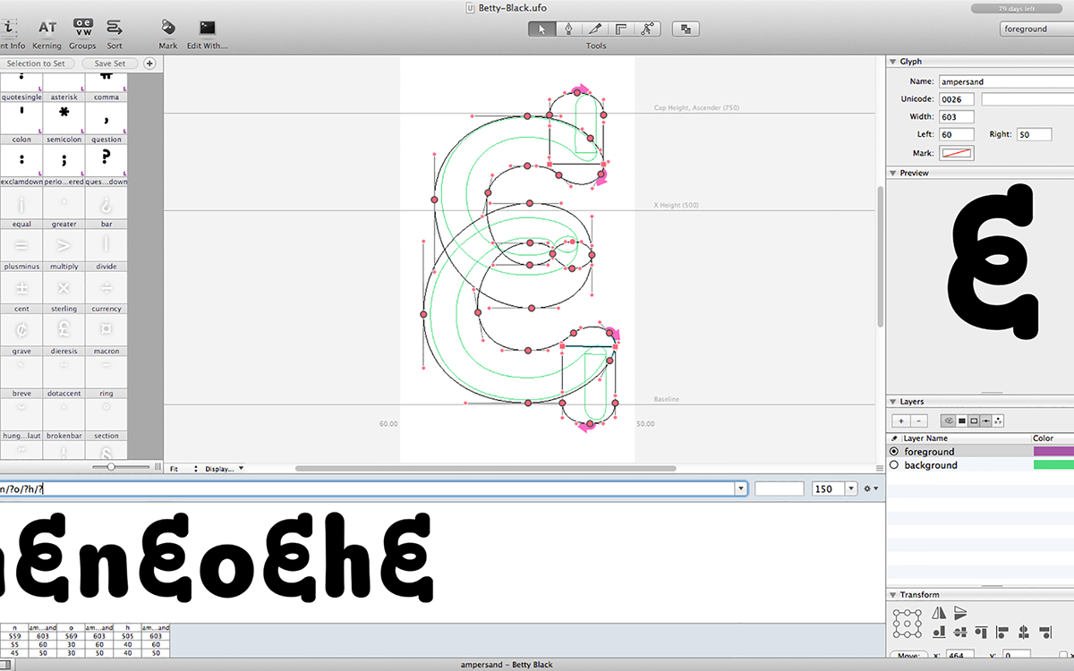
As I simultaneously crafted each letterform, I also had to print them out and compare them side by side with other letters for consistency. This revealed a lot of mistakes, but it was a vital part of the process too.

Tal Leming was instrumental in the development of Betty. With his years of experience making typefaces, he was able to easily spot mistakes that I wasn't able to. Our weekly check-ins made sure that I was on the right track the whole time, and it was such a pleasure to see a pro at work, doing what he does best. I learned so much from Tal.
When each letterform was completed, Robofont automatically created them at different point sizes. This was quite convenient because it allowed for a seamless transition into InDesign, which I used to make quick little paragraphs to print out. This was helpful with kerning pairs too, and provided a medium in order to gauge legibility. Robofont rocks!

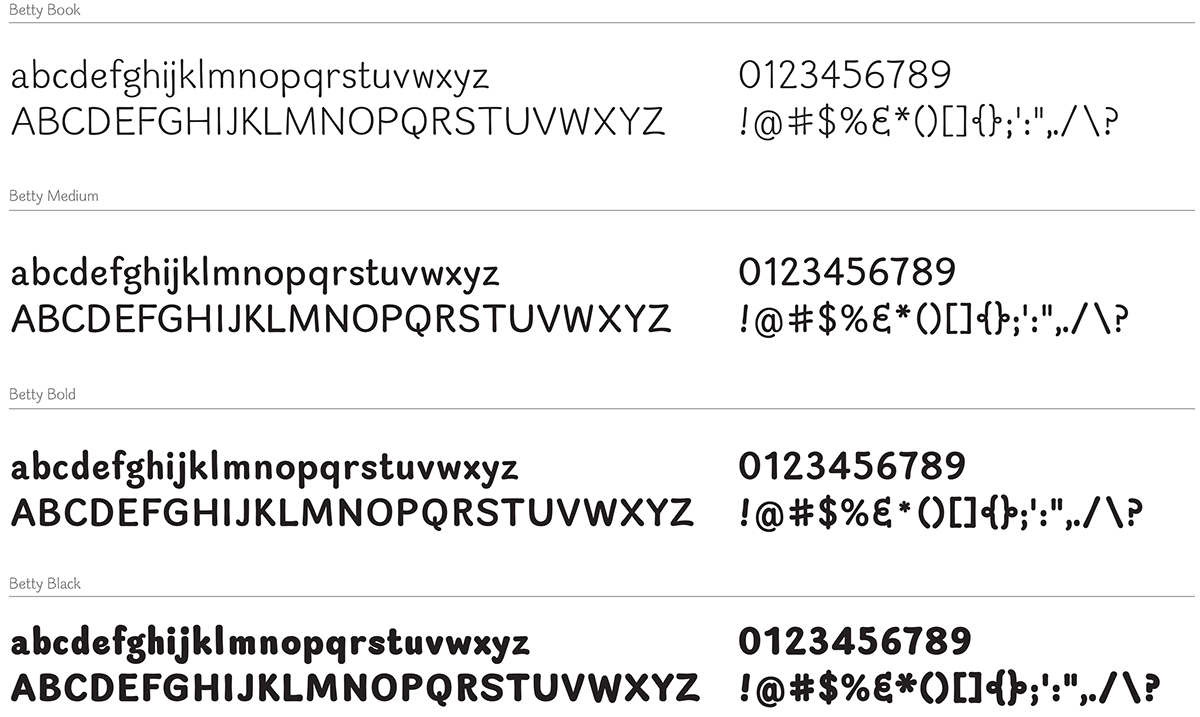
Another cool feature of the tool is interpolation, which allowed me to create different weights almost automatically. I needed to have a bolder option first, so I repeated everything I've done so far for to make a bolder weight. Interpolation then mathematically calculates weights in between the two, giving us the book, medium, and bold options (provided you've created light and black first).
Here are the finals weights for the Betty typeface:
Here are the finals weights for the Betty typeface:

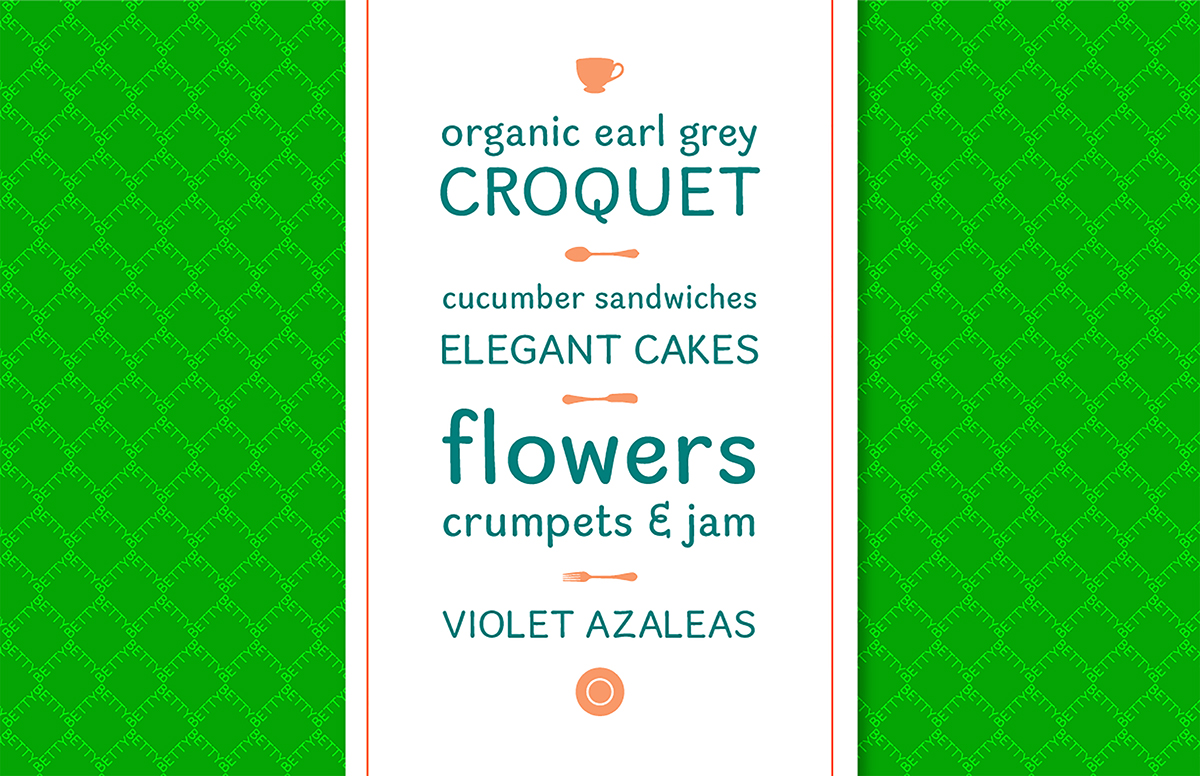
My favorite part was getting creative with my typeface. Since I named the typeface after the hit show Ugly Betty, I decided to borrow Betty's bold color palette to create a daring and fun type specimen.


Thanks for stopping by, and I hope you had fun reading about my process of creating Betty!

