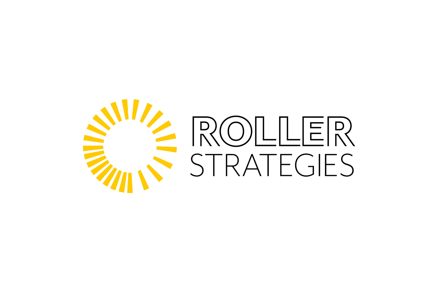
Signature / Horizontal version
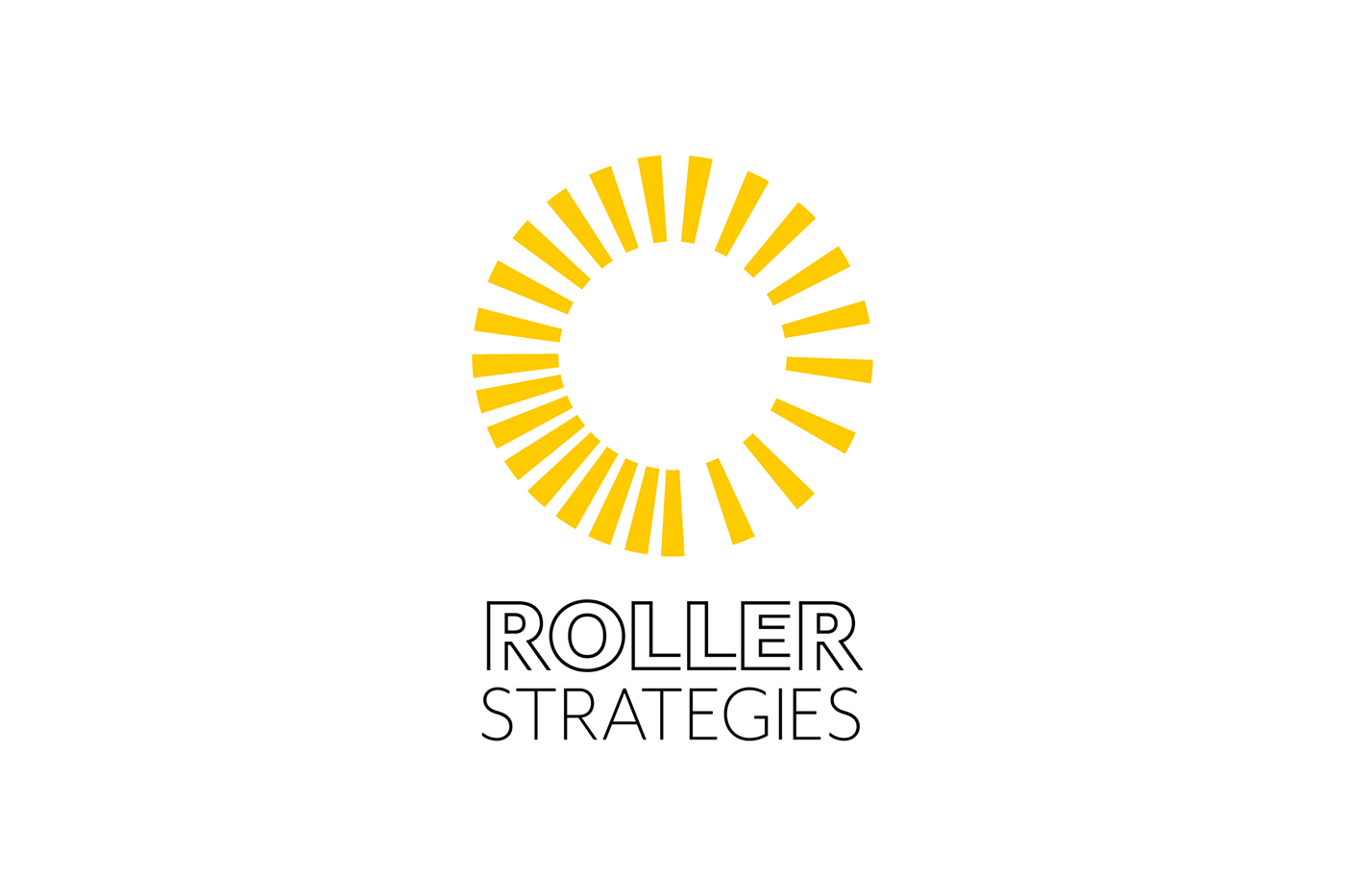
Signature / Vertical version
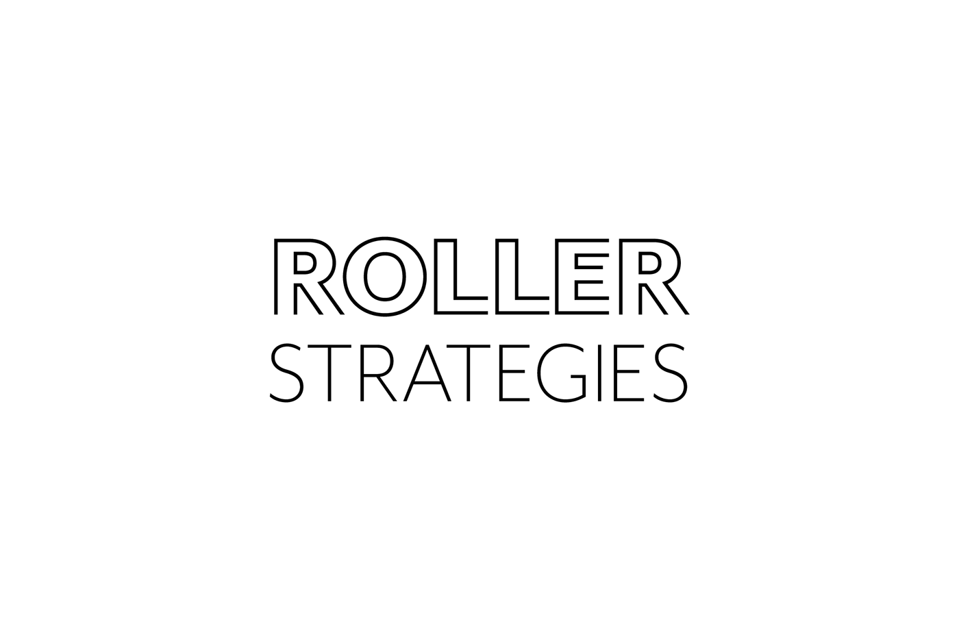
Logotype
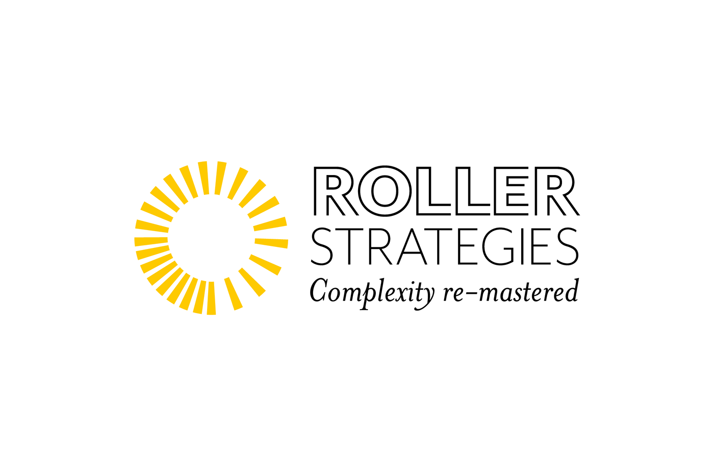
Signature / Horizontal version with motto
Signature / Vertical version with motto
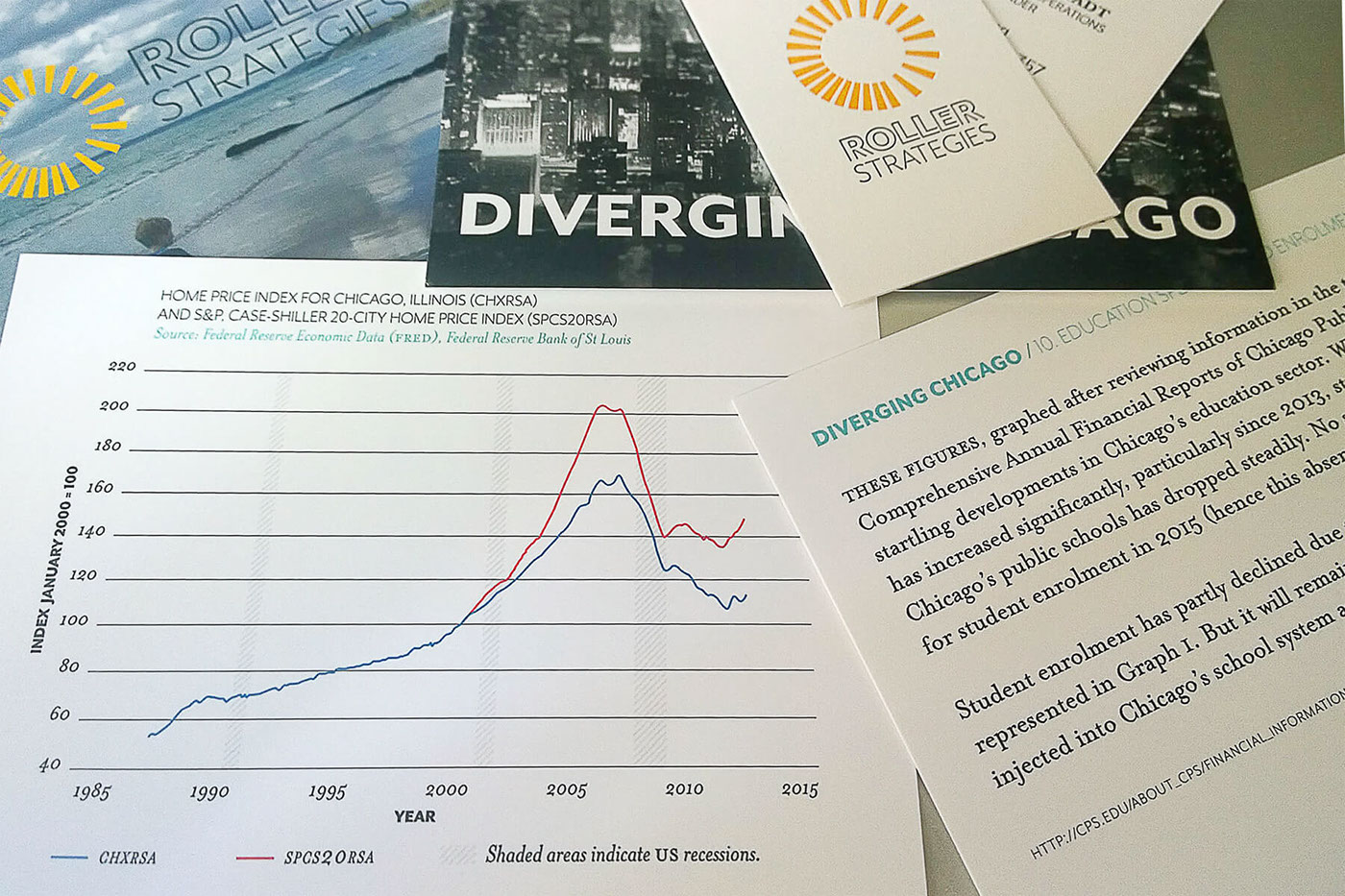
Diverging Chicago / Postcards
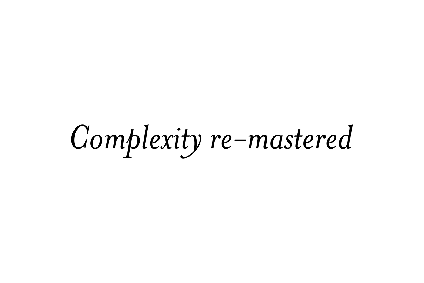
Motto
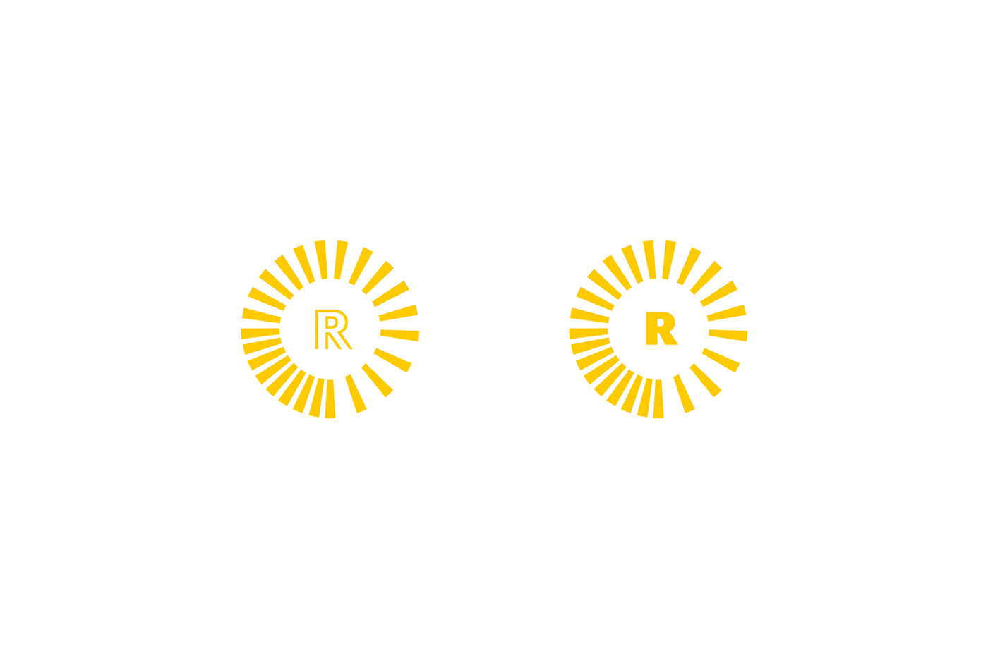
Mark / Concept
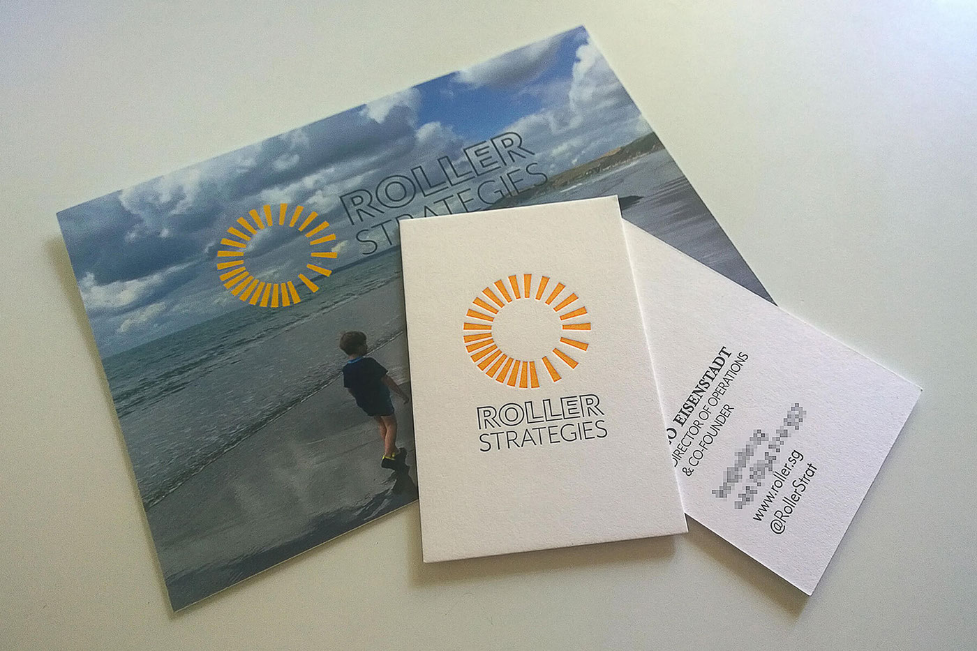
Business cards printed in letterpress
Business card and postcards for Diverging Chicago
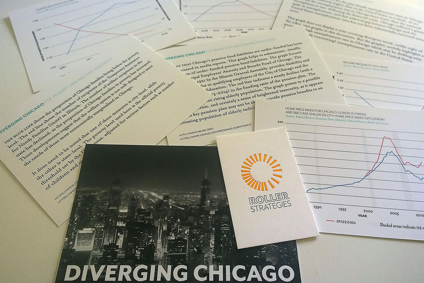
Diverging Chicago / Postcards
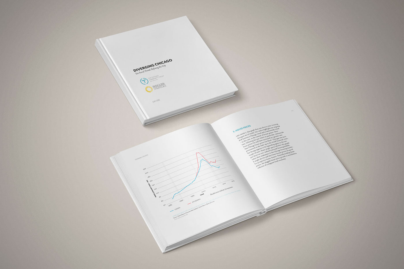
Diverging Chicago / Report
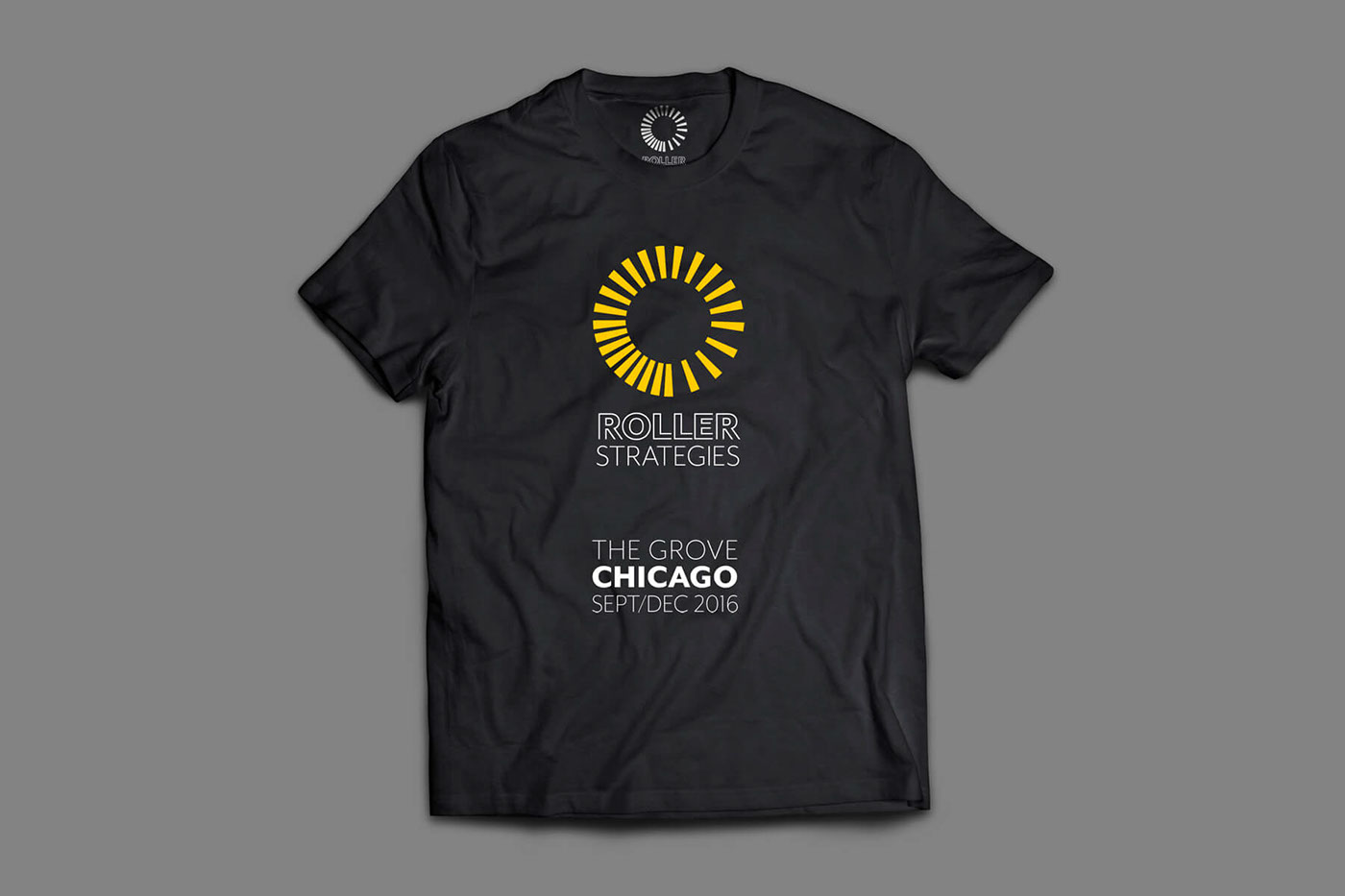
The Grove Chicago / T-shirt
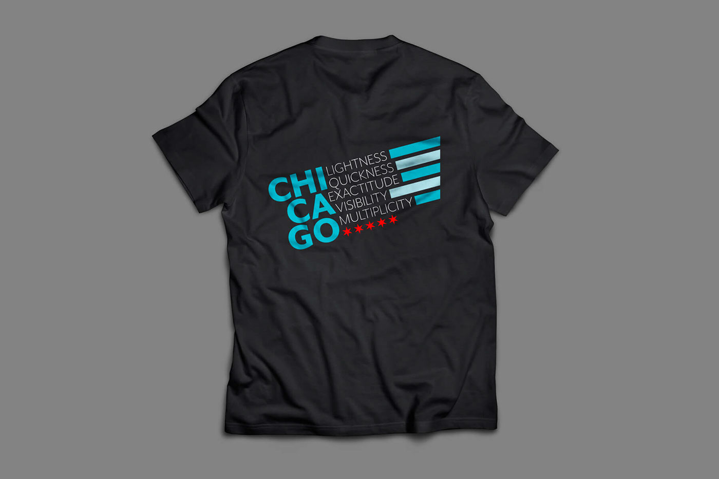
The Grove Chicago / T-shirt
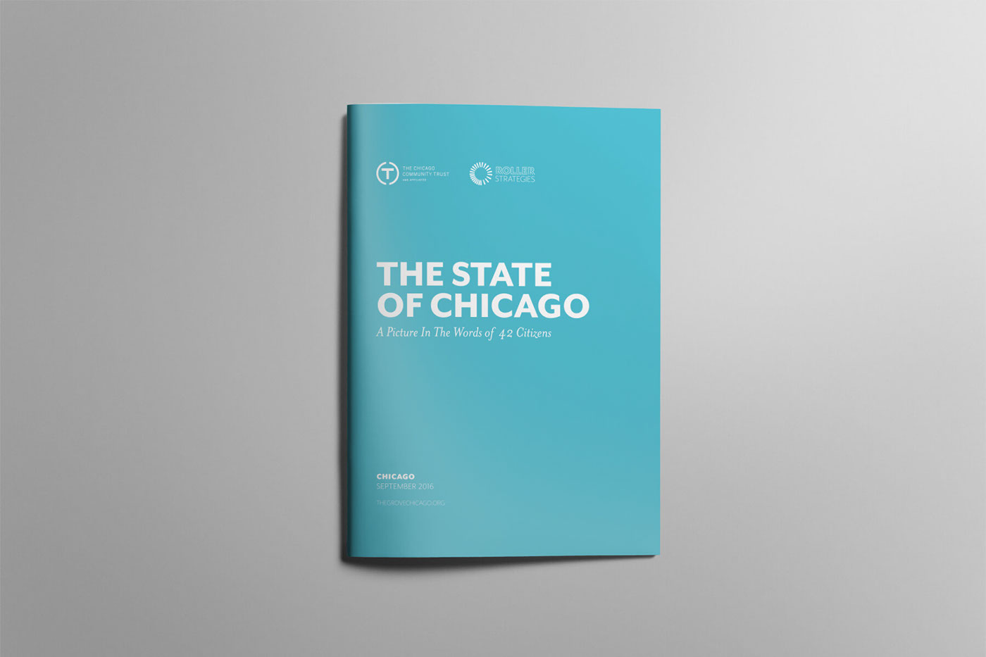
The State of Chicago / Report
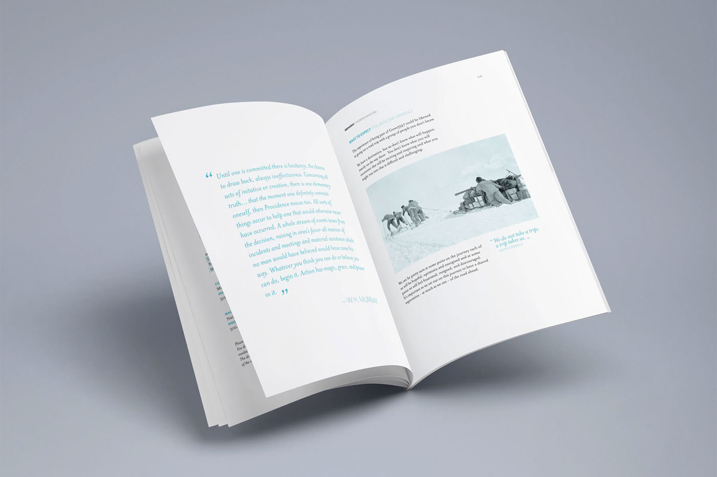
The State of Chicago / Report
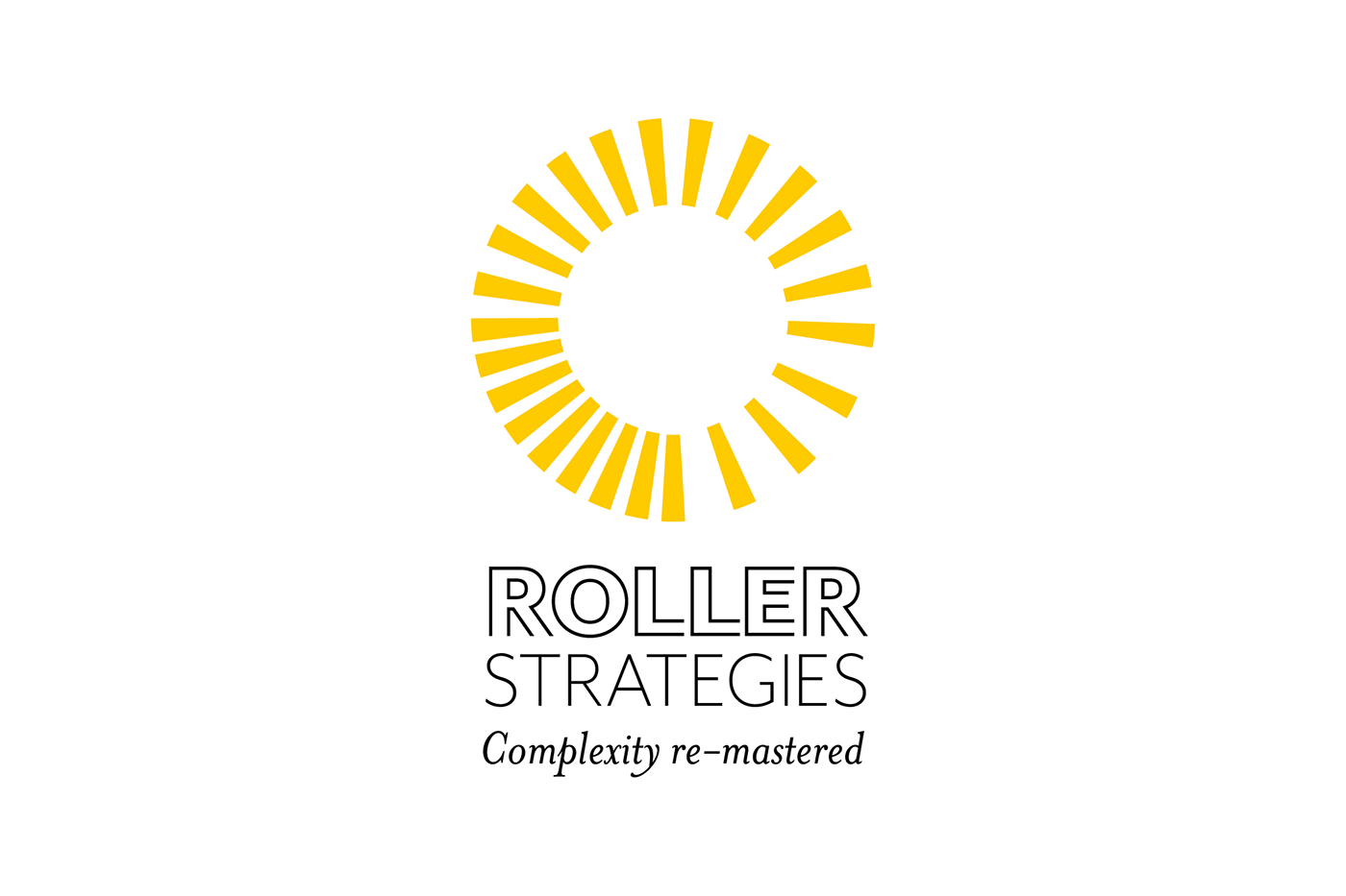
Roller Strategies
Complexity re-mastered
Identity for Roller Strategies Ltd, a professional services firm focused on next-gen solutions to the world's most complex challenges.
Logotype, mark, signature, motto, typography.
Logotype: Roller word is based on Mr Eaves Modern Heavy. The word has been then outlined, and some changes made to create a more distinctive visual result. Strategies word is set in Mr Eaves Modern Light.
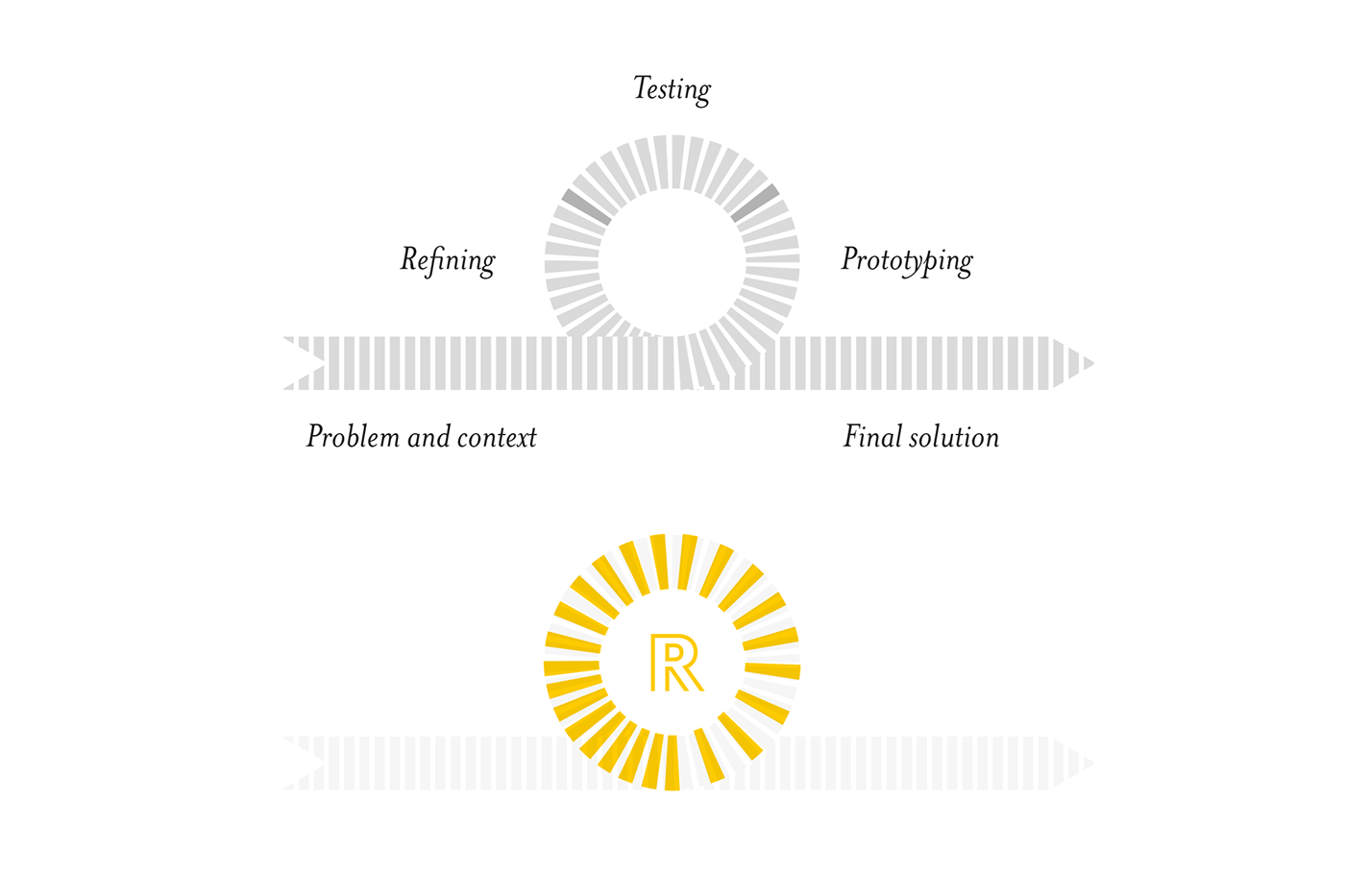
Mark: the mark is based on agile prototyping concept. Study of context and problem > Prototype > Test > Refine > Repeat till it works > Final Solution. The mark is used in its simpler form with the logotype to create the signature, but can be used with an R inside as a kind of trademark, "Made by Roller". The space between lines is first wide, then lines get closer and closer. The idea is to convey a sense of acceleration: the process starts slowly, but the solution comes out "at full speed".
Signature: logotype + mark. Two versions, vertical and horizontal, both with and without the motto.
Motto: Roller Strategies is focused on finding next-gen solutions for social complex challenges. So "Complexity re-mastered".
Typography: Roller's typography that will be used in their communications is based on Mr Eaves Modern (Heavy and Light) and Mrs Eaves, both by Emigre. Mr Eaves Modern Heavy will be used for headlines, sections' titles, paragraphs' titles. Mrs Eaves will be used for text, while Mr Eaves Modern Light will be used for subheadings, captions, summaries.


