Arcas (typeface)
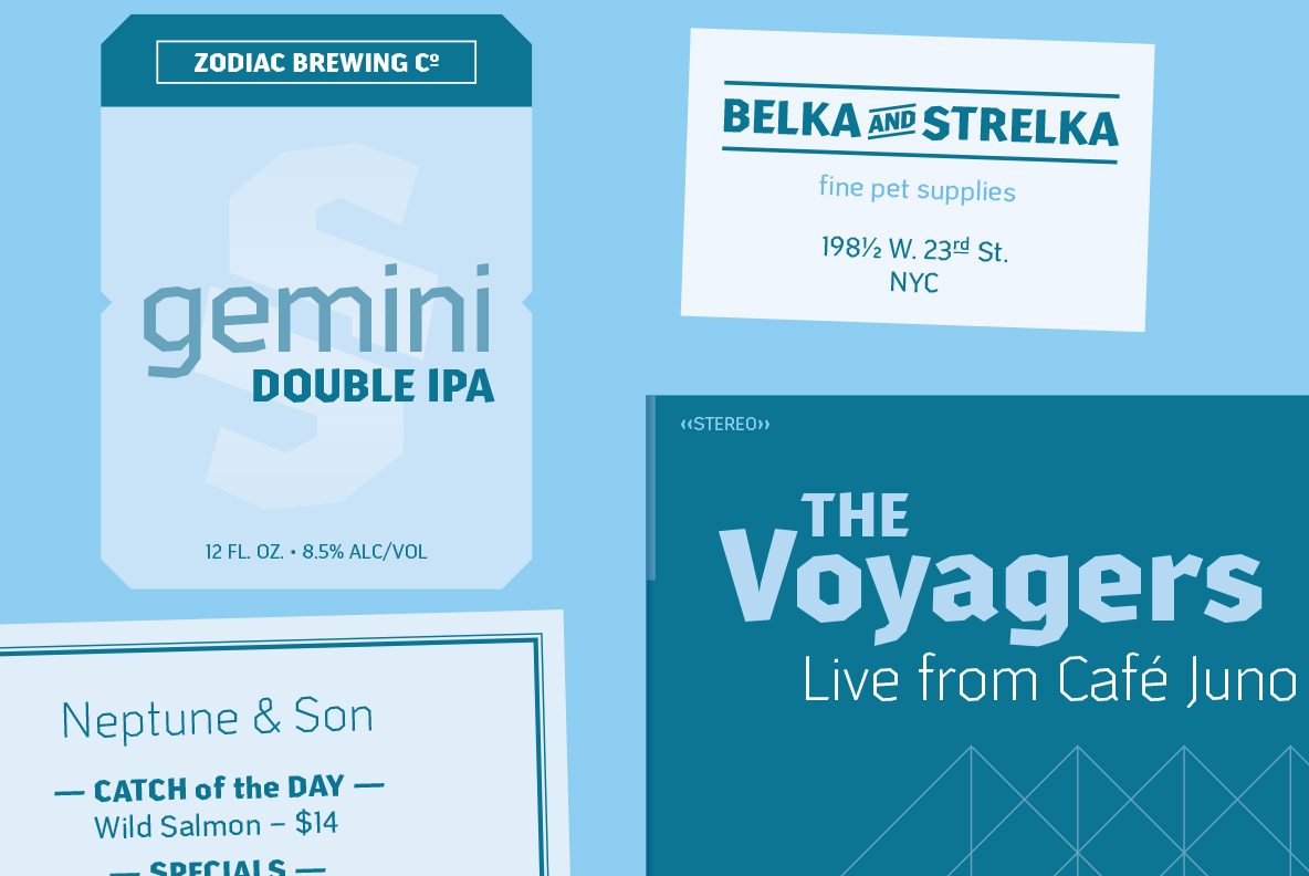
Arcas is a friendly sans-serif display typeface in three weights.
You can test the fonts and purchase a license at MyFonts or YouWorkForThem.
I thought it would be a fun challenge to create a typeface with no curves — straight lines only — but nothing like the typical fonts that do this. (Think sports-y or “college” fonts, which tend to be very symmetrical, or tech-y fonts that feel mechanical or futuristic.) Instead, I envisioned something a bit warmer and friendlier, with some asymmetry and some subtle contrast.


The Process

First sketches. Once I hit upon the idea of an asymmetrical O whose counter was a sort of offset hexagon, I was off and running.
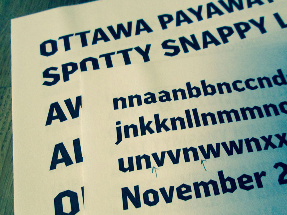
Early proofs. After being drawn on paper, the letterforms were digitized in Glyphs. At this stage—testing and revising the Bold alphabet—the mild blackletter influence was a bit more evident, but it was toned down as the design progressed. Note the "pointier" tops and bottoms of some characters, which were later abandoned.
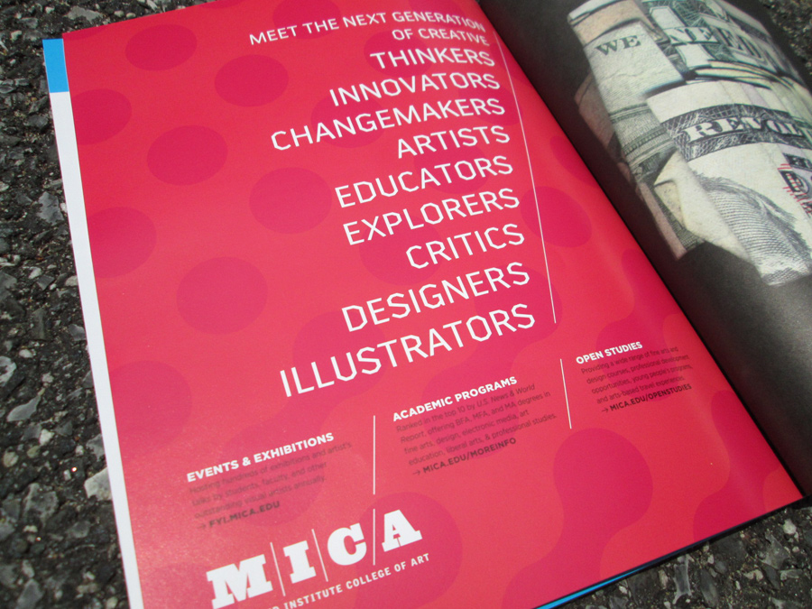
A test version of Arcas in its first real-world use in 2016. MICA ad designed by Post Typography.

About the name: Arcas was a figure in Greek mythology, the namesake of the Greek region of Arcadia — and also of the neighborhood I moved into shortly before getting the idea for this typeface. As the story goes, Arcas was transformed by Zeus into the constellation known as Ursa Minor (aka the Little Dipper). Just as constellations are drawn with imaginary straight lines between a set of stars, straight lines connect points to form the letters of Arcas.
Purchase Arcas at MyFonts or YouWorkForThem.

