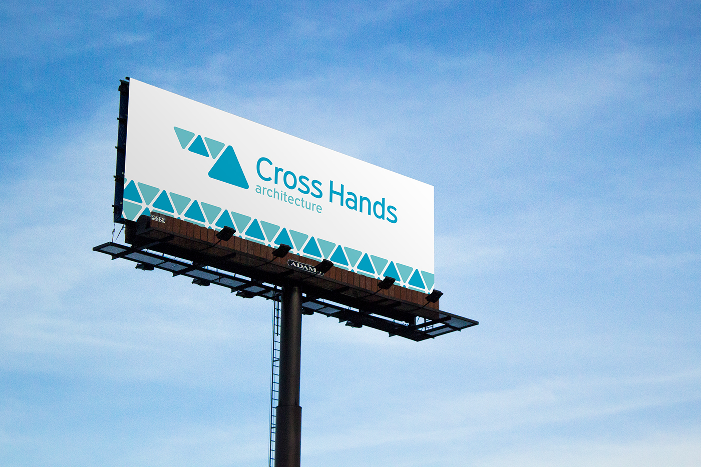
Cross Hands Architecture
Logo and visual identity
Cross Hands Architecture 2016
Cross Hands Architecture is an office that runs projects to promote Human Rights, offering innovative solutions by "Cross Changing": an optimist co-creation method that brings people together. They also construct pre-made, easy to build, modern shelters on refugee camps/war zones and poor countries around the globe.
-
For this project my goal was simplicity above all. The logo will be present in various countries around the world, therefore it should be transversal to all or most of the cultures.
The triangle shapes evoke a felling of organization, commodity and security, which contrasts with all the confusion and chaos that most of the time takes place in the action zones of Cross Hands Architecture.


Visual Concept
The organization of tents from refugee and war zone camps gave us the inspiration to create this logo based on shelter and protection.

Logo

Colors

Monochrome

On solid backgrounds

Font

Sub-logos

Secondary colors

Stationary

Visual Universe


