
THE HEXAGON
Logo concepts for a Baltimore art gallery and performance space – 2010
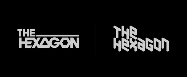
I designed these 2 logo concepts for The Hexagon's logo contest. The Hexagon was a DIY community art gallery and performance space in Baltimore. The call for entries required that the logo be versatile enough to use with widgets, emails, buttons, business cards, letterheads, and flyers.
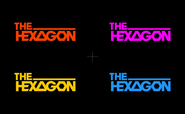
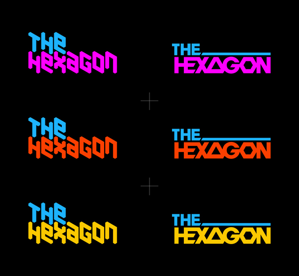
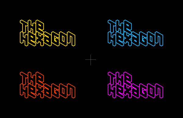
Logo 1 uses strict geometry to influence the custom letterforms. The definitive shape in the mark is the hexagonal letter ‘O’ with its 30º angles, which are reflected throughout the logo. Using 30º as a standard, all the diagonal cuts in the logo are derived from the hexagon.
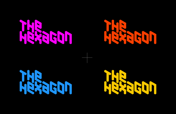
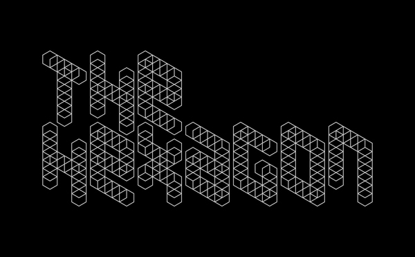
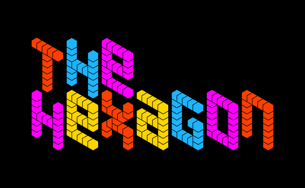
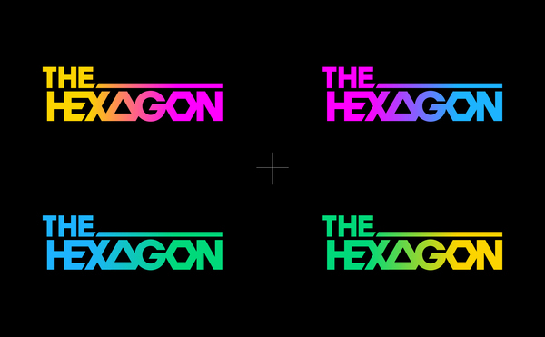
Logo 2 applies the hexagon shape once more, however by adhering to more rigid parameters in that the letterforms are built solely of a framework of repeated hexagons. This creates a unique situation where each letter takes up the exact same amount of hexagonal space.
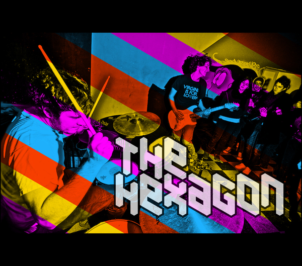
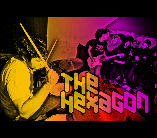
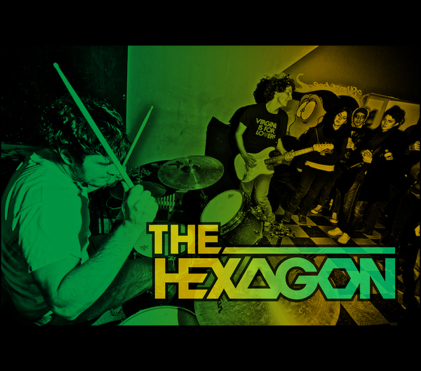
The photo of the uber awesome Baltimore-based basement rock band WEEKENDS performing at The Hexagon is courtesy of local photographer RaRah. You can check out his award winning photography at rarahphoto.com
Logo 1 uses strict geometry to influence the custom letterforms. The definitive shape in the mark is the hexagonal letter ‘O’ with its 30º angles, which are reflected throughout the logo. Using 30º as a standard, all the diagonal cuts in the logo are derived from the hexagon.
Logo 2 applies the hexagon shape once more, however by adhering to more rigid parameters in that the letterforms are built solely of a framework of repeated hexagons. This creates a unique situation where each letter takes up the exact same amount of hexagonal space.
The photo of the uber awesome Baltimore-based basement rock band WEEKENDS performing at The Hexagon is courtesy of local photographer RaRah. You can check out his award winning photography at rarahphoto.com


Visit my facebook page or follow me on twitter for Super Rad updates!
Check out work in progress on dribbble


