
The Data:
In the middle of each cluster is a person who works at Columbia University that wrote a paper. Other papers, that cited the Columbia Universitys paper, are linked by a line, are the same color, and are positioned around the paper they cited.
In the middle of each cluster is a person who works at Columbia University that wrote a paper. Other papers, that cited the Columbia Universitys paper, are linked by a line, are the same color, and are positioned around the paper they cited.
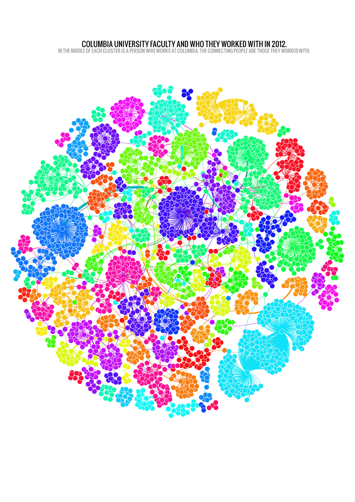
What I learned about this is when I showed the visualization to a professor, he told me the key to innovation is considered to be interaction. Here the innovation department is the least connected department, meaning the teachers that teach in that department, do not teach in any other department.
http://zackdesario.com/t1/ is a link to running that same visualization algorithm in the browser using JavaScript and new HTML5.
http://zackdesario.com/t1/ is a link to running that same visualization algorithm in the browser using JavaScript and new HTML5.

Above is a visualization I created while exploring the Columbia University's Department of Epidemiology's data. The first one, just below, is a network of how their staff (professors) work and interact with each other illustrating highly connected components.


