


A personal project featuring and promoting myself.
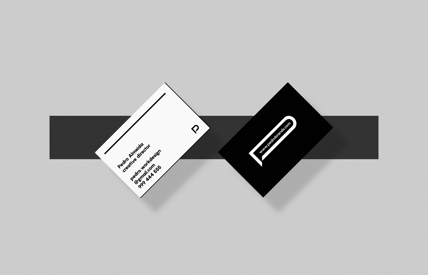
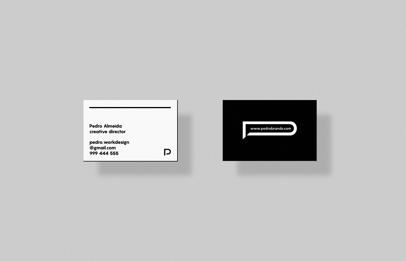
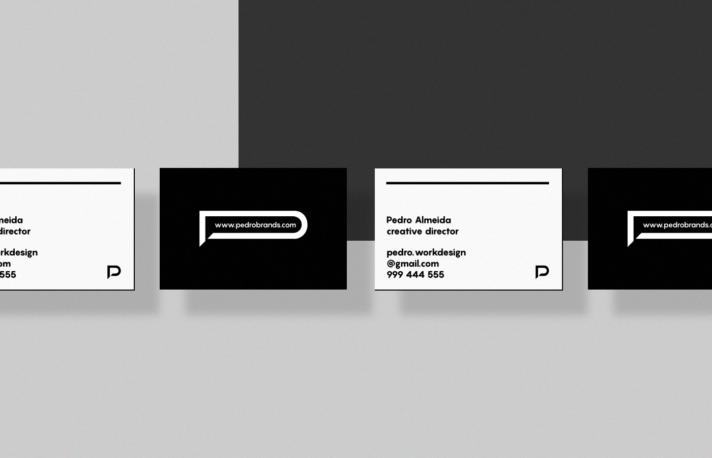
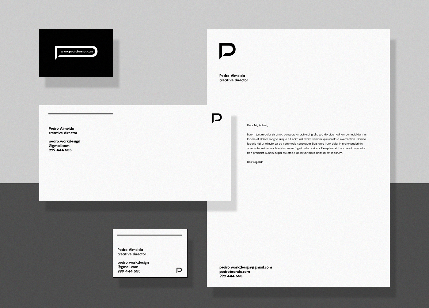
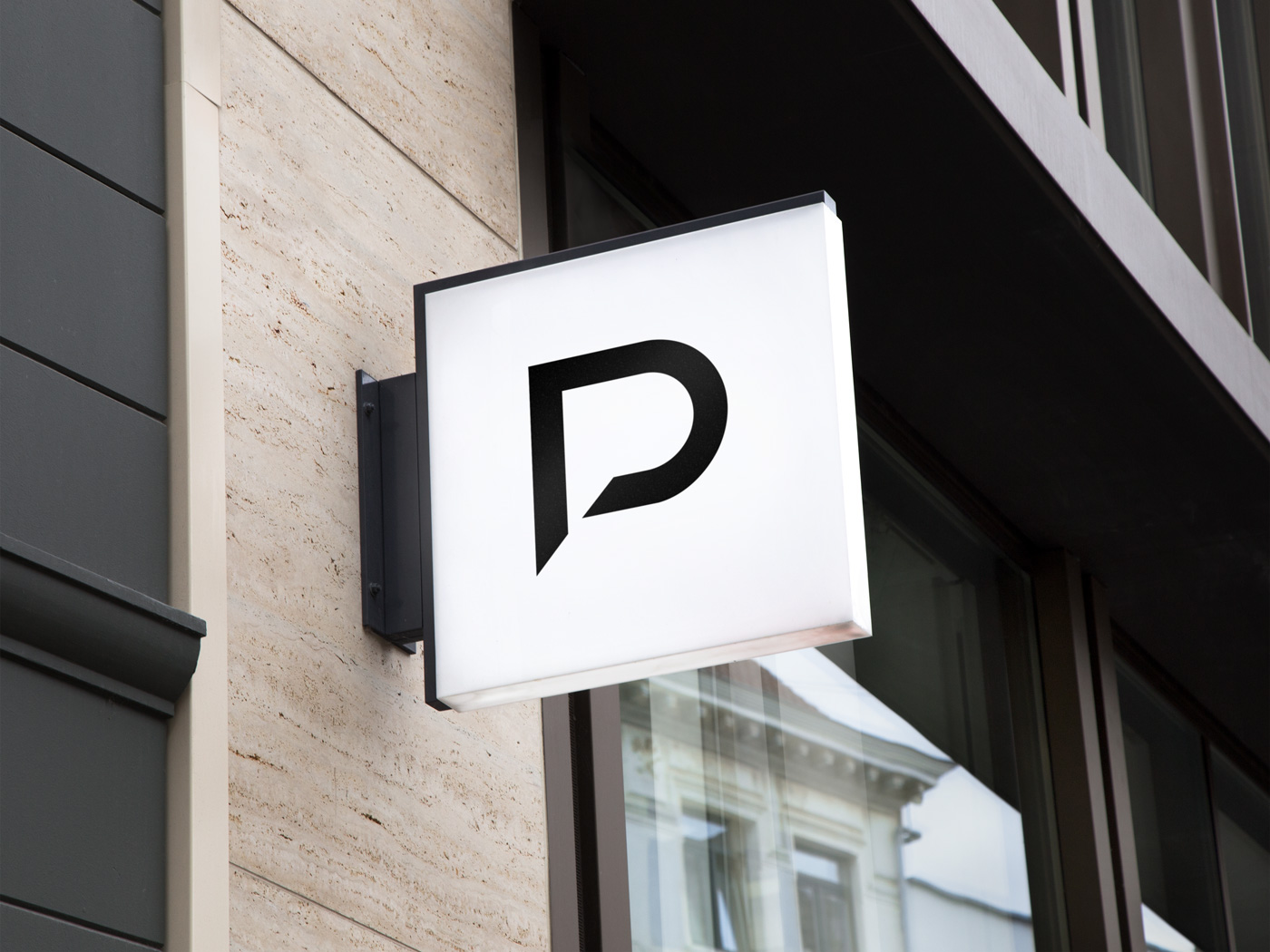
The mark is the combination of both letters "P" (Pedro), "D" (Design) and a speech bubble.
A simple and bold mark, communicating the creative process behind every project and a speech bubble giving the opportunity to feature a few sentences/phrases and quotes inside it.
The creation of this symbol allows a playful and fluid use of the identity. It also supports the simplicity approach in every design project I take on.
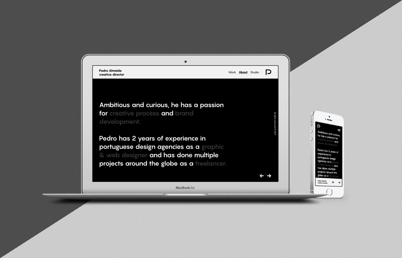
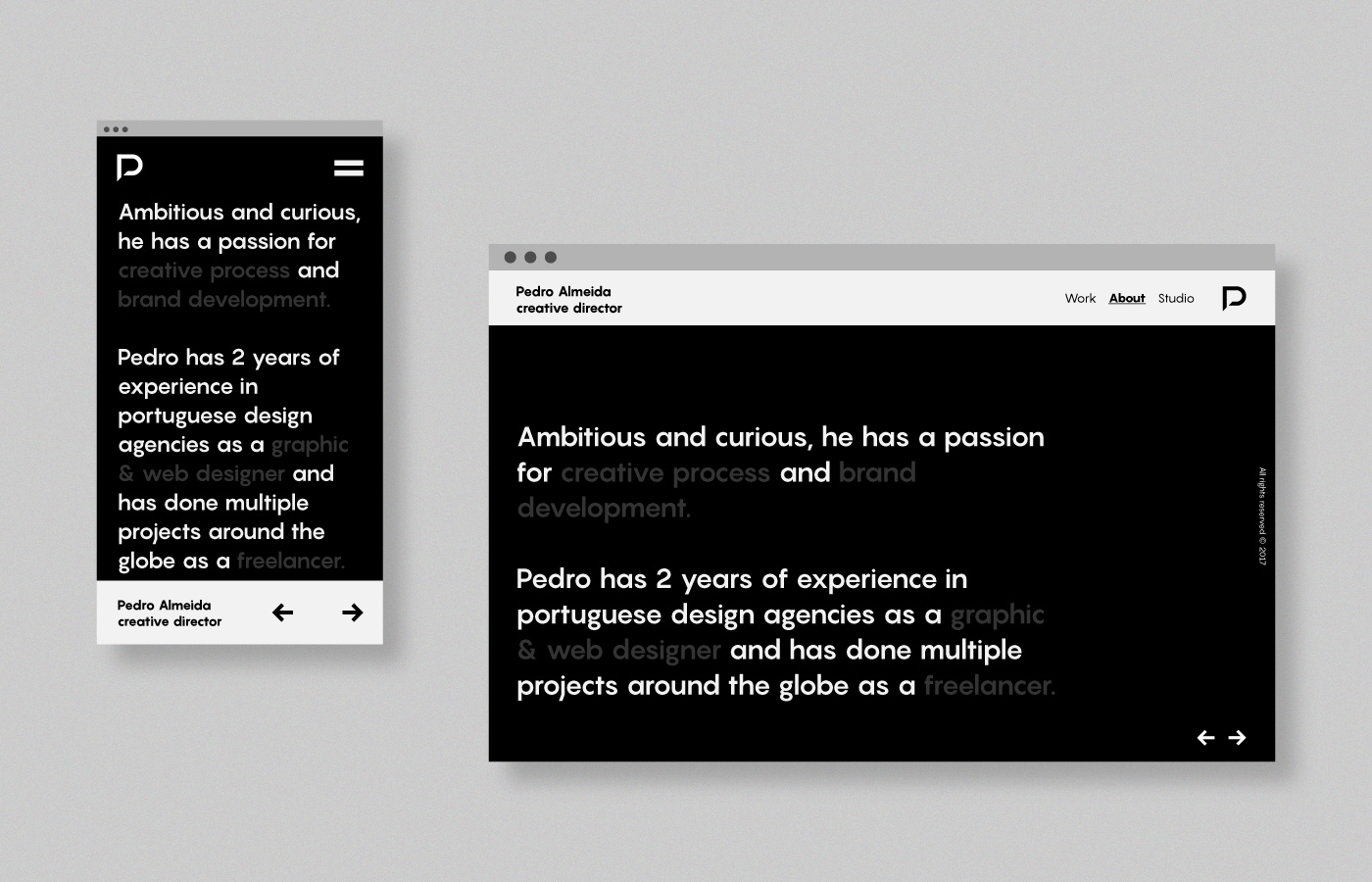
The font family used in this project is Pangram Sans from Pangram Foundry.
Check them out here!


It's an honor to be one of the 50 contributors invited by the international IdN magazine to feature my personal visual identity. I want to thank everyone for the support and recognition. Cheers!
IdN: Self Promotional Design
Branded identities - v.25 no.4
IdN: Self Promotional Design
Branded identities - v.25 no.4

Visual identity developed by: Pedro Almeida
Contact: pedro.workdesign@gmail.com
Contact: pedro.workdesign@gmail.com


