

This project I was able to work with Brooklyn Circus’s owner and creative director, Ouigi Theodore on how we could create a dynamic and changing anniversary identity as time continues for Brooklyn Circus’s 100-Year Plan. This plan is to change men’s image through classic American designed and styled apparel.
I was tasked with designing a 10 year anniversary logo that would permeate every decade until the 100-Year Plan has been satisfied.

After working with a League Gothic, I found that it didn’t function as a beveled typeface as well as I’d like, so I decided to create my own. Using consistent width rectangles, I rounded the corners and lined up where I was going to cut the numbers (red lines).

Continuing with the styling the number forms, I applied two different shadow styles to give a three-dimensional illusion.

To visualize the ‘100 Year Plan’ I wanted to create a dynamic system of separate pieces of each number to visually show the upcoming and previous decades. As each decade arrives, they condense and solidify into one number – visualizing how far Brooklyn Circus has come per decade.
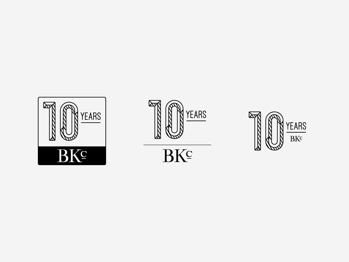
Variations of how the Brooklyn Circus identity is applied in relation to the anniversary logo.
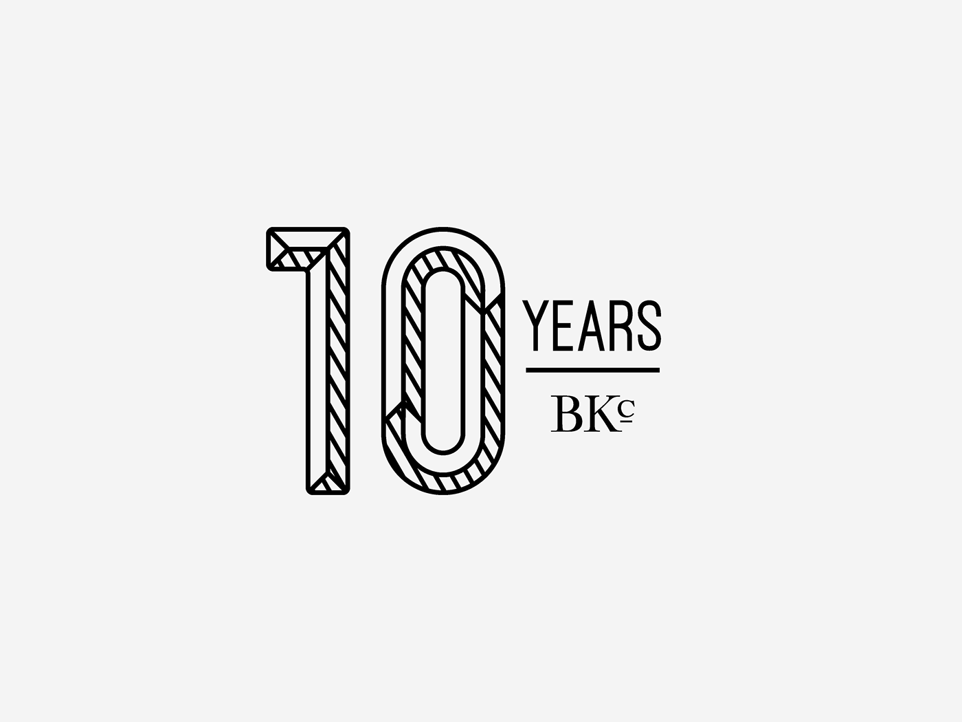
This is the final rendition of how the BKc logo is applied. Being present yet small, increasing the importance of the anniversary logo and its relation to BKc.

Both solid and dynamic anniversary logos applied to clothing labels.

Both solid and dynamic anniversary logos applied to tote bags.