
Task: to design a leaflet dedicated to a famous typeface
Result: two leaflets dedicated to Avenir typeface
Result: two leaflets dedicated to Avenir typeface
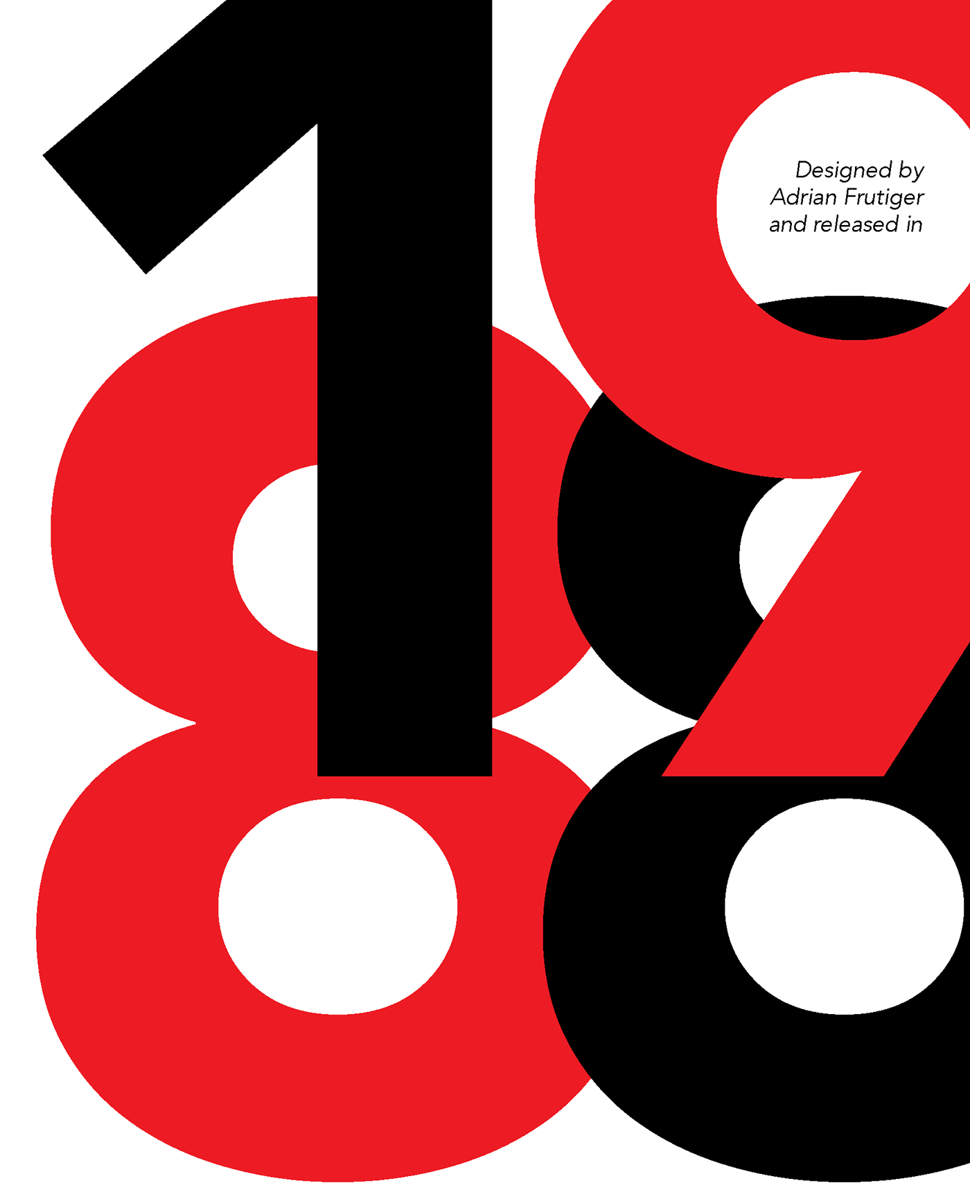
From Wikipedia: 'The word avenir is French for "future". As the name suggests, the family takes inspiration from the geometric style of sans-serif typeface developed in the 1920s that took the circle as a basis, such as Erbar and Futura. Frutiger intended Avenir to be a more organic interpretation of the geometric style. Frutiger has described Avenir as his finest work.'
Size: folded A4
Production method: offset printing
Version one

Version two


